Tasked with revamping and refreshing not only the face of the brand, but also with the pressures of changing the perception of palm oil in the region, we undertook the project in a calculated manner centered around an optimistic approach to the product.
Palm oil has long been regarded as an unsustainable and damaging crop. This is primarily due to the harmful farming methods practiced in vast areas of Asia and Africa. The Palm Oil Association of Sri Lanka was seeking to alter this perception drastically and thus turned to us to overhaul their image to support their message.
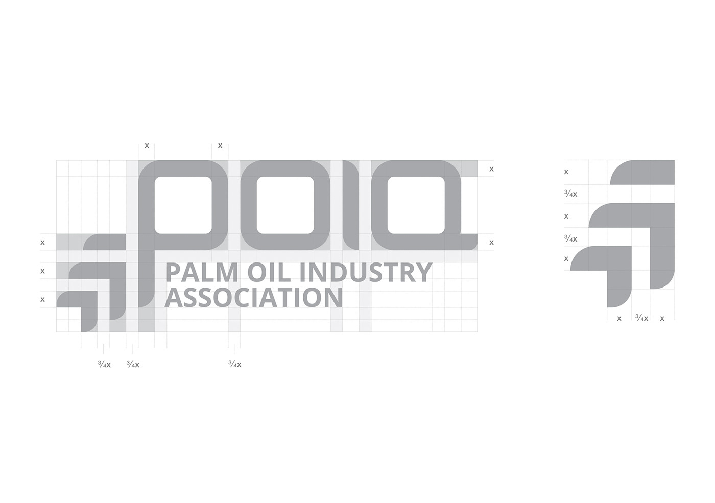
The logo took on a traditional, yet progressive colour scheme along with elements to further embellish the forward thinking mentality of the brand.
Discovery
The brand required an uplift in the overall modulation seen in the visual elements for the relevant audiences to interpret the design differently. They didn’t possess a visual identity to drive their message and agenda of turning the negative stigma that surrounded the industry into one that could overcome the mass criticism of the public.
Design
Having a blank slate proved to be an interesting task as creating an identity from the ground up, gave us the ability to introduce a guideline as to how it should ideally be perceived. Thus, it’d prove to form the artillery required to fight off the criticism of the general public.
Delivery
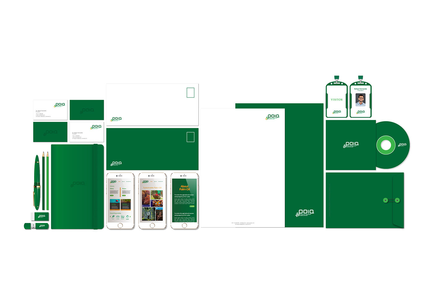
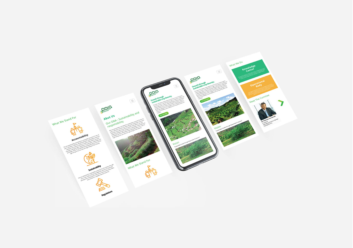
The logo took form as a derivative of select components to form a contemporary and direct message while maintaining the notions of a longstanding and reputed institution. This was applied in the thought process when designing all collateral material, communication tools and the digital presence of the brand.