


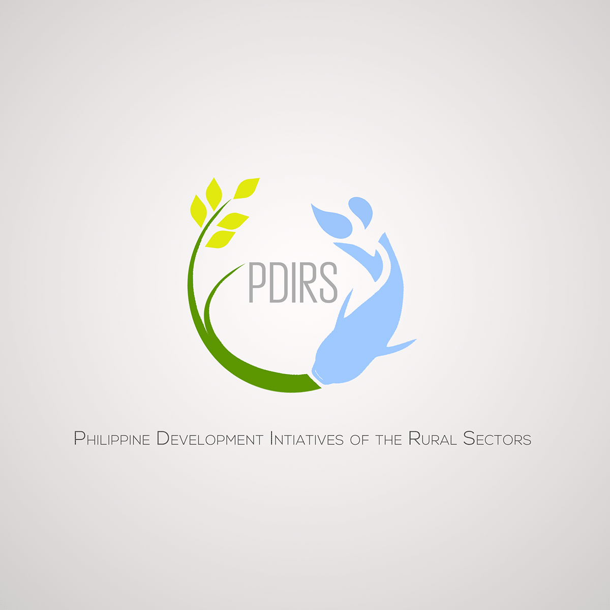
This a project for a newly established research firm in the Philippines. The organization focuses on the communities in the rural areas. I wanted to feature a rice stalk & catfish representing the primary livelihoods (fishing and farming) in which Filipinos depend in the country side.
The variations started from depicting the P as the central Letter incoporated in the logo, this is to highlight the country's initial. It evolved eventually by omitting the P and establishing the organization's Acronym for a much stronger look.
The typfaces used were: Grigorio Sans and Nexa Light
BELOW is the FINAL LOGO for the company.


