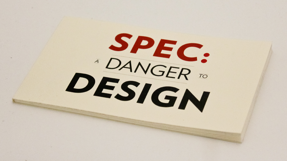
A small, informative publication meant to raise awareness about the issue of speculative work for fellow students, designers and creatives.
Printed & bound by hand on supple Rives White 175; typeset entirely in Verlag by Hoefler & Frere-Jones - atypeface with a distinctive voice. The palette consists of merely two colors: a bold, deep blue (PMS 7547 PC) and a punchy red with a hint of magenta (PMS 484 PC). With varying saturations these two inks speak in a range of emotions.
The language and ideas contained are inspired by the NO!SPEC campaign (www.no-spec.com)