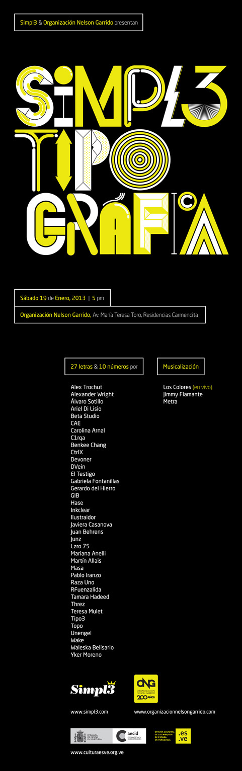
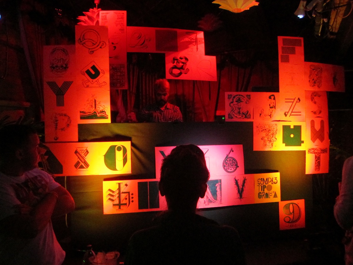
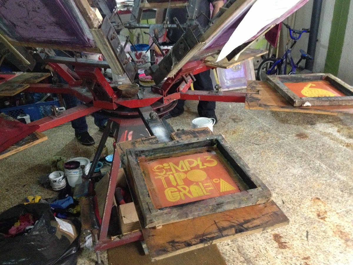
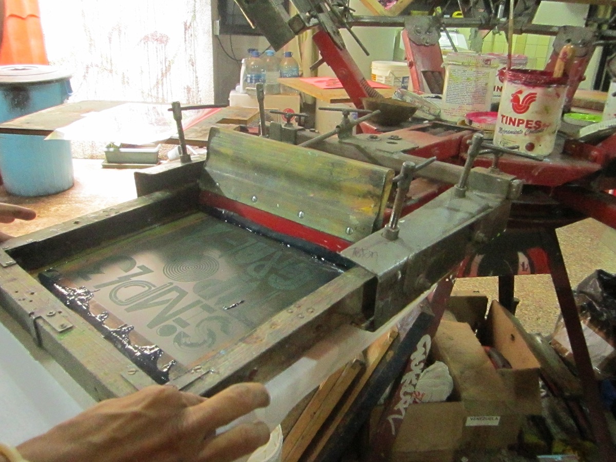
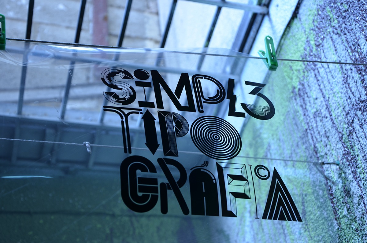
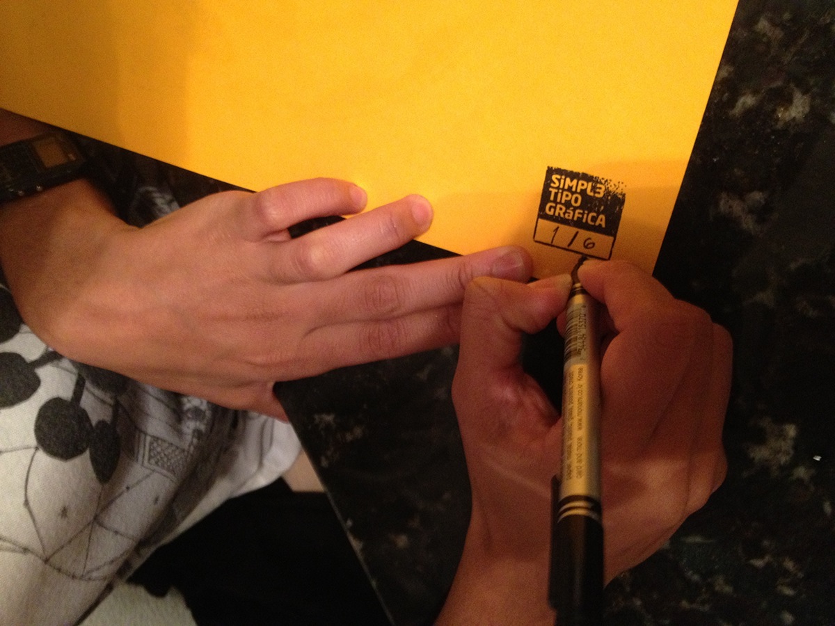
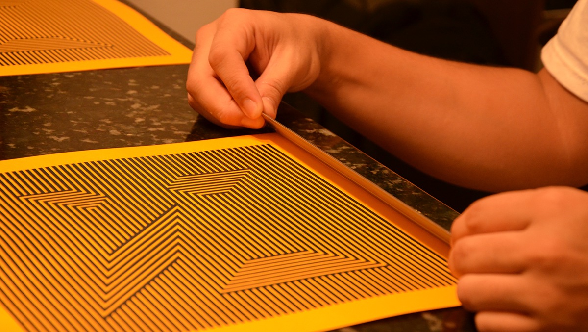
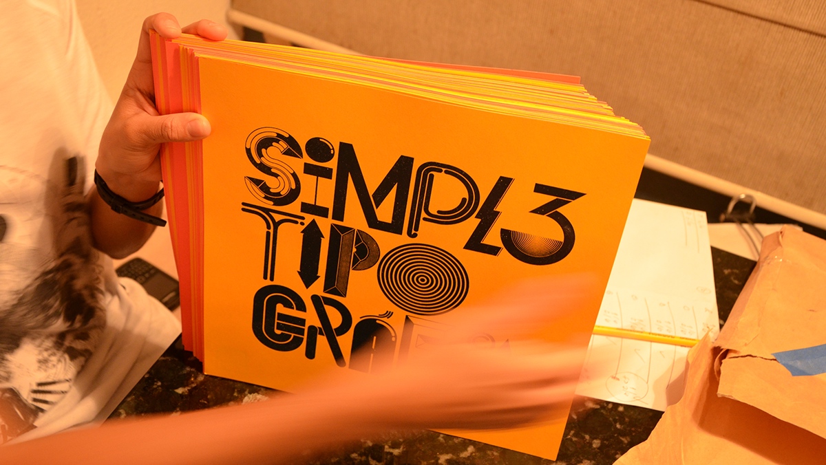
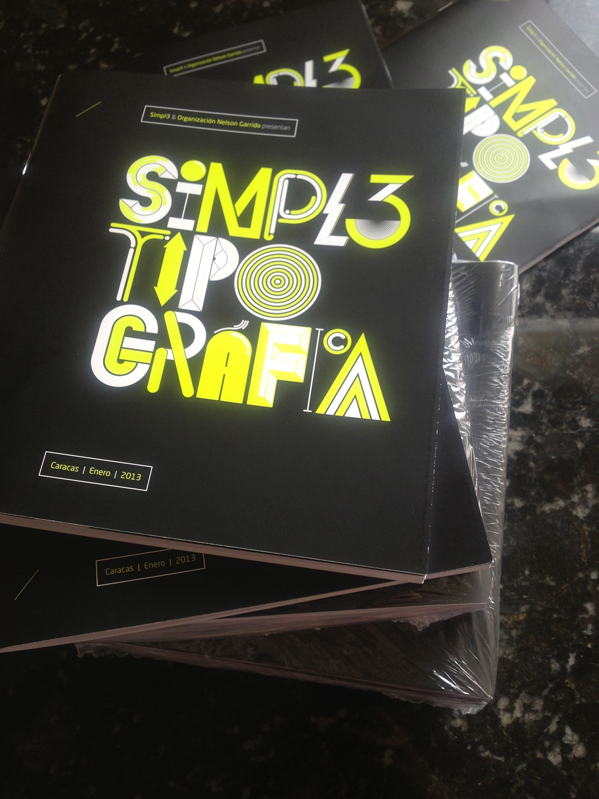
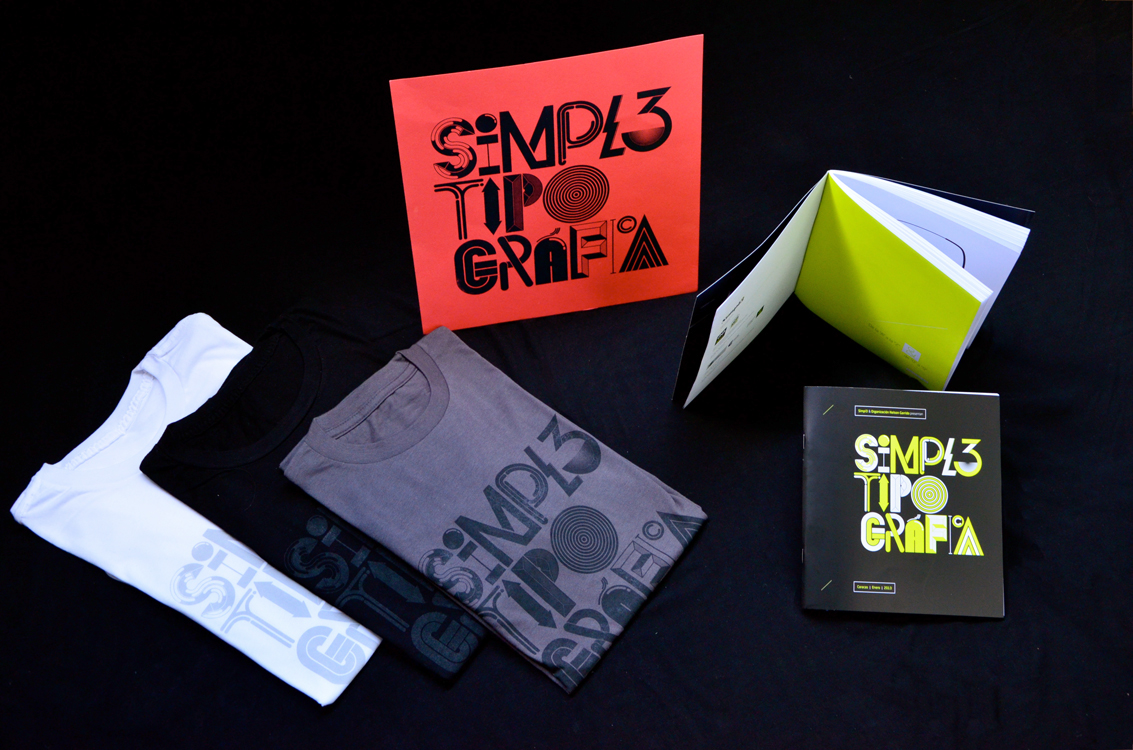
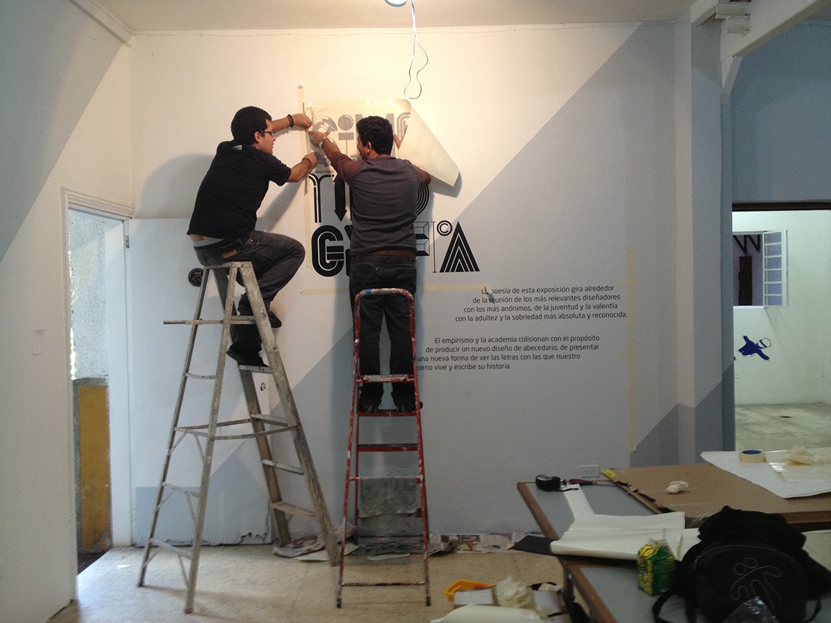
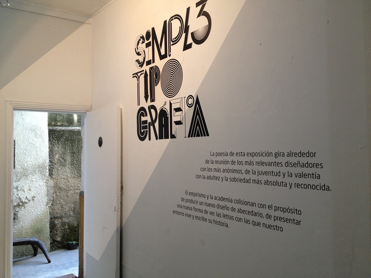
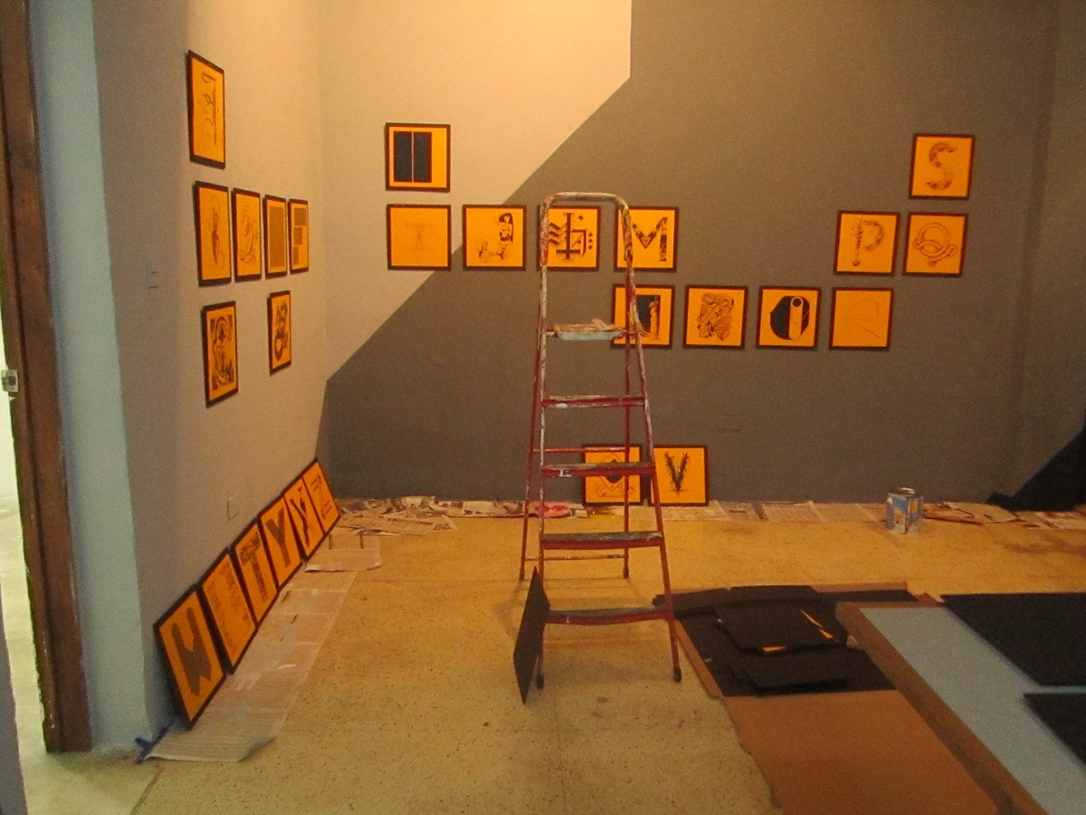
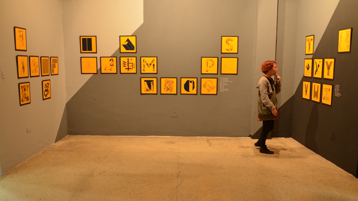
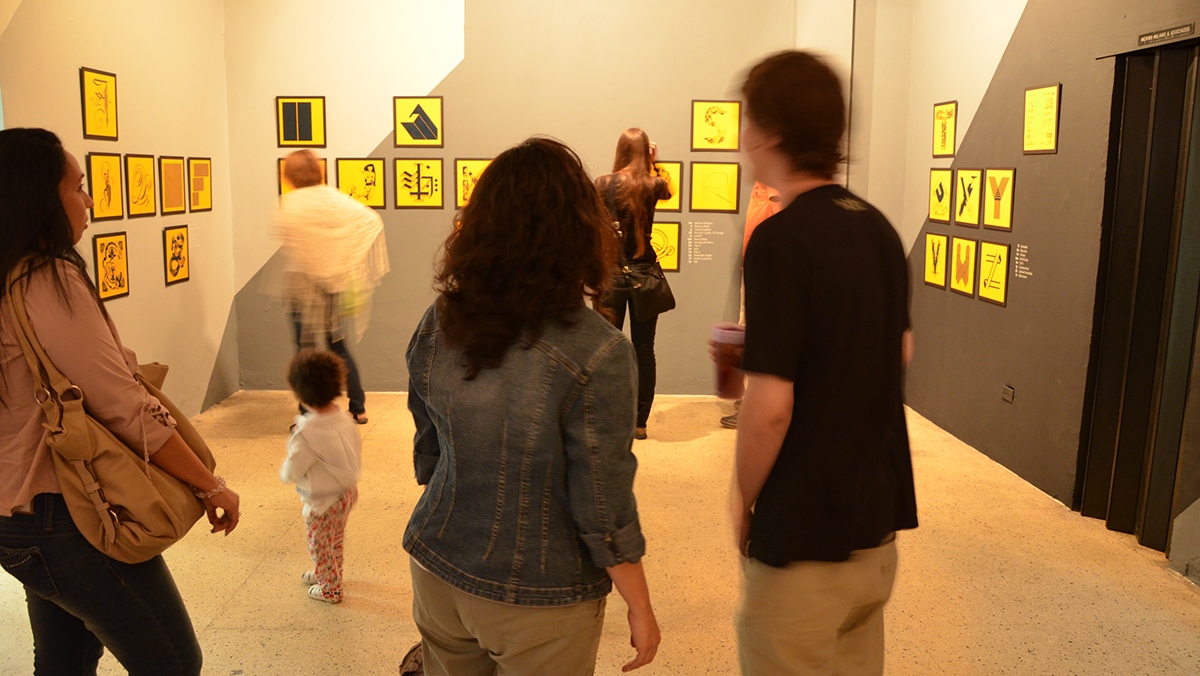
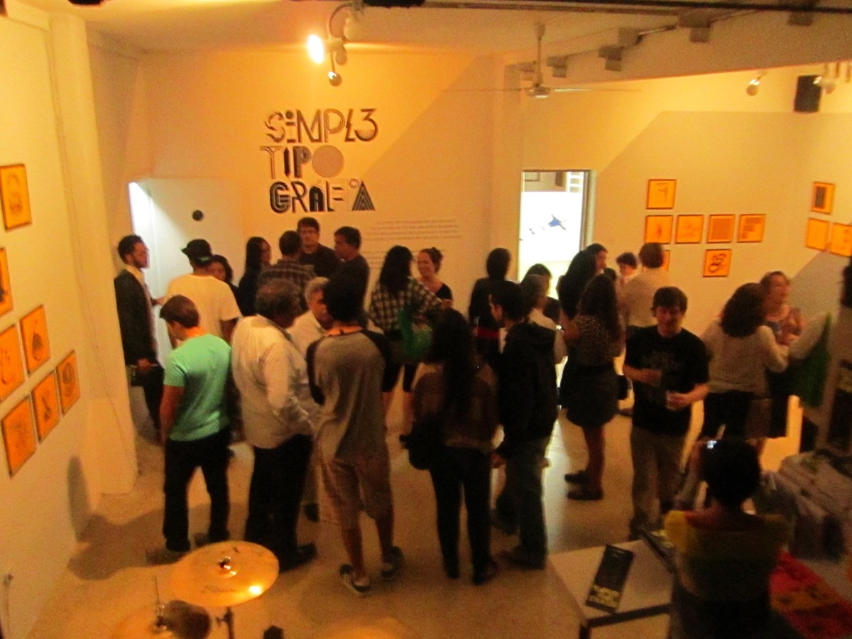
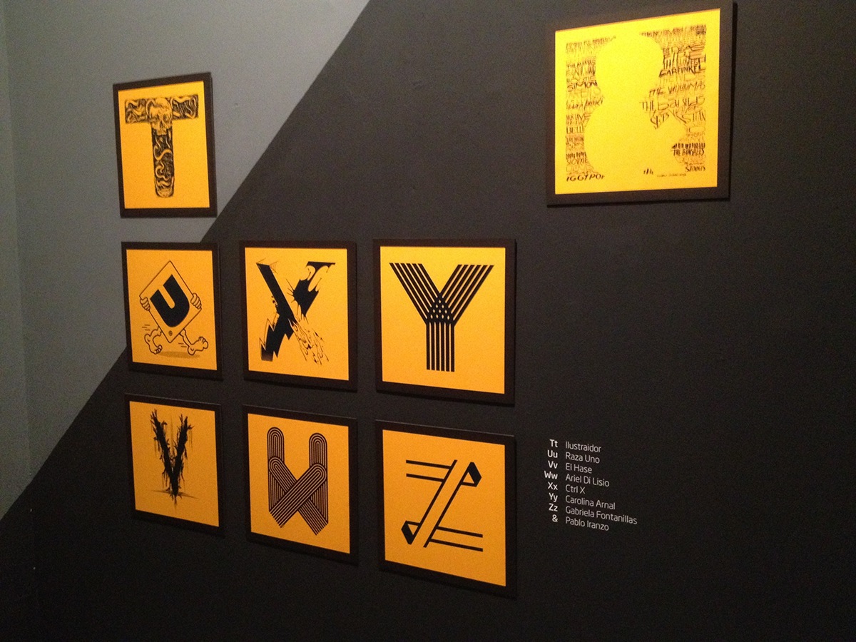
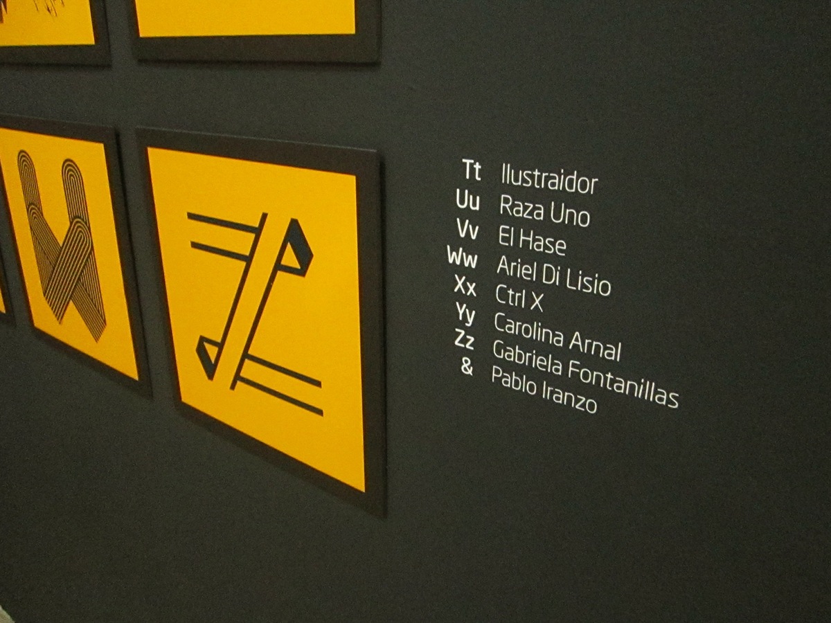
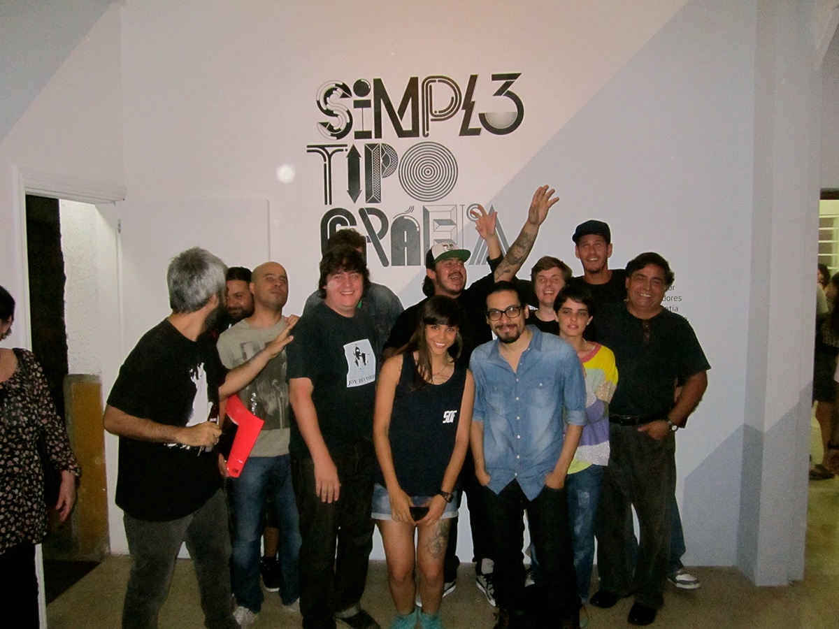
Artistic and creative direction for Simpl3 Tipo Gráfica, a typographic expo held during the beginning of 2013 in Caracas, Venezuela. 39 illustrators/designers were invited to each interpret a letter or number completing the alphabet among us all. Each letter was printed in one color silkscreen on colored paper. The expo was launched in December 2012 with a party at a local club but later presented in a more orthodox way at Organización Nelson Garrido. I was in charge of creating the logo, catalog, website and over-all image and also created the letter Q for the exposition.
You can check out all the letters at the website www.simpl3.com
This was only possible thanks to the team effort of Simpl3 crew and all the extra people that pitched in!
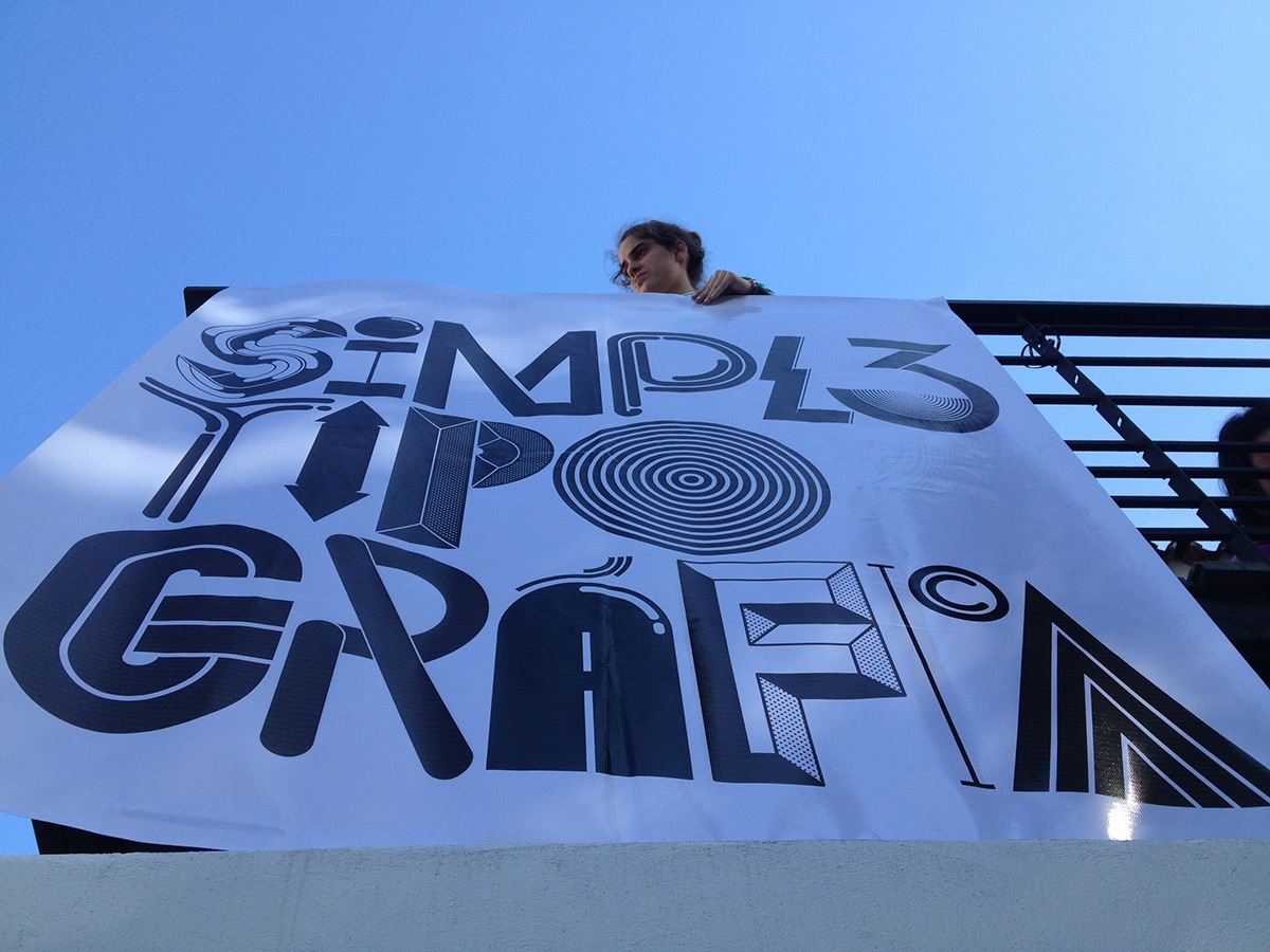

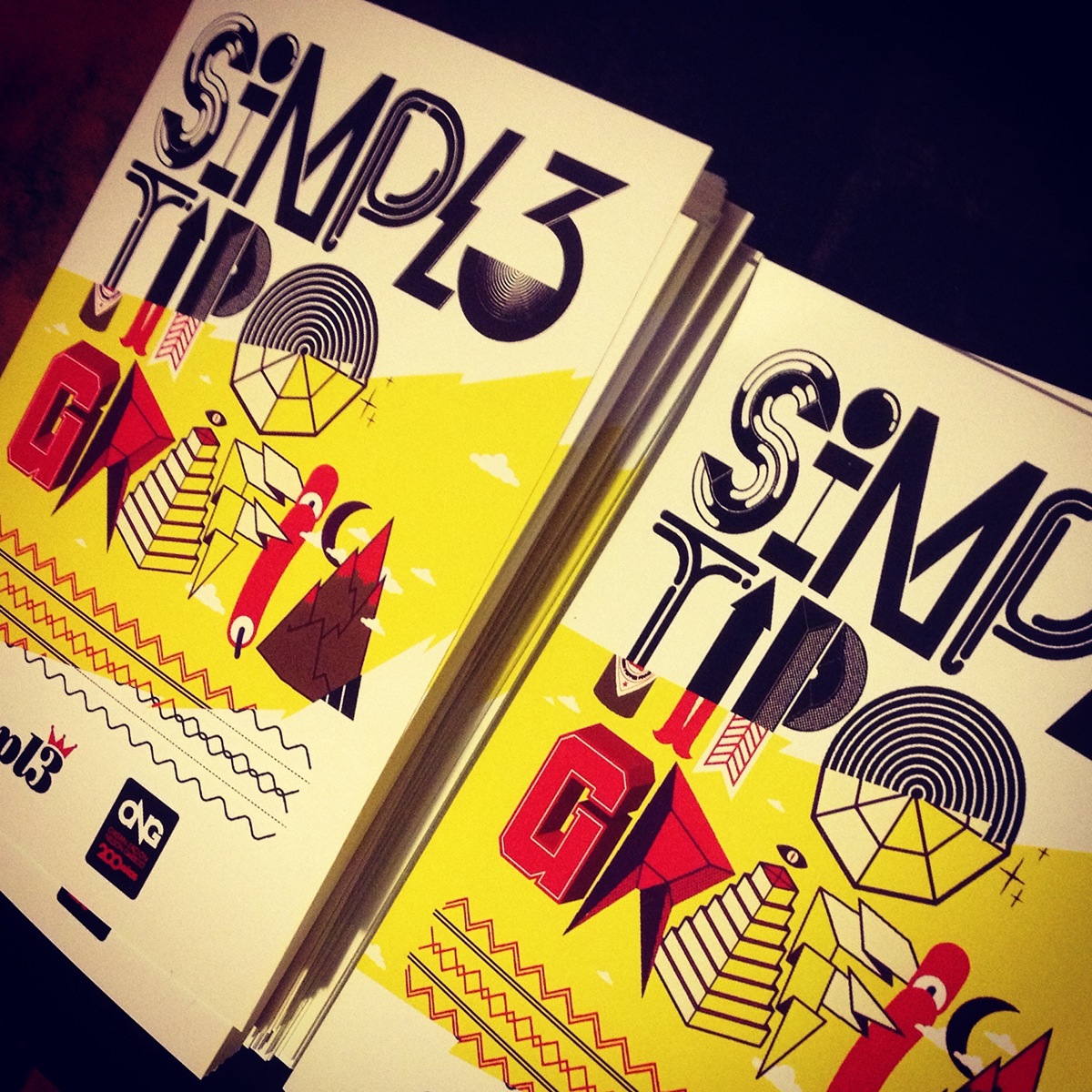
Flyer remix by Inkclear
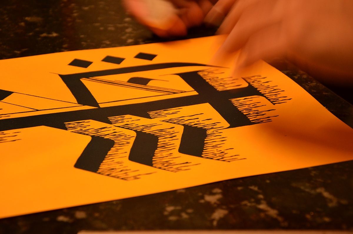


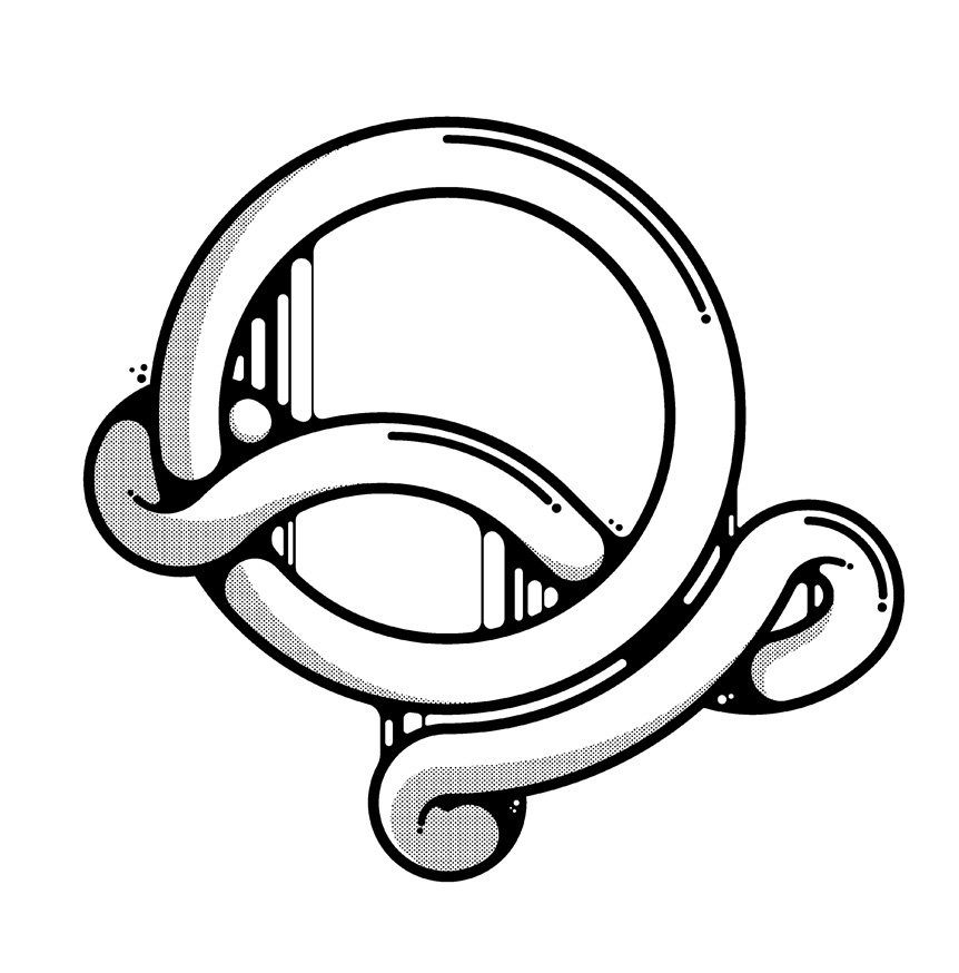
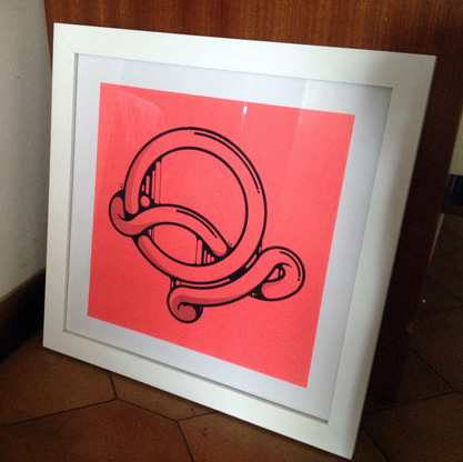
My letter Q based on "Queso Fundido" (melted cheese)...
Be sure to check out all the letters at the website www.simpl3.com