


ARIZONA CARDINALS: The Cards moved to the desert in 1988, it's about time they start looking like the Pyrrhuloxia variety of cardinal native to Arizona. The update also brings in copper and a state flag alternate.

ATLANTA FALCONS: The Falcons recent redesign is close, but with a few changes it's even better. The logo gets an angular upgrade. The PrimeTime alternate uses bandana paisley and some gold to bring back the days of Deion in ATL.

BALTIMORE RAVENS: The Ravens logo gets a dark upgrade to look more like the bird it represents. Elements of the Baltimore flag adorn the uniform, with an iridescent purple added to the alternate.

BUFFALO BILLS: The Bills logo gets a 21st century upgrade and their blue gets a nickel tone to represent the Nickel City. The alternate brings back royal, a horned helmet, and the electricity of the Buffalo seal.

CAROLINA PANTHERS: The Panthers swap black for plum and get a race themed alternate.

CHICAGO BEARS: The Monsters of the Midway's bear gets an upgrade. The uniforms get a font upgrade thanks to the Cincinnati Reds and some stripe consistency. The alternate brings the beloved Chicago flag into the mix.

CINCINNATI BENGALS: Who dey? A monogram logo should represent the city, not the nickname. The uniforms get bigger, bolder stripes and a black alternate.

CLEVELAND BROWNS: The Browns deserve a logo other than their helmet, this monogram is a C a B and the iconic stripe. Stripe consistency is the name of the game on home and away and the Akron Pros are represented in the alternate fauxback.

DALLAS COWBOYS: Big D finally gets one silver and one blue. Simple uniforms and big stars for the alternate are a timeless look for Dallas.

DENVER BRONCOS: The Orange Crush return to the bucking bronc' and D from days past with uniforms to match. The alternate uses their current, unique striping.

DETROIT LIONS: The Lions get the muscle car racing stripe treatment their city deserves.
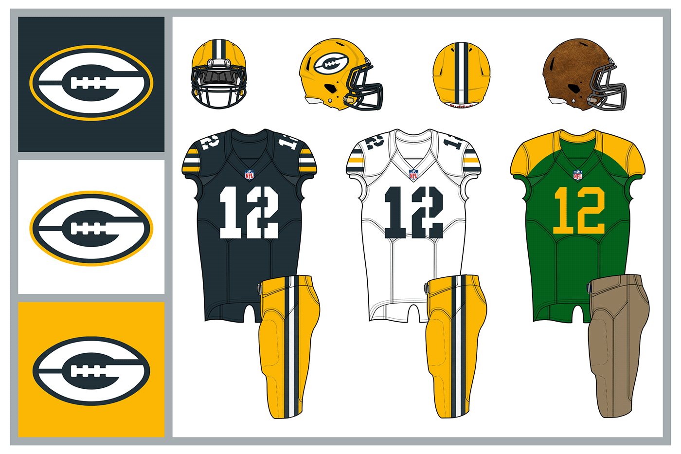
GREEN BAY PACKERS: The Pack logo gets an update (though they should never change). Uniforms get an updated stencil font to match and a 1950s throwback.

HOUSTON TEXANS: The Texans get a cattle brand monogram and some western colors because red, white, and blue are overused. The alternate pays homage to the space travel history in Houston.

INDIANAPOLIS COLTS: The colts logo gets an upgrade and uniform striping to match. The alternate uses a brick pattern and italicized font to pay homage to the Brickyard.

JACKSONVILLE JAGUARS: The Jags logo is a mix of old and new. The uniforms get sublimated spots and a black & gold alternate.
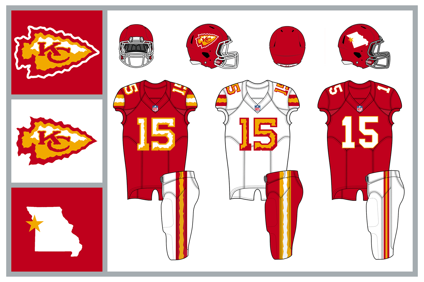
KANSAS CITY CHIEFS: The Chiefs logo gets a jagged rework and uniform stripes to match. The number font gets a bevelled treatment. The fauxback alternate harkens back to the Dallas Texans.

LOS ANGELES CHARGERS: The Bolts have used a horse in their logo in the past, but the League already has the Colts and Broncos, so they get a charging rhino to replace it. The uniforms have only a few changes from the 2020 redesign.

LOS ANGELES RAMS: The Rams uniforms return to a classic look, with a yellow away in place of white. The Hollywood alternate uses LA's art deco design and metallic gold.

LAS VEGAS RAIDERS: The Raiders get a new logo for their move to Sin City. The only update to home and away is the number font. The alternate gets a chrome helmet and metallic uniform elements. A sword adorns the left hip.

MIAMI DOLPHINS: The Fins get a new color scheme with uniforms that celebrate the sunshine. The vaporwave alternate is quintessential Miami.

MINNESOTA VIKINGS: The Vikings logo has grown out his beard and gotten rid of black. The home and away use a stripe pattern that was originally supposed to be used by the expansion Vikings in 1960. The Mjolnir alternate represents the power of the viking hammer.

NEW ENGLAND PATRIOTS: Pat Patriot returns! Despite that return he doesn't make it back to the helmet, a less detailed, more unique design gets that distinction. The tri-corn hat is used for both helmets. The uniforms get real American with their red-white stripes and an alternate inspired by General Washington himself.
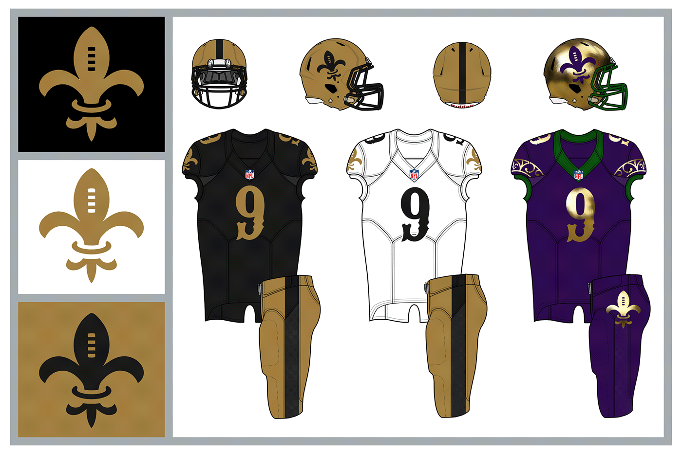
NEW ORLEANS SAINTS: The Saints simplify their uniform and get a new number font. The alternate celebrates New Orlean's greatest celebration, Mardi Gras.

NEW YORK GIANTS: There's a new giant in New York, and his name is Kong. The new logo features King Kong and an NY monogram. The new monogram is on the helmets and uniforms get a number font to create the illusion of height. The throwback alternate is unique to the league.

NEW YORK JETS: The Jets gets a logo with a jet in it, fancy that. The fauxback alternate is inspired by the Titans of New York of yore.

PHILADELPHIA EAGLES: The Eagles new logo gets rid of black and brings in the famous Liberty Bell. The uniforms get a modern striping and a fauxback alternate that harkens back to the 1924 Frankford Yellow Jackets

PITTSBURGH STEELERS: A new P logo and a steel grey for the Steelers. A wordmark and number font uses I-beams as inspiration. The alternate uses elements of the Pittsburgh city seal.

SAN FRANCISCO 49ERS: The 49ers logo is simplified with a western font. The helmet and pant stripes evoke the city's famous bridge. The alternates roll in the fog.

SEATTLE SEAHAWKS: The 'hawks logo and unis get some more NW inspiration and an S. The alternate uses a logo that was originally planned for the expansion Seahawks.

TAMPA BAY BUCCANEERS: The Bucs get rid of black in their logo and bones instead of swords (why have swords on the flag AND waving the flag?). The home and away are simple aside from the new number font. The fauxback meant to look like it could have fit in the 1920s. Back in 1926 Jim Thorpe led the Tampa Cardinals, a barnstorming team. They played Red Grange and his Bears in '26 and travelled around Florida.
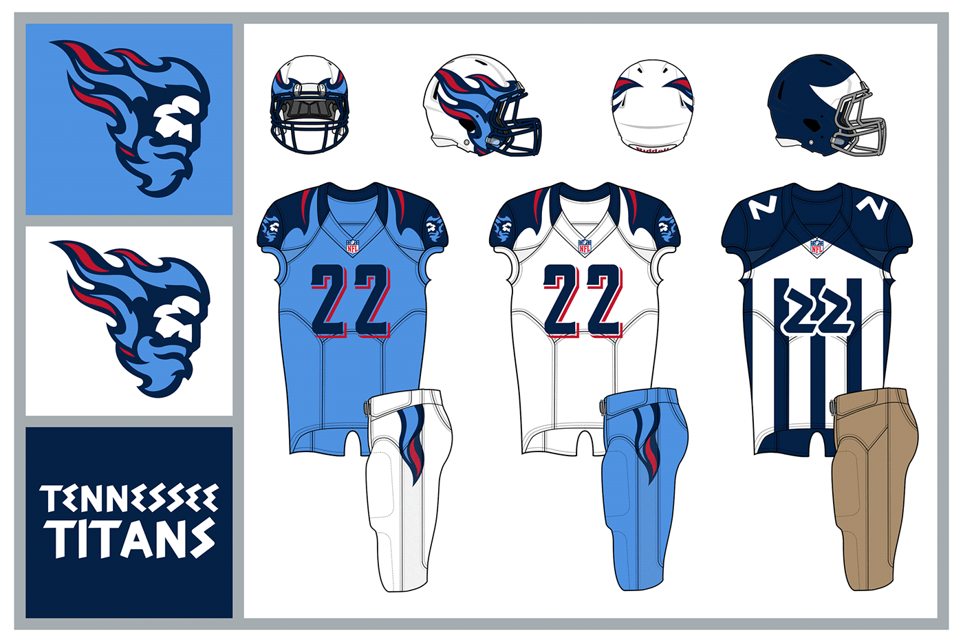
TENNESSEE TITANS: The Titans new logo is a Titan ready to take on the Gods. The flames take the lead in the uniforms. A parthenon inspired fauxback uses a winged helmet that looks like it could have evolved into the flames they sport today.

WASHINGTON REDTAILS: The Redtails name replaces current monicker, let's leave it at that. The new name and logos honor the Tuskegee Airmen. The primary logo looks like an airplane emblem as well as the stars and stripes of the DC flag. The alternate is made to look like the P-51s flown by the Redtails in WWII.


