


Project 'bokk' / branding
restaurant concept
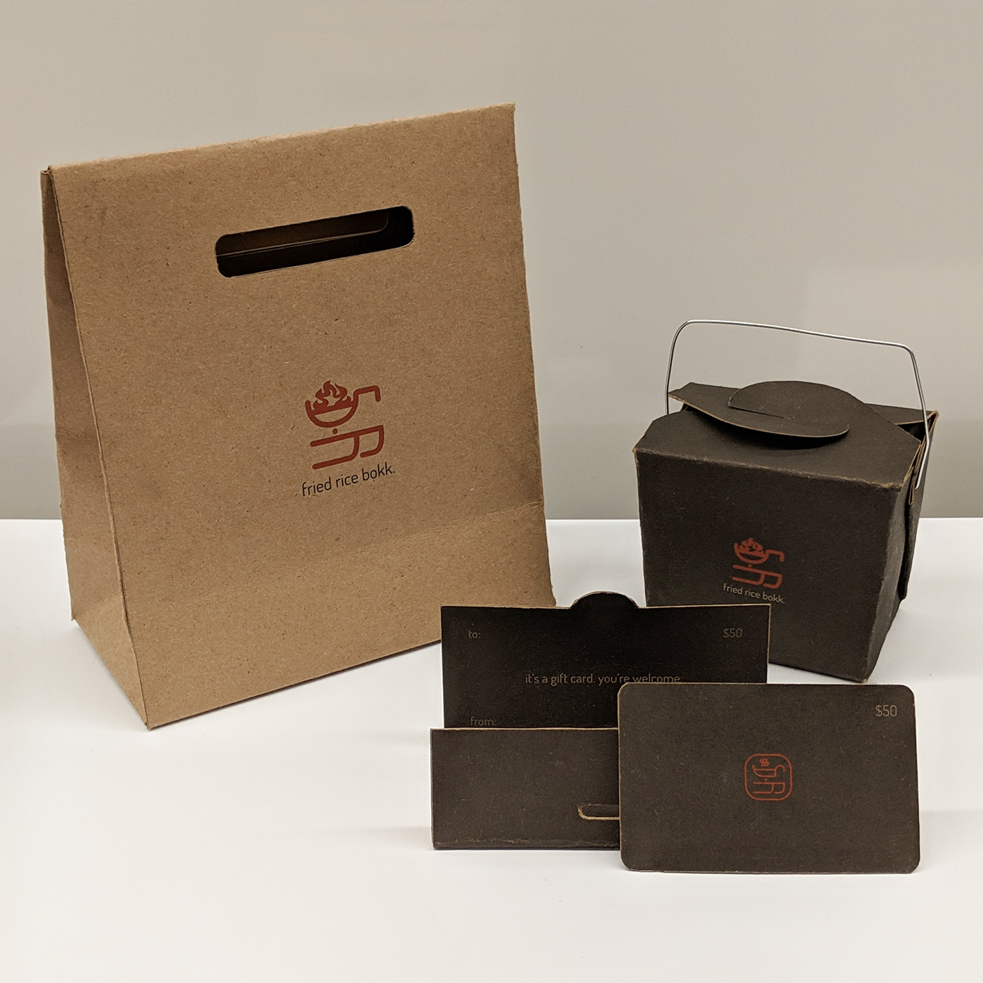
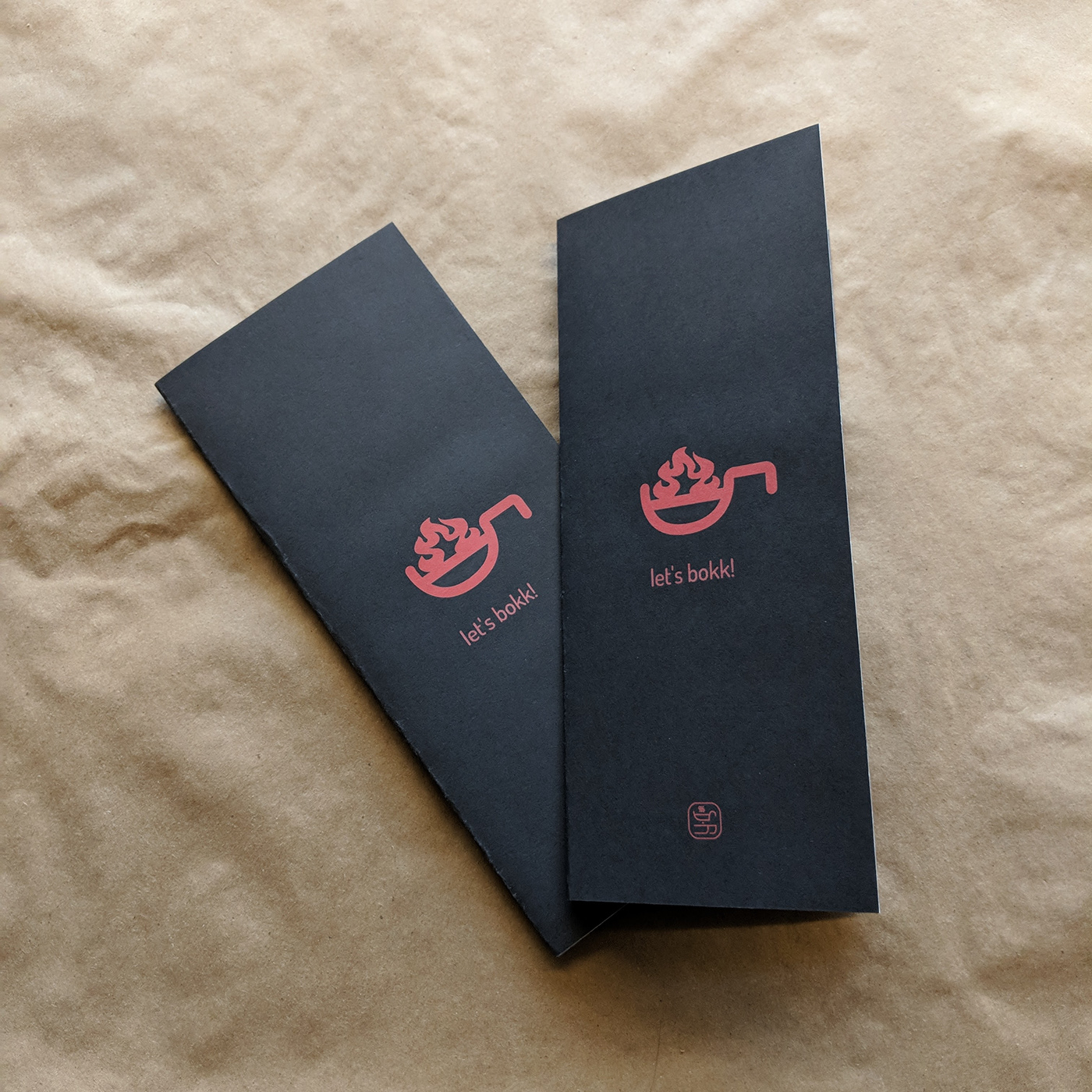
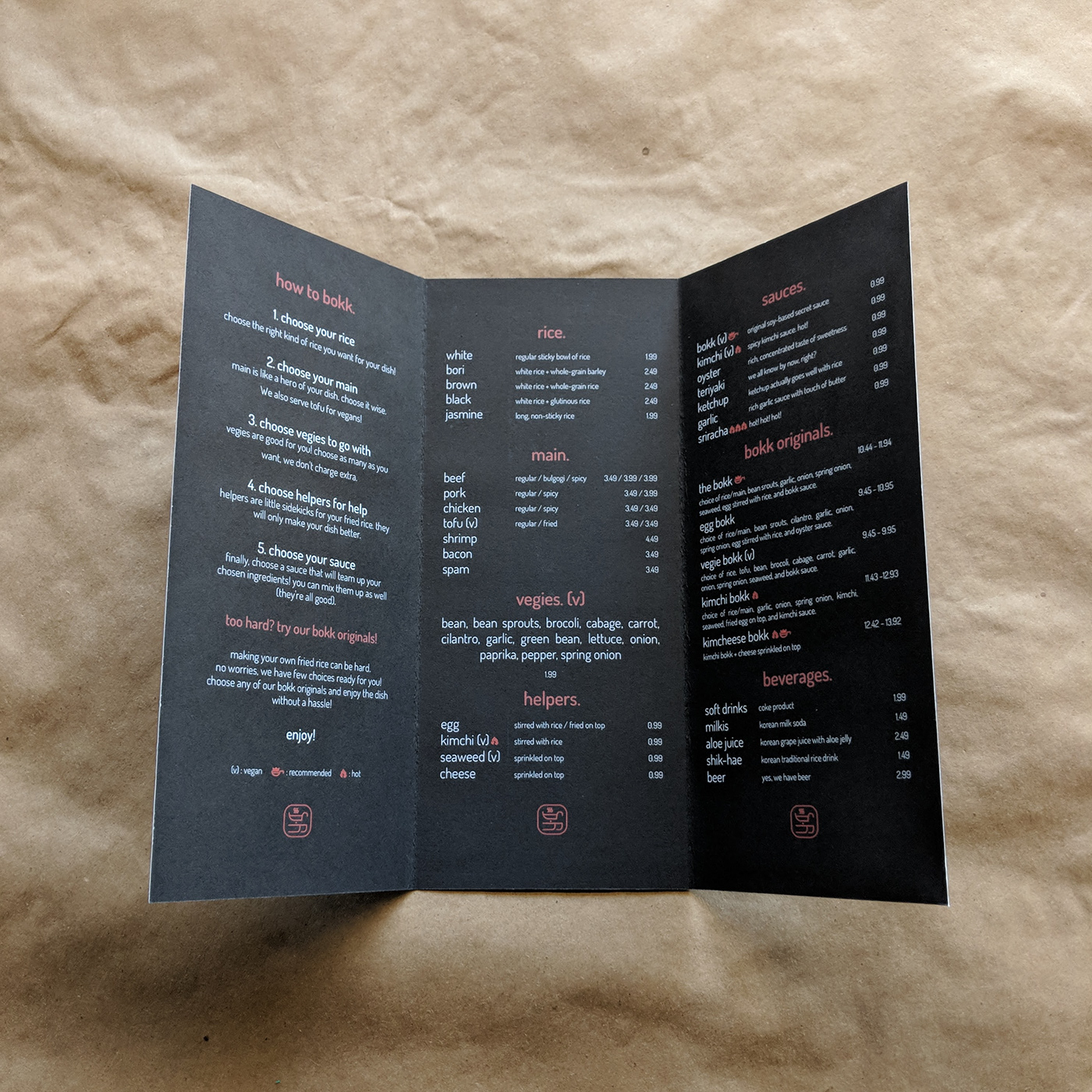
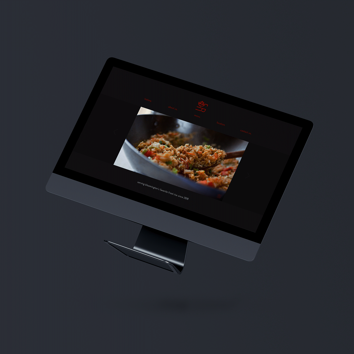
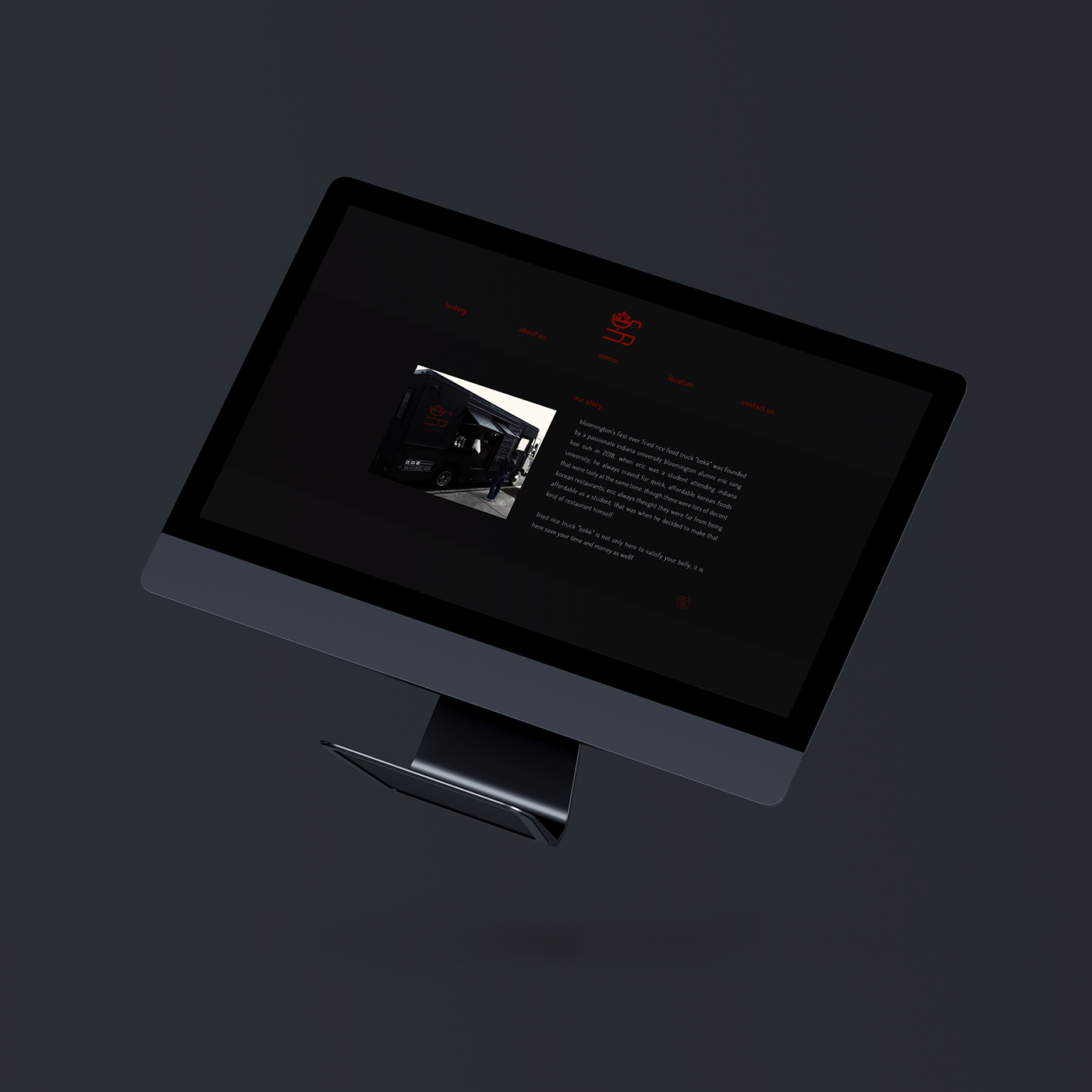
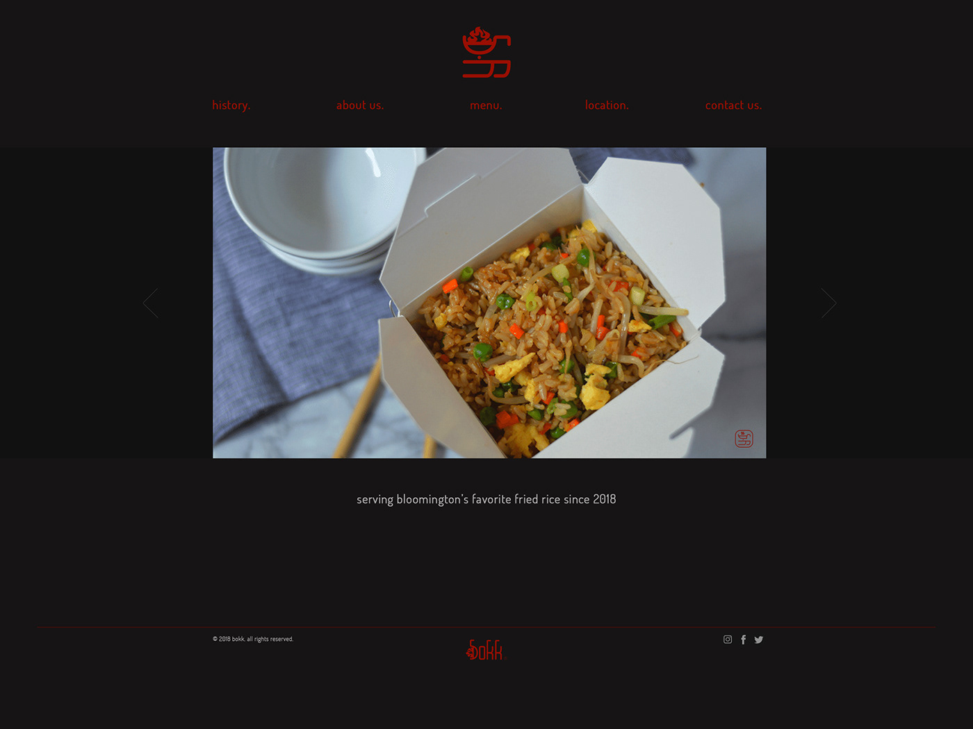
Project ‘bokk’ is a concept design for a fried rice food truck. The goal of the project was to entice the target audience by using consistent branding design.
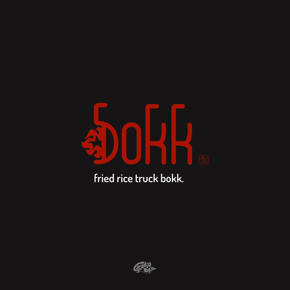
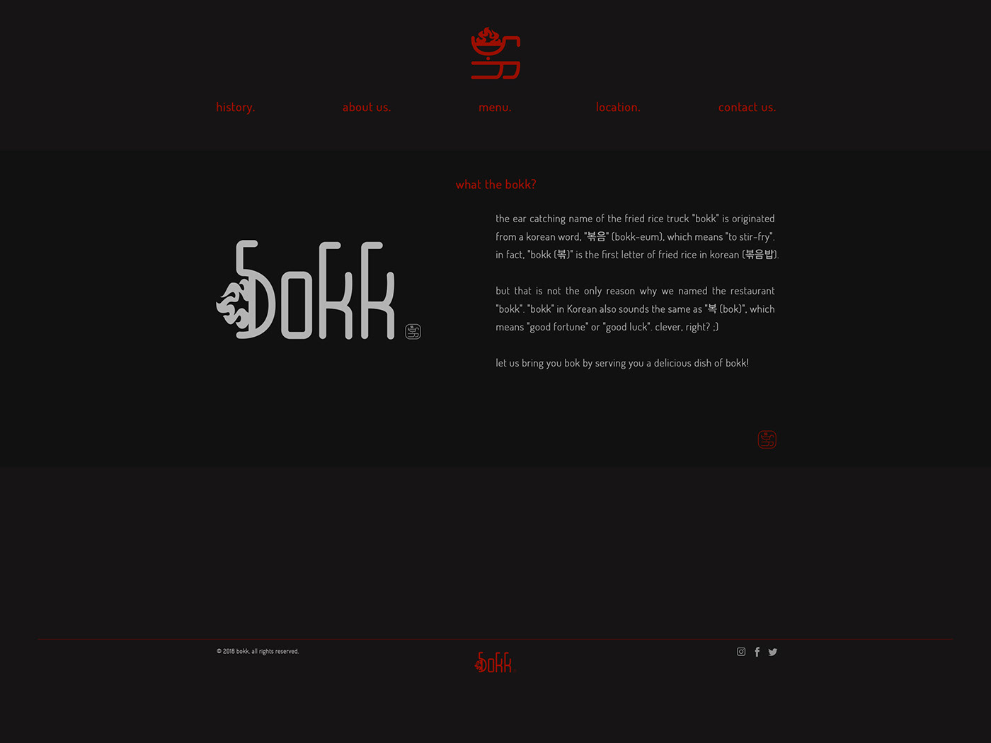
The ear catching name "bokk" originated from a Korean word, "볶음" (bokk-eum), which means "to stir-fry". "bokk" in Korean also sounds the same as "복 (bok)", which means, "good fortune" or "good luck". Moreover, the basic structure of the logo is from a Korean alphabet, “ㅂ” which in the logo symbolized as a wok. In English logo, the symbol of a wok is used as an alphabet “b”.
The ear catching name "bokk" originated from a Korean word, "볶음" (bokk-eum), which means "to stir-fry". "bokk" in Korean also sounds the same as "복 (bok)", which means, "good fortune" or "good luck". Moreover, the basic structure of the logo is from a Korean alphabet, “ㅂ” which in the logo symbolized as a wok. In English logo, the symbol of a wok is used as an alphabet “b”.
프로젝트 '볶' / branding
restaurant concept
프로젝트 '볶'은 [미국인에게 어필할 수 있는 아시안 푸드트럭] 이라는 컨셉 아래 시작된 볶음밥 푸드트럭이다. 컨셉 목표는 브랜드 전체를 일관성 있게 잡아줄 브랜드 디자인으로, 통일된 컬러감으로 전체적인 무드를 정리하였다.
로고의 모양은 '볶'의 형상과 볶음밥 요리의 상징인 웍을 조합하였다. 또한, 로고의 전체적인 모양은 인감을 떠올릴 수 있도록 라운딩과 어두운 적색으로 작업하였다.


