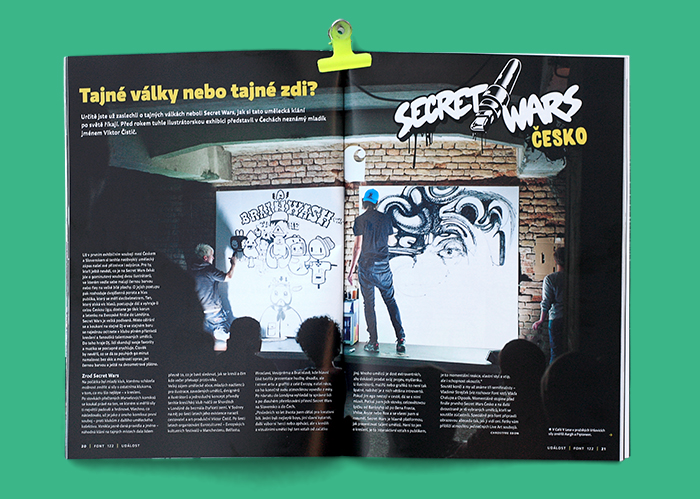
This is a story of long term and probably forever on going project. Once upon a time Aargh joined the first year of Secret Wars (now Secret Walls) league in the Czech republic. Apart from losing in the second round (my story), every artist was asked to create two custom letters for a magazine that featured article on Secret Wars...

...the magazine is called Font and it's the main Czech graphic design magazine, not only it featured short contestants bios, neat article and an opening photo, but also all the custom letters.
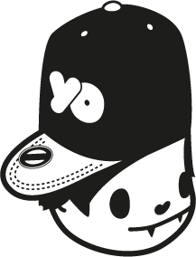
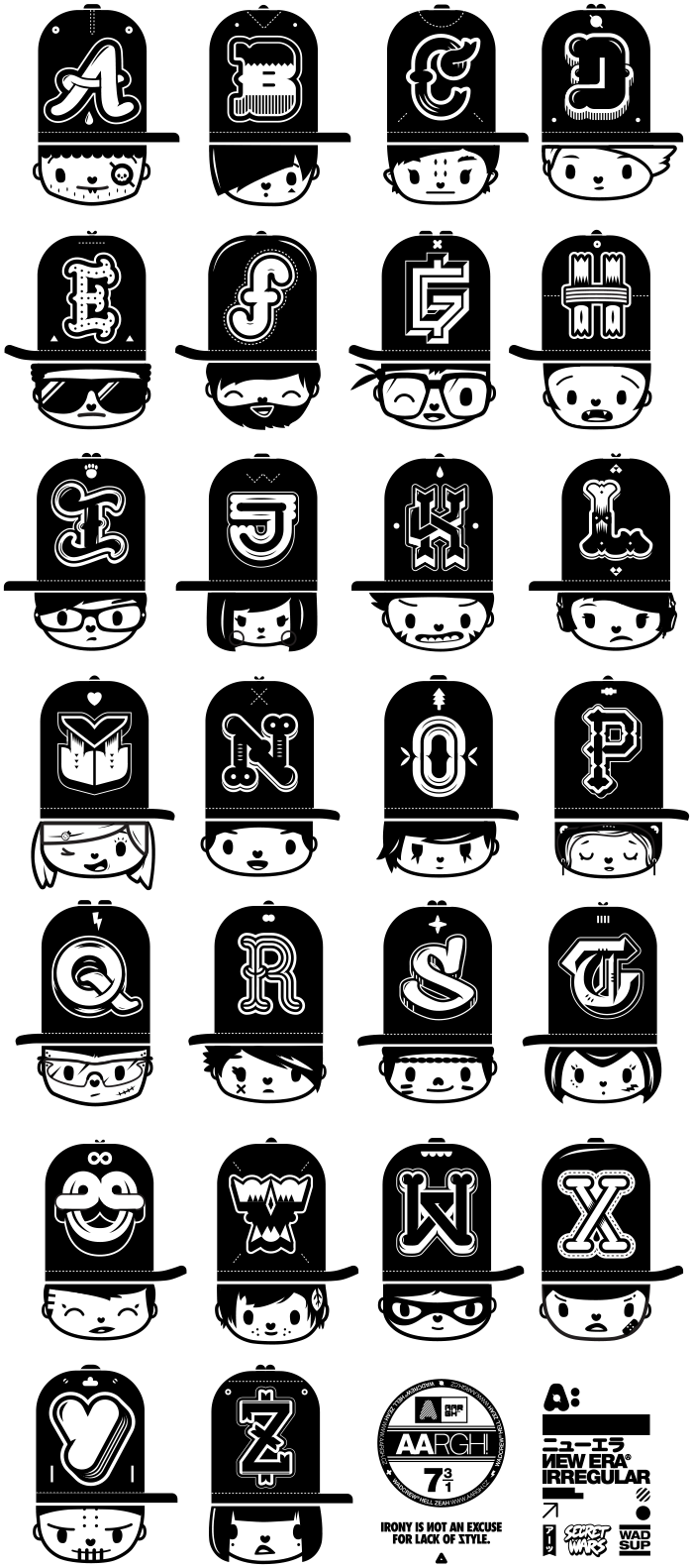
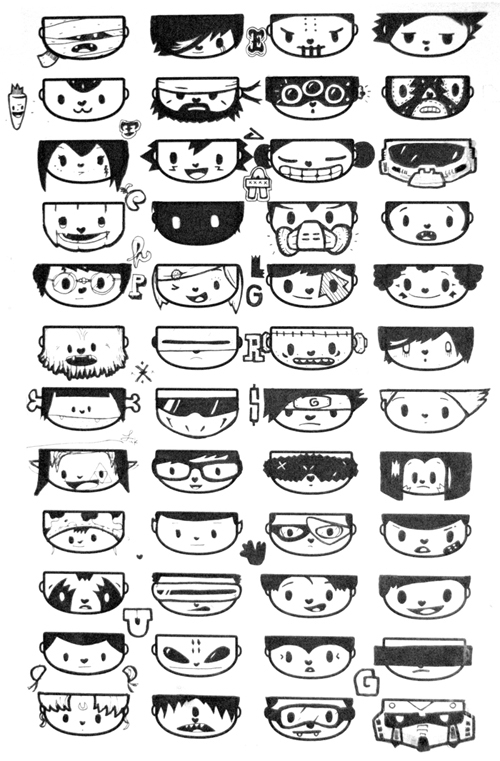
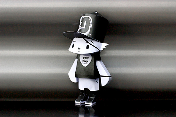
I picked the letter A and G and started thinking about how to connect my strongly character based artworks with typography. Later that week (after few calls from Viktor about how late my letters are) I finally decided on best character/letter combination and first letters were created. Based on visual language of sport team single letter logos placed on fitted caps with Aargh characters made the perfect combination at that time.
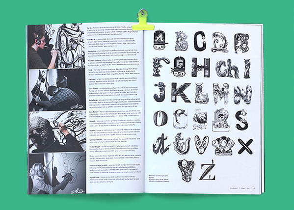
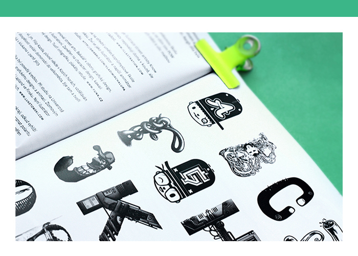
When I recieved the real thing, I was like 'Hey that needs all the letters!'. Hell Zeah back to the clicking now!! I made sure all the characters were created without usual contemporary clichés, no wayfarrers, no mustaches, no monocles - no hipsters!


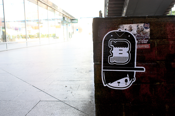
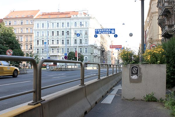
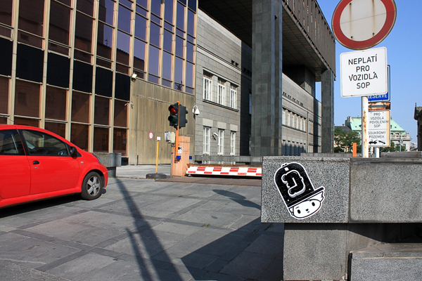
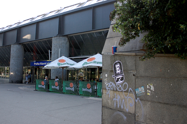
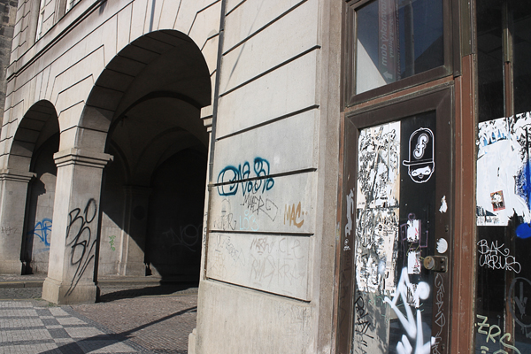
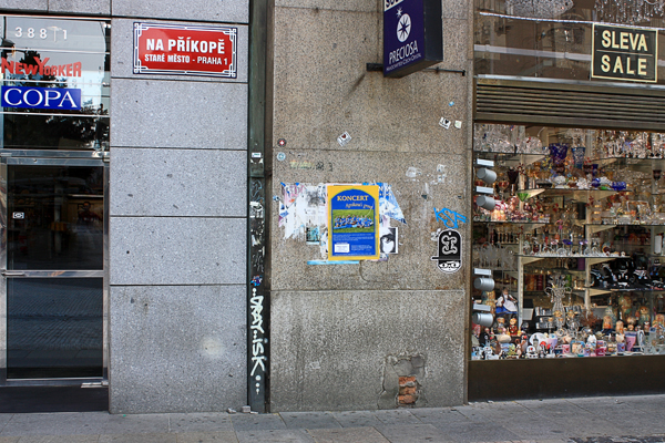
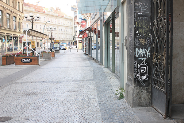
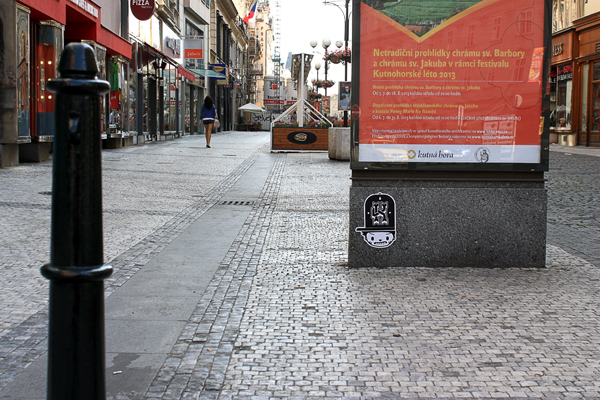
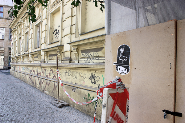
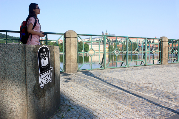
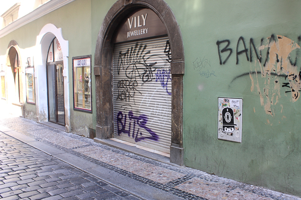
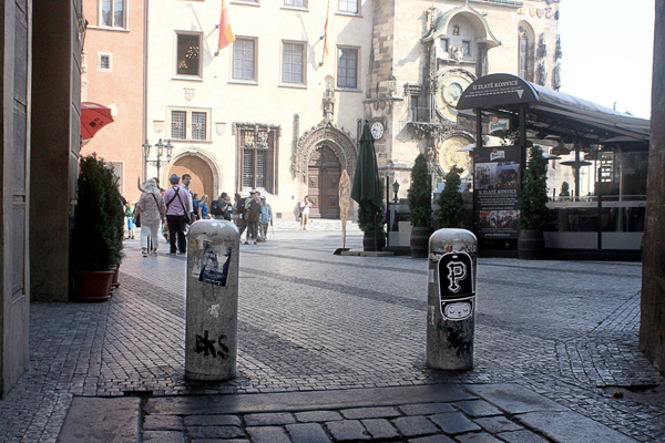
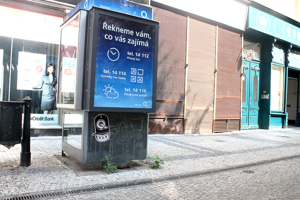
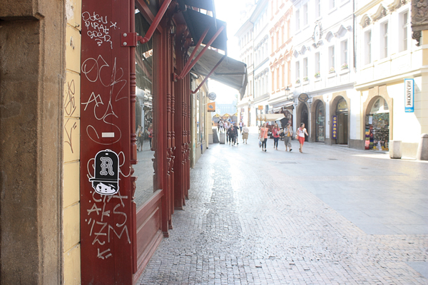
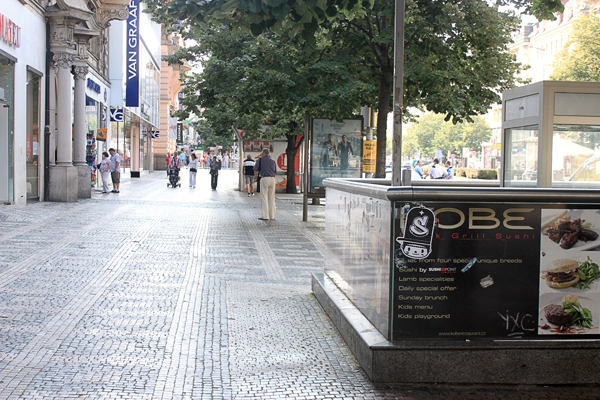
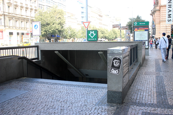
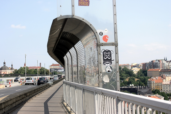
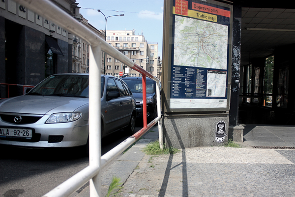
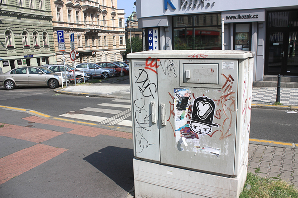
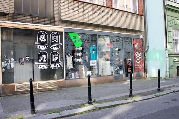
26 unique posters placed in various street location in Prague, Czech republic. There they are wheat pasted A3 cut out posters for my homies - the whole glyph set in the streets.
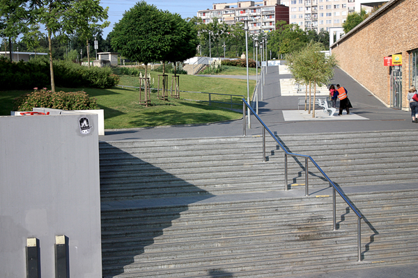


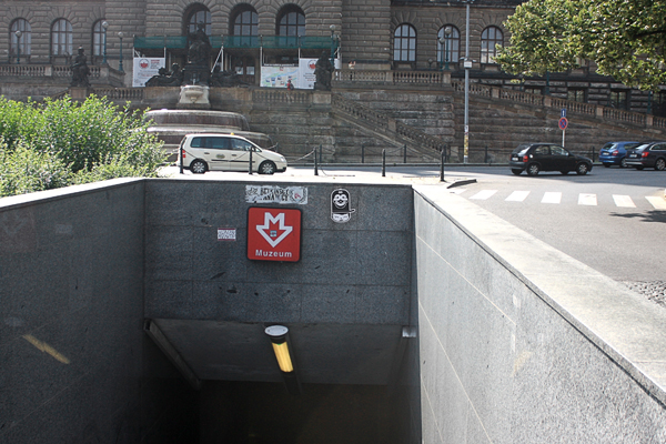

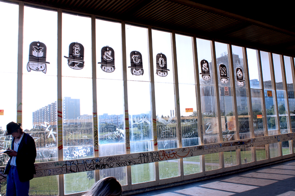
To play around with the type I created "Město snů" (city of dreams / based on PSH-Jižák song) lettering from 2x2 tiled DIN A3 posters. It is located nowhere else than on metro station Opatov, the heart of Jižák.
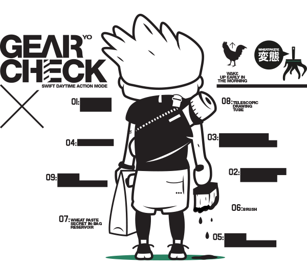
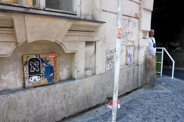
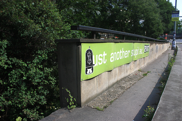
And for sneakers.cz fellaz at the Queens store I wheat pasted some swag too. This time tiled from 3x2 DIN A3s.

I thought I will struggle more with the letters but suprisingly they were finished before all the faces. So to make the process faster i printed out blank faces and wanted to create sketches. Unfortunatelly it turned out that it might be a nice concept to have famous characters with their initial on caps.
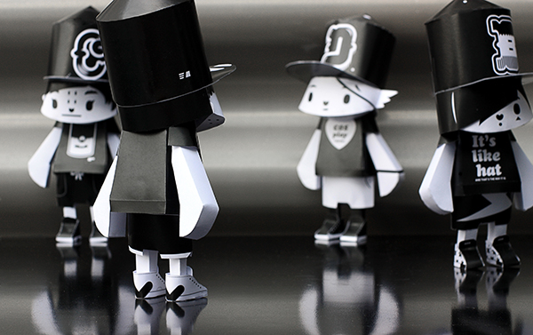
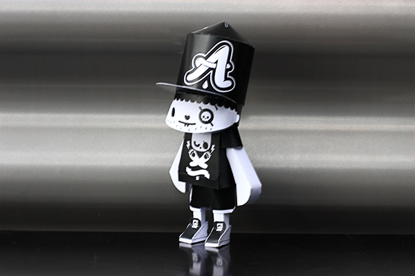
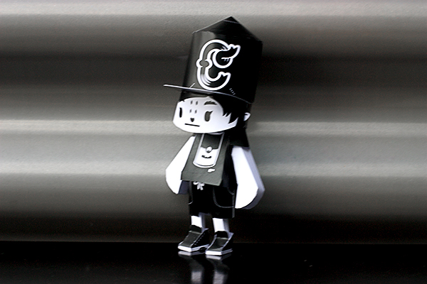
In the mean time I started designing paper cut toy. All 26 glyphs were created based on the similar platform, 1:7.8 with A3 paper source. Bend/Cut/Fold/Glue/Play/Yeah! The finalized papermodels will be uploaded on the go as they are built.
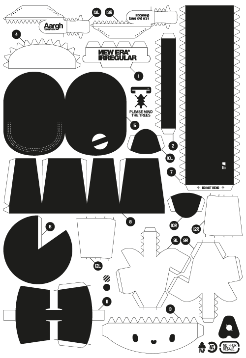
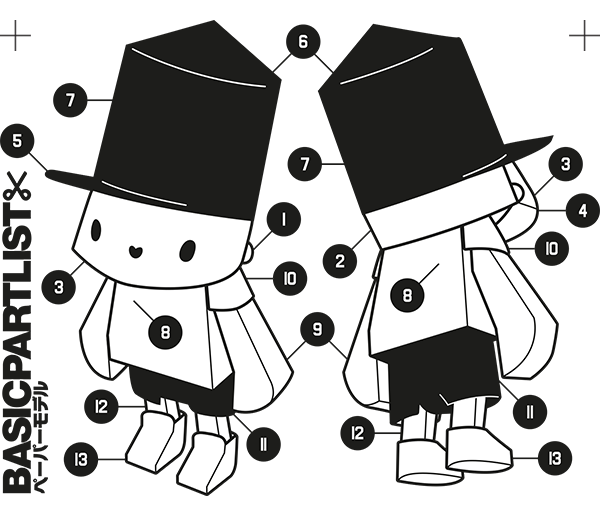

►►download the papermodel pdfs here: https://www.dropbox.com/sh/2pn8l2ayd5qtuqt/NGWIP3nJVq and have fun! ◄◄

How is this relevant to the 'Pioneers of now' briefing?
I did very, very small research about the reason to choose a letter on cap people choose to wear it. Original sport team fans are really rare in Czech republic, so I knew there has to be something else. Most people pick their caps according to their initial no matter the club - I would wear Detroid Tigers cap for example, so the character is based on my current personal atributes.
The whole process demonstrate my usual approach to all projects. Starts with two letters and end up sky high with various media and executions. I must admit that I am not really keen on delivering my personal long-term projects and this was no exception. I just get too excited about small things and push it where it's hard to finish all the ideas.
And because you asked for it: last but not least this project was done on my precious intuos3 special edition - got to get it because the basic gray i3 did not match my table.