See Full Project at redkroft.com

Heimdall
Rebranding of a small manufacturer
who wants to revolutionise the market.
who wants to revolutionise the market.
Heimdall came to life as a rebranding of a small family business from a little town in Masuria, Poland. The founder's goal was to create a brand that would reflect the innovation and ingenuity of the machines he crafted and at the same time, start a revolution on the conservative, archaic roofing market.
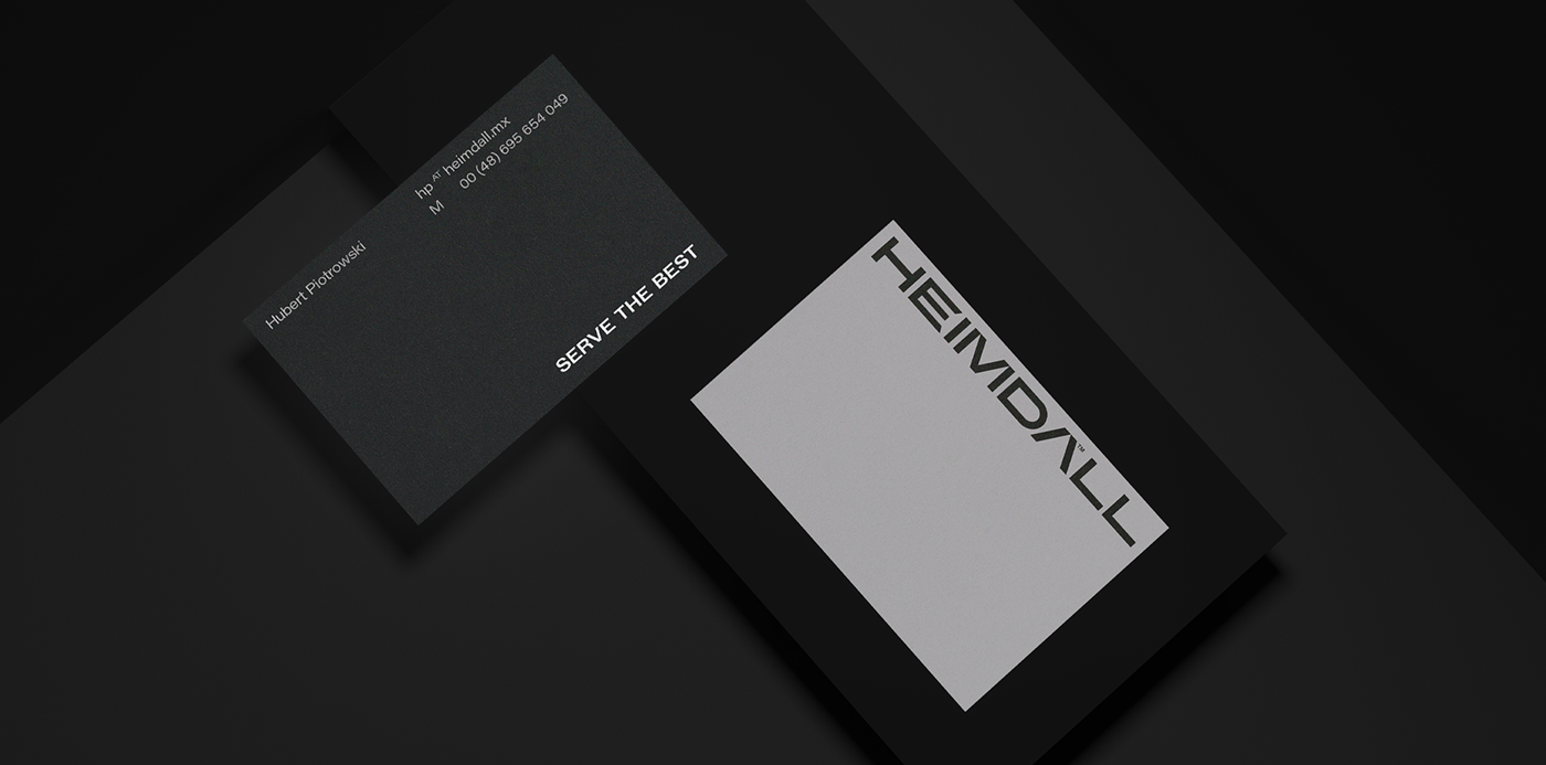
Our goal was to create the name and visual identity of the brand to face the status quo of the roofing market and to present the company as an innovative, bold, customer-friendly.
The name resonates perfectly with the audience.
Heimdall is a Viking god, a symbol of masculinity, protectiveness and sacrifice. He serves other deities, protecting their household. It symbolizes everything that is metaphorically close to the goals of roofing - creating a shelter over one's head. Also, Nordic nature is essential, because it evokes associations with the harshness of the weather, which roofers struggle with every day.
Heimdall is a Viking god, a symbol of masculinity, protectiveness and sacrifice. He serves other deities, protecting their household. It symbolizes everything that is metaphorically close to the goals of roofing - creating a shelter over one's head. Also, Nordic nature is essential, because it evokes associations with the harshness of the weather, which roofers struggle with every day.
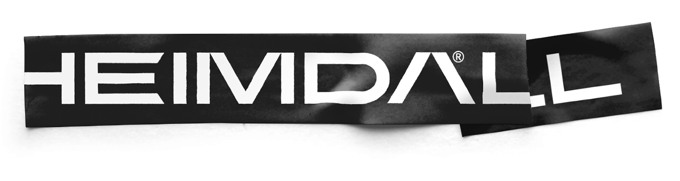
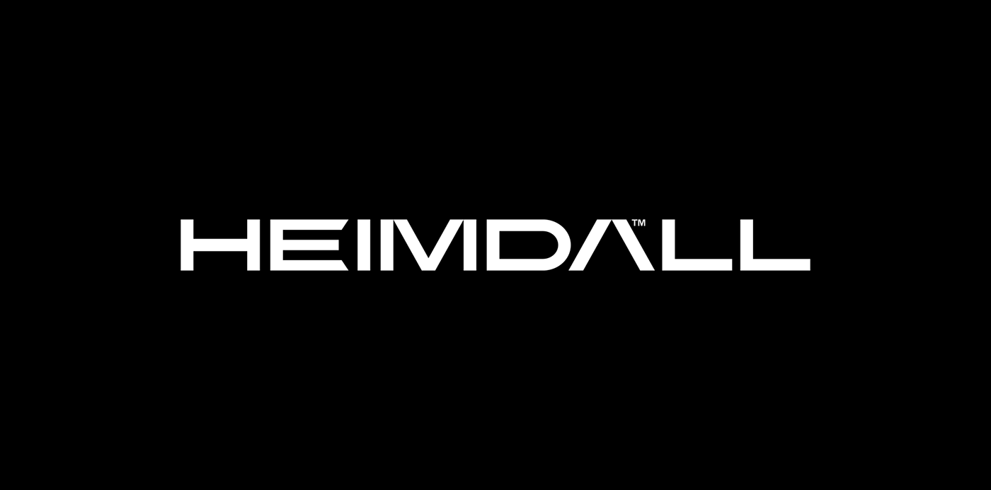
The sound and construction of the word also play a fundamental role. Phonetically, the name takes on a stable, low, masculine tone. The geometry of the letters is simple, with sharp angles, which gives the required impression of stability and strength.
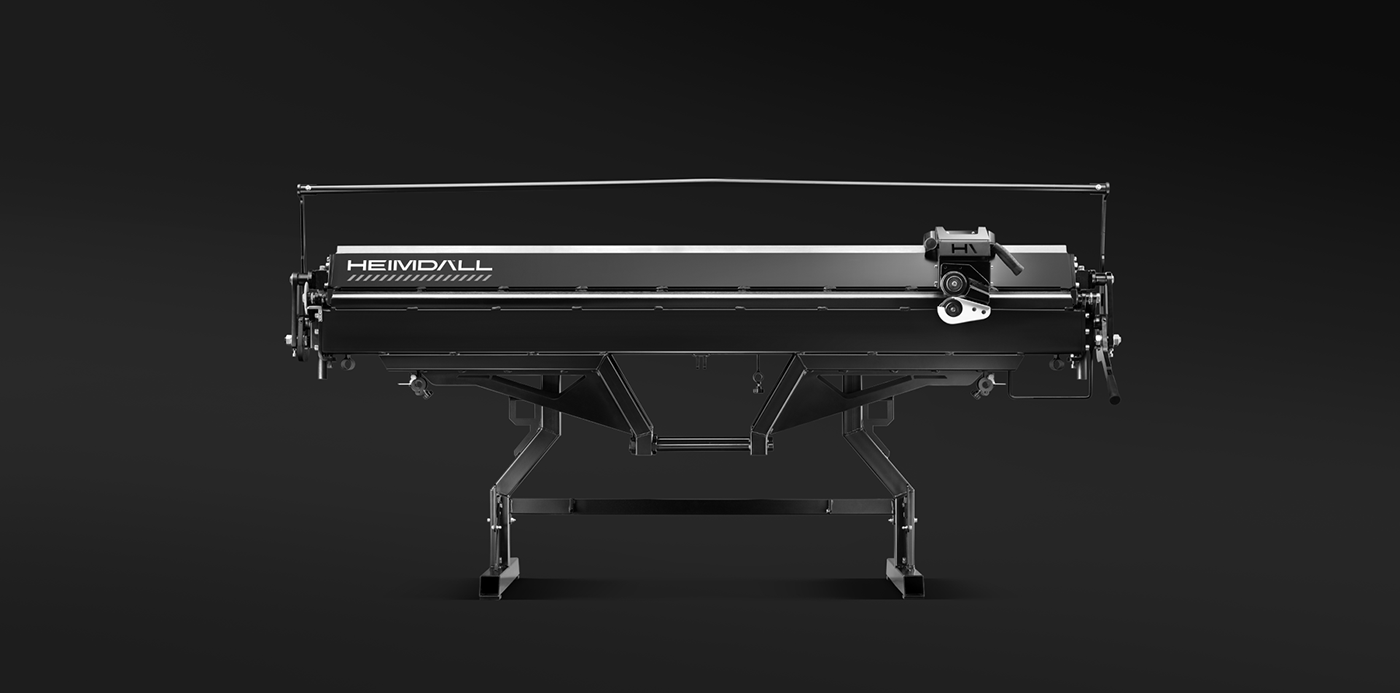


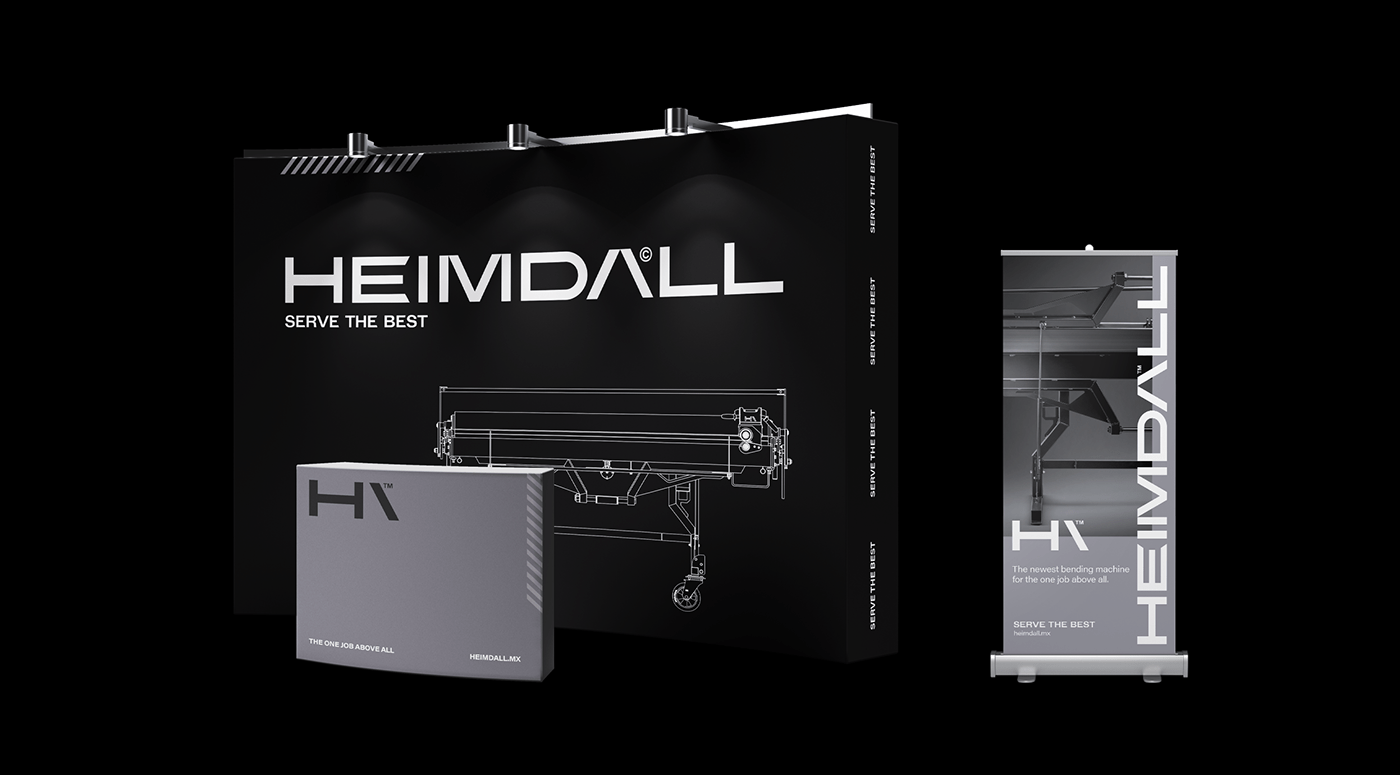
Heimdall products are used for bending and cutting sheets metal. The visual structure of both the logotype and the icon is in perfect harmony with the company's profile. Details like the geometry of letters and symbols reinforce the feeling that the brand is technical.
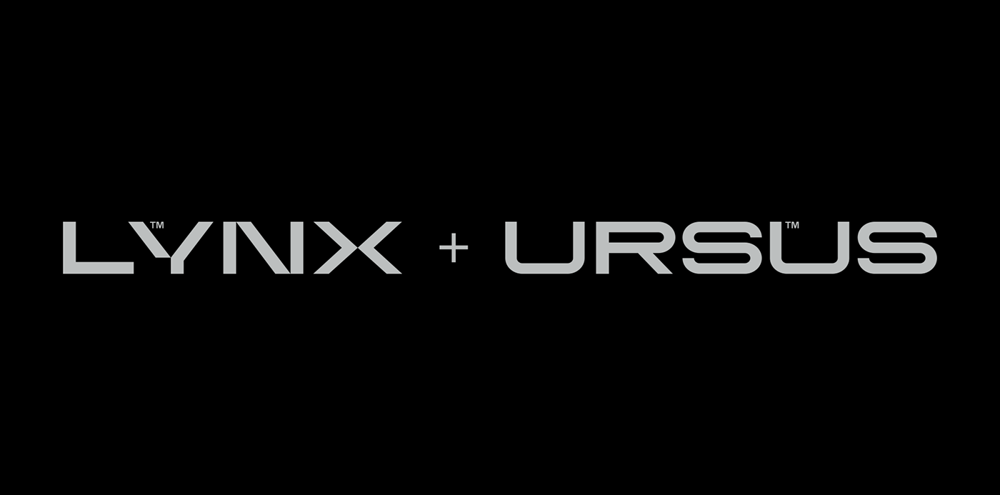
Lynx, Ursus and the use of Latin.
Our task was also to develop a naming system for products that can be generated in a simple, logical and systematic way. Our inspiration was the mythos behind the Wild Hunt and woodland animals. We wrote their names in Latin and assigned to the machines according to its character - Lynx is light and mobile, Ursus (bear) a heavy and stationary.


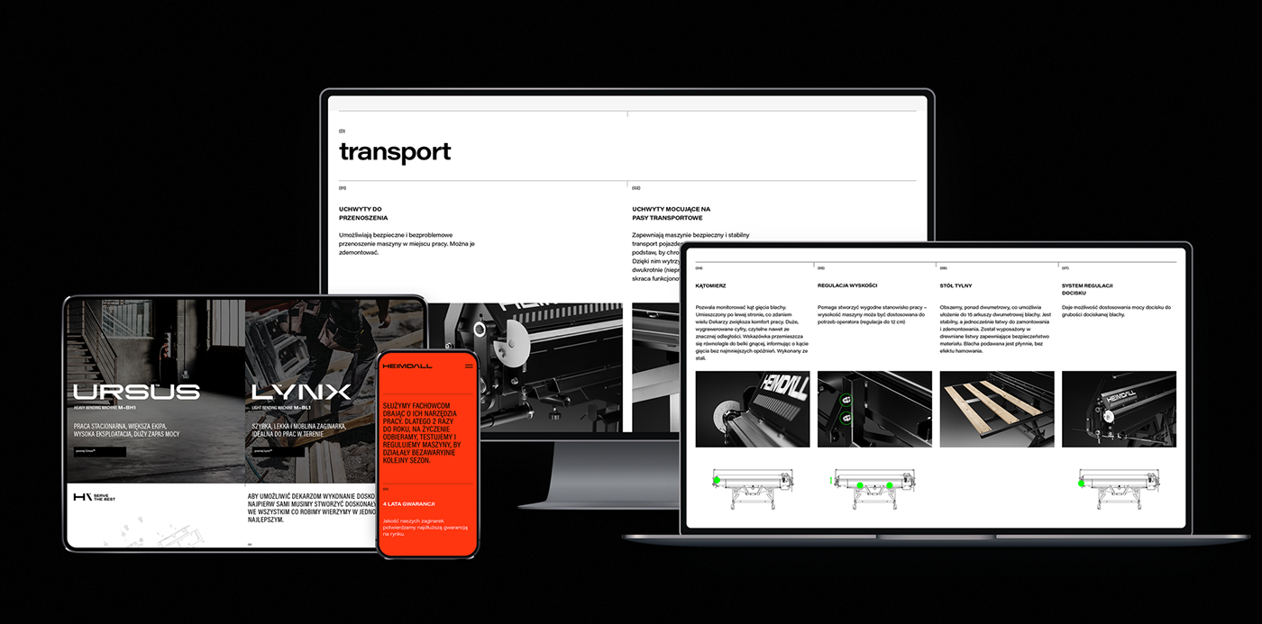
The website aims to introduce the world of Heimdall and present its unique products.
We treated the home page as a presentation of the brand's character, display of its distinctive values and features. Product pages focus on the details of the offer and accurately present the individual components of each machine. The Service and Contact tabs are the final steps in the customer's journey - they reduce purchase dilemma and motivate the customer to chat with a brand representative.