

Haste
From the illusion of reverse contrast to actual reverse contrast.
Sometimes our eyes play trick on us.Typeface designers are well aware of that fact, a big part of our job consists in managing the friction between what things are and what they appear to be.
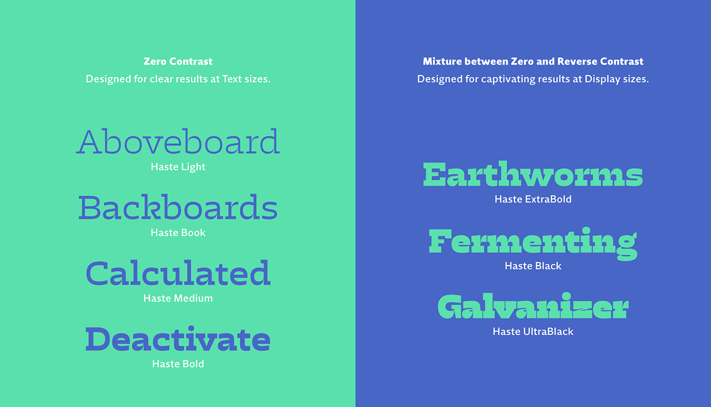
One good example is the fact that our eyes tend to perceive horizontal shapes as heavier than they really are. Typically these shapes are optically adjusted to apear similar, however this was not the case with Haste. By letting both vertical and horizontal strokes carry the exact same weight we took advantage of this effect to create the illusion of a reverse-contrast typeface.
However this isn't always true. Haste's three heavier weights were developed for larger sizes and feature a mixture of zero contrast letterforms, with actual reverse contrast ones. This misture allowed us achieve the darker weights and produce more visually appealing results at these scales.

