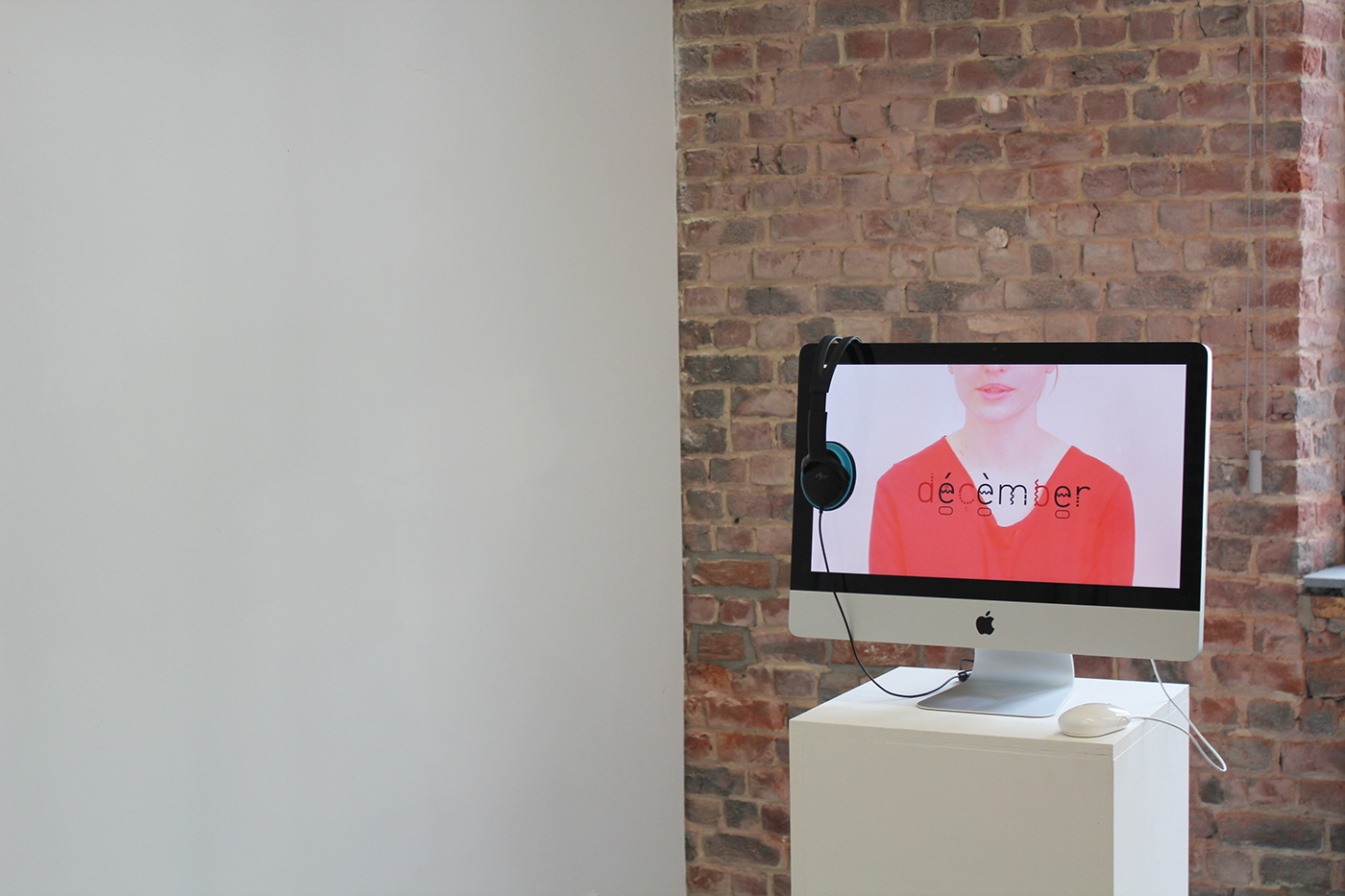
FONETICA
Fonetica is about both visualizing and making Dutch articulation understandable.
After having examined prior articulation systems I concluded that these often contain a high dose of complexity and made use of strange symbols (eg. Greek letters) which makes articulation difficult to learn or understand.
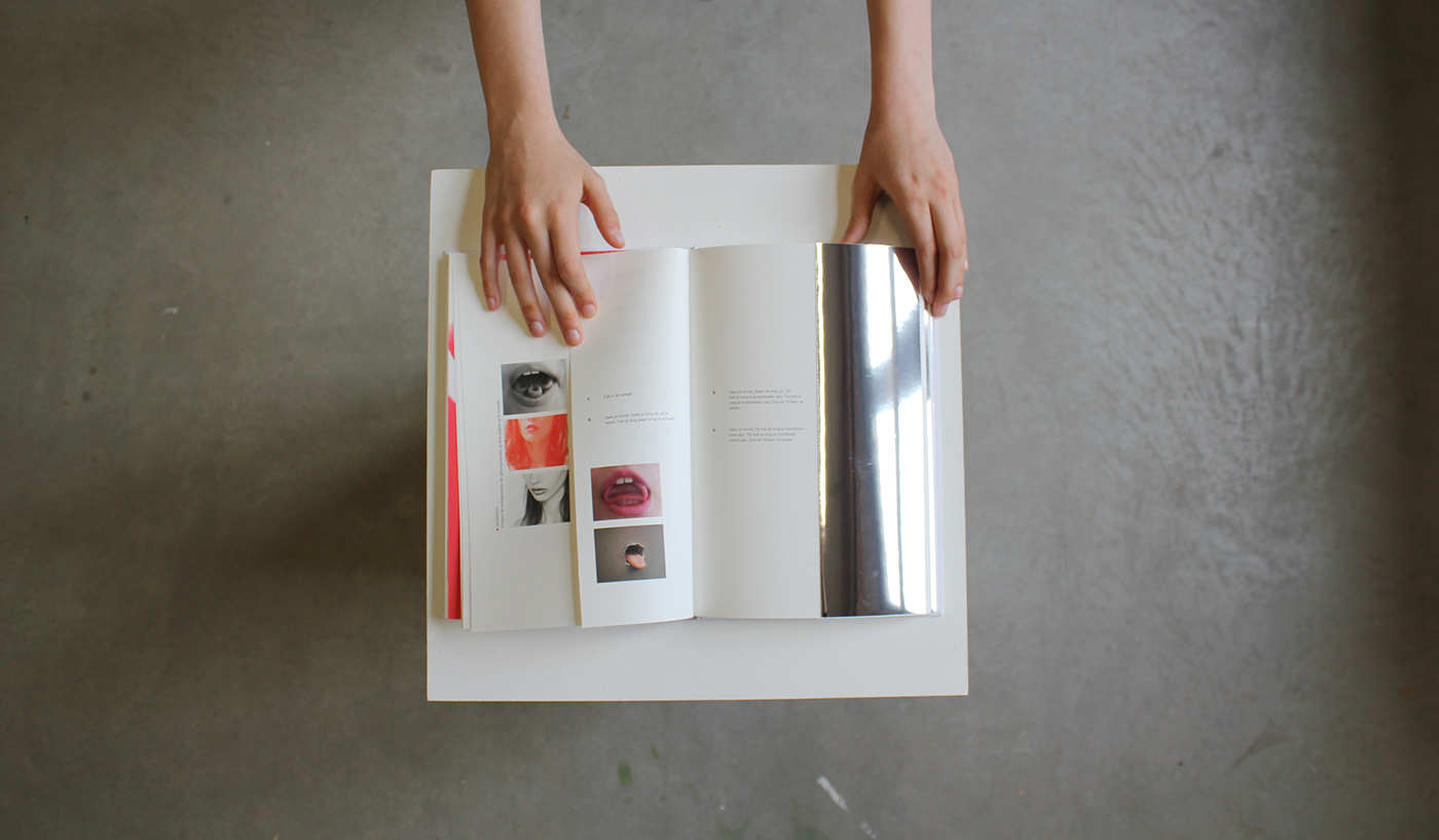
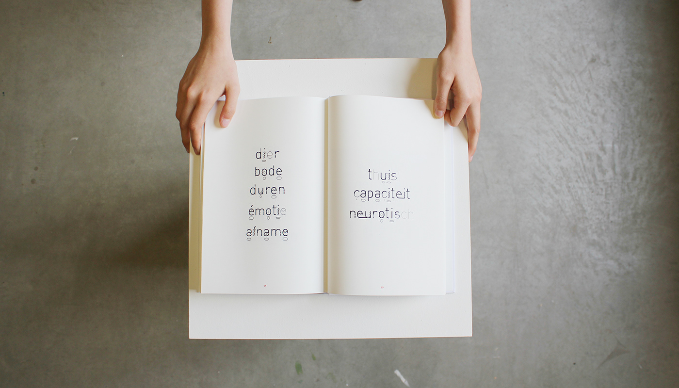
To avoid this problem Fonetica has arisen, a typography that only consists of Latin alphabet letters that represents the articulatory aspects of the Dutch language.

The purpose of Fonetica is to explain Dutch articulation in a clear and fun way, to non-native residents in Belgium who already have a basic knowledge of the Dutch language.


Fonetica explains how to pronounce letters and words and which speech organs you use whilst doing so. Because of the variations in the different characters that correspond to the variations of sound and speech organs, Fonetica can be understood and read very intuitive.


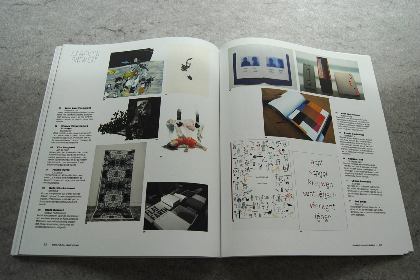
Publication | Kwintessens, Afstudeerprojecten, Grafisch Ontwerp 2013


