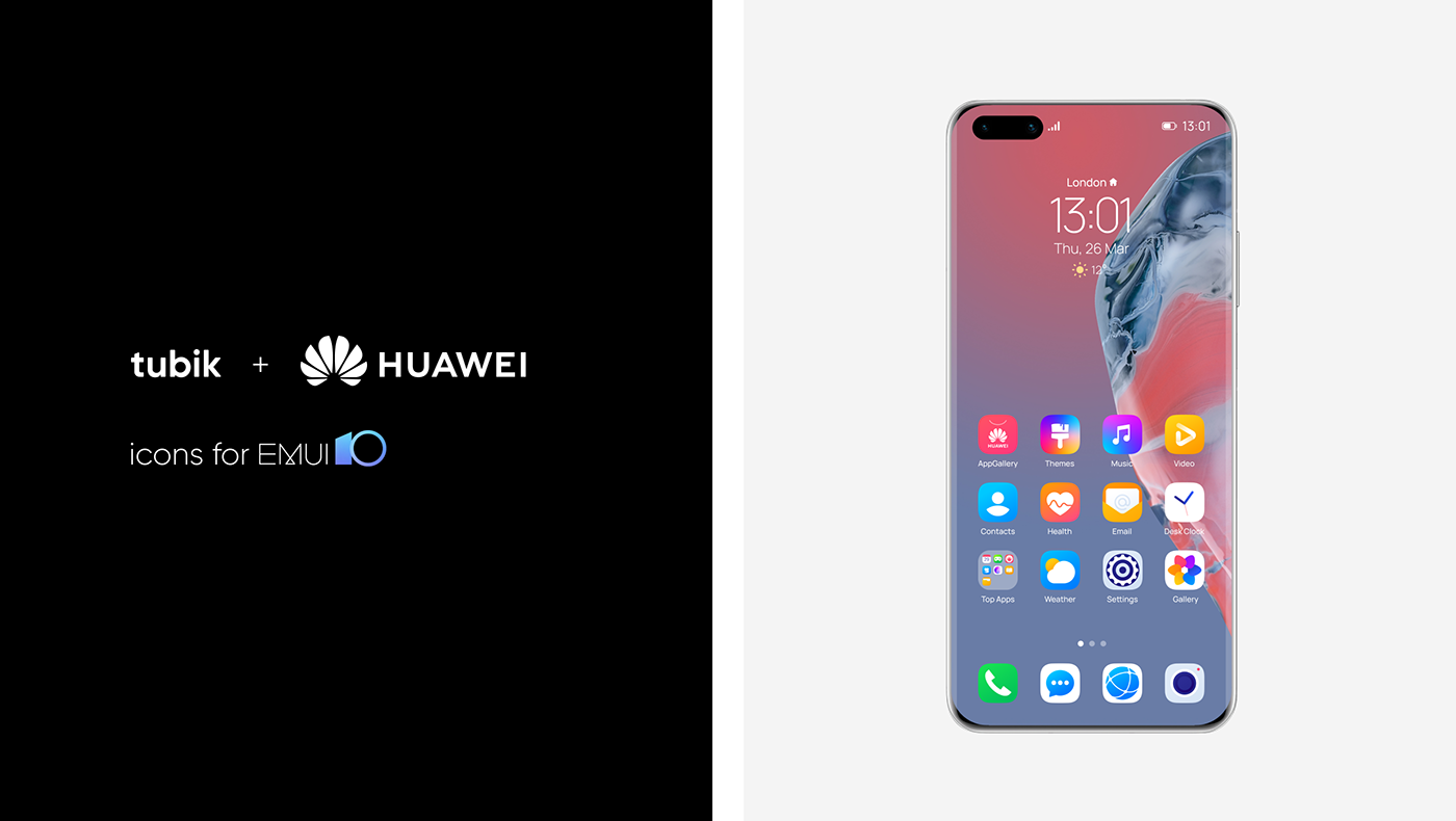
In summer 2019, we’ve got an offer from HUAWEI to collaborate. The request was
to take a fresh look at the design of basic icons for the EMUI custom Android user interface. The task for tubik was to create 54 icons that would meet the trends,
would be loved by current fans and users of the brand, and would attract new
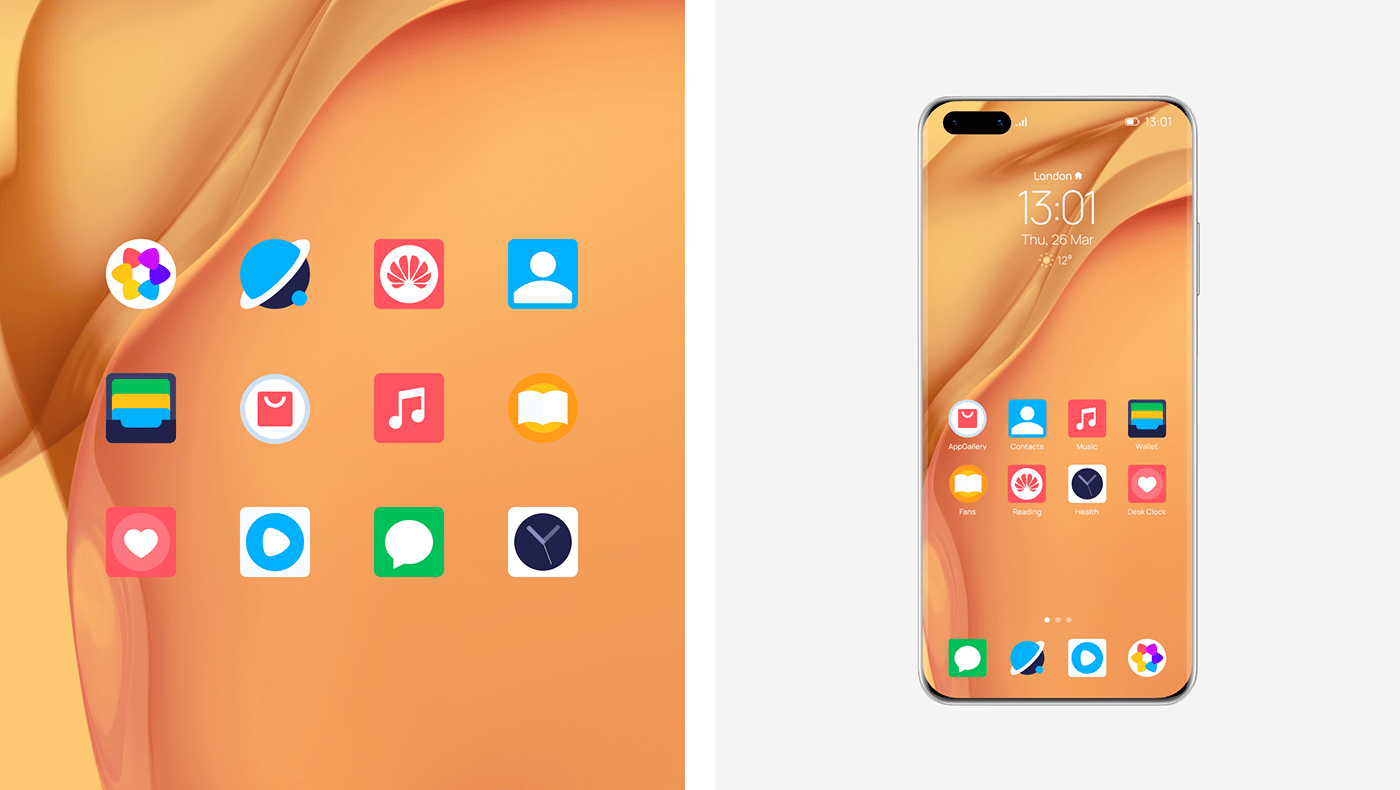
users.The outcome of this Icons project has been commercially deployed
in HUAWEI flagship smartphones. The first flagship smartphone using these
icons is Mate 30, and then, P40.
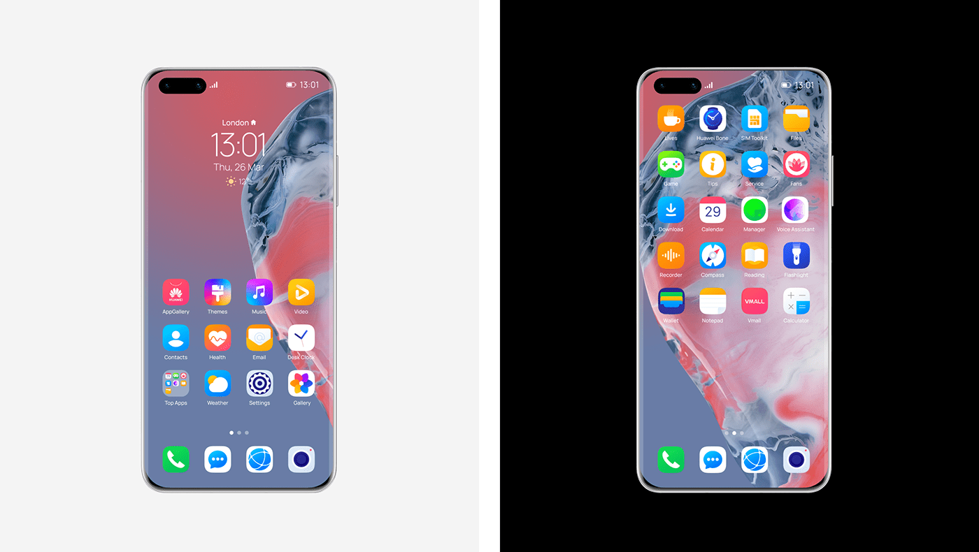
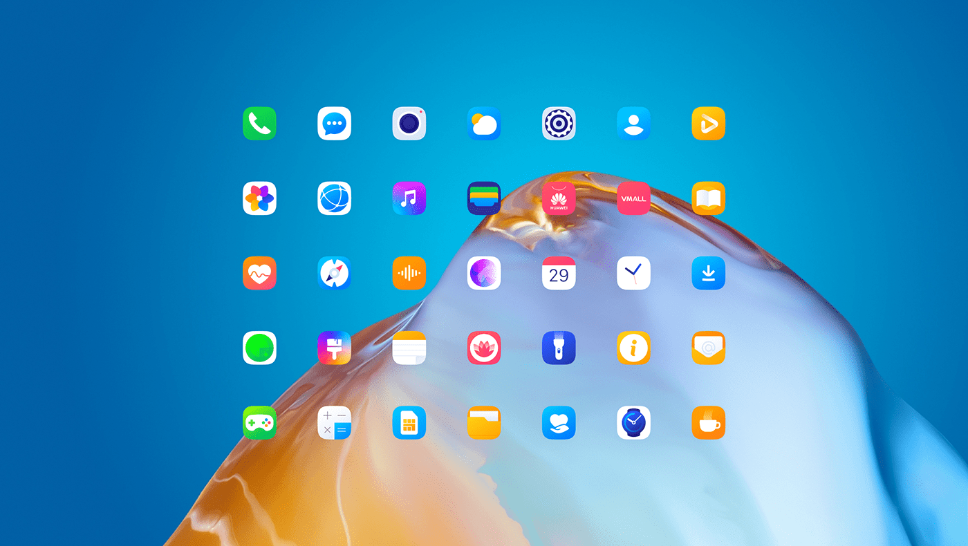
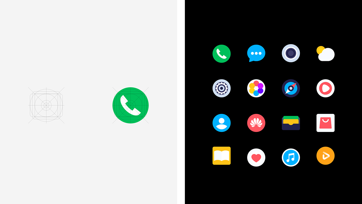
We created the grid that would suit all the needed sizes and variants of roundness
as well as kept the same dimensions so that the icons looked belonging to one
design system. The design process started from traditional sketching in search
of new ideas and ways to shape them.
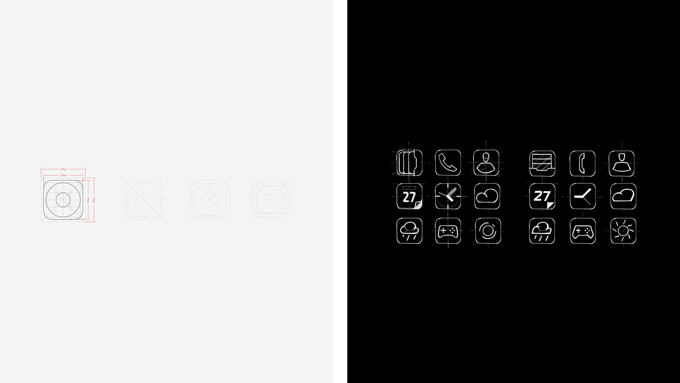
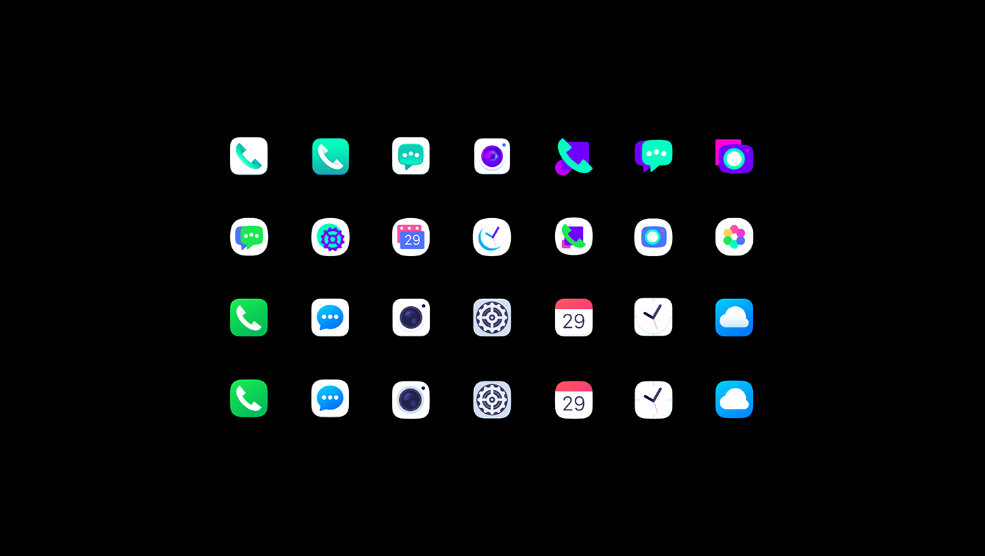
One of the variants featured elegant icons based on geometric primitives, minimum
of details and decor, and simple color palette limited to only four colors.
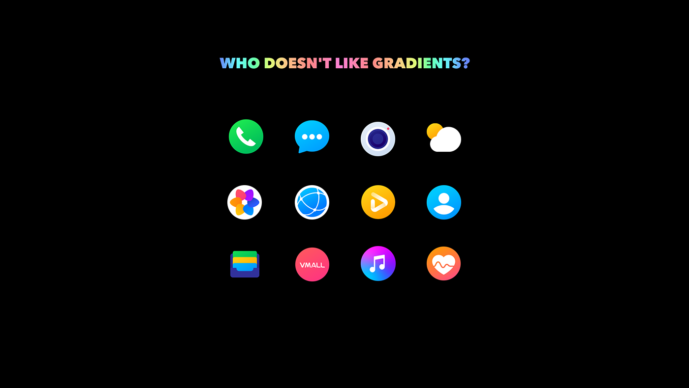
At the next step we got back to gradients that given an upper-class feeling
which was one of the key criteria for the new style.
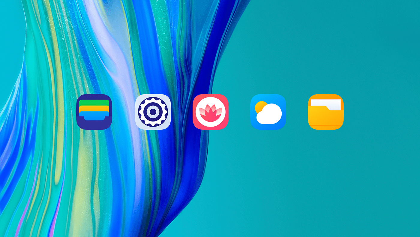
The final version keeps the square shape for all icons as well as the reduced radius
of the rounded parts. The gradients work harmonically with minimalism
and basic geometry as core design priorities.