
Packaging Design: Meat Republic Biltong
The Canadian Meat Republic Company approached me to re-design the packaging for their 4 biltong flavours. The logo was provided by the client. I presented them with four design concepts and then collaborated with the client to optimise the preferred option for the target market.
Primary Design Objectives:
1. Design a completely new look for the Biltong Packs
2. Create a package that is arresting, attention-grabbing and that will display vividly
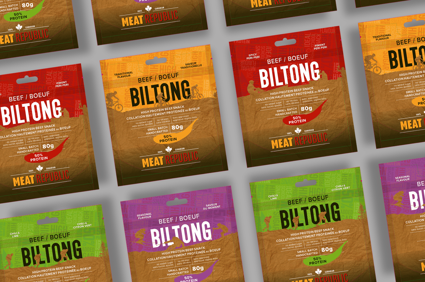
3. Pay attention to differentiating the ‘traditional’ and ‘peri-peri’ flavours on the shelf
4. Talk to a Canadian market that can afford luxury snacks
5. The packaging still serves an introductory/educational purpose – product new to the market
6. Emphasis on high protein
1. Design a completely new look for the Biltong Packs
2. Create a package that is arresting, attention-grabbing and that will display vividly
3. Pay attention to differentiating the ‘traditional’ and ‘peri-peri’ flavours on the shelf
4. Talk to a Canadian market that can afford luxury snacks
5. The packaging still serves an introductory/educational purpose – product new to the market
6. Emphasis on high protein
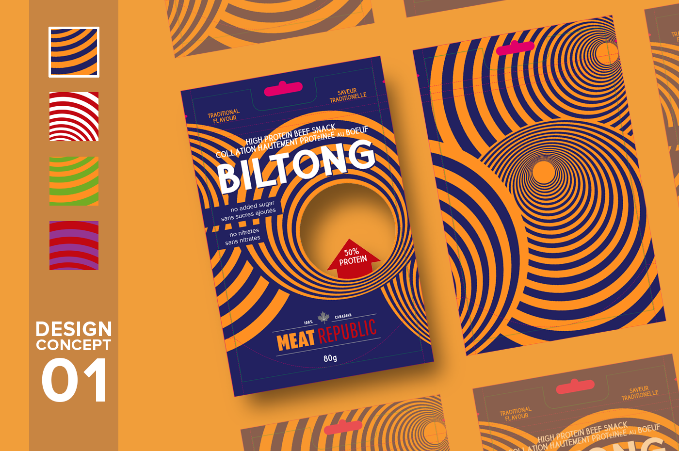
PRIMARY DESIGN / COMMUNICATION DEVICE: Bright and almost hypnotic pattern employed to grab and hold attention, in keeping with current psychedelic design trends (Loosely based on African basket designs, also alludes to target, bulls-eye). Secondary: Dark blue is introduced as 5th colour in the palette to use together with the yellow (of MEAT in the logo) as primary ’Traditional Flavour’ colours – these are significantly different to the proposed white and red palette of the peri-peri flavour.
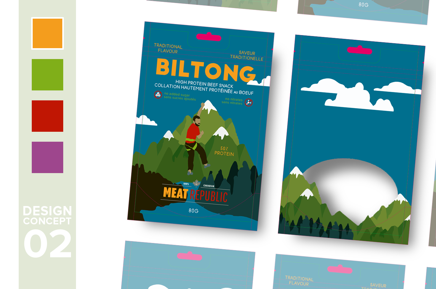
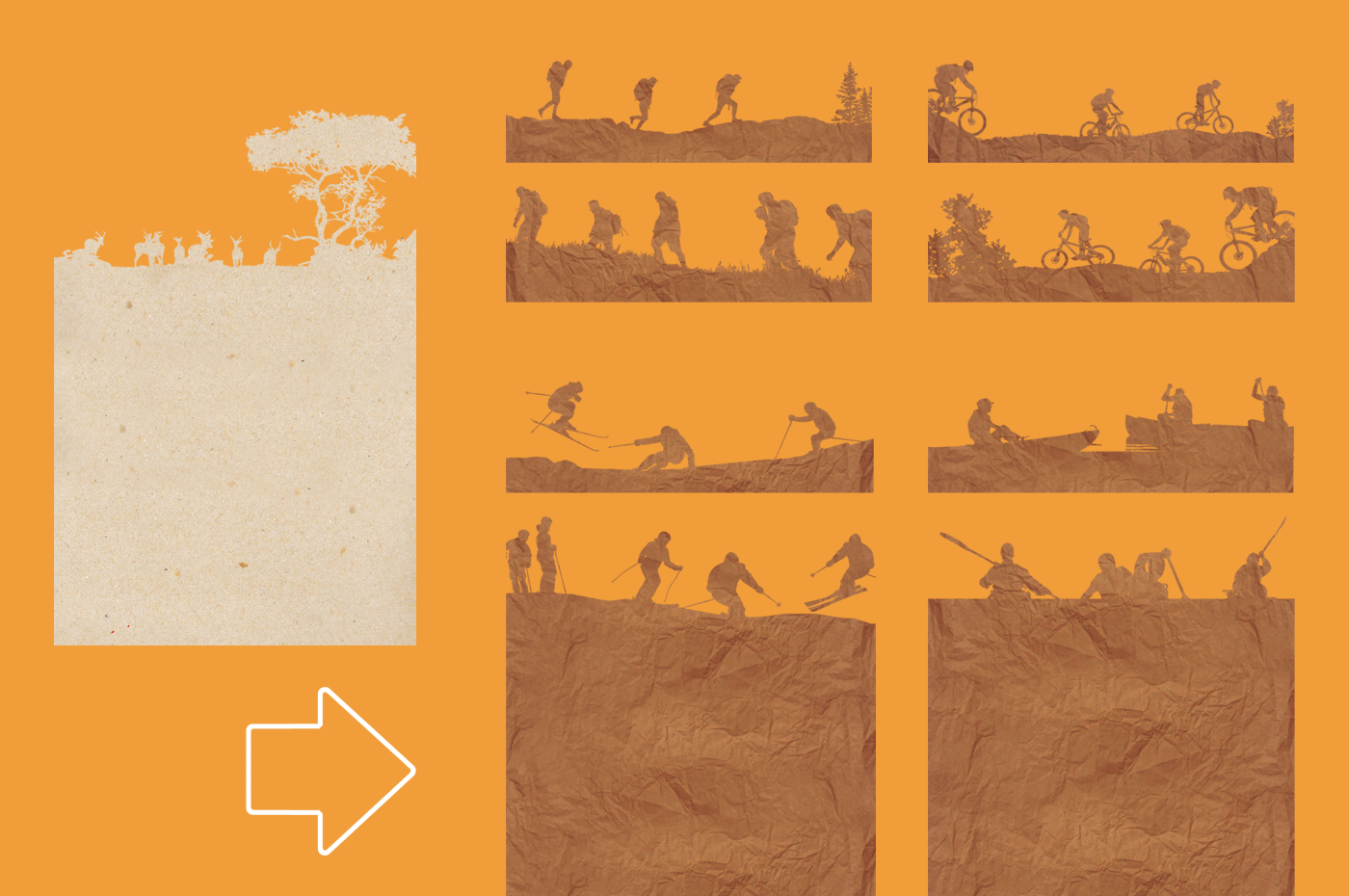
PRIMARY DESIGN / COMMUNICATION DEVICE: An appeal to people’s better natures. Pure value signalling. ‘I am active and healthy and outdoor-loving and I eat high protein snacks’ (Even when I’m a couch potato this still applies, if not more so). Secondary: Every flavour has a different activity depicted with custom original illustrations (canoeing, hiking, etc). The activities take place against Canadian landscapes. Background colours and colour of BILTONG differentiate flavours.
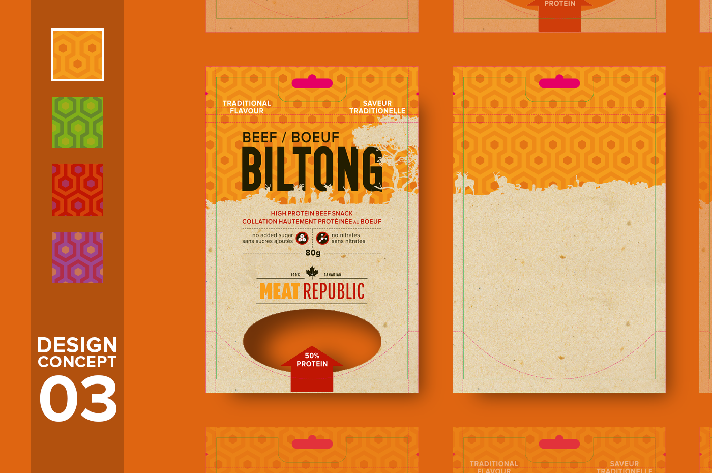
PRIMARY DESIGN / COMMUNICATION DEVICE: “I have a dream of Africa” – the more artisanal, bespoke and handcrafted option. (The background pattern is loosely based on South African indigenous tribal patterns – aka Mandela shirts). Secondary: The use of African animals on the horizon necessitates the beef/boeuf tag. Each flavour has a different horizon depicting different wild African landscapes with different wildlife. Variations in colour & colour combinations of patterns to differentiate flavours. – CLIENT PREFERRED OPTION
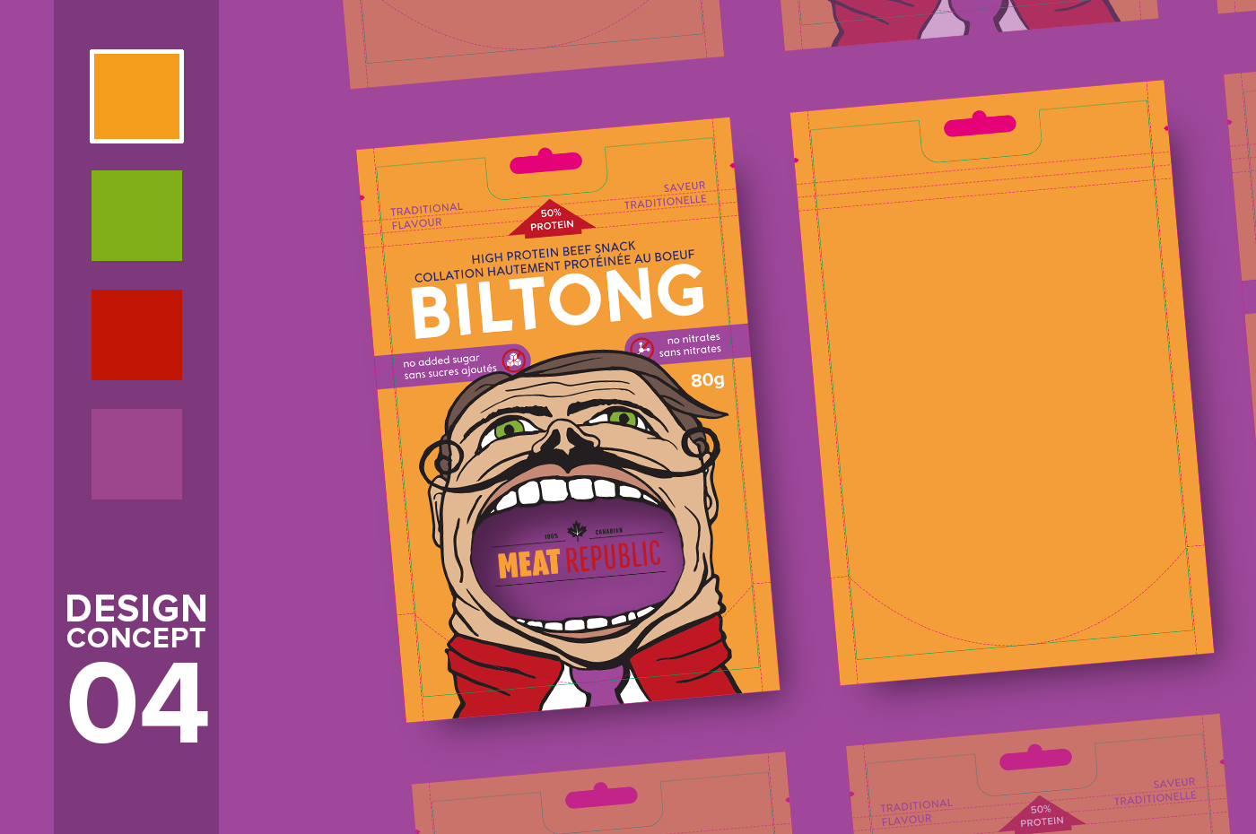
PRIMARY DESIGN / COMMUNICATION DEVICE: “Monkey see, monkey do” – I will put it in my mouth like on the picture (The fun and slightly humorous option). Secondary: Bold, vivid variations of the primary palette differentiate flavours. Different custom hand-drawn characters are used for different flavours.

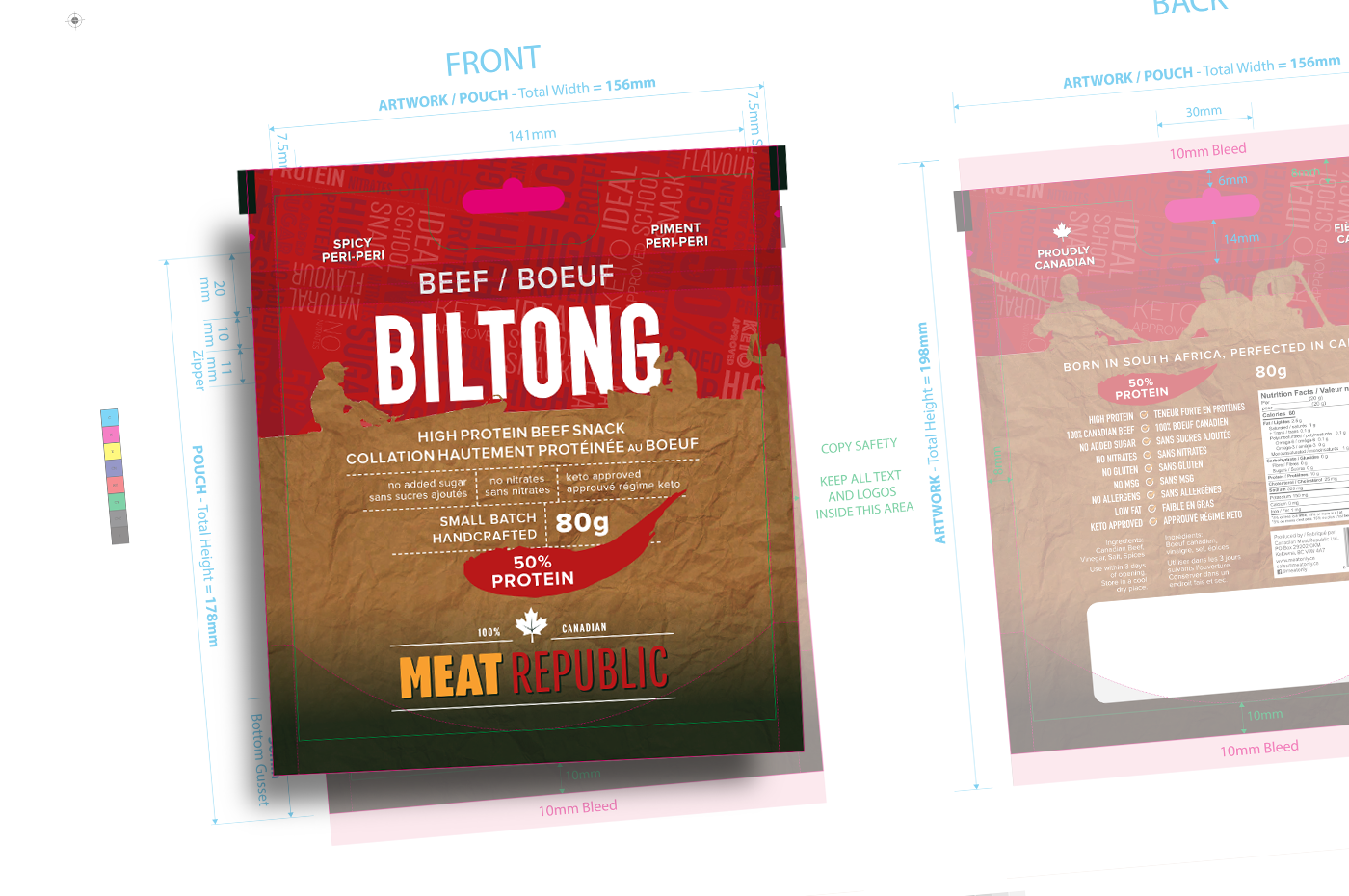
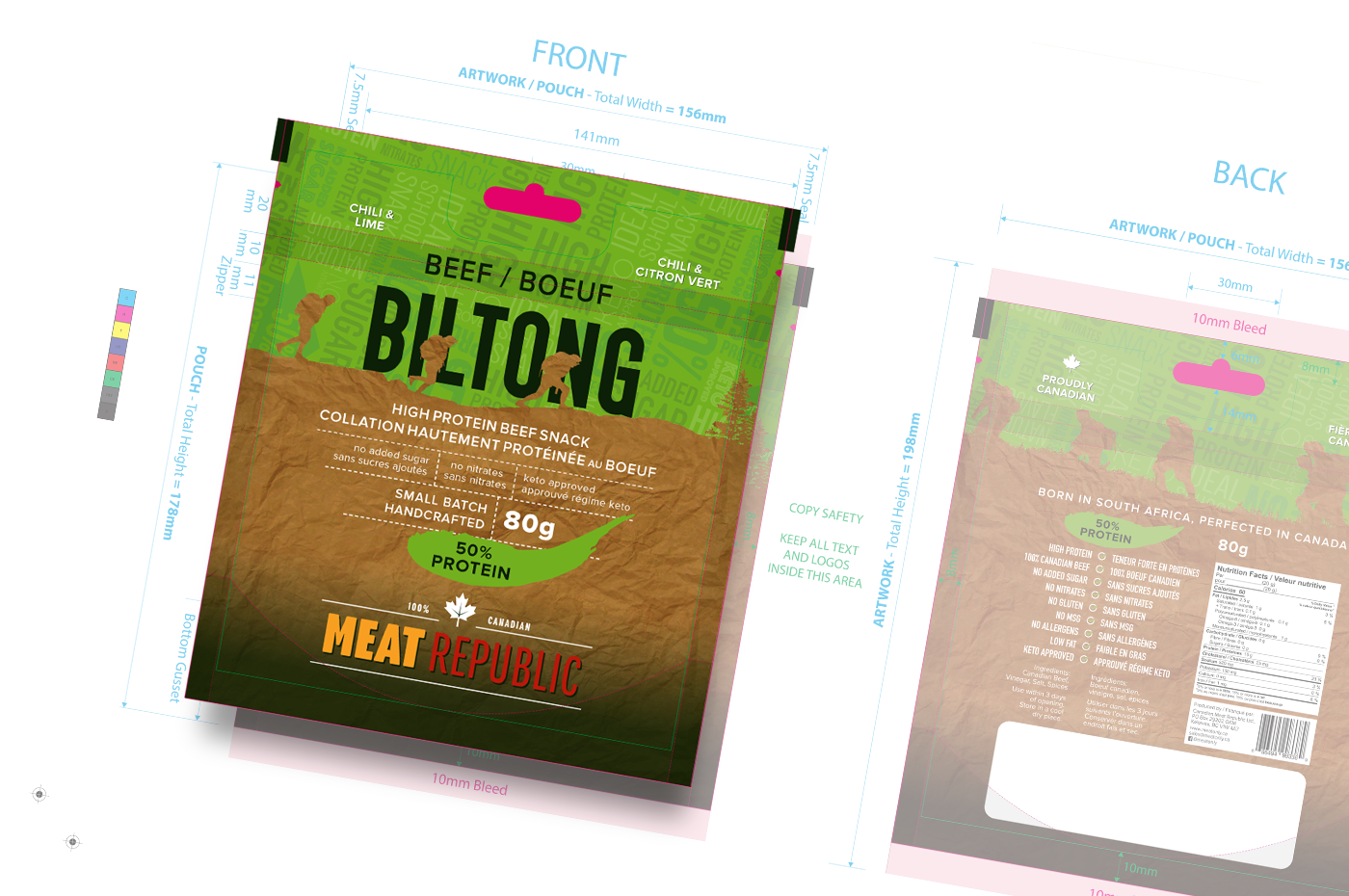
We decided to replace the background of the preferred concept with a more informative pattern.
The client requested that I replace the African landscape in the foreground with Canadian outdoor sports activities, borrowing from the second concept. They also wanted the paper texture to mimic the fat-stained brown paper bags that bilong is classically sold in (in South Africa).