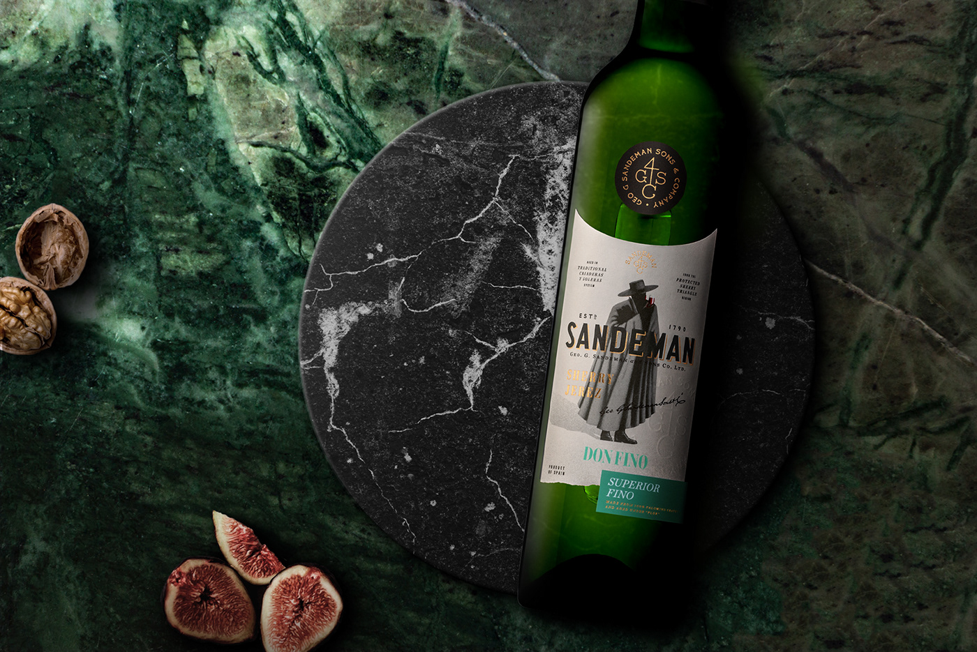
SANDEMAN SHERRY PREMIUM & RARE
Restoring a premium heritage
-
When the Sandeman brand contacted us to redesign the image of its Sherry Premium & Rare wines, the name of the category defined a visual language that would have to raise the brand to a level of different quality.
These are Sandeman's sherry wines of choice, complex, rich and aromatic with the Royal Ambrosante as the maximum exponent of quality and perfection.
As in the range of classics, the arc shape on the top of the label and the black circular symbol in its visual fit (inspired by the famous Sherry black casks) were the graphic basis of this redesign.
Here, too, the Don takes on a new dimension, with his enigmatic presence giving personality to such vertical labels. Premium finishes that bring an image of superior quality to the wine were used without reservation, such as high reliefs, gold foils or spot varnishes. The cutouts at the base of the labels also add a more noble tone, revealing the color in a subtler way. Various typographic compositions fill the labels, giving them an unavoidable visual appeal without losing their ease of reading.
These are wines for special moments, which deserve a special design.


