SANDEMAN SHERRY CLASSICS
Redesigning Sandeman's hidden secret
-
The Sandeman brand is world famous for its Port wines, but it also has a 200 year old tradition in the production of the best Sherry's of Jerez: just remember that the Don, the brand's mythical symbol, wears a student cape from Coimbra and the typical wide brimmed hat of the Andalusian caballeros.
Sherry is a very characteristic fortified wine, with profiles ranging from dry to sweet. Aged according to the solera method in typical black painted casks, they are true treasures waiting to be discovered.
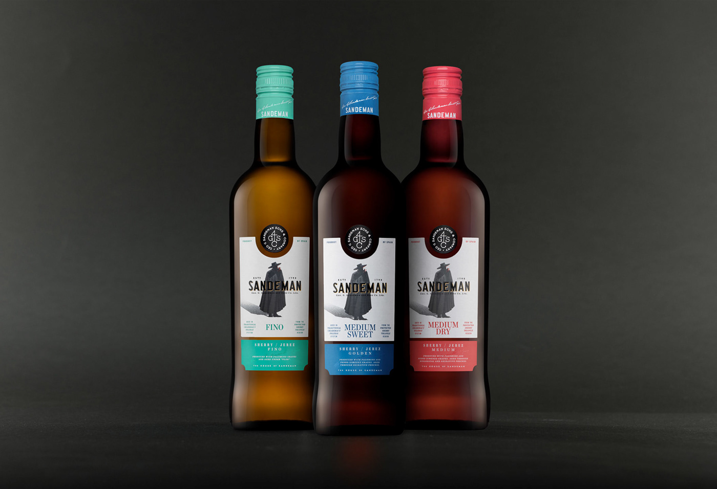
Sandeman challenged VOLTA Studio to redesign its unavoidable classic Sherry's: the young and elegant Fino, Medium Dry and Medium Sweet. Our work began with a search in the archives for Sandeman's old labels, having discovered and recovered a distinctive graphic detail of labels from the 60's / 70's: the top of the label with an arc shape and a circular symbol in its visual fit.
The typical colours of this wine range, blue, red and green were used with stronger tones, bringing renewed youth to the bottles.
As with premium wines, the black circle at the top with the Sandeman fire brand brand symbolizes the famous black painted casks.
Aligned with the recent visual renewal of the brand, the Don now has much more presence and prominence, and all the typographic arrangements and finishings make the product more premium.
The range of Sandeman Sherry classics is now more modern and punchy but is solidly anchored in the brand's long and rich tradition.
Sherry is a very characteristic fortified wine, with profiles ranging from dry to sweet. Aged according to the solera method in typical black painted casks, they are true treasures waiting to be discovered.
Sandeman challenged VOLTA Studio to redesign its unavoidable classic Sherry's: the young and elegant Fino, Medium Dry and Medium Sweet. Our work began with a search in the archives for Sandeman's old labels, having discovered and recovered a distinctive graphic detail of labels from the 60's / 70's: the top of the label with an arc shape and a circular symbol in its visual fit.
The typical colours of this wine range, blue, red and green were used with stronger tones, bringing renewed youth to the bottles.
As with premium wines, the black circle at the top with the Sandeman fire brand brand symbolizes the famous black painted casks.
Aligned with the recent visual renewal of the brand, the Don now has much more presence and prominence, and all the typographic arrangements and finishings make the product more premium.
The range of Sandeman Sherry classics is now more modern and punchy but is solidly anchored in the brand's long and rich tradition.


