Xodar
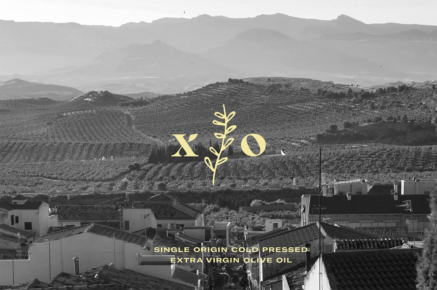
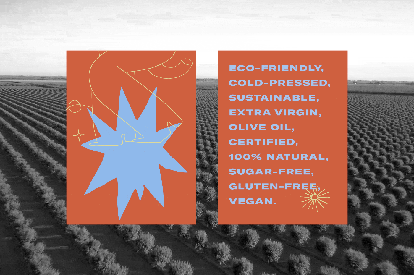
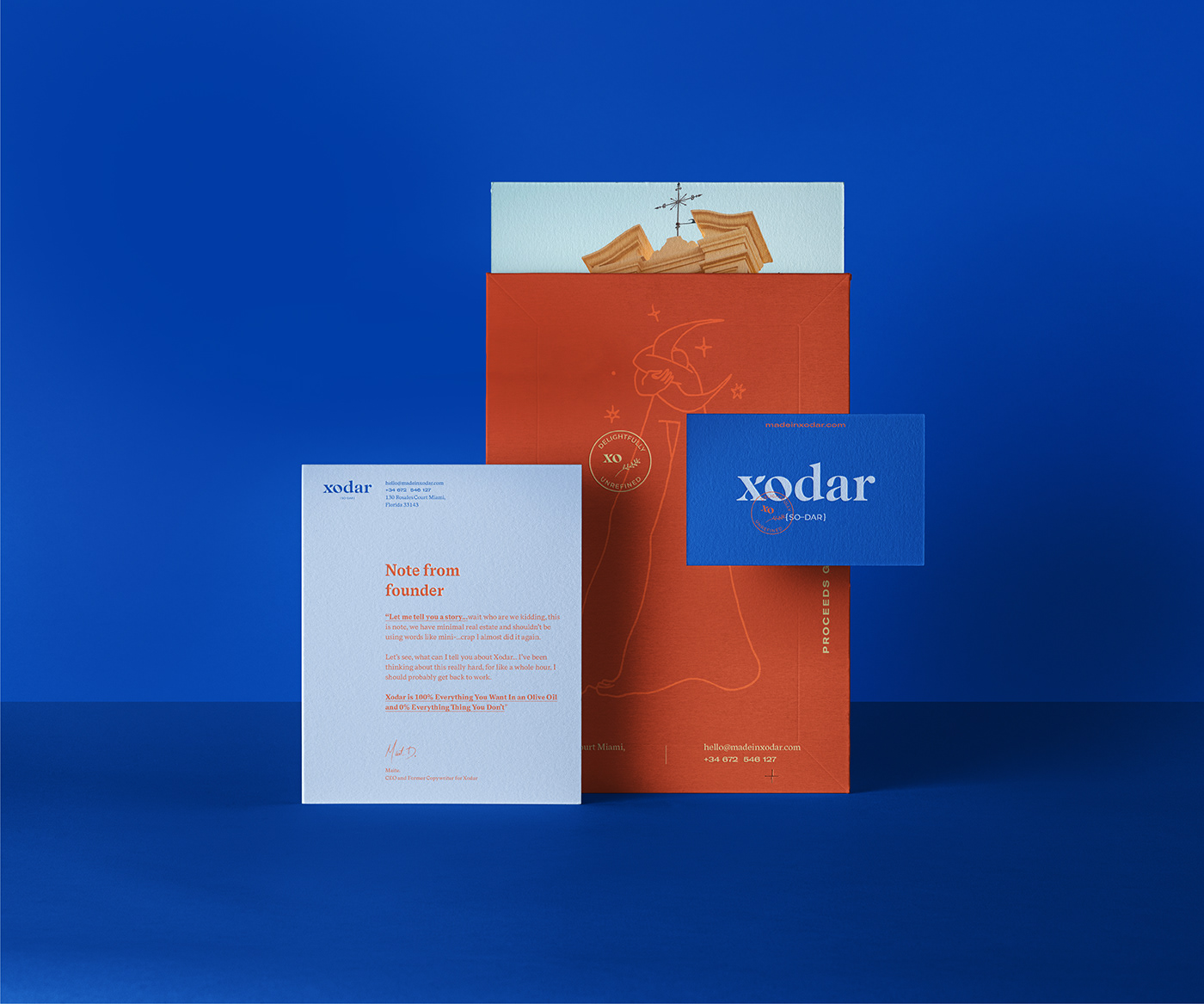
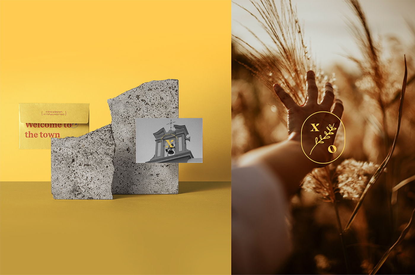
Visual identity and packaging proposal for Xodar, a brand committed to high-quality, ethical practices and giving back to the local community. Xodar carries the essence of the Andalusian way of life and directly contributes to the local people, environment and animals.The olives are hand-picked by the family that owns and maintains the land, creating no-funny-business, 100% undiluted oil.
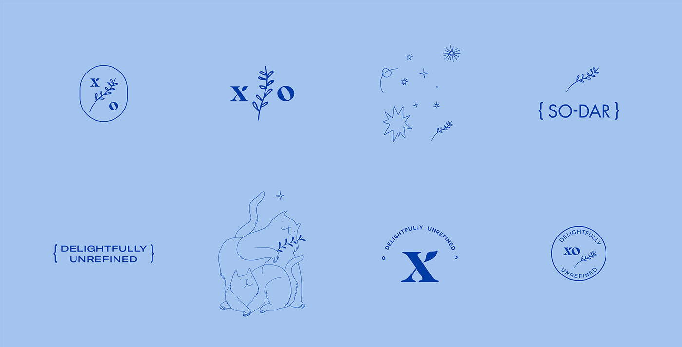
The goal was to tell the story of the brand in a bold yet simple way, to accomplish that feel-good, nostalgic, yet modern, earthy and warm esthetic. It´s attention grabbing, fun and colourfull.
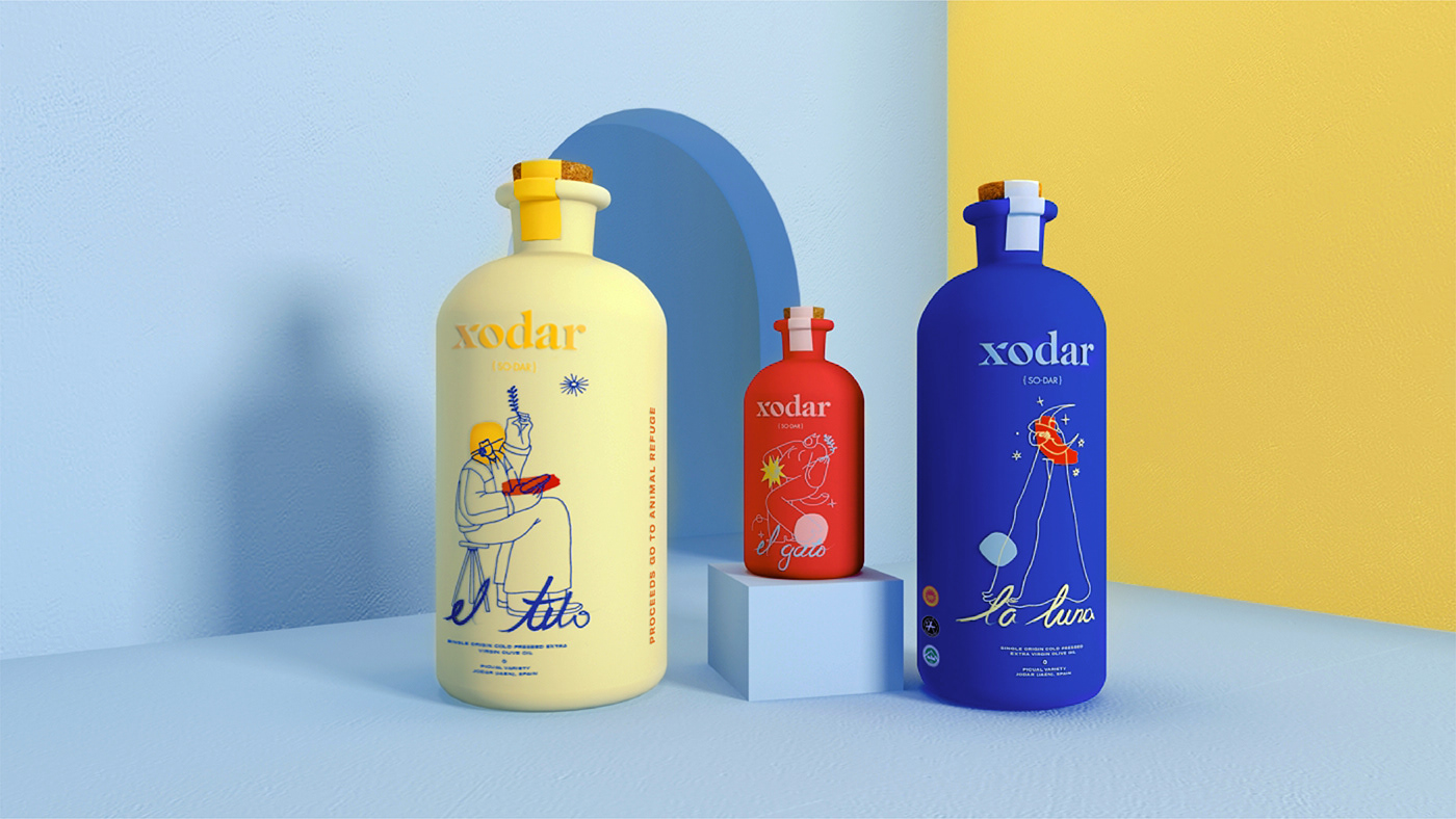
There are three types of olive oil bottle design, each with it´s own identity and representative colors:
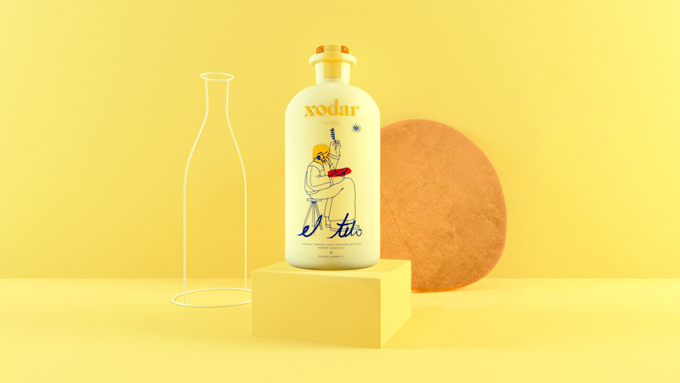
EL TITO-THE EVERYDAY olive-oil | it can be used for pretty much anything.
Cold-pressed, minimally filtered olive oil, it´s the perfect addition to any food.
EL GATO- PET FRIENDLY | This extra virgin olive oil is for literally everyone.
Cat, dog -and human- friendly.
LA LUNA-LIMITED EDITION | extra virgin olive oil, from the early harvest, first selection.
Picked during the full moon harvest to accentuate the lunar influence.
It has a special moon glow to add that little “extra” touch.
Creative direction and graphic design: Antonia Fiscutean
Illustration: Marta Moya Melia
Photography: Claret Castell
Illustration: Marta Moya Melia
Photography: Claret Castell