Logo Design For Deacon O'Connor
Deacon O'Connor is a camera operator and a craftsman who wanted a simple logo that he could put on a business card and use for a metal brand to stamp his woodwork and leather crafts.


That's right, he needed a brand mark for the original form of branding - burning a mark directly on the item!

He wanted a plain single color logo of his initials, possibly interlocking to make the creation of a metal brand easier and more cost effective, and wasn't sure whether he wanted to include the apostrophe or not.
We started with typeface selection.

After Deacon selected the ones he liked best we began discussing which ones would best represent his style and personality and which ones would work best for a metal brand.
A more decorative typeface would be a good choice for his style, since he often adds a unique twist to his projects, but one that is too detailed wouldn't work very well for a branding iron.

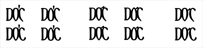
We narrowed it down to two choices and began looking at different thicknesses for one of them and discussing which one would be best.

After selecting a thickness and deciding on the interlocking version, Deacon decided he did want to include the apostrophe. I showed him a few options, one with the apostrophe separate from the initials, and two where it was connected to them.
Then we discussed adding a tagline for when he put the logo on business cards.

We narrowed it down to two options...

And after much debate, the final design was chosen:


