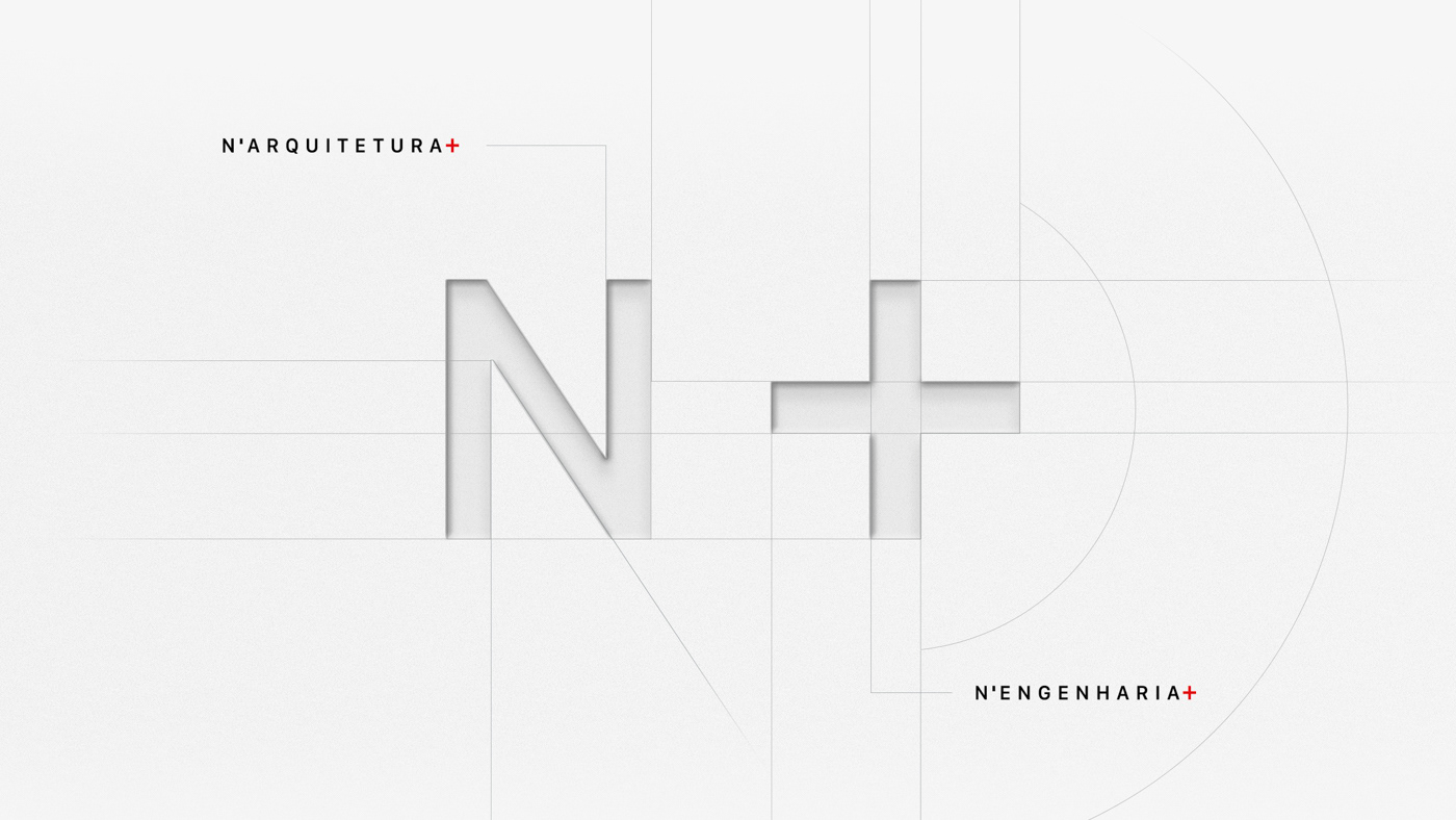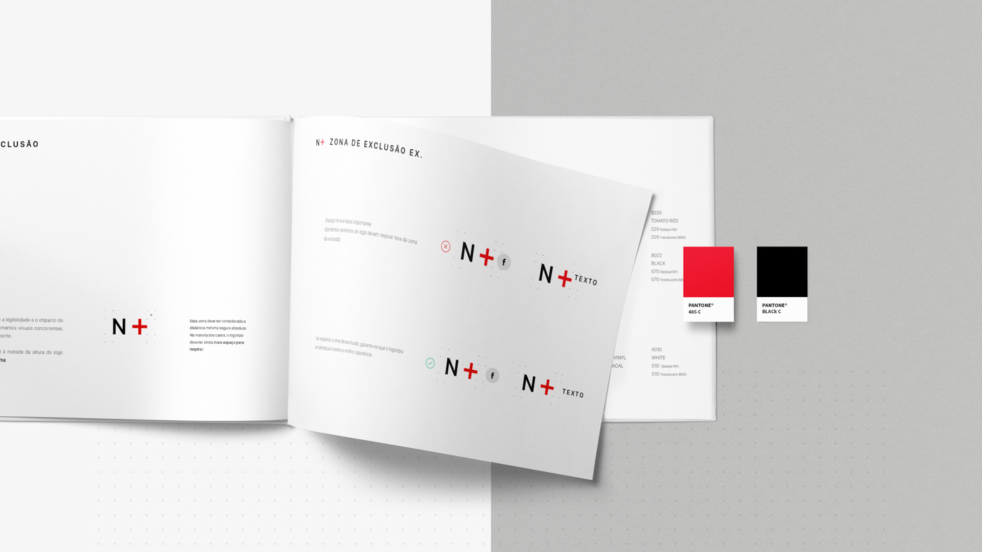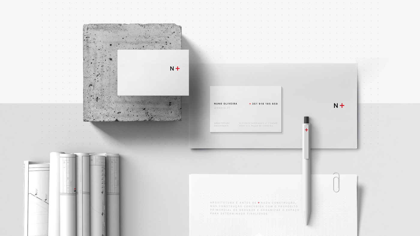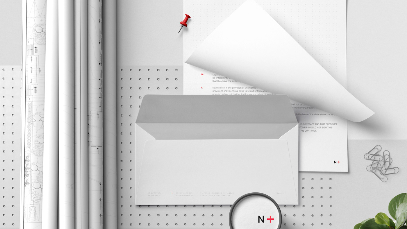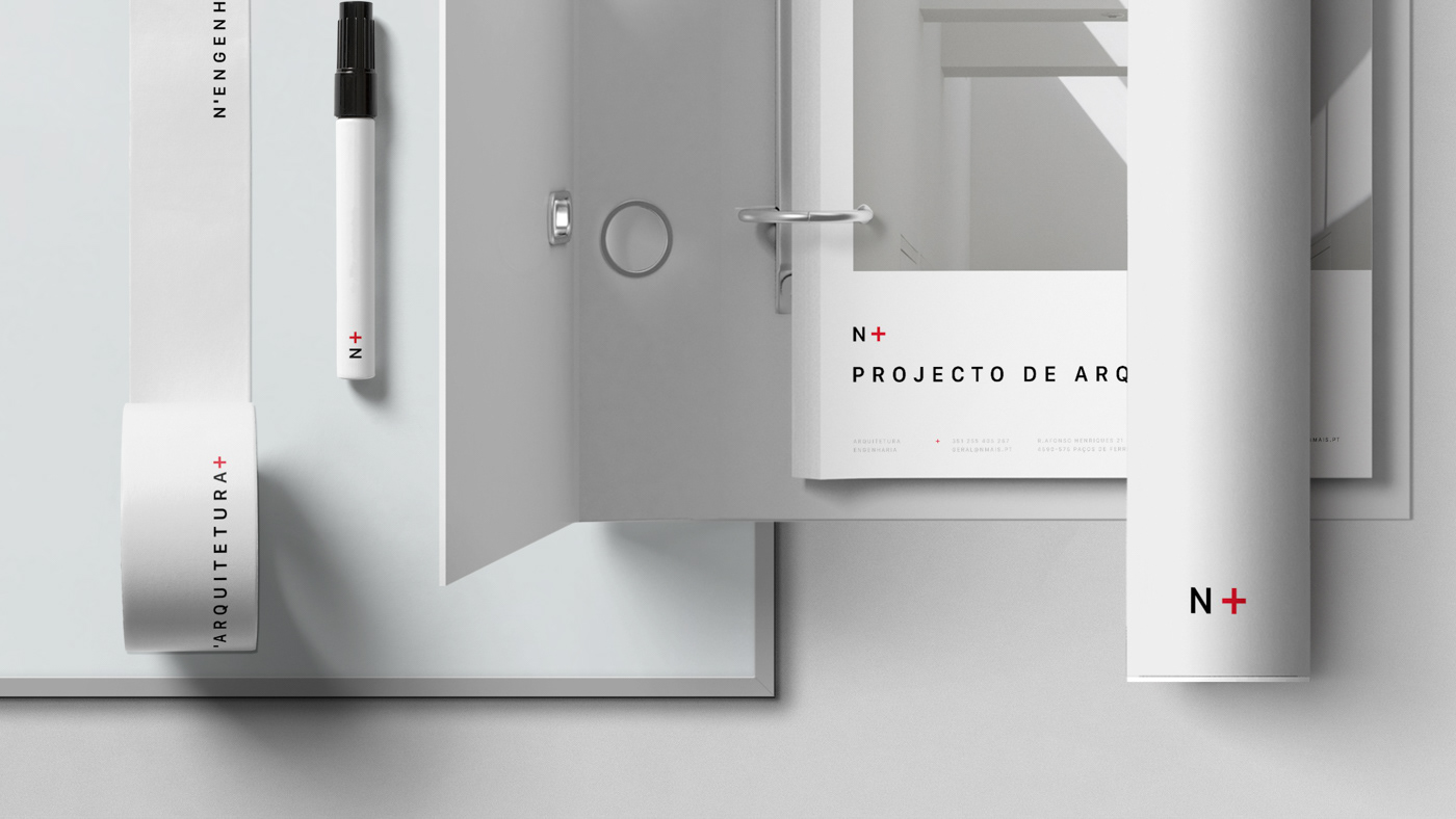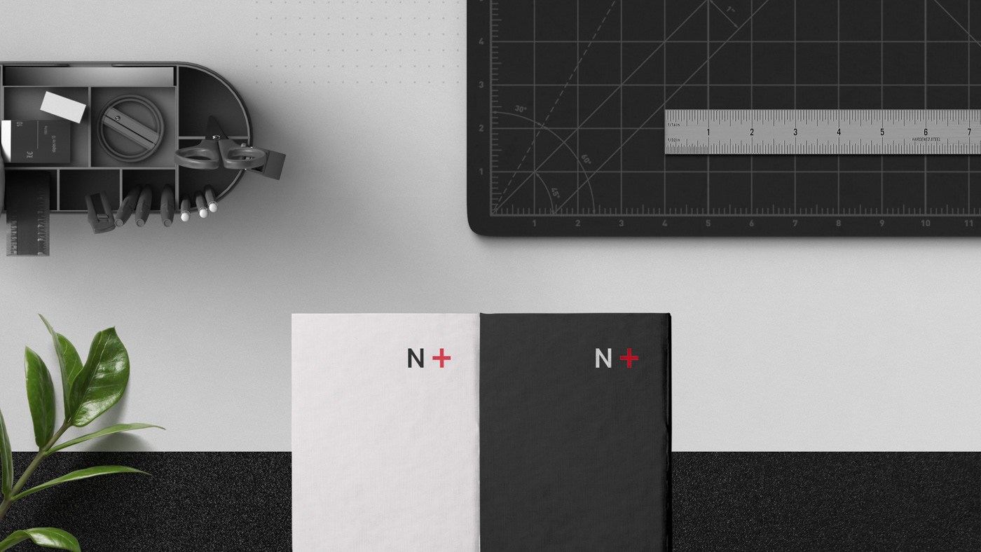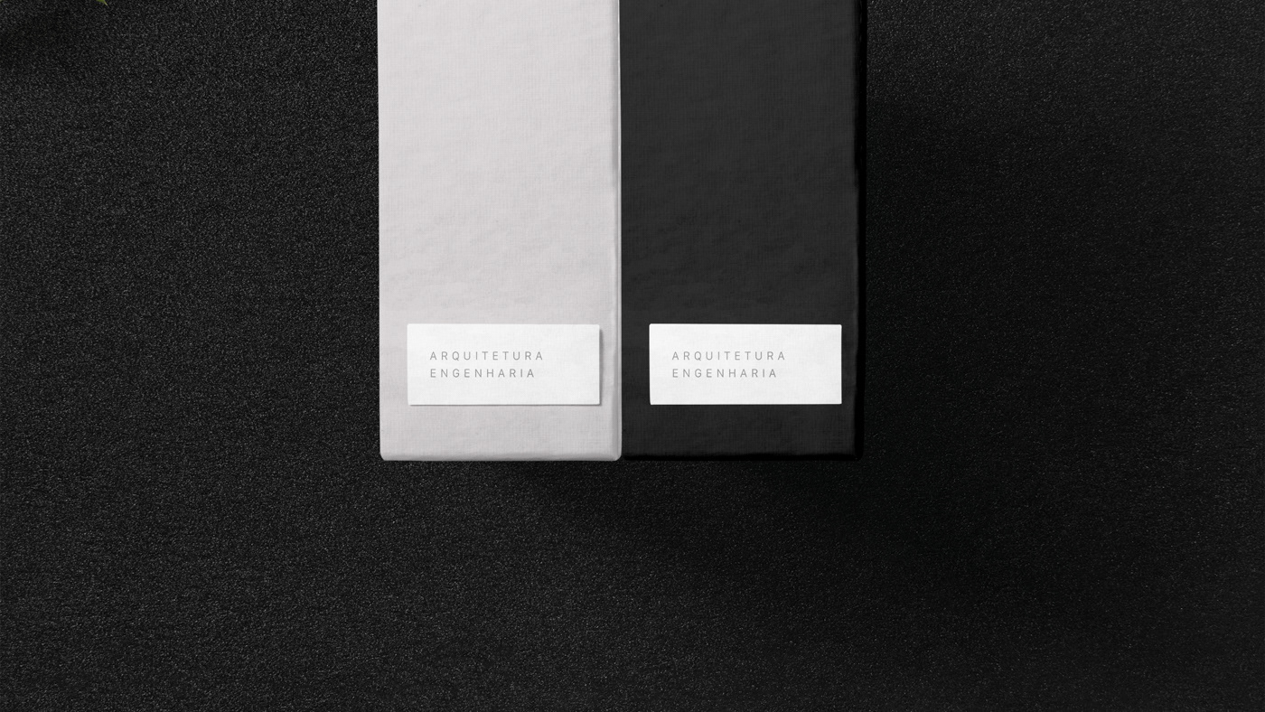


The balance between space and content layout was undoubtedly the most important factor in the development of this branding.
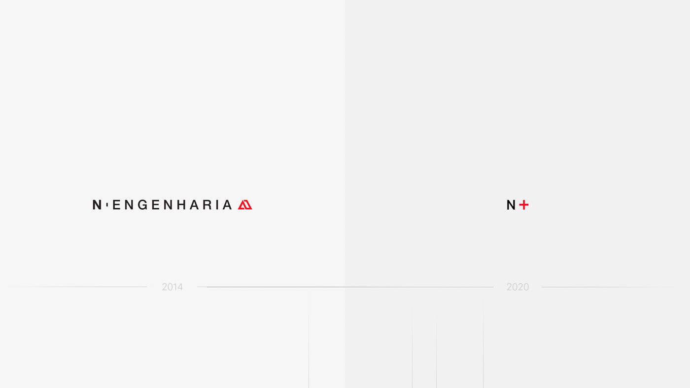
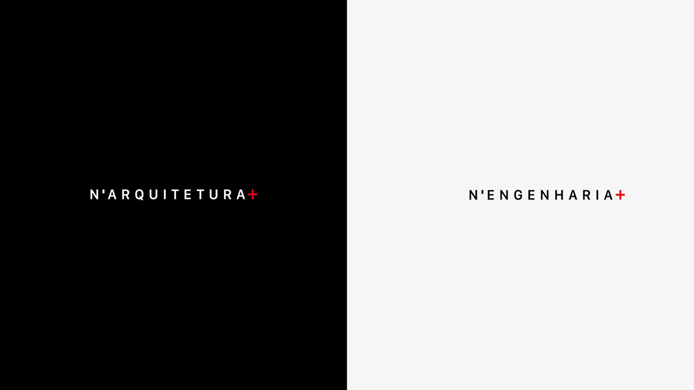
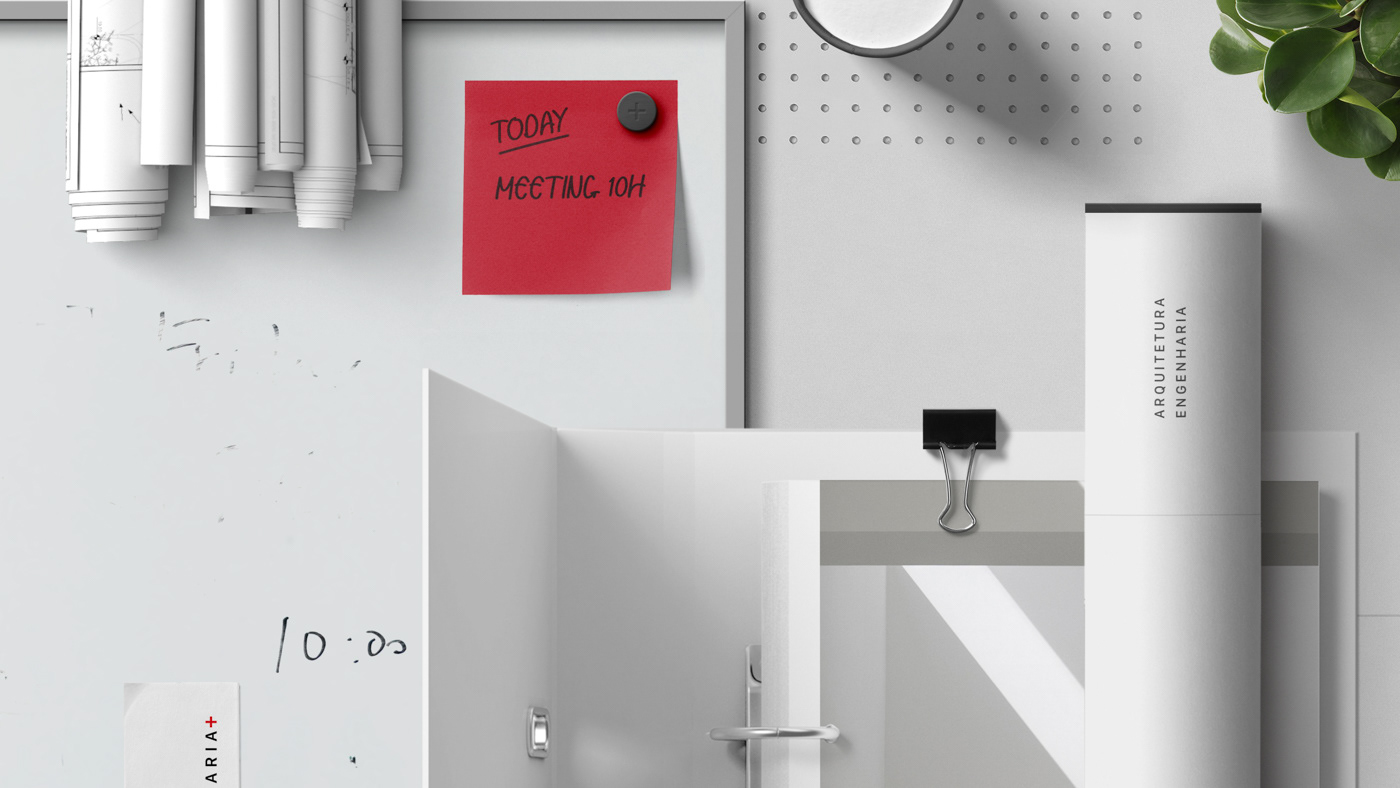
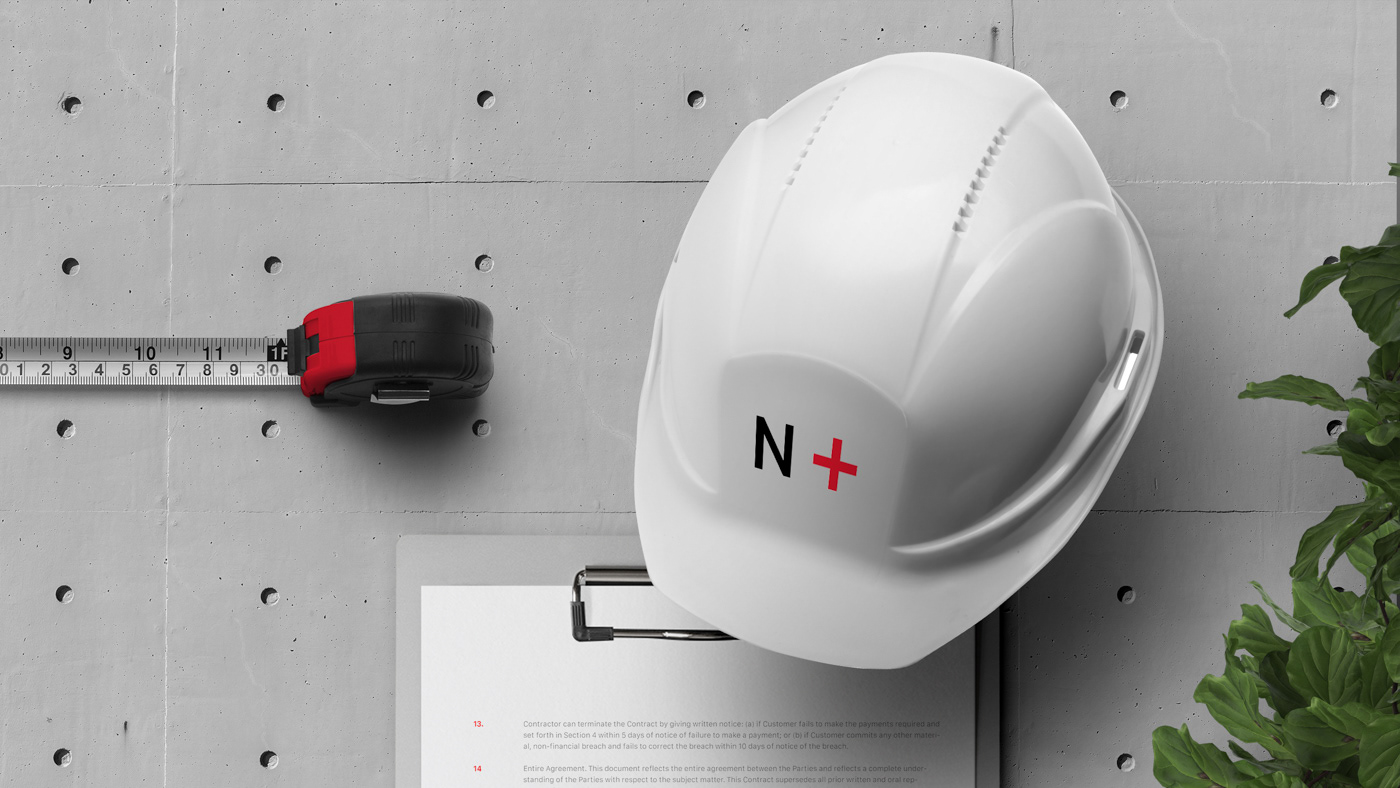
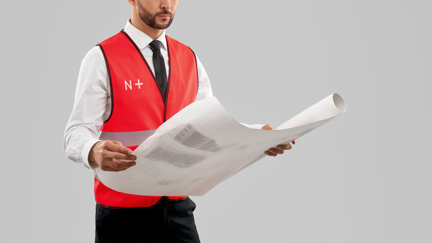
N+ was born from the restructuring of N’Engenharia, a company with more than 10 years of experience in the field of architecture and engineering, it’s vast portfolio includes projects for companies such as IKEA, Farfetch and Leroy Merlin.
From this restructuring arises the need for a visual change that brings together the two main aspects of the brand without compromising any of the areas.
And so we proposed to develop a visual identity that would solve the problem of brand segmentation without leaving behind the connection with the existing history. The new visual aspect would have to be recognized as an evolution of N’Engenharia.
In this project, we started by addressing the new concept, and the need to develop a symbol that was strong and clean from the beginning.
The balance between space and content layout was undoubtedly the most important factor in the development of this branding, and we made this a rule across all the branding elements.