Non-Fiction Journal: 01 Power
Brand Identity & Print Design
Brand Identity & Print Design
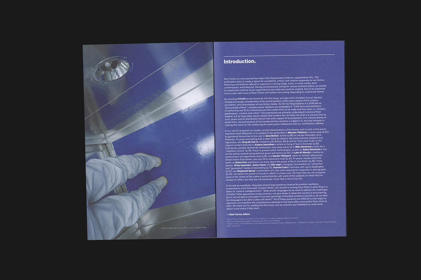
Non-Fiction is a new biannual journal by Open City Documentary Festival. The publication aims to create a space for considered, critical and creative writing on non-fiction and features contributions offered in response to moving image, audio or cross-media, both contemporary and historical.
Tonally, it is accessible but intellectual, providing a serious space that is dedicated entirely to non-fiction, and not constrained by release cycles or distribution requirements. It features a variety of voices and perspectives, both in terms of contributors and subject matter, crossing the spectrum of possibilities present within non-fiction as an artform.
The audience is specialised, though the publication is created in response to a demand: the lack of outlets that engage seriously, or specifically, with non-fiction film. Its primary target readership will be the festival’s existing audience of documentary film enthusiasts and practitioners, but also those in the field around the world who are aware of the festival but not able to attend - as well as those who are interested in cinema, art and culture more broadly. Like Open City Documentary Festival, the journal looks to nurture and champion the art of creative non-fiction, aiming to challenge and expand the idea of documentary in all its forms.
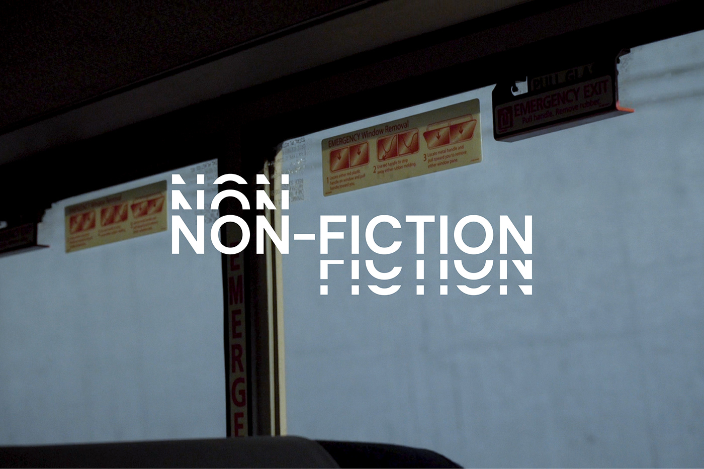
Passport were asked to create the core identity for the journal as well as the design of the editorial. The Non-Fiction logo we developed visually reflects the notion of moving image which is achieved through selected letterforms that are cropped and then repeated. We chose clean and sober sans-serif typeface that provides a suitably neutral tone to accommodate the wide variety of subject matter that it will sit alongside.
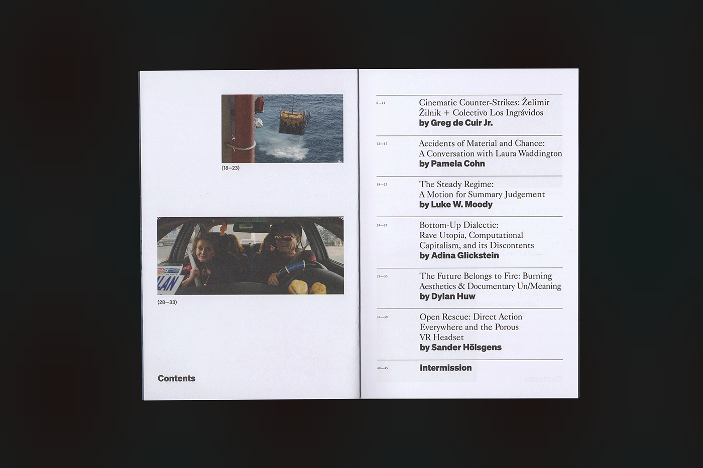
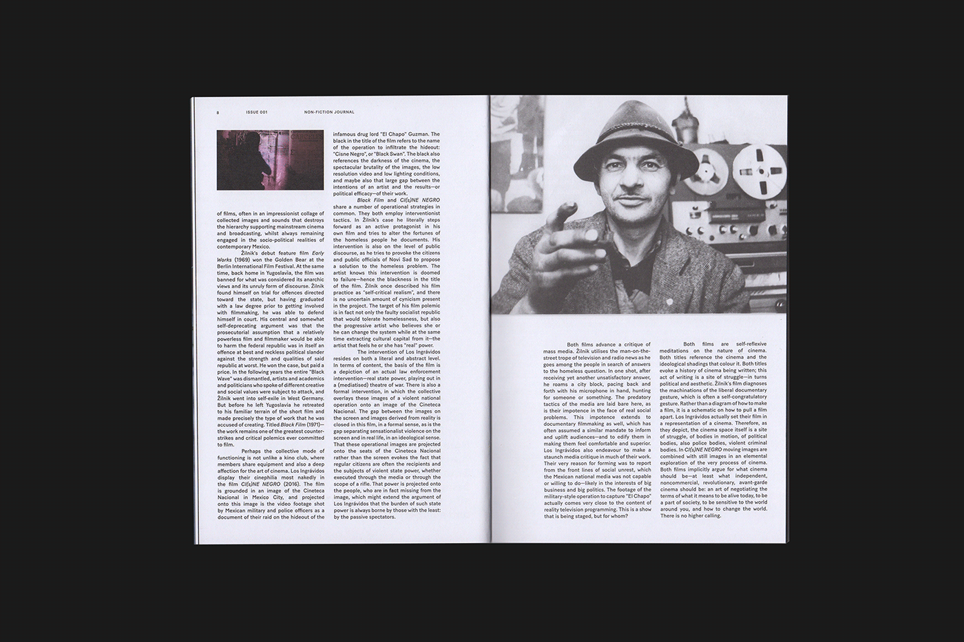
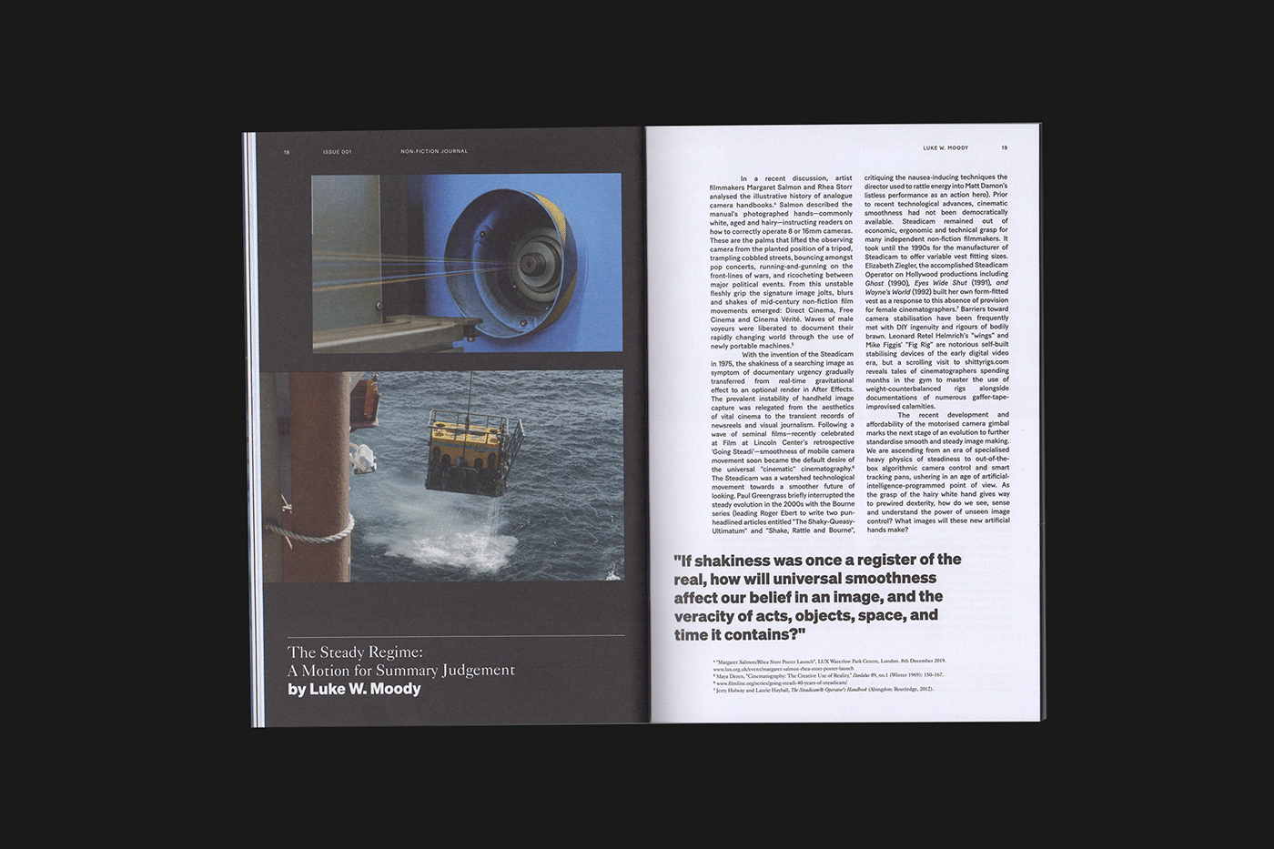
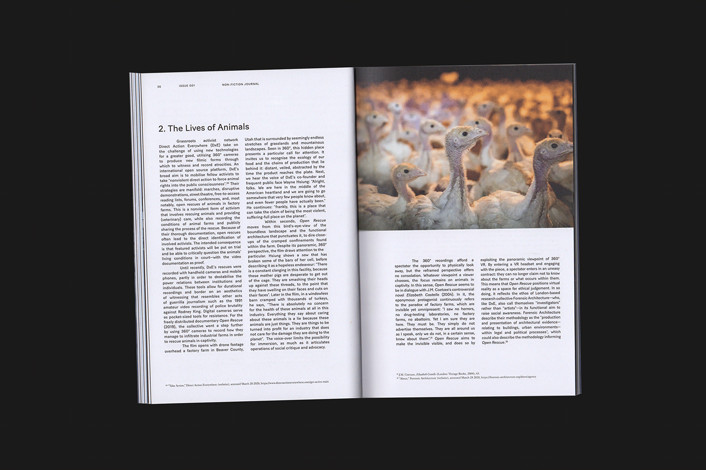
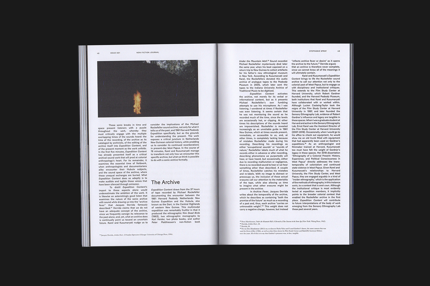
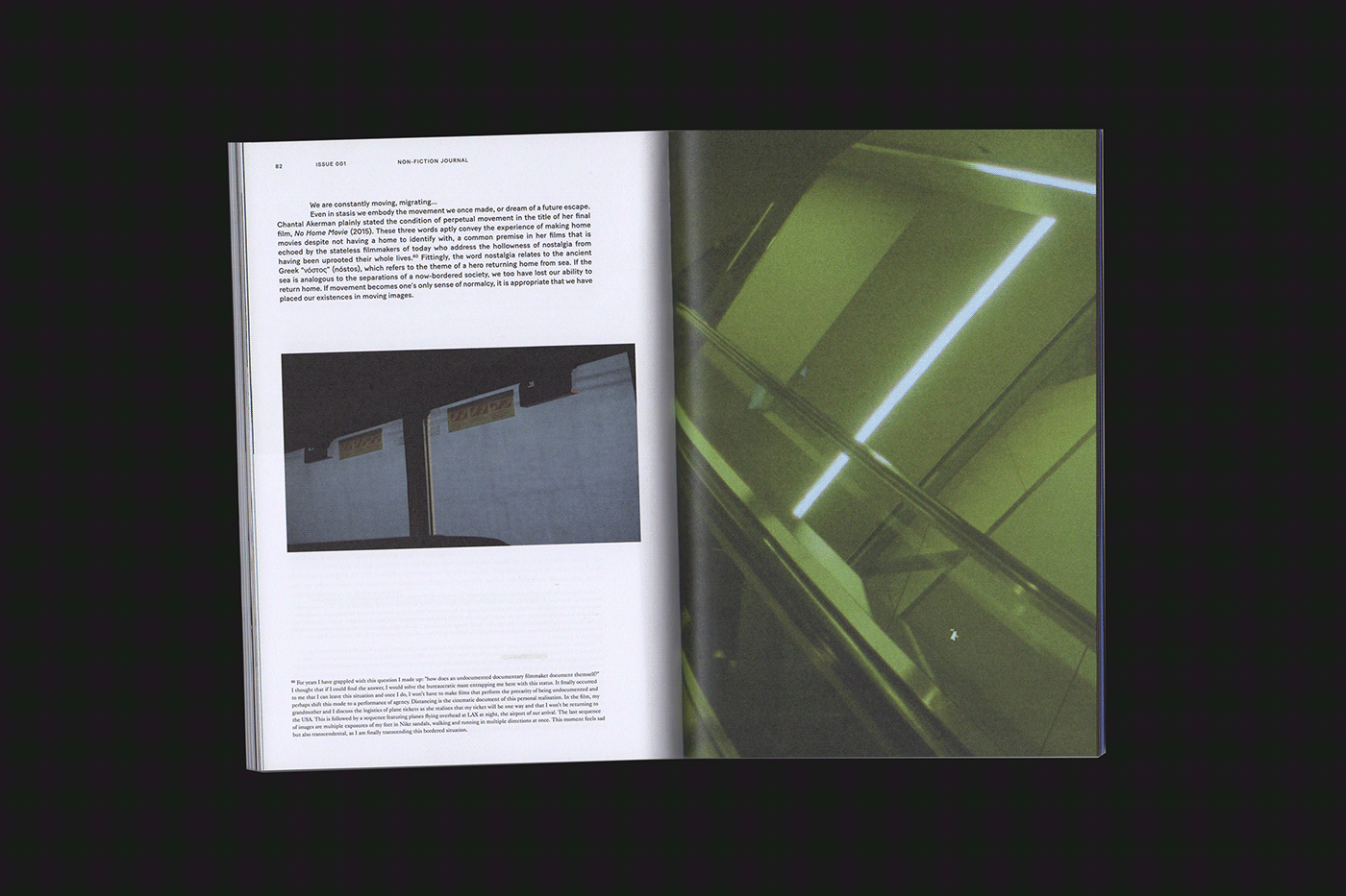
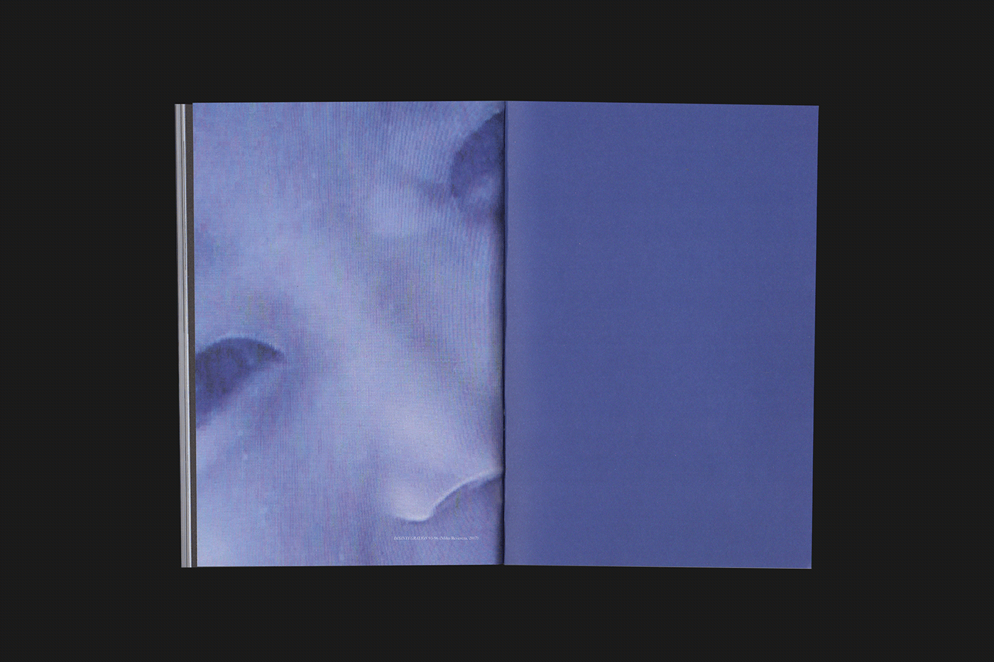
The wider identity then focuses on ensuring that a number of different perspectives and tones of voice can be communicated. This is established through the use of a varied typographic palette in combination with unorthodox and unusual layouts. A super-heavyweight typeface to highlight the contributor and key pull quotes contrasts against a delicate serif used for the academically referenced footnotes and other selected details. The editorial layout styles also range considerably from classic neat columns, through to more free-flowing, sporadic placements that are used to reinforce the character of each article.
Buy a copy of the journal here: opencitylondon.com/nonfictionjournal/