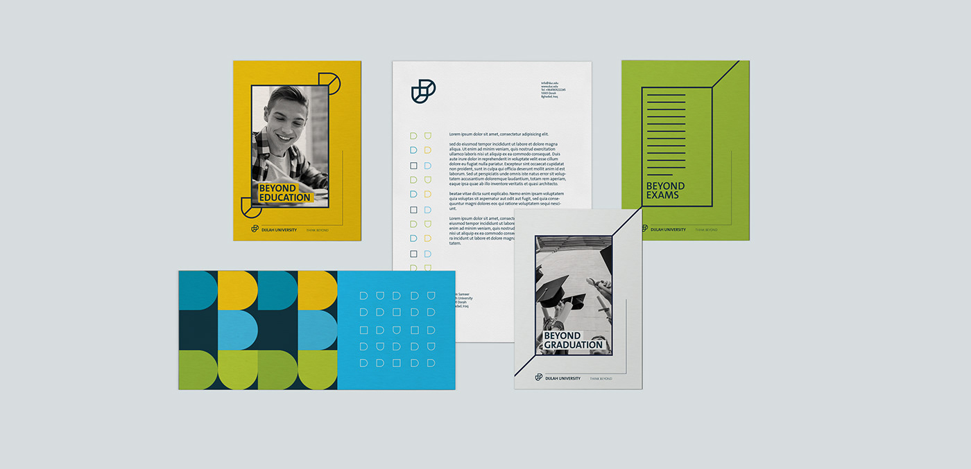
Dijlah University didn’t only look towards providing a piece of paper that won’t do much for you (university degree)... they actually cared, They were thinking beyond. We centralized the branding on the concept of “Think Beyond”. They though beyond the walls that surrounded their university, beyond the degree they were obliged to provide students, beyond the hours of operation and beyond their students’ graduation… they were here to offer a solution to Iraqi problems and the solution is not a piece of paper. The solution requires their faculty to mix in with the real market and know what is required in today’s competitive market, the solution is to be a networking hub for their students and allow them to mix with industry leaders from the private sector so they are more familiar of where to look for jobs and what skills to have.
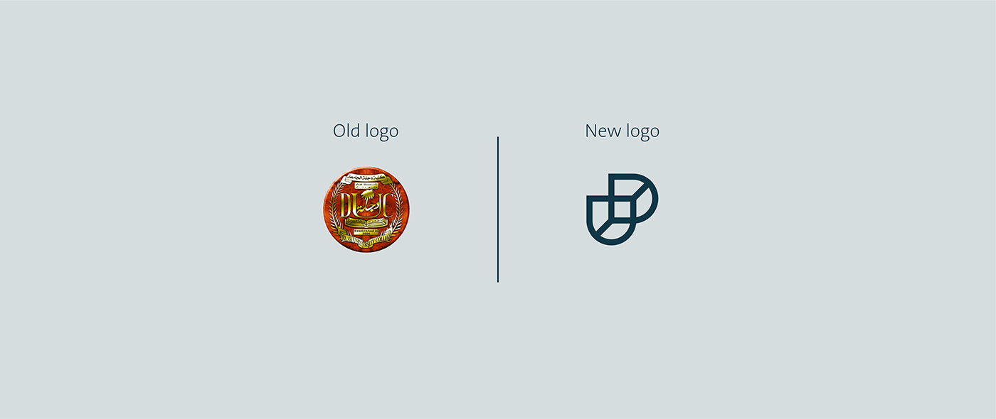
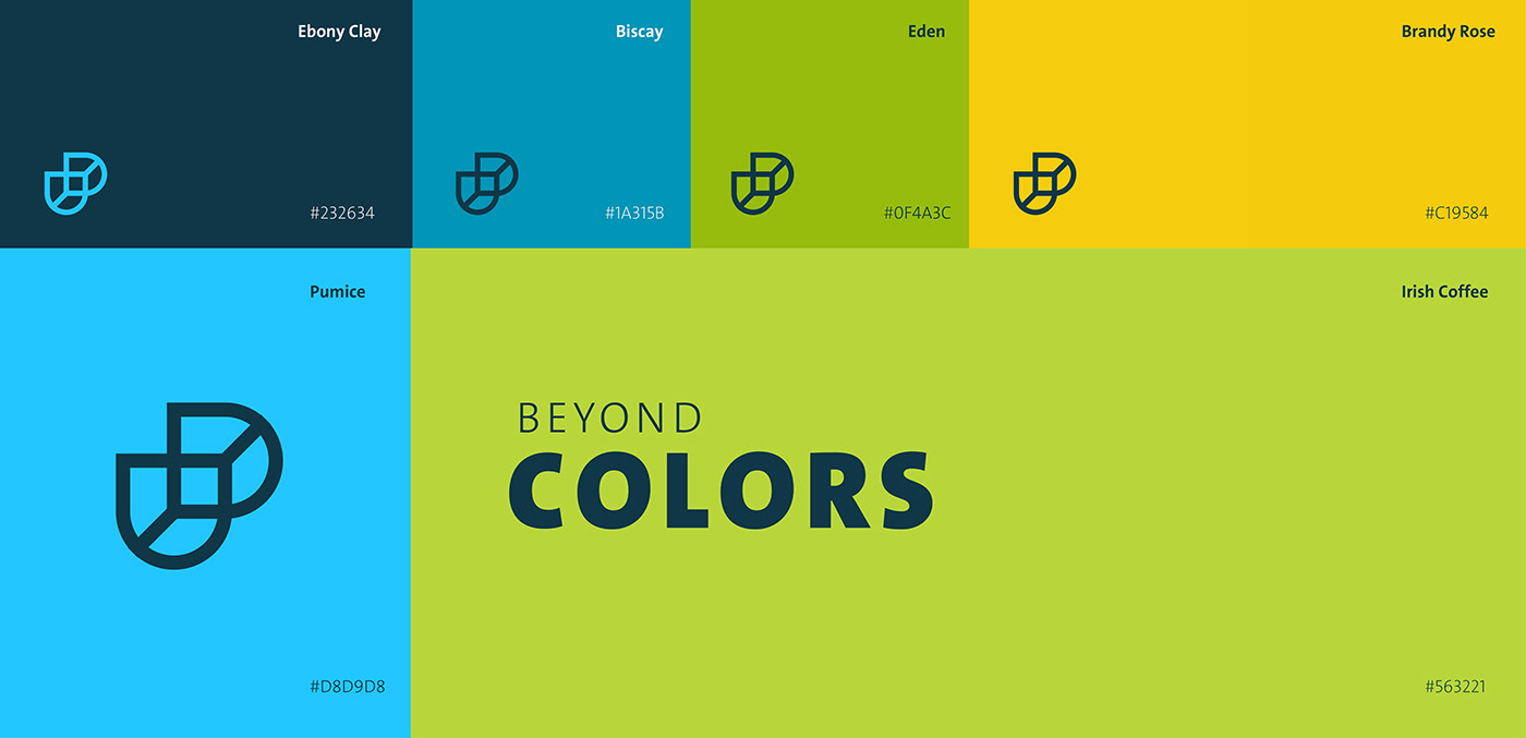
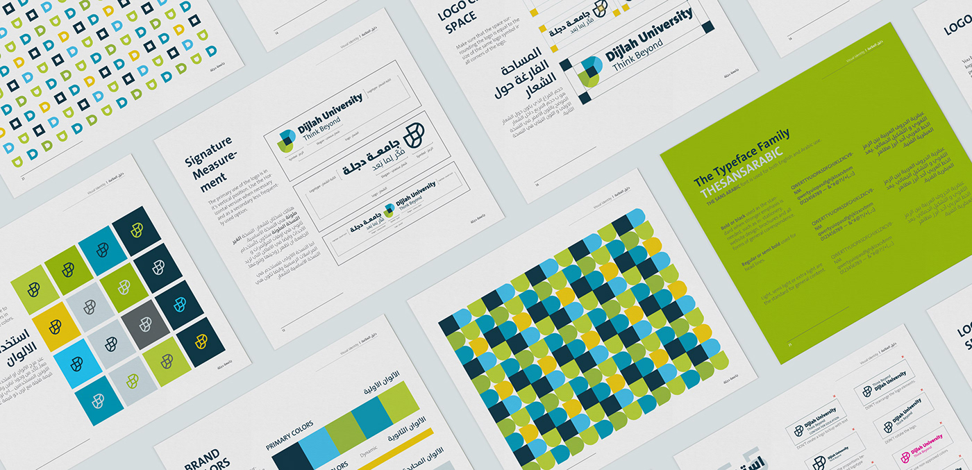
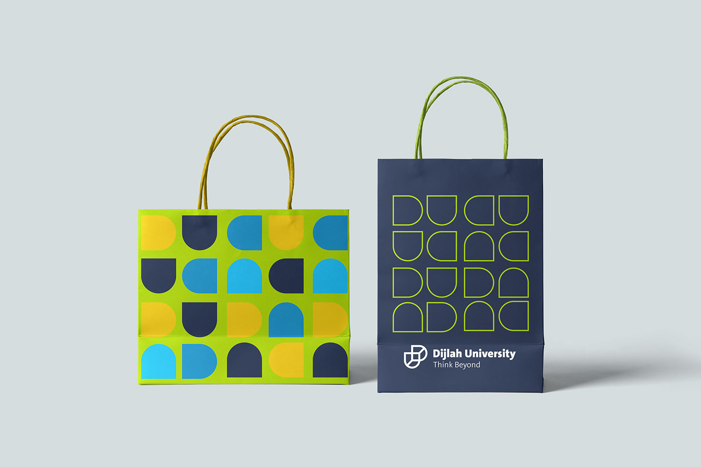
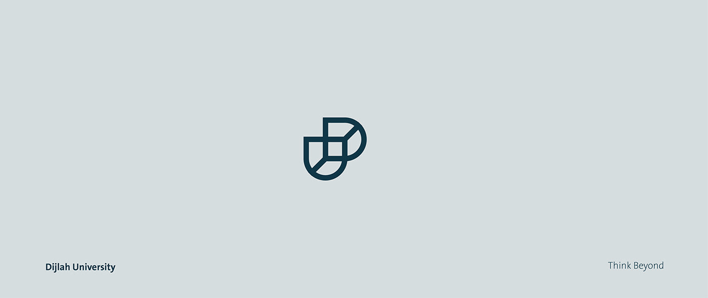
The logo is formulated by the letters D (Dijla) along with U (University) in two form sets, one of the logo forms is in black and white outline and the other is vibrant with colors representing some of Dijlah's brand values, including growth, creativity, education & professionalism.