


The Current State and Problem
How many people carry cash anymore? Walking past people who live on the street, many more folks apologize for having no cash on them, and truly mean it. Yes, there is support available: shelters and food banks across cities like Toronto welcome donations electronically, and help by providing access to food, clothing and essentials. Consequently, the homeless and underhoused grow increasingly reliant on organizations and lose the small amount of financial autonomy that they could gain from receiving personal assistance. A cash-free city can create a barrier for turning compassion into immediate action as social alienation increases. What can we offer to the homeless in our neighbourhoods when spare change becomes scarce?
Design Proposal
An app idea that I have envisioned offers a way for people to give money directly to the homeless, even when cash is not available. What I am proposing with Spare is an app that can make a quick, secure, contactless and in-person donation with a mobile phone, right to someone who needs it. The video walkthrough below takes you through three primary tasks within the Spare app, beginning with onboarding and setup.
How Spare Works
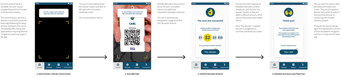
Below are a couple of storyboards that illustrate how the Spare app functions.
The first storyboard demonstrates how a user moves from the landing screen (scan mode) through the workflow of making a donation to someone. The app opens automatically to the viewfinder for scanning a card, so Spare is instantly ready to go. The app captures the QR code as soon as it comes into focus, so the user only has to tap once on one button to complete the entire task and make a donation.
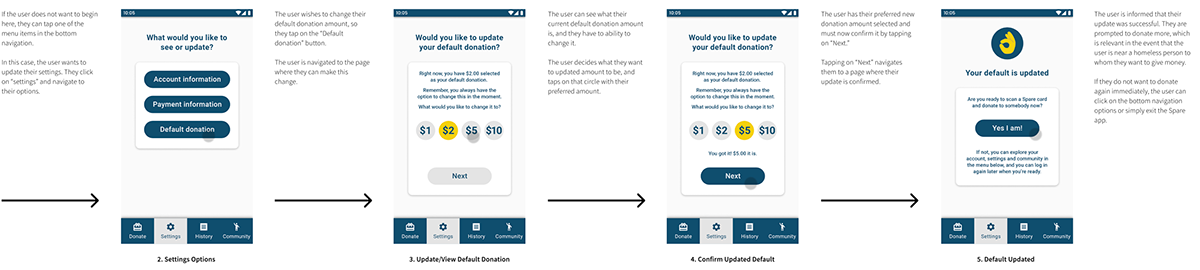
The one-tap feature that makes it so easy to donate is enabled by setting a default donation amount. This second storyboard shows how a user changes the default donation amount stored in the Spare app:
Spare System Components
Spare Representatives: Spare representatives would be assigned to station themselves at shelters and food banks to register the homeless and distribute Spare cards. They would also serve to provide help and support to registrants, including checking the balance of their Spare cards.
The Spare Card: With the assistance of a Spare representative, an account would be created without a government-issued ID required, and each person would get their own ID number. A card would be issued on the spot, attached to a lanyard, and an option would be available to have a label added that says the person’s first name. Otherwise, the key feature of the card is the large QR code printed on it, which encrypts the individual’s Spare account and balance. A starting balance would be immediately available to the new registrant.
Sponsors: The Spare system would be powered by a major financial services corporation, such as Visa or Mastercard. This sponsor would be donating the initial starting balance on each Spare card, in addition to providing early investment in the project and supporting the speed and security of all monetary transactions.
Participating Vendors: The Spare card would not be used everywhere. Spare would team up with partnering organizations, which could include food and beverage sellers like Tim Hortons and clothing retailers like Value Village. The Spare card would work like a gift card and enable these card users to make purchases. Spare would prioritize partnerships with vendors that provide the most essential goods and services to the wellbeing of the homeless population, as advised by the Canadian Observatory on Homelessness based on its extensive research.
The Spare App: Users of the Spare card are not the users of the Spare app. Users of the app are people who have chosen to download Spare as a means to donate directly to homeless people who are in possession of Spare cards. The app is intended to function as simply as possible to make digital donations as effortless — if not more effortless — than giving coins to a person in the street.

Project Scope
The system is complex in several categories, from finance to technology to philosophy. For the purpose of this assignment and its interest in user interface design, my focus was on the Spare app. The scope is limited to some aspects of branding, visual design, user experience and accessibility. While the users of the Spare system crucially comprise both the card users (receivers) and the app users (givers), the primary user addressed within the scope is the app user. Additionally, it’s important to note that I have not attempted to form a viable business plan, and all suggested sponsors and vendors have been proposed hypothetically.
Branding and Aesthetics
Brand Concept
Core concepts of the Spare brand are approachability, compassion and simplicity. While contemplating brand concepts, I took all users into account; however, there is special consideration here for the app users. Fundamentally, the app users interact with the interface (which is my assignment’s focus), and they are the group that will require more convincing to adopt Spare, since they are not the financial beneficiaries.

The Logo
I worked with several concepts for the Spare logo, and above are the later versions I developed. The direction I was drawn to was a logotype design with some adaptations to the original typography. I began by browsing typefaces that were accessible and “approachable,” leading me to limit my search to sans-serif families and stick to lowercase. I selected the geometric sans Futura Std Bold for its rounded features, near-circular counters, low stroke contrast and heavy weight, which all generally make this typeface highly legible at any scale. I adjusted the kerning of the font for improved optical spacing between the characters, and I experimented with what elements could be considered “spare” with the word still remaining readable. I played with the isolation of the letters' terminals, ultimately deciding to keep them connected as whole letterforms with a two-tone aesthetic.
Mood Board
The images that I gathered helped me to develop the brand aesthetic, palette, look and feel:

Design Considerations
A number of considerations went into my design choices, beginning with my mood board and brand development, and importantly they included my concerns related to accessibility, and user experience and context. Communicating approachability compassion, and simplicity were addressed across the branding and the overall look and feel of Spare components. Type takes up the majority of the real estate on many of Spare’s screens, so deciding with typographic family to select was important. I opted for Roboto since it is generally regarded as a highly accessible and legible typeface that’s supported within the library of Google fonts. I chose to use the medium and bold weights for many of the interactive elements of the interfaces, and used nothing lighter than Roboto Regular, and nothing smaller than size 16 font. For the colour scheme, I recognized the greyscale and cool colours from my mood board, and believed that they would do well as a part of the Spare palette, capturing the colour-scape and feel of street living. I was drawn to an unsaturated slate blue as the primary brand colour, with its depth and sombreness. I selected a bright yellow to accent this, that’s cheerful and subtly references gold, or money. The rather basic icons all came from the same set for consistency and familiarity, as they are frequently used in Google products.
Colours and Contrast
Many of the considerations that went into colour choices have been discussed in the section on Branding and Aesthetics, yet the accessibility of colours was also top of mind. My foremost concern was that the colour scheme I worked with was highly accessible with high contrast ratios that are compliant with WCAG AAA standards. Most contrast ratios between background and foreground colours are WCAG AAA compliant, with AA compliance in some cases.
Below are simulations of how the interface colour scheme would appear for those with the most common form of colour-blindness, Deutranopia, which I tested with Colblinder. There is still significant colour differentiation.

Accessibility
My goal was to build accessibility into Spare from its inception. One of my user groups is already excluded from society in many ways, so inclusivity was very important to the development of Spare. My priority with my choice of colours, shapes, icons and assets is to make information accessible: to make it perceivable and understandable. The components that I envision for my system were chosen with a concern for my user groups and making their particular tasks accessible.
Accessibility for App Users
The intention here is to ensure that any person with an inclination to give to the homeless should have their access needs accommodated by this app as well as possible. Spare does require the giver user to have access to a smartphone, a data plan, and a credit card that can be verified with its information stored within the downloaded Spare app. The interface’s typography (based on mobile OS standards, with styles outlined in the previous section) and colours have been selected to be accessible.
Accessibility for Card Users
The concept of ‘Accessibility’ goes beyond considerations related to accommodating physical and mental impairments. Accessibility also concerns socioeconomic handicaps, much of which affect and perpetuate homelessness on the individual and community scales. The Spare system has been designed to benefit a highly underserved user groups by providing a technology that can facilitate support for them. All the while, the system does not require underprivileged users to own a mobile phone themselves; rather, it equips them with an object that is compact, has little material value and is cheap to produce. Issued with a lanyard, the Spare card can be worn under the user’s shirt for safekeeping. Users will be advised to regularly redeem the balance of their cards with purchases, as to dissuade potential Spare card theft amidst members of the homeless community.


