


O lettering de assinatura do grupo Melanina MCs foi elaborado tendo como base a ideia de uma representação sólida do grupo, com caracteres construídos através de linhas espessas e quinas pontiagudas. A proximidade entre os elementos que compõem o lettering constrói uma contraforma na qual é possível identificar a repetição de vários elementos triangulares, em referência aos padrões tradicionais africanos.
The signature lettering of the group Melanina MCs was created based on the idea of a solid representation of the group, with letters made of thick lines and pointed corners. The proximity between the elements that make up the lettering builds a counterform where it is possible to identify the repetition of several triangular elements, in reference to traditional African patterns.

Foto: Vitor Junquilho (@vjotaguedes)


Foto: Nunah Alle (@allesnunah)
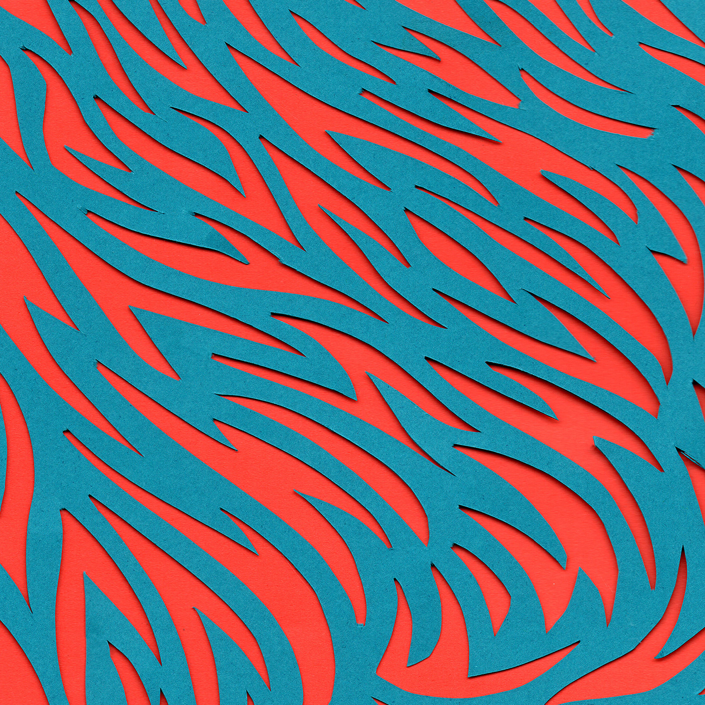
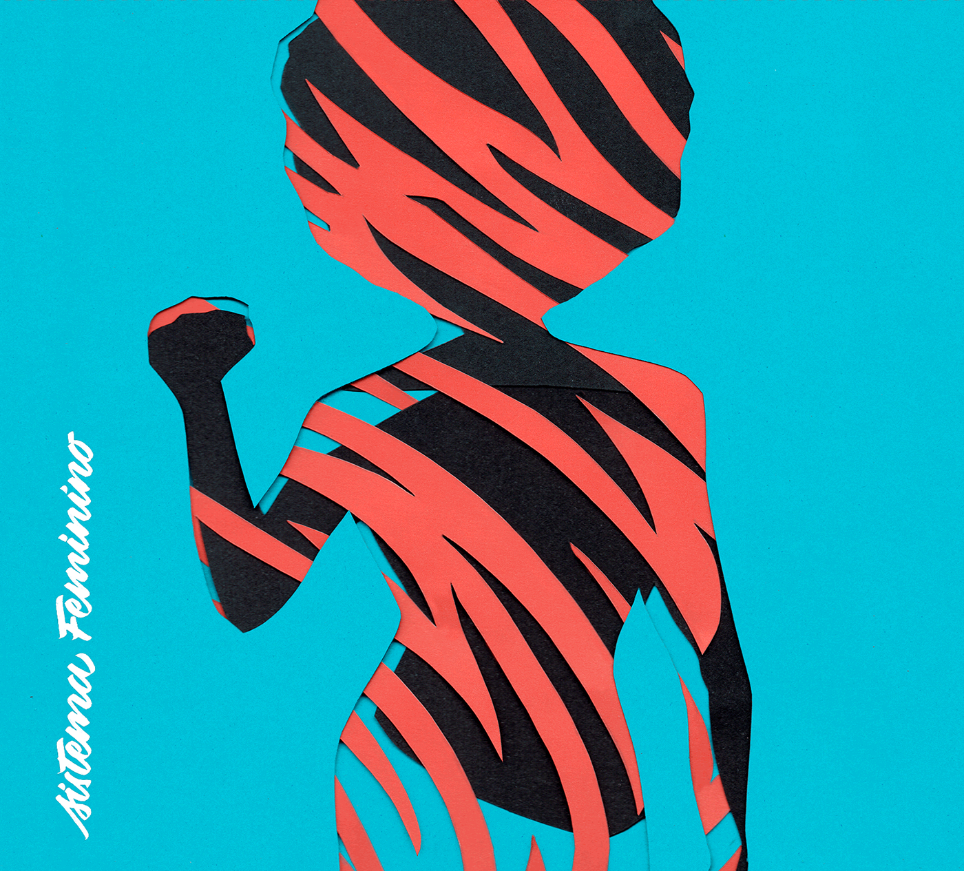
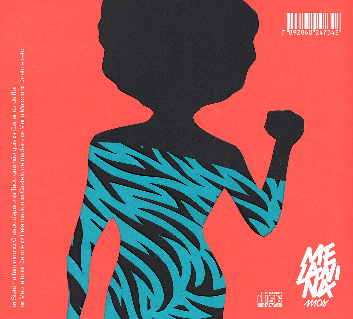
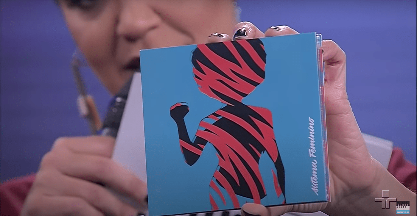
Para o disco de estreia, intitulado Sistema Feminino, o grupo buscou evidenciar a figura da mulher negra através de letras contundentes e questionadoras. Ao mesmo tempo, o álbum também traz faixas mais descontraídas, sugerindo que a diversão também pode ser uma forma de resistência. Optamos, então, por representá-las através da figura de uma mulher negra em uma postura que possa ser lida de forma ambígua, tanto como um protesto quanto uma dança. Também é ambíguo o padrão que recobre o corpo feminino na capa, trazendo à memória elementos que estão presentes em vestuários e adereços mas também se reconhecem na pintura de guerra. As ilustrações foram feitas a partir de recortes e sobreposições de papéis coloridos que foram posteriormente escaneados em diferentes composições.
For the debut album, entitled Sistema Feminino [System of Womanhood], the group sought to highlight the figure of the black woman through striking and questioning lyrics. At the same time, the album also features more playful tracks, suggesting that fun can also be a form of resistance. We chose to represent the group through the figure of a black woman in a posture that can be read ambiguously, both as a protest and as a dance. The pattern that covers the female body on the cover is also ambiguous, bringing to mind elements that are present in clothing and props but are also recognized in war painting. The illustrations were made from cutouts and overlays of colored papers that were later scanned in different compositions.


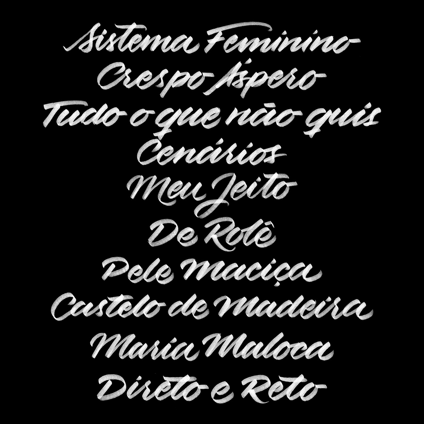
Os títulos do álbum e das músicas foram trabalhados através da caligrafia cursiva para criar contraste em relação às composições tipográficas da capa e do encarte.
The album and song titles were done with cursive calligraphy to create a contrast in relation to the typographic compositions of the cover and booklet.


Manos e Minas (agosto de 2018)
Créditos
Design gráfico, lettering e caligrafia: Wérllen Castro | Monomotor


