


Galien - Inspired by the typography
of the French Renaissance
Galien is a modern serif typeface inspired by the typography of the French Renaissance that started in the 15th century and lasted for more than a hundred years.
These were the times of the reinvention of the Ancient Greek and Roman science, art and literature. Mainstream typography moved away from the original Textura Blackletter model of the early days of printing to Humanist letterforms inspired by Carolingian writing used in ancient manuscripts of the Holy Roman Empire. It was a decisive turning point for Latin typography that shapes our reading habits up to this day.
The work of the punch-cutters such as Jenson, Manitius, Griffo, Garamond, Granjon, Haultin, Villiers and other contemporary masters is here summarized, abstracted, and interpreted into Galien, a digital typeface of the twentyfirst century.
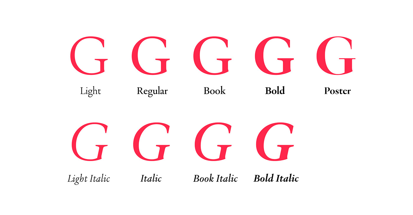
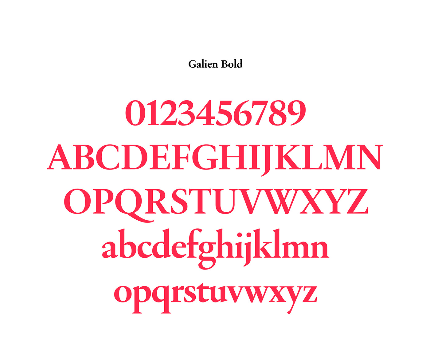
Galien is rather a revival of a period than that of a particular typeface. The Italics are directly inspired by the Venitian types of the early sixteenth century. Galien is a well-dosed blend of various Old Style models that shapes a contemporary digital typeface. Tuned to perform well at body copy size, the contrast between thick and thin remains nevertheless quite visible to preserve elegance. While the 8 styles of the family ensure good legibility at small sizes, the special Poster cut enhances the flamboyance of this interpretation with a particularly high contrast on a more transitional axis with some daring design decisions for impactful headlines.
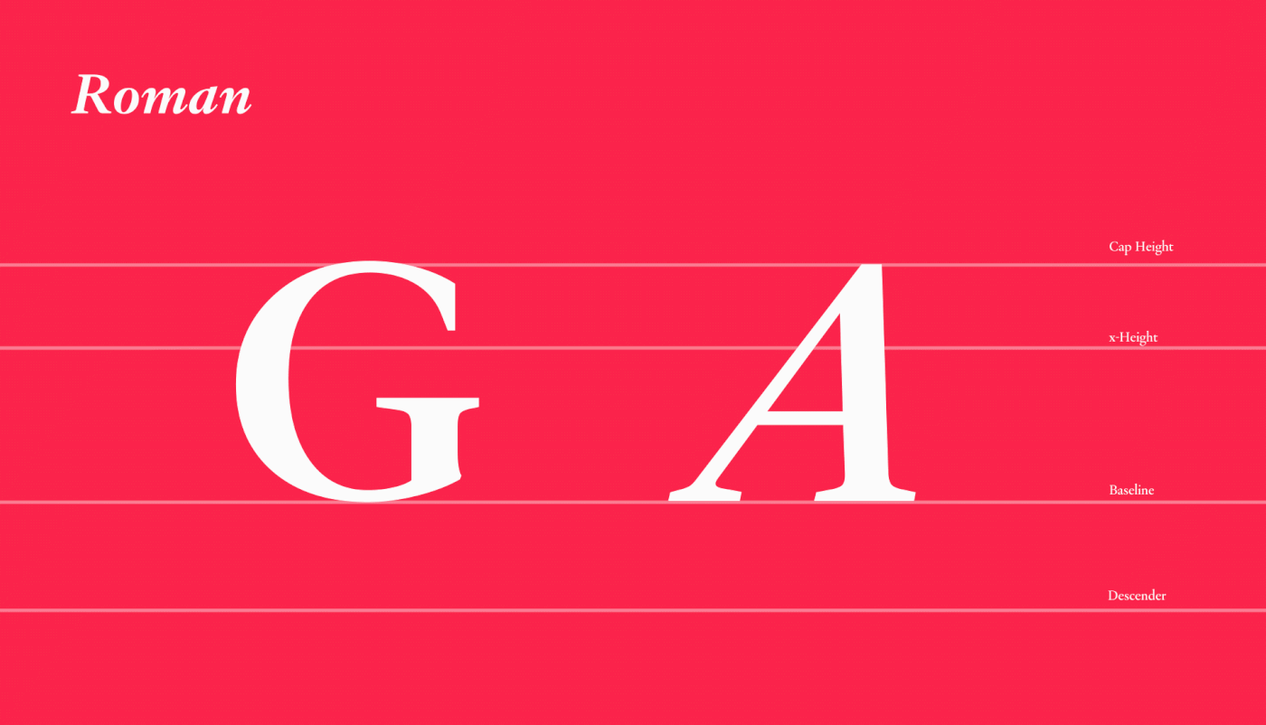
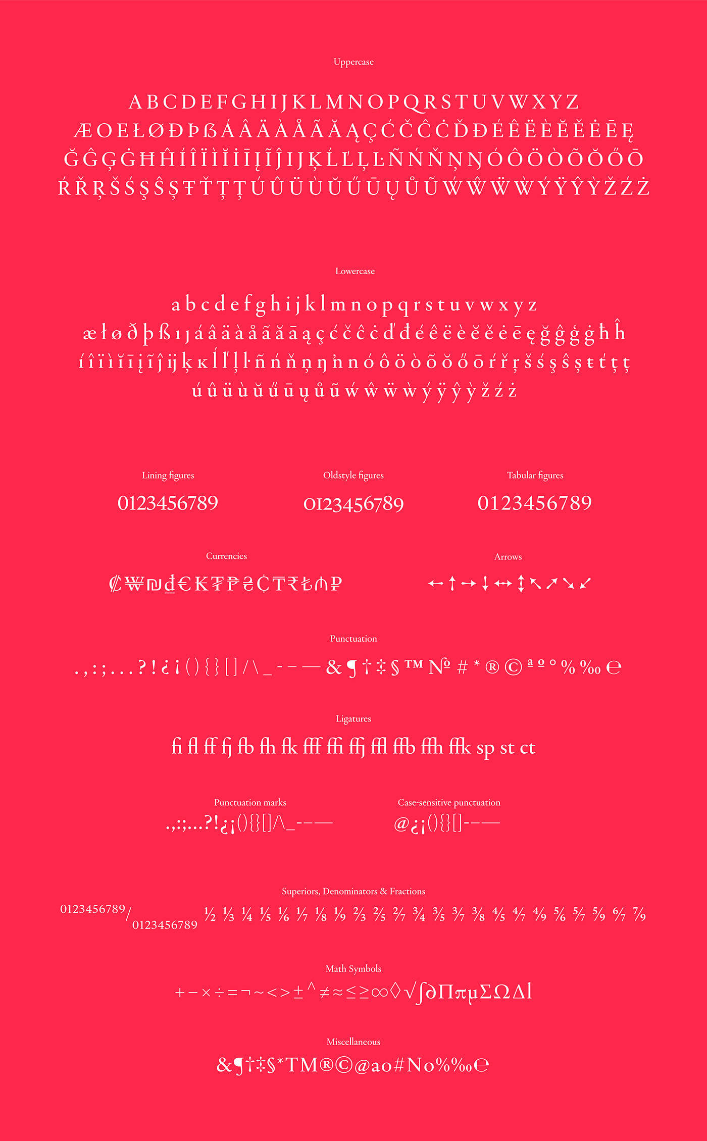
To enable contemporary usage, Galien’s character set is quite comprehensive and includes glyphs that did not exist in the typefaces of the Renaissance period: multiple sets of numerals, fractions, a large selection of currencies... etc. The particularities of this design may be notably found in the fluctuating angles of the Italics giving it a Humanist vibrance and a warm feel. The Romans feature slight cuts and curve breaks making it more decisive and pairing well with the more flowing and soft Italics. Accents and diacritics are thin and tall, reminiscent of the delicate sophistication of the Renaissance letters as well as creating a unique contrast for European languages.
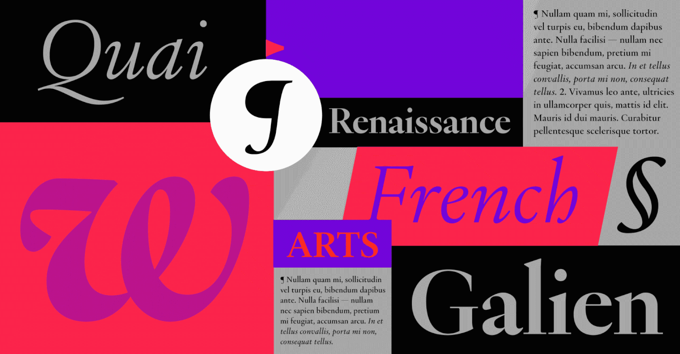
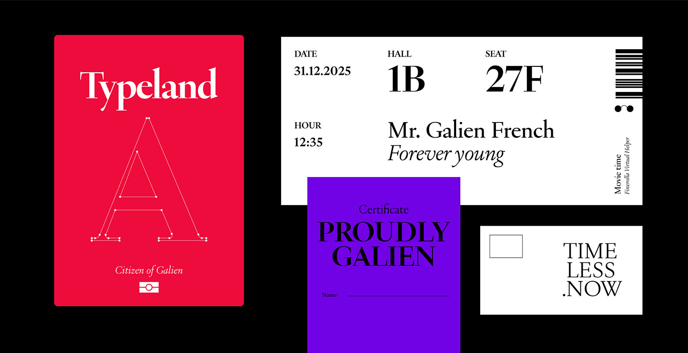
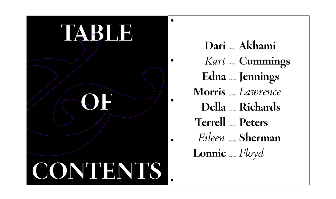
Galien will be the typeface of choice for setting highly readable texts as well as beautiful titles in projects where elegance and style are a must. It will be a perfect font family for fashion and beauty, arts and culture, education, design and architectural projects and will work well in magazines, newspapers and online publications.