Project: Web-based mobile design tool experience
Product: Custom Ink Design Lab
Role: Product Designer
Year: 2019-2020 (ongoing)
Case
The Custom Ink Design Lab is used by customers (who are typically not designers) to create custom designed shirts and apparel for their group or event.
Problem
Over 19 years, the product has undergone tech-focused modernizations, but the corresponding experience improvements were often incremental at best, and UX work was focused on the desktop experience. The mobile experience stagnated because conversion was lower than desktop, which created a languishing cycle that resulted in an increasingly poor experience for users on phones.
Approach
More than 60% of new traffic came in on mobile, but less than a third of conversions happened there. Customers were finding Custom Ink, but were being driven away by a poor experience on the device they found us on. We observed real-world interactions with the mobile Lab, conducted dozens of usability tests, interviews, and metric-based funnel analysis to determine where users were hitting the biggest pain points.
Insights
We found that the biggest issues came down to losing the context of their design and confusing navigation through menus. Most of the UI was driven by full-screen menus which covered your design until you were done adjusting. These experiences were driven by the desktop experience, and trying to reuse desktop-sized sidebars and menus and screens on mobile. Users couldn’t keep track of what effects they were changing while in menus, and doing repeated tweaks and changes meant re-navigating through several steps many times. Discoverability of useful features was poor because users wouldn’t know to dig through a menu to find a tool that would help their current need.
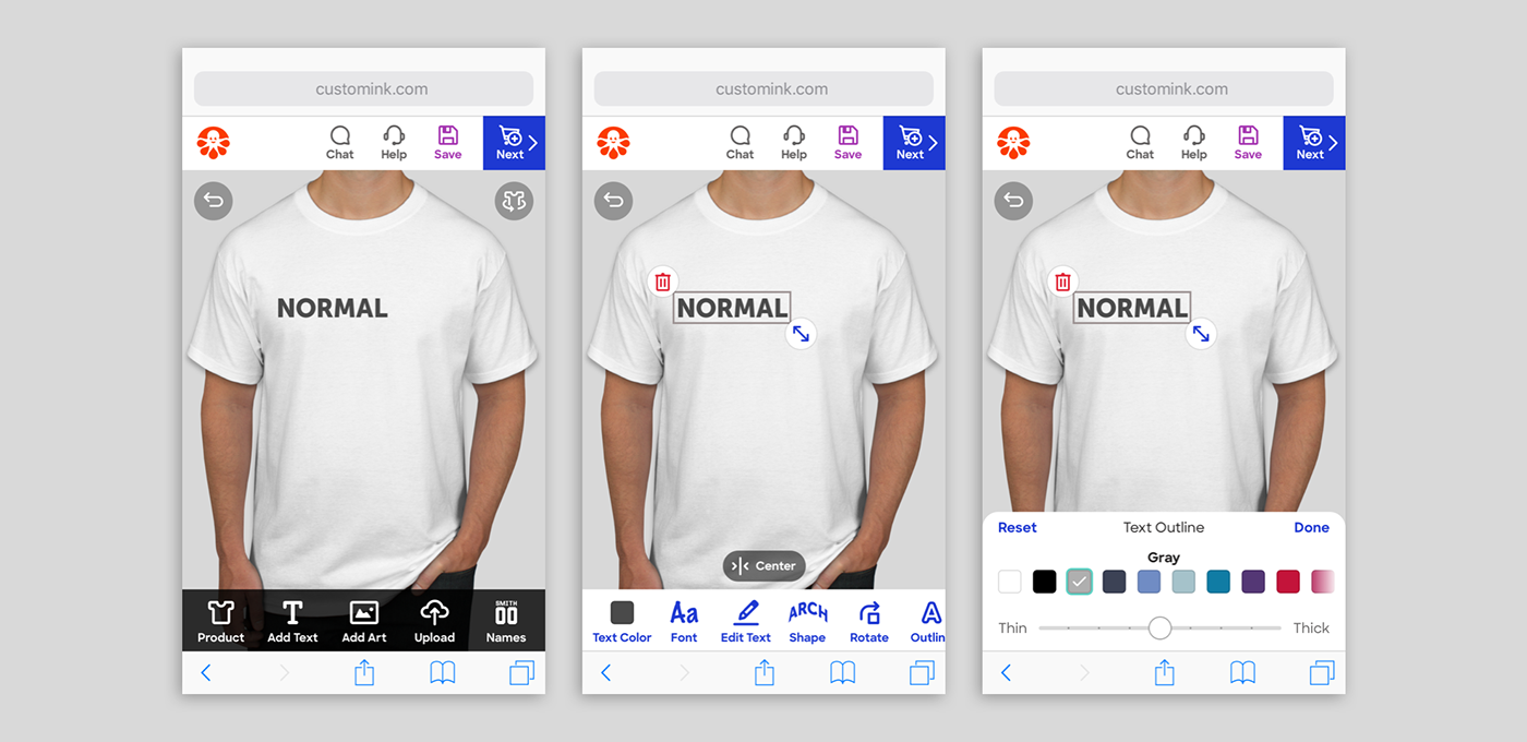
Solution
The mobile Design Lab needed to keep the customer’s design in focus at all times, and present the most relevant tools to the user directly instead of relying on menus. Navigation was kept to only one level deep, and a unique system of a contextually-driven toolbar brought only the right tools to the forefront, right when users needed them.
Evaluation
We’re part-way through this project, with toolbars for text, art, and uploads (replacing menus) seeing positive results in-market. Despite a fairly major UI change, users adapted well to the new changes and conversion remained strong. Upcoming phases include the contextual toolbars and improvements to the design canvas.

