
Context & Problem:
This app-prototype was designed as a capstone project for the Interaction Design specialization of UC San Diego on Coursera. The project took 8 weeks from start to finish. As required, it was a solo project - as such I was responsible for every role and action contained in it.
The design brief concerned (behavioral) change. I filled this in by looking at how people with ME/CFS (also known as: chronic fatigue syndrome) could be supported in discovering and implementing interventions.
Week 1: Interviews
Interviews were held with 2 current ME/CFS-patients. Rough sketches were made of several potential problems, in order to more easily keep track of them.
Week 2: Ideation
The point of view was taken that ME/CFS-patients could make better-informed health decisions when similar patients (peers) shared their own health situations. Based on this, 20 user needs were identified. Visual inspiration was gathered, as possible examples for some key components.

Illustration 1: Interview questions, sketched problem, and visual inspiration for a network of similar peers
Week 3: Storyboards and Paper Prototypes
Two opportunities were identified:
1. Searching for specific interventions (to discover the experiences of others with it).
2. Discover which peers are most similar to the user (to see what works for those peers).
For both options a storyboard was made.
Paper prototypes were sketched to support the high-level actions that would be required for both tasks (11 screens in total).
Week 4: Heuristic Evaluation and Lo-fi User Testing
A heuristic evaluation was done on my paper prototypes by a different Interaction Design-student, and vice versa. Furthermore, the paper prototypes were used for a lo-fi user test with one patient. Descriptions for problems were written down. These were then grouped by heuristic, assigned a severity-rating, and a possible solution was included. Finally, a digital version for the homescreen was made.

Illustration 2: Storyboard, paper prototype of peer network, & first digital version of homescreen
Week 5: Development Plan and Navigational Skeleton
A development plan was made, to keep track of the necessary steps, deadlines, project status, estimated time and actual hours spent.
The tasks and screens required for the basic functionality of the app were decided upon, as well as stretch goals. Basic functionality consisted of 3 tasks: discovering which peers are most like the user; discovering their situation; and tracking the user's own situation.
A high-level navigational skeleton was made for all major elements in Marvel. Most secondary components still consisted of simple placeholders. A separate color-coded map was made to keep track of the overall information structure.
Week 6: Development and Getting ready for Testing
All screens for basic functionality were developed in Marvel, as well as some screens for stretch goals. All screens were linked up into an interactive prototype. The majority of these screens haven't been revised since, and can be found in the final interactive Marvel-prototype.

Illustration 3: Development plan with progress; Basic functionality & Stretch goals; Information structure map
Week 7: User-Testing Prototypes
A testing protocol was written, including consent forms, instructions, tasks, method of recording, and debriefing. The prototypes were tested with 2 participants: a potential end-user, and a retired participant. Instructions were given verbatim, user routes were written down, and additional questions were asked. The participants managed to complete all tasks by themselves, and ran into few problems.
Afterwards, the results were analysed to identify potential problems. Potential problems were defined, given a severity rating, and quickly solved. Two versions of the home screen were developed for an A/B-test next week.

Illustration 4: Part of testing protocol; and two pictures of user testing
Week 8: Online test results
The A/B-test concerned the best location for the Friends-button. The online testing was done on UserTesting.com with 4 users. The test protocol of the previous week was used, in addition to a sixth task related to the A/B-test.
The actions of the participants were followed using screen captures. For the analysis, the results were grouped by task. Correct actions were coded green and incorrect actions were coded red. All possible problems were notated alongside the data. For each task a conclusion was written on what problems had been encountered.
The results showed that most tasks presented little difficulties for the participants, and were completed within 1 minute. A list of potential revisions was made, and some of the problems were immediately solved. The A/B-test caused some problems (in both conditions), because this task concerned friends rather than peers.
Participants reported little confusion concerning the app, wanted few changes, and thought the navigation was very clear. One participant noted that the app was intuitive, but that the design looked out-dated. That's fine by me! :)
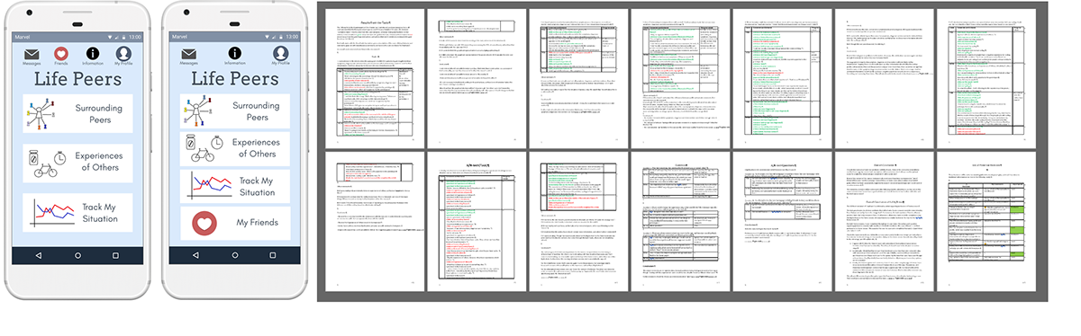
Illustration 5: Two versions of home screen; raw data and analysis of online user tests
Epilogue & Take-away
The project ended after this iteration. The final interactive prototype can be found here (click!). A fully working product would be nice, but a logical business case is lacking. That said, feel free to message me and/or steal my work for further development!
The main educational take-away for me was how important the testing with real users was. Take for example: how to communicate which peers are most similar to the user.
1. In the initial rough sketch, it wasn't clear enough which peers were nearest to the user.
2. Concentric circles were added and percentages of similarity. But not all users understood that the user was the big grey pawn in the center.
3. The icon was changed. Most online participants understood this - but not all.
4. The list-view was made the default way to show this information. It's uglier and it's not my initial concept. But it gets the point across and tends to be easier to understand for users. That was ultimately the goal: intuitive interfaces. Even when they're ugly.

Illustration 6: Iterations of communicating which peers are most similar to the user.

