


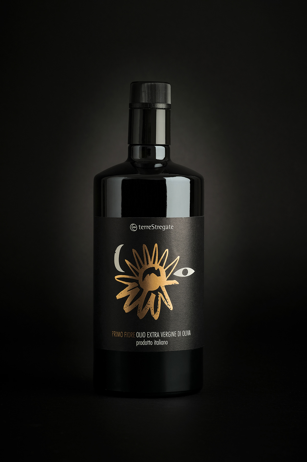
TerreStregate is a historic company that produces wines from Guardia Sanframonti, Benevento, in the south of Italy. They asked us to work on a new project of packaging for their wines.
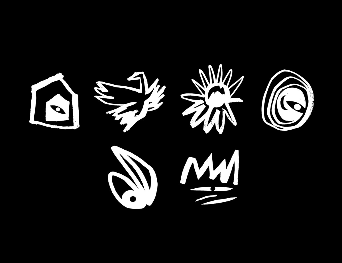
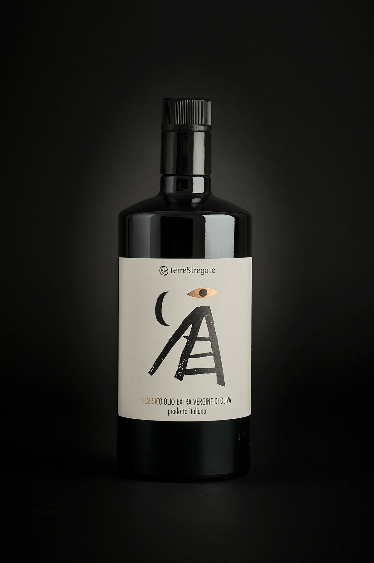
We decided to work on several signs that seemed to born from the roots of their land. We also wanted to design something that would have continued to tell the story of the witches (from which the name of the company comes from. Terre Stregate means "Hauted Lands").
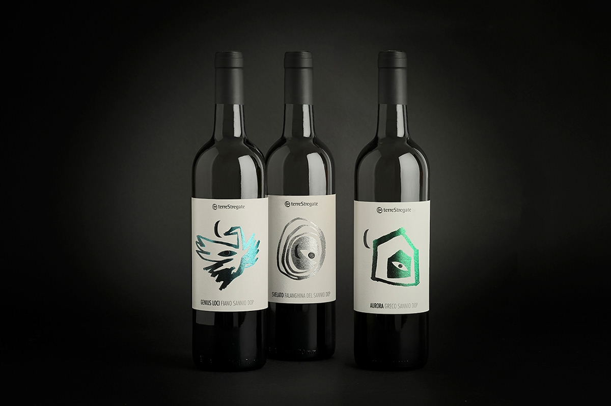
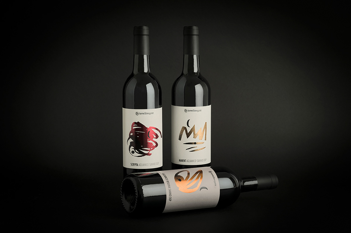
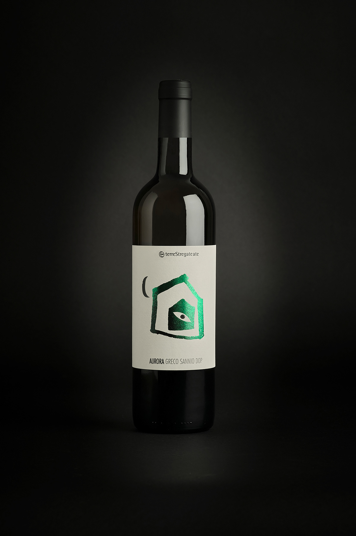
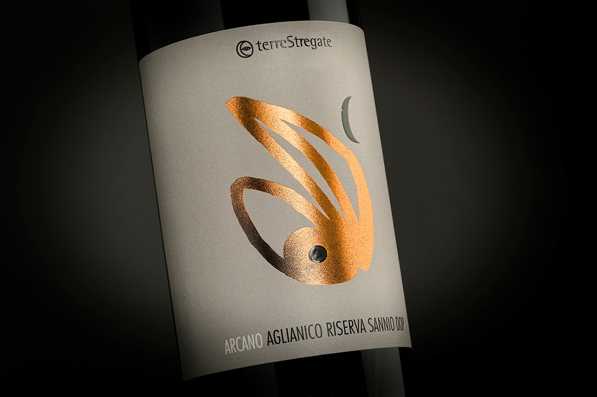
So we created this arcaic signs, rough and simple at the same time. We used each sign for one wine, mixed with the moon and the eye, which are the elements that compose the logo of Terre Stregate.
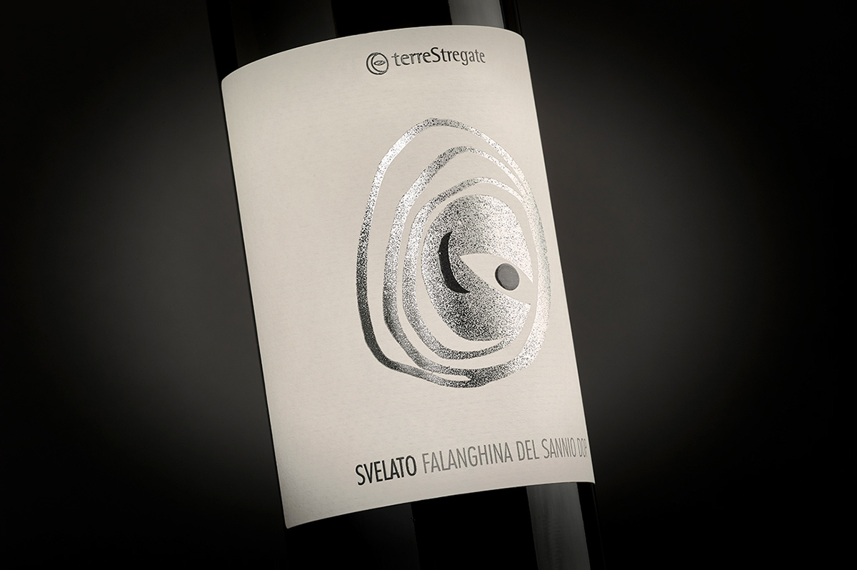

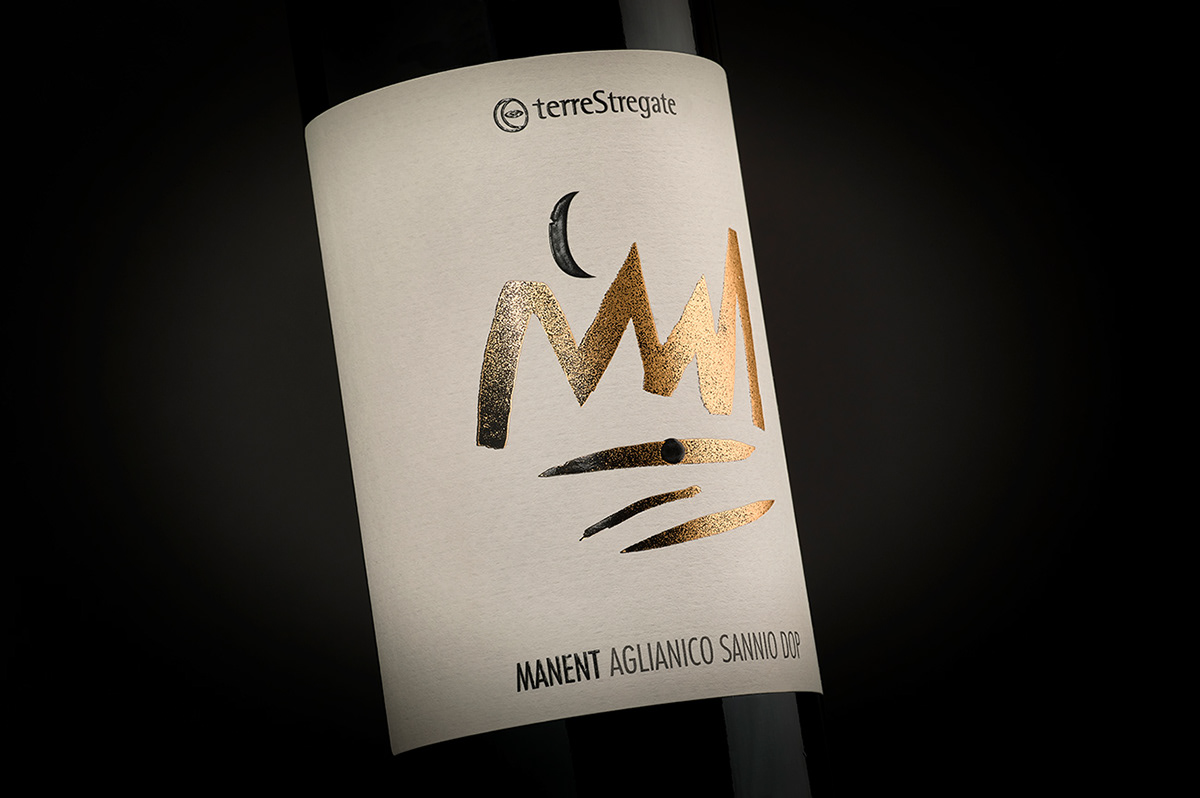
Each sign has been printed in hot foil, every label has a different color of foil.
We hope that you like it!
Take a look at njucomunicazione.com


