


Douro
Douro region, in the north of Portugal, is the oldest demarcated wine region in the world. Beside the Douro river, it's where the famous Port and Douro wines come from. It's mostly known for its historical lanscape: deep valleys carved by the river and schist mountains transformed by the people into soil to plant the vines.
As a World Heritage Site, Douro lives through its materials and landscape. Douro is wine, is gastronomy, is nature and a set of different territorries united by the river and wine production. It's an experience. It's history.


Douro is the history of man power. It's molded nature. It's a world heritage because it has been built, respecting nature. The human action changed the landscape through tradition.
That's why I propuse a humanist typeface, Goudy Old Style. It has a tilt and different thicknesses that refer to a classic handwriting, with its open and light shapes. It assigns an antique value to the logo, referring to tradition of Douro's production and landscape.


The texture of linoprint was used to create an open system. Referring to the terraces that draw on the landscape, the logo works as a reaction of the ambience where it's fitted. This dynamic system gives a place for the public to discover Douro's rich history.

As an experience, each person has their own view and story of Douro.
And that's why the logo lets each person discover the meaning of it.


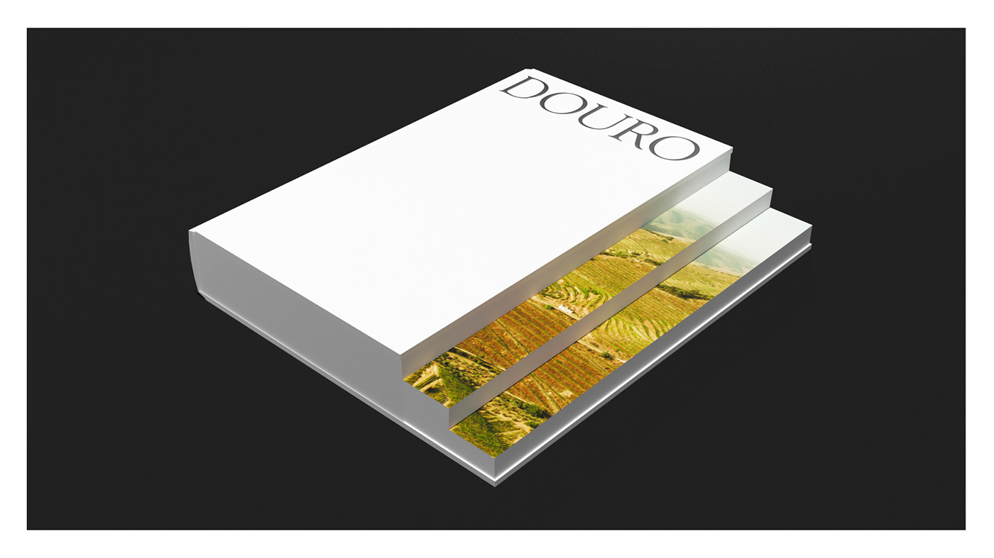
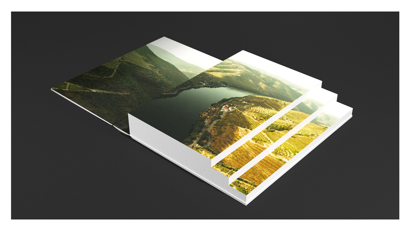
As for the concept book, as it happens in the logotype, the landscape speaks for the region.
The sape of the book refers to the terraces built on the soil.


Douro pictures by order of appearance:
1. Museu do Douro
2. Gottakeepmovin.com
3. Whotrips.com
4 - 5. Francisco Gomes of PSP Production Portugal, Spain and Malta
This project was made for the subject of Design II under the supervision of Professor Eduardo Aires, at Faculty of Fine Arts, University of Porto — Communication Design Bachelor degree.
2019/2020


