Prix. Air Freshener. Rebranding
Year: 2019
Client: Prix
Role: Logo Design. Packing Design
Tools: Adobe Illustrator, Adobe Photoshop
The goal of Prix rebranding is to expand the brand's audience through visual updating: to strengthen the loyalty of the existing target audience and attract a new one. And he also had to refresh the brand, convey its power and innovation, and stand out from the competition.
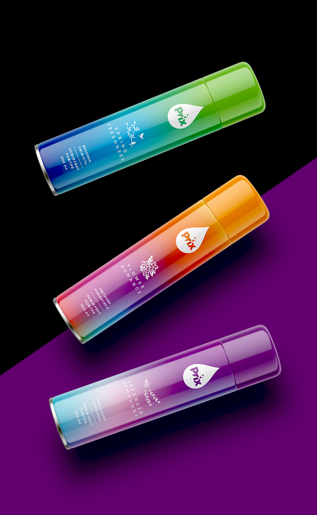
Instead of the traditional approach using flowers and fruits, gradient transitions were introduced into the packaging design. This allowed us to make the design bright, fashionable, memorable, and highlight the brand on the shelf.
Thanks to the contrasting color differentiation of the product line, it is much easier for the consumer to distinguish products from each other. Each smell has its own gradient, which conveys its character. For example, the smell of lavender visually conveys a gradient with mixed shades of lilac, purple, and blue. The smell of citrus - mixed shades of bright pink, orange, and yellow. Minimalistic illustrations complement the design and help identify the product.
Everything is simple and clear. A new logo was also developed, which organically fit into the new design and solved the problem of the readability of the brand name on the packaging for all types of products.