


This literature magazine was created with a plain cover in order to stand out for the overly-communicative magazines we find in news stands every day.


The table of contents was seppared into two different sides of the page in order to mark the two different sections of the magazine.

Great black and white pictures where used to add some rhythm breaks.


A large Bodoni type was used for titles and page numbers, while Janson, a better fit for smaller sizes, was used for the text and it's italic version was used for the pull-outs.

Light color block were used in order to differenciate different parts of the same article,

The magazine is divided into two parts. In the second one, the book part, both gride, type size and paper change for a more comfortable reading of the short stories.
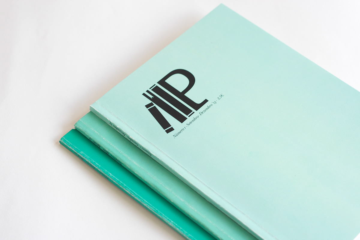
Each year the three issues will have three different hues for the same color, which is the Color of the Year picked by Pantone. This way you can identify in which year the magazine was pulished and which number it was without having to actually read the spine.


