
Building an Illustration System for Kaodim
A comprehensive graphic illustration style for Kaodim products
How we started it
By early 2019, being a part of the small design team in Kaodim, I proposed to redesign our new illustrations in our core products. Prior to this we had very few illustrations in our products, and it was not based on any strict guidelines. For sometime the long-time-sleeping artist/comic-maker in me (ermm, or a wannabe one) was having a wee-bit concern that we needed to build something fresh and new. Beginning of the year seemed like a good time to start something new and fresh.
So, why are illustrations important anyways?
Illustration is a way to communicate. An illustration accompanied with text can convey a message far better than with text alone. It can very well resonate with a user’s moods easier than words could. Also, this may sound cliched, but “an image speaks louder than words”.
Illustration is a way to communicate. An illustration accompanied with text can convey a message far better than with text alone. It can very well resonate with a user’s moods easier than words could. Also, this may sound cliched, but “an image speaks louder than words”.
Exploring ideas and establishing principles
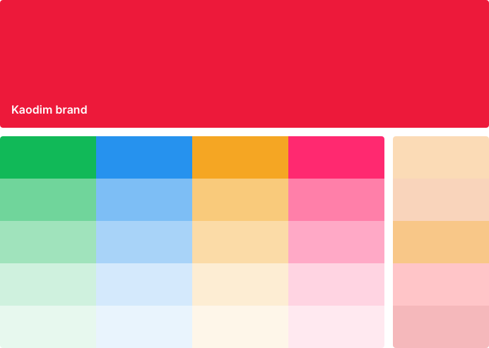
Even though art is subjective and challenging to convey the same meaning to the observer, it shouldn’t stop from defining certain principles. Simpler shapes, short strokes and limited colour palette preserving brand colour, primary and secondary colours were decided as key visual guidelines.
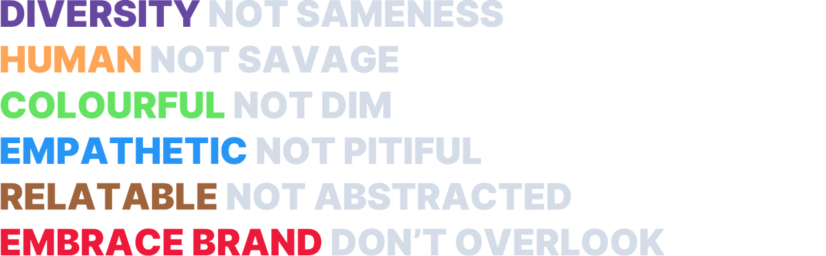
In order to explore within a set of constraints, and to not go overboard with too many ideas, we restricted explorations to few core principles:- Diverse, Human, Colourful, Empathetic, Relatable, and On Brand.
We are diverse
Kaodim group serves its users across Southeast Asia — Kaodim in Malaysia and Singapore, Beres in Indonesia and Gawin in Philippines. Our product have a diverse user base — people from different backgrounds, cultures, age groups, etc., We portray diversity with varied skin tone palette, physical features and true-to-life body types.

Be human
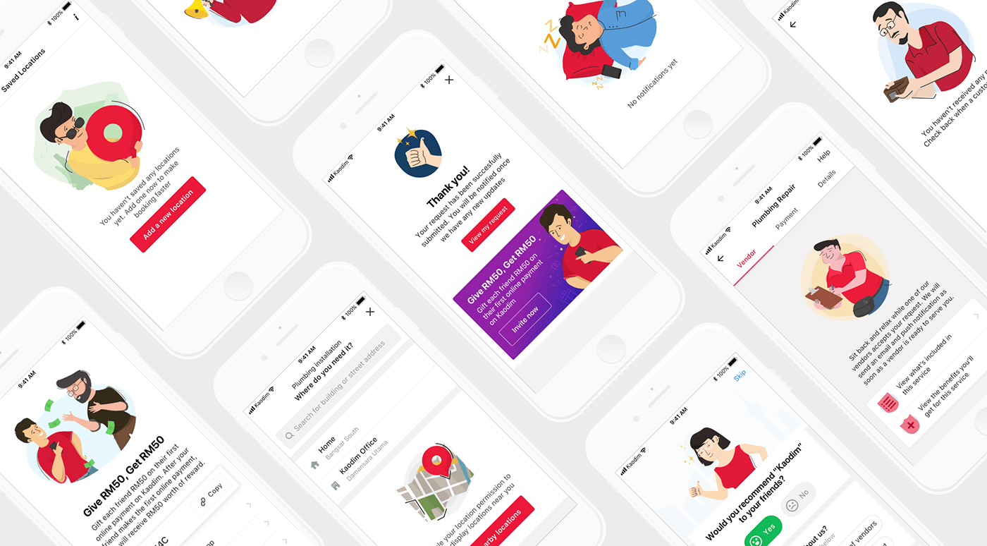
We use human characters wherever it is possible. Characters should be in action, expressive, or doing something instead of being stiff, life-less or generic.

Colourful
Although we don’t have a complete colour palette for all the colours that can be used on illustrations, we do have a recommended set of colours to be adapted from our style guide in Kaodim Design System.
Empathise with users
Empathy is fundamental in product design, the lack of it can give disastrous user experience. To resonate with our users, we try to empathise with our users on by reflecting on their emotions, thoughts or experiences.

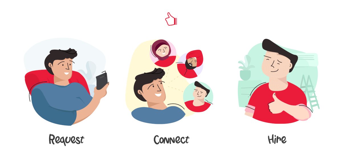
When to use illustrations
Having guidelines or style isn’t just enough, you also need to use it properly. An illustration is only as powerful as the way you present it. Avoid doing illustrations that end up being distracting or overwhelming. Respect the user’s primary goal in every situation with the product. An illustration should only guide, assist or help the user relaxed.
When do we use illustrations in our products:-
— Scenarios where a user may have no clue on what to do next
— For misunderstood or highly ignored features (including introducing to a new feature)
— Onboarding tutorials on first time launch of the app/screen)
— Assist a long text that might be misunderstood
— Success and celebratory moments
Thank you, and stay safe
Thank you for reading, and I hope this had been informative to you. While I am penning down this I am on my fourth week of working from home. We are still facing the COVID-19 pandemic and I hope for things to turn out good soon. Stay safe, all of you

Thank you for reading. This is an abstract from the full article I originally posted on Medium


