


About the Rebrand
Chappies is one of South Africa's most beloved chewing gum brands. And did you know that this heritage brand is over 70 years old? Well-known for its "Did You Know?" trivia facts on the inside of its gum wrappers, to the iconic Chappies Chipmunk mascot, this brand is held dear to many individuals for the memories they have made growing up with it.
This project aimed to redesign a South African heritage brand, along with creating a new and improved logo, corporate stationery set, and advertising mediums. Have a look at the final outcome.
The Logo


Original Chappies logo (left); rebranded Chappies logo (right)
The Chappies logo was redesigned to look more rounded, bubbly, and fun—all the while keeping a similar look and feel as its predecessor. The Chappies Chipmunk mascot was given a new makeover as well, favouring blowing a chewing gum bubble and sporting a baseball cap.
The Stationery


Various corporate stationery assets
Stationery Mockups


The corporate stationery was designed with a similar aesthetic in mind, so that it would work together as a complete set. This was achieved using rounded margins, generous white space, as well as implementing the core Chappies colours: yellow, blue, red, and white.
Social Media Posts


Instagram posts
The social media posts have the same look and feel implemented all across. This was done through the use of selecting colours from the Chappies colour palette, custom illustrations and bold texts packed with fun and informative messages. Each advert is colourful and eye-catching, engaging viewers to interact with the brand online.
Gum Wrappers


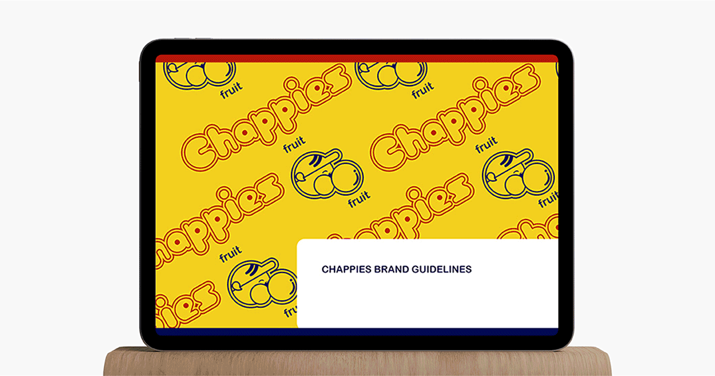
Brand Guidelines Manual
Social media icons designed by Icons8


