Savills
A pitch concept design for the high-end estate agents
A pitch concept design for the high-end estate agents
Back in 2007 Large Design had the opportunity to pitch for the website of estate agents Savills and asked me to come up with some concepts designs.
Savills caters for the high end of the property market - prices in the millions not being uncommon - so routinely have great looking properties and photography to work with. The design takes advantage of this and is heavily focussed on large format imagery to represent both the properties and the company itself. Property sales being so dependent on visual appeal this has a practical side, not just aesthetic. To emphasise the luxury feel a number of (at the time) cutting-edge animation and mash-up techniques, now far more commonplace, were proposed to add a slick feel to the user experience.
Key in defining the character is the animated horizon header imagery - every page has a continuous panorama of imagery slowly scrolling across the header area, images are joined on the horizon line and represent the wide variety of real locations where the company has property for sale. Property detail pages use the same approach but using imagery from the property in question.
Homepage

The homepage for the UK localised site, featuring imagery from property locations around the country and leading with prominent search and recently added properties. The image below shows the same page after the header strip has animated a while, scrolling slowly right to left.

In addition to visual appeal and representing the company's range of properties, the scrolling header is a suplement to the navigation - clicking on an image will perform a search for properties in the vicinity of the photograph. The above image shows a tooltip with summary information that would appear on rollover.
Search results

By default search results appear overlaid on a map - above. Tabs allow the user to switch to grid - below - or list views. Away from the homepage and product details the scrolling header is reduced to a narrower strip.

Property Details
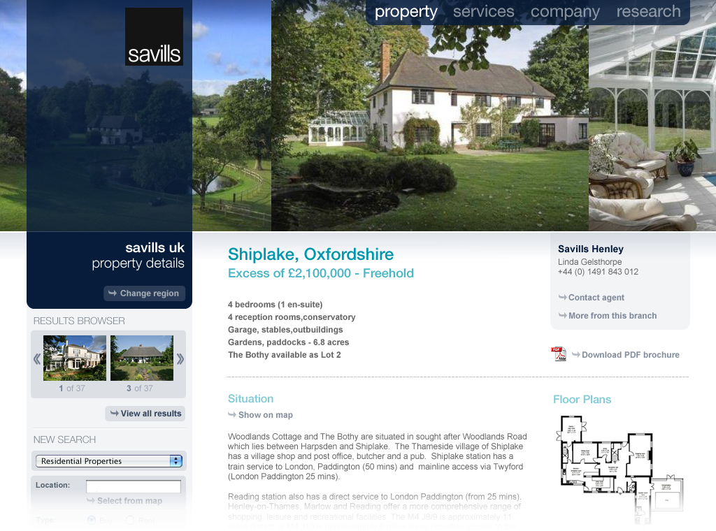
The property details page uses the same format as the homepage but with photography of the property for sale scrolling along the top rather than the regional imagery used elsewhere. Content is structured to run from summary at the top to more detail further down the page, and the sidebar contains an image based 'next/previous' nav strip above the search form.

Passing the cursor over the scrolling images reveals a pop-up filmstrip of all the property images in the scrolling bar, allowing the user to quickly flick between images rather than watch the passive scroll.


Email Alert Format

International Site

Part of the brief was to show how the UK design would be carried consistently across their international corporate site. These screenshots show how simply switching out UK based imagery for a selection from around the world allows the brand consistency to be retained while communicating an international feel.


