Naked & Sated
Naked & Sated is based on real food, without fats, sugars or additives. We banished the idea that eating healthy and well would leave you hungry. You would be satiated; you would enjoy a delicious meal without worries, a value that later became our tag line: eat without regrets.
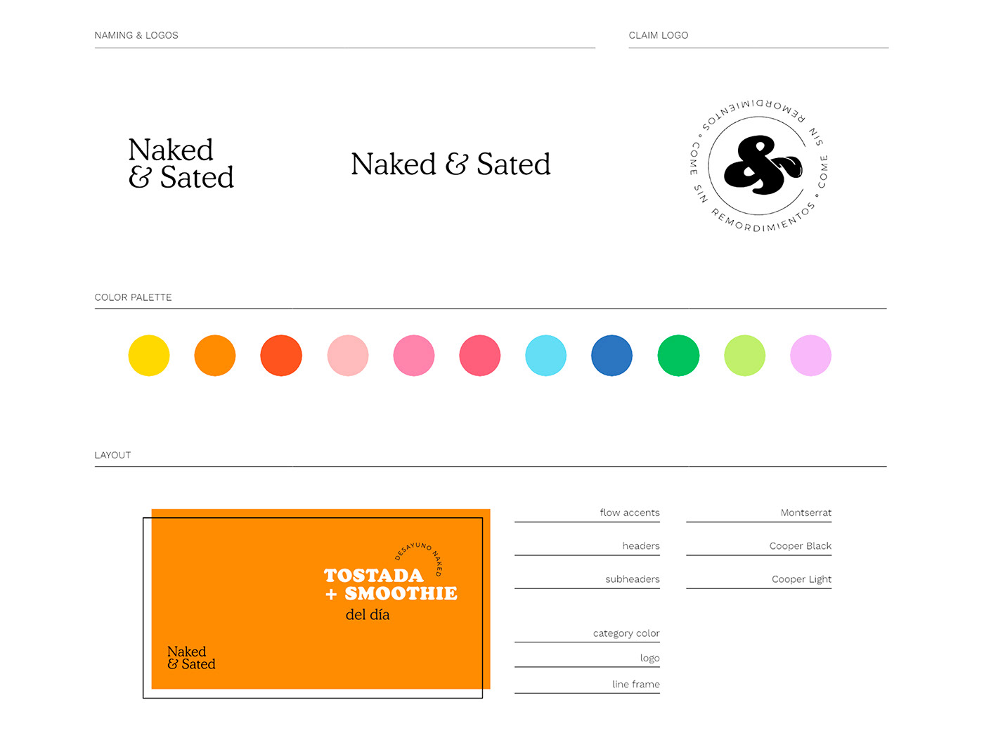
We created a visual identity based on the color of fruits and vegetables. We took advantage of the double meaning of the word Naked to
undress our products in a series of photographs that added a rogue touch to the already daring proposal of dishes. We made the restaurant menu an object of desire, a poster-size print that diners could take home.
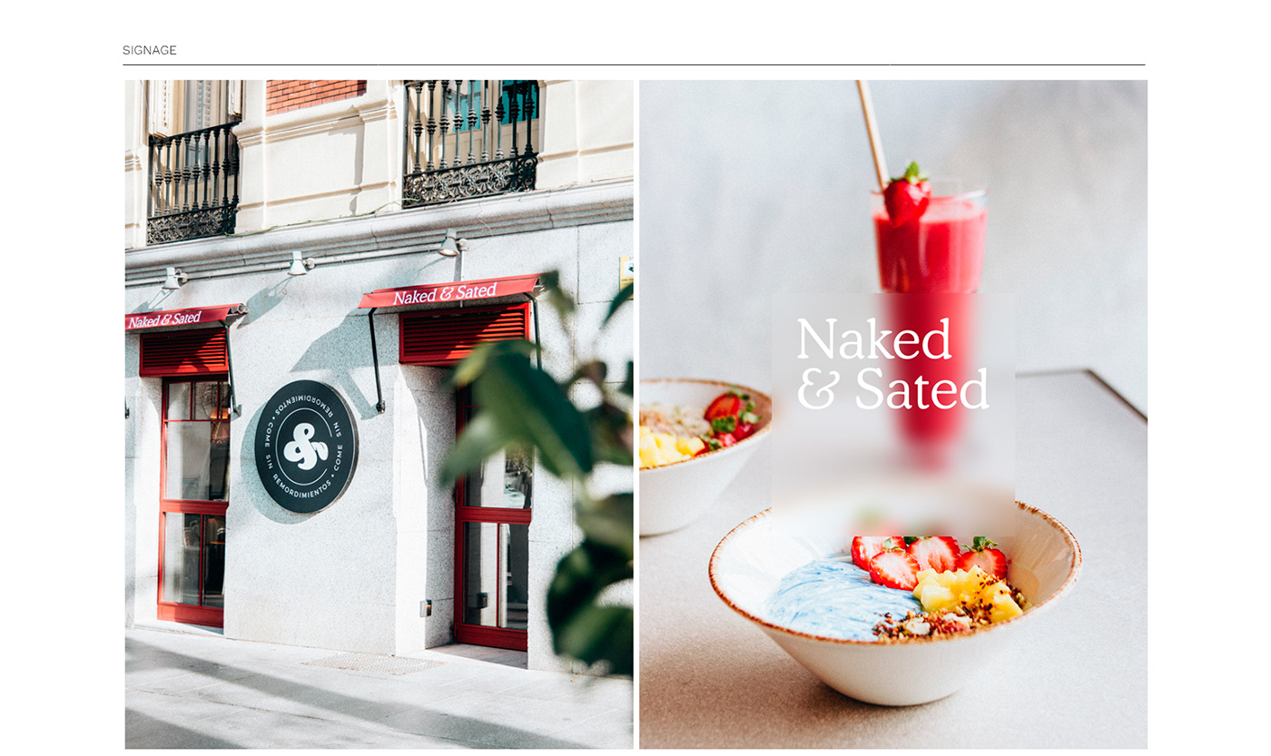
Furthermore, we needed that Naked &Sated reflects @chefbosquet philosophy: flavor, aesthetics, and proximity. So, in each opening, a
local illustrator would intervene on one of its walls, uniting art, aesthetics, and proximity. The illustrator who inaugurated the initiative was @delhambre.
We created a visual identity based on the color of fruits and vegetables. We took advantage of the double meaning of the word Naked to
undress our products in a series of photographs that added a rogue touch to the already daring proposal of dishes. We made the restaurant menu an object of desire, a poster-size print that diners could take home.
Furthermore, we needed that Naked &Sated reflects @chefbosquet philosophy: flavor, aesthetics, and proximity. So, in each opening, a
local illustrator would intervene on one of its walls, uniting art, aesthetics, and proximity. The illustrator who inaugurated the initiative was @delhambre.
Nos basamos en un naming que habla de la comida real, desnuda, sin grasas, azúcares o aditivos añadidos y desterramos la idea de que comer sano y bien te iba a dejar con hambre. Disfrutar de una comida deliciosa y saciante es el valor que más tarde se convirtió en nuestro lema: come sin remordimientos.
Creamos una identidad visual basada en el color de frutas y verduras y aprovechamos el doble sentido de la palabra Naked para desnudar a nuestros productos en una serie de fotografías que le añadían un toque canalla a la ya atrevida propuesta de platos. Con las fotografías hicimos que la carta fuera un objeto de deseo, una carta en tamaño póster que los comensales pueden llevarse a casa.
Con @chefbosquet a los mandos necesitábamos que los locales destilaran su filosofía a los fogones: sabor, estética y proximidad. Así, en cada apertura, un ilustrador local intervendría uno de sus muros, uniendo arte, estética y cercanía. El ilustrador que inuguró la iniciativa fue @delhambre.
Photography: Pablo Paniagua
Photography: Inés & Kike Garp
Illustration mural: / Del Hambre /
Murals: Garabato
___