

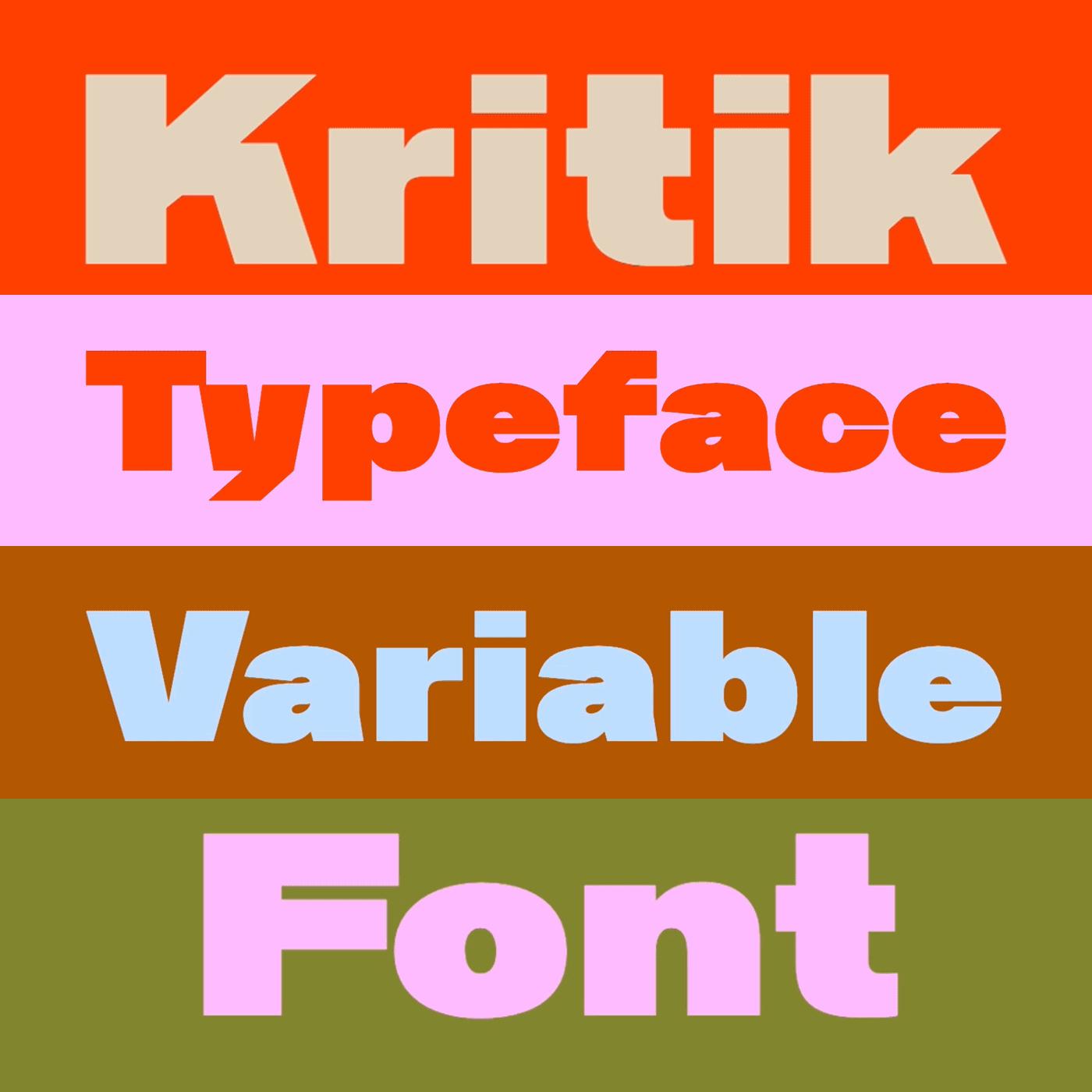
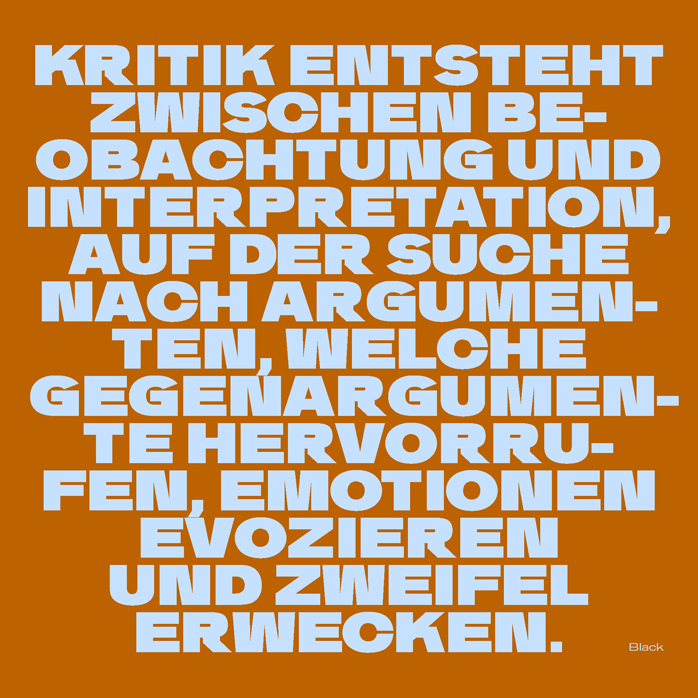
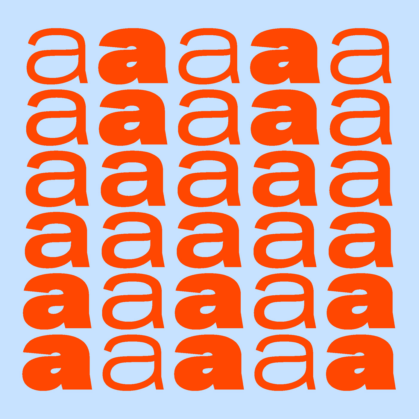
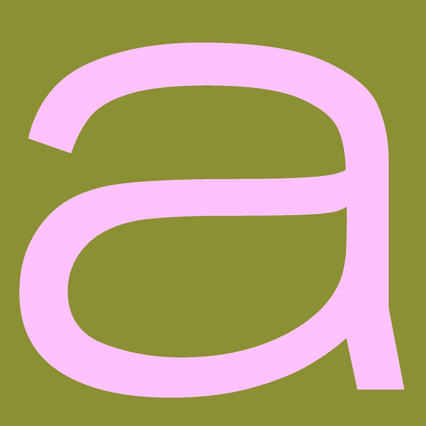
KRITIK TYPEFACE
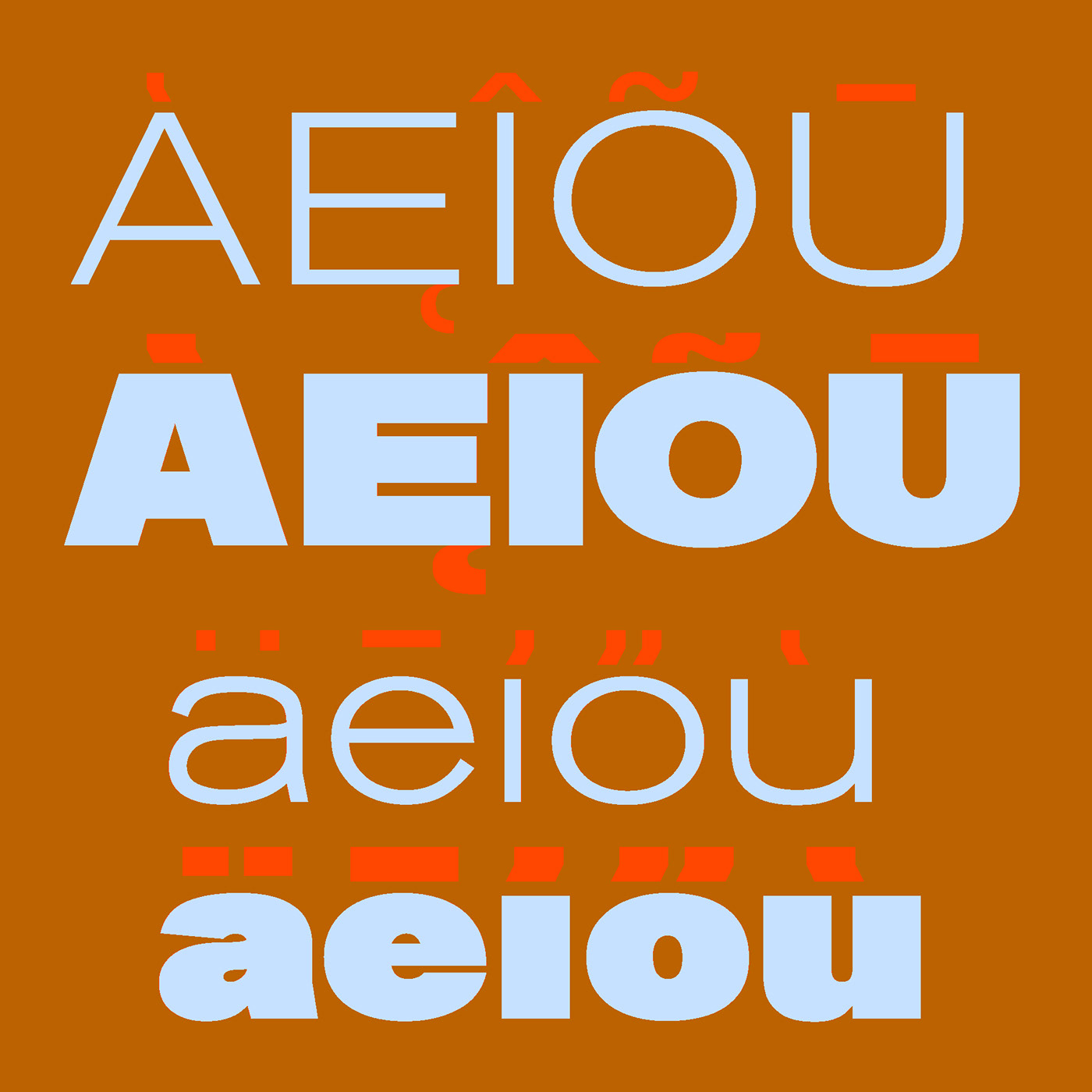
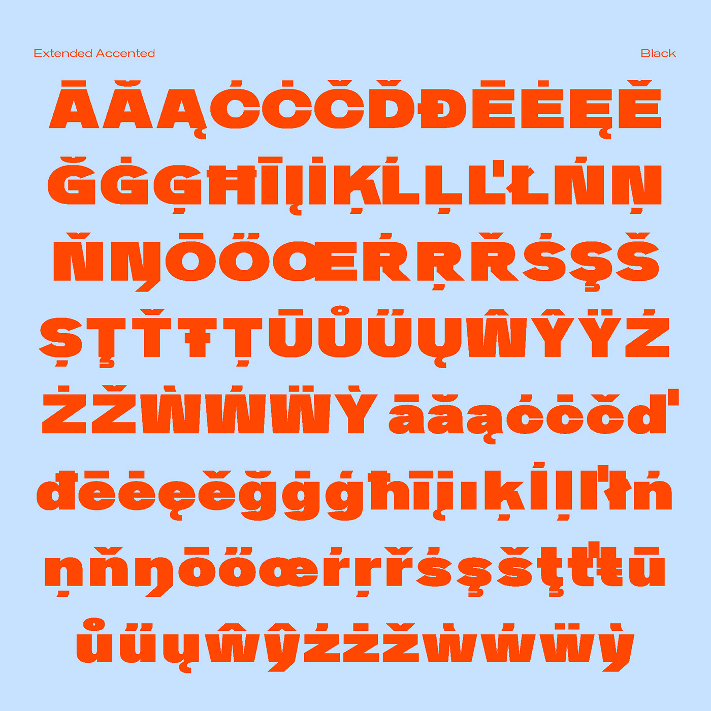
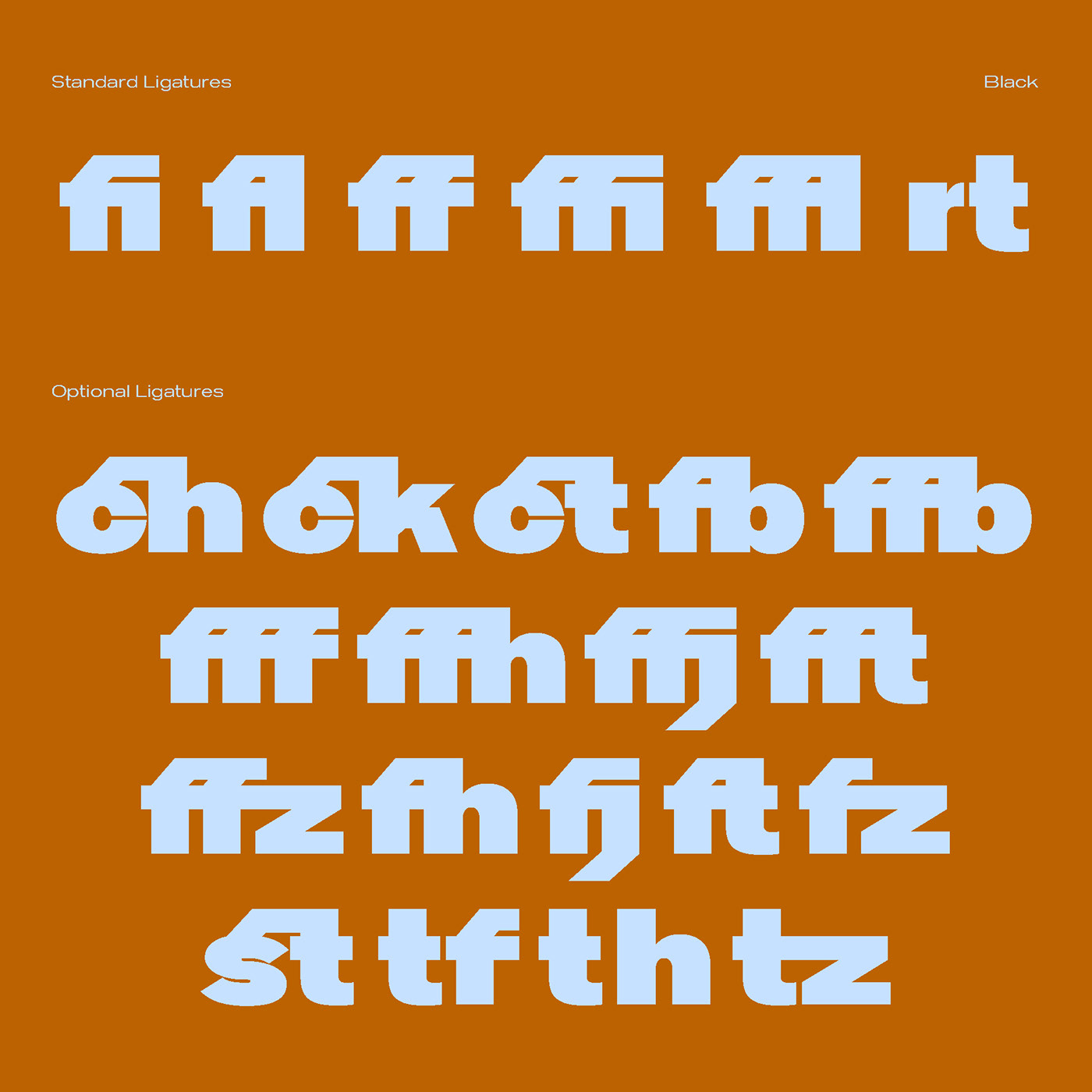
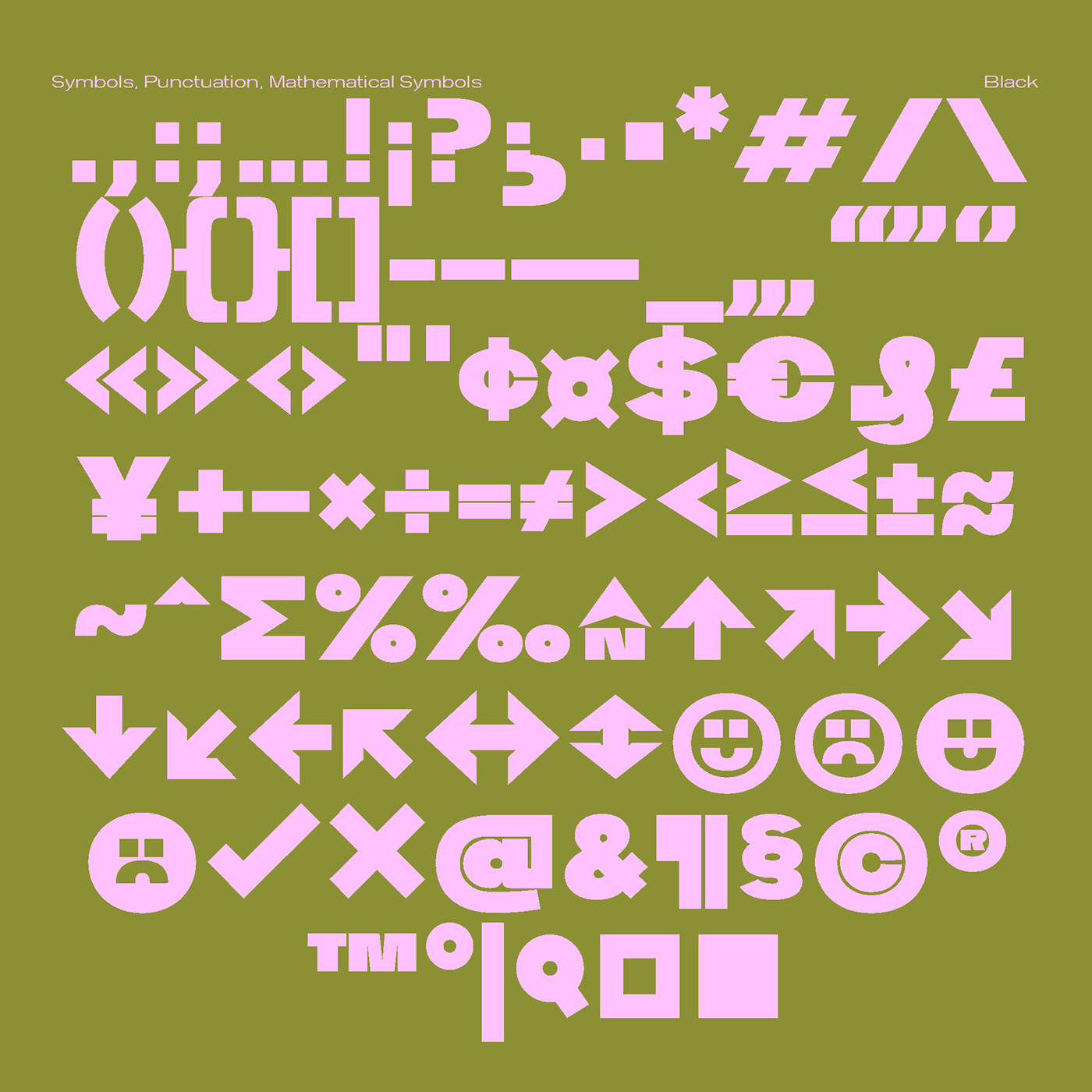
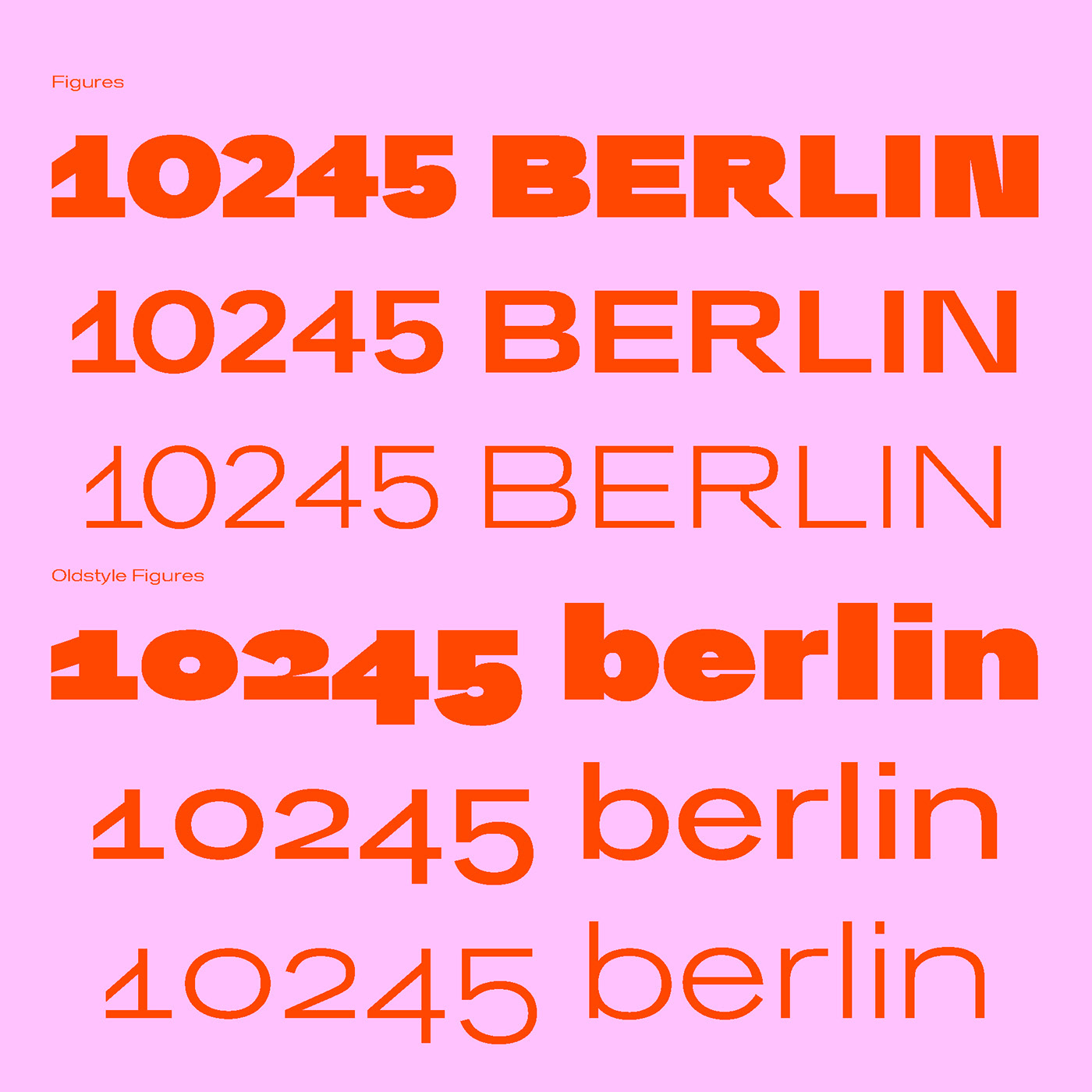
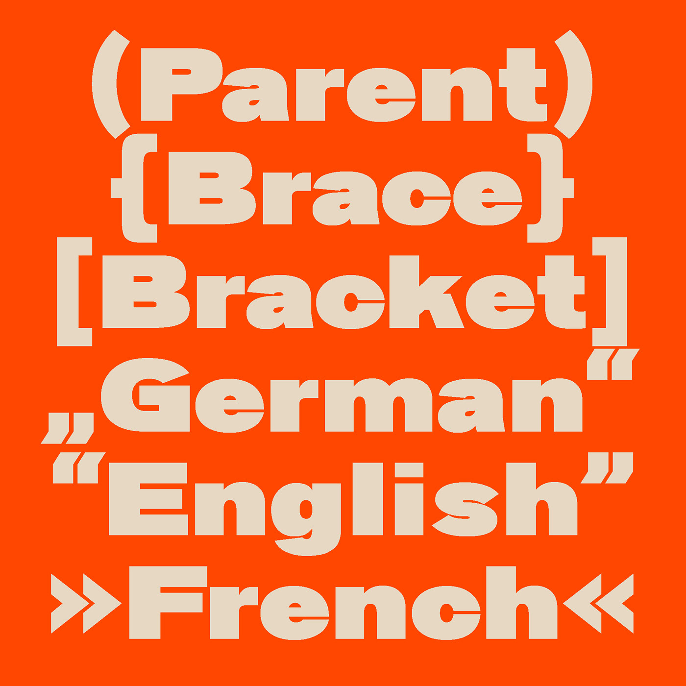
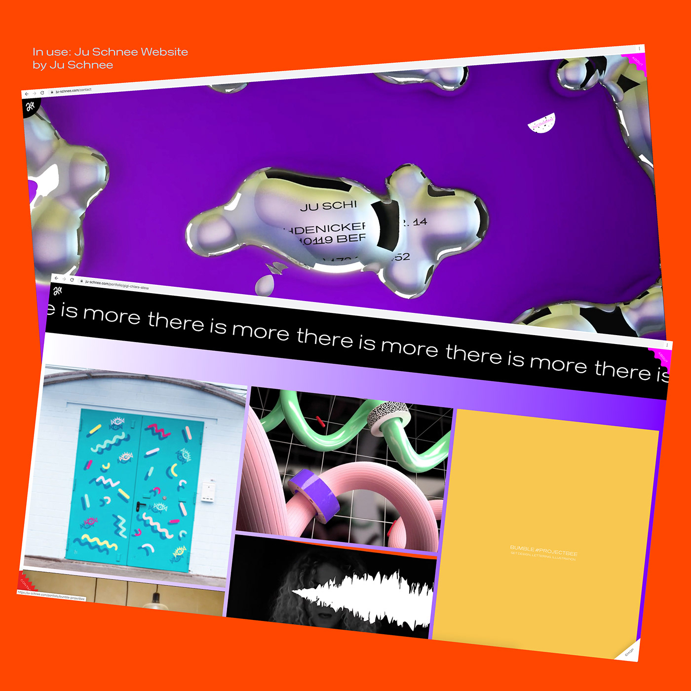
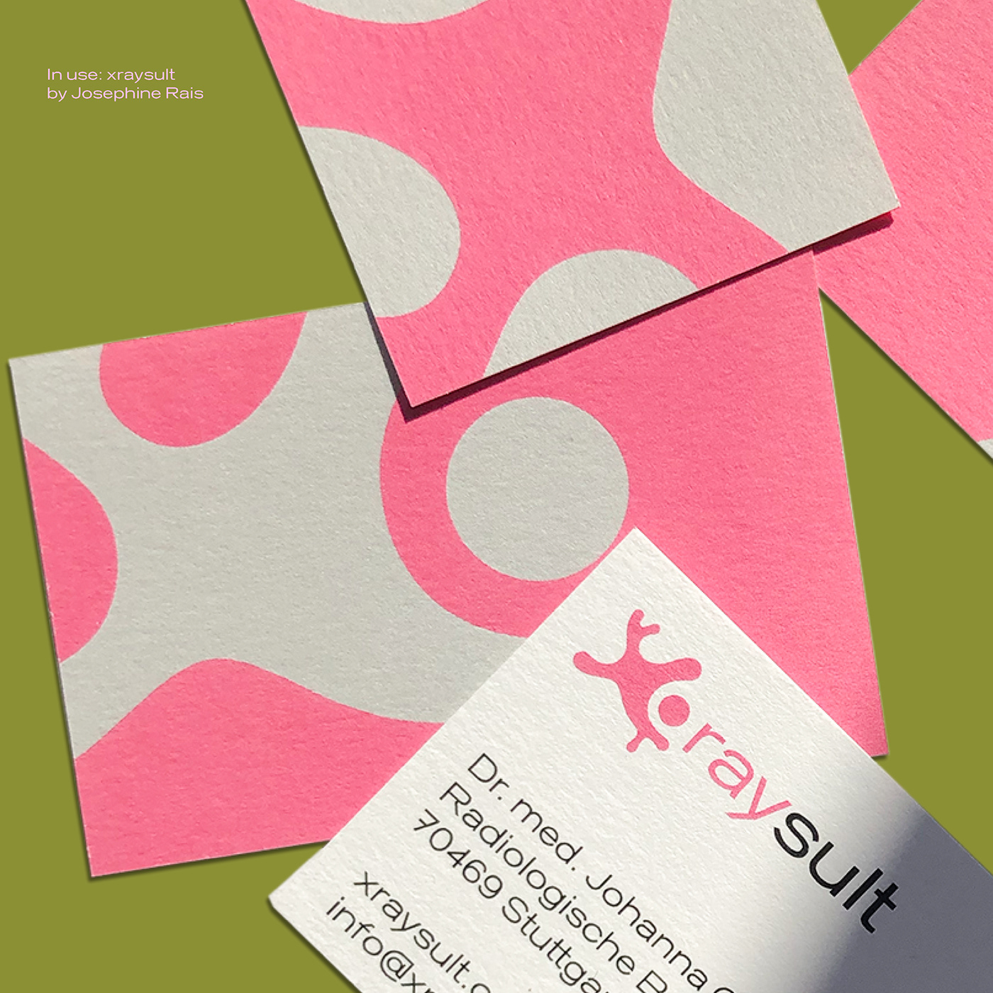
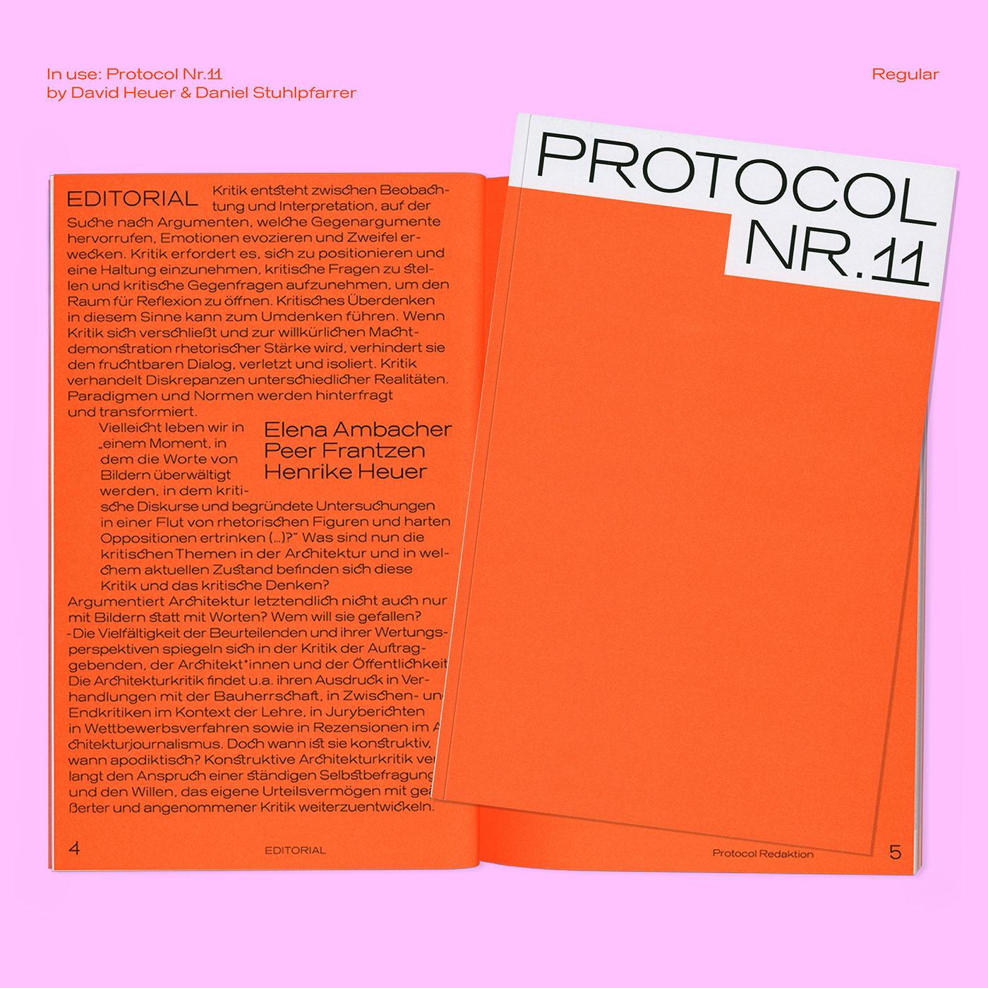
“Kritik” Typeface is specially made for the 11th issue of the Protocol Magazine. Its character is “angular” and “pointed”, but in its basic form “round” and “soft”. More and more single elements break out or are additions to an already existing scaffold, as it also occurs in architecture. The name comes from the German word “Kritik” and means criticism. “In the beginning was the word, and the word was critique. To critique is to adopt a disposition. Which frameworks of critique should we propose? Who criticizes whom? We invite you to take a stance on critique in architectural discourse, practice, and education. Whether it is stoic or brash!“ This text from the Open Call for the Protocol Magazine is the basis for the whole type design. Criticism can be hard and destructive or soft and constructive. Both conditions have been turned into a typeface. This produced a type family consisting of 1 Variable Font and 7 fixed weights:
“Kritik” Typeface is specially made for the 11th issue of the Protocol Magazine. Its character is “angular” and “pointed”, but in its basic form “round” and “soft”. More and more single elements break out or are additions to an already existing scaffold, as it also occurs in architecture. The name comes from the German word “Kritik” and means criticism. “In the beginning was the word, and the word was critique. To critique is to adopt a disposition. Which frameworks of critique should we propose? Who criticizes whom? We invite you to take a stance on critique in architectural discourse, practice, and education. Whether it is stoic or brash!“ This text from the Open Call for the Protocol Magazine is the basis for the whole type design. Criticism can be hard and destructive or soft and constructive. Both conditions have been turned into a typeface. This produced a type family consisting of 1 Variable Font and 7 fixed weights:
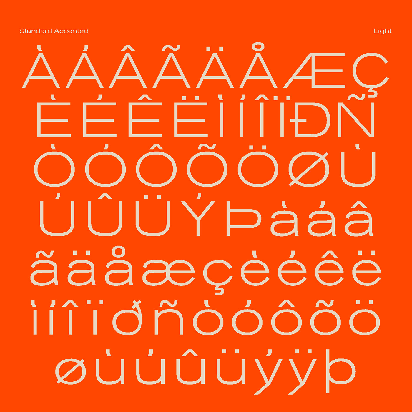
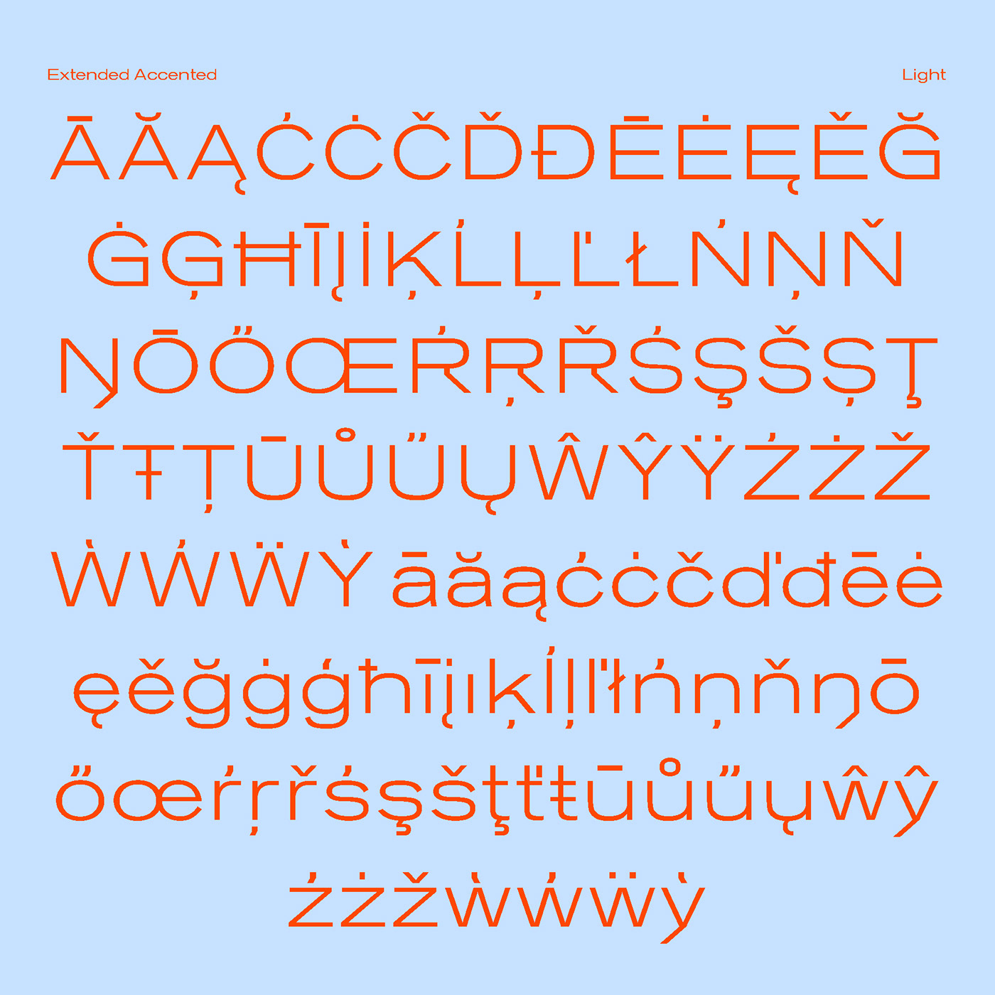
Light
Regular
Medium
SemiBold
Bold
ExtraBold
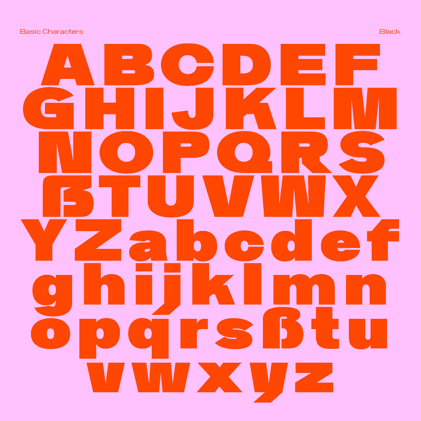
Black
Available on request in OTF, TTF, WEB & VAR.
Bold
ExtraBold
Black
Available on request in OTF, TTF, WEB & VAR.


You can test the typeface on www.danielstuhlpfarrer.com and request trial versions via mail and Type Department: https://type-department.com/collections/fonts/products/kritik
Thank you!
Thank you!


