


“Moda” is Latin in origin, and nobody blinks an eye at it in Rome, but the further east you go from Italy, the more delicacy is demanded in its usage. You have to be careful with “moda”. Otherwise it can just end up sounding contradictory.
Established in 2011, lamoda is now Russia’s biggest online fashion retailer. Rebranding is more than just a reaction to growth, it reflects the natural shift from being an e-commerce platform to a daily fashion consultant; the shift from technology to the human, whether it be employee or customer. And this shift had to come with a change in shape. Or, should we say, a new visual angle?
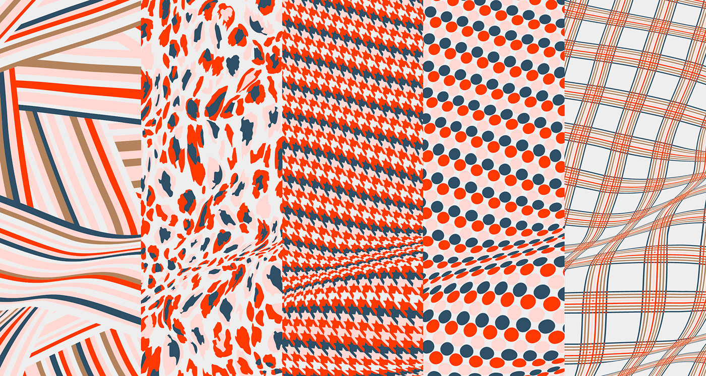
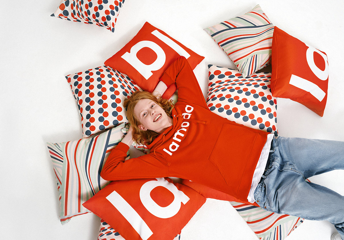
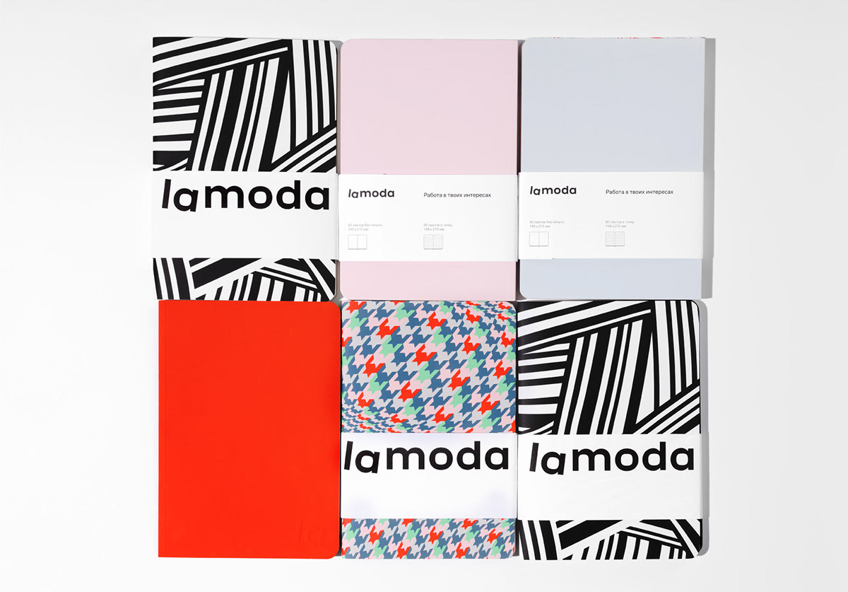
Stripes and squares, leopard skin and houndstooth. All these are the classic patterns we crafted the key visual from. Interwoven with the gold, skies, and primroses of the color palette. Lamoda is no longer just about fashion. It is fashion.
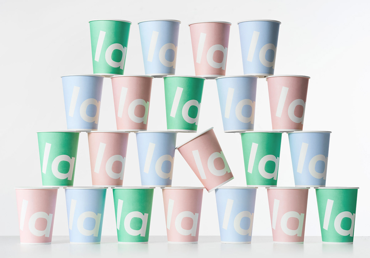
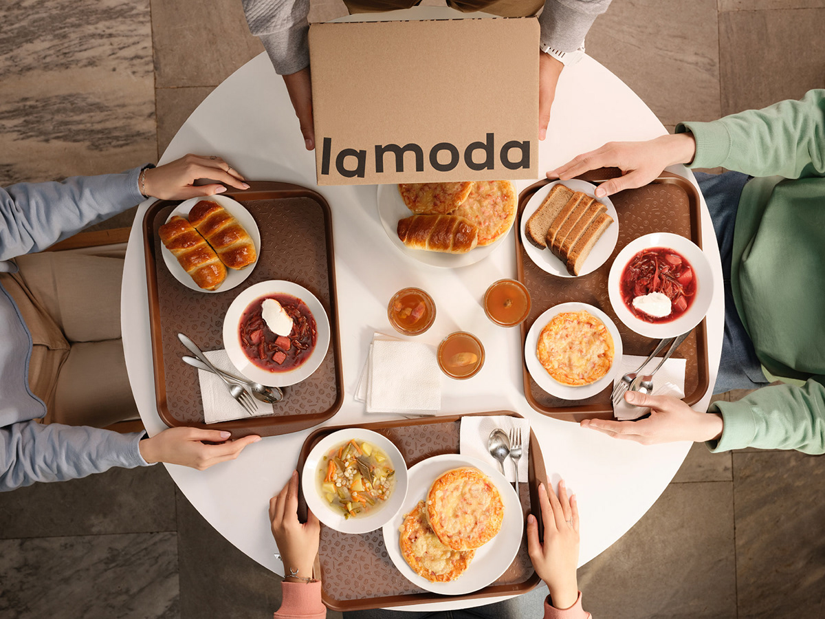
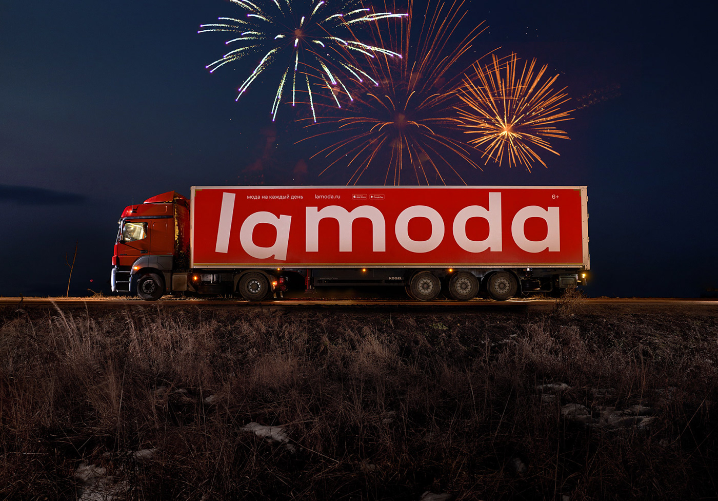
We revisited all lamoda’s business units (the website, app, delivery service, and planned offline stores), and developed a consistent visual system for it. We added an irony to the message. The boxes, company vehicles, advertising, and merchandise — everything is united.
The old logo didn’t suit the internet era of apps and SMM. Now the la is an icon. But it’s also a vocable, an exclamation, an emotion. Its Italic modification is the brand's heritage. We just exaggerated the angle. That’s how we preserved it to become a metaphor of an easy outlook on fashion. The inner spaces of the vowels are round squares, this holds the composition. Like the stitches that keep your coat from falling apart.
#shukadesign 2020

Old logo


SHUKA
creative directors → ivan vasin, ivan velichko
creative directors → ivan vasin, ivan velichko
art director → alexander koltsov
designers → marina gaiman, valya lazareva, konstantin frolov
motion designer → dmitry okulich-kazarin
photographer → ivan knyazev
designed by shuka ®
© all rights reserved