

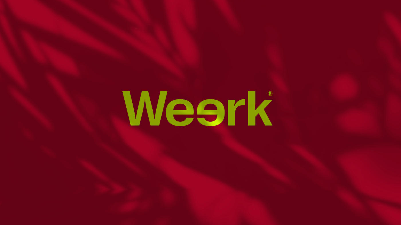
Weerk ®
Branding + Packaging Design
[PT-BR]
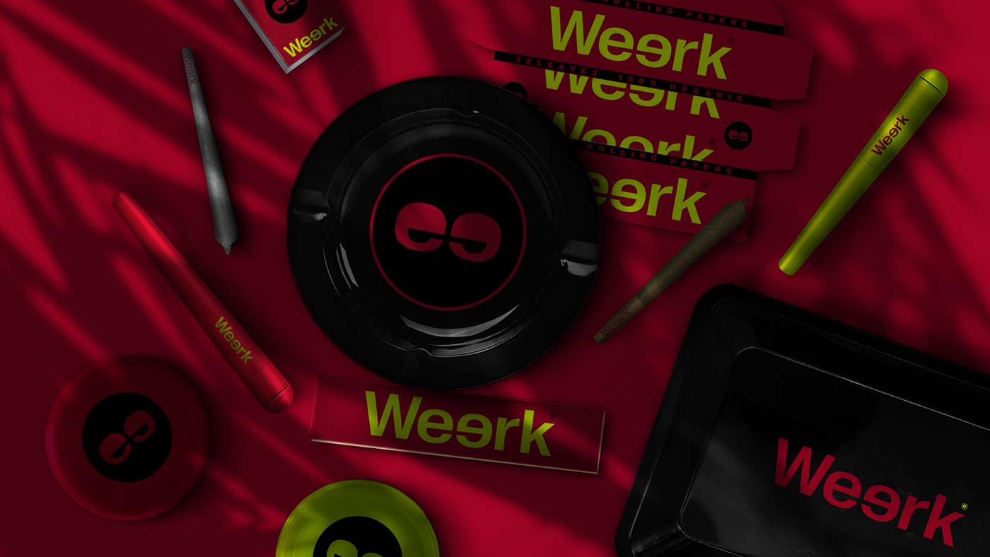
Conceito: Weerk® é uma marca que produz artigos relacionados ao universo tabagista e canábico. Sedas, piteiras, esmurrugadores, cinzeiros e porta-tabacos, são alguns itens encontrados nas coleções de produtos da marca. De forma consciente e discreta a Weerk® quer ressignificar o estereótipo dos usuários e simpatizantes da cannabis. Diferente do que é imposto pela sociedade em alguns lugares, a marca trás a tona pessoas saudáveis, que trabalham, estudam, tem um ritmo de vida ativo e que não dispensam utilizar técnicas alternativas de relaxamento em seus horários livres.
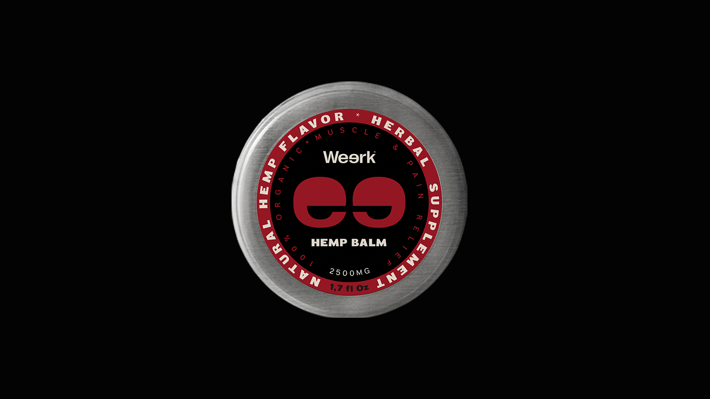
Marca: O ícone de apoio é formado pelas duas letras "E", presentes no centro da palavra Weerk. Ao isolá-los e adicionando um circulo em volta, formamos um "rosto". Esse rosto/símbolo, faz menção aos olhos do usuário canábico, que tendem a ficar ligeiramente fechados.
Marca: O ícone de apoio é formado pelas duas letras "E", presentes no centro da palavra Weerk. Ao isolá-los e adicionando um circulo em volta, formamos um "rosto". Esse rosto/símbolo, faz menção aos olhos do usuário canábico, que tendem a ficar ligeiramente fechados.
[ING]
Concept: Weerk® is a brand that produces cannabic and smoking-related products. Rolling papers, filters, ashtrays, grinders, saverettes are some of their collection items. In a conscient and discreet way, Weerk® wants to reframe the stereotype of users and sympathizers of cannabis. Unlike whats assumed by society in some places, the brand brings to the picture healthy people, that work, study and have an active lifestyle and also don't dismiss alternative ways for relaxation in their free time.
Brand: The support icon is created by the two letters "e", showed at the center of the word Weerk. Isolating them and adding a circle we created a "face". This face/symbol mentions the eyes of the cannabic user, which tend to be slightly closed.
Brand: The support icon is created by the two letters "e", showed at the center of the word Weerk. Isolating them and adding a circle we created a "face". This face/symbol mentions the eyes of the cannabic user, which tend to be slightly closed.


__
WEERK
Executive Project: Oh! My Brandness
Creative Direction & Design: Lucas Ribeiro
____
Lukthis. Studio ® 2020.


