


HAMCORE – это не просто бренд, а сильная команда инженеров, программистов – криэйтеров! Современный подход к автоматизации и возможностей самореализации создал потрясающий, доступный и конкурентный продукт.
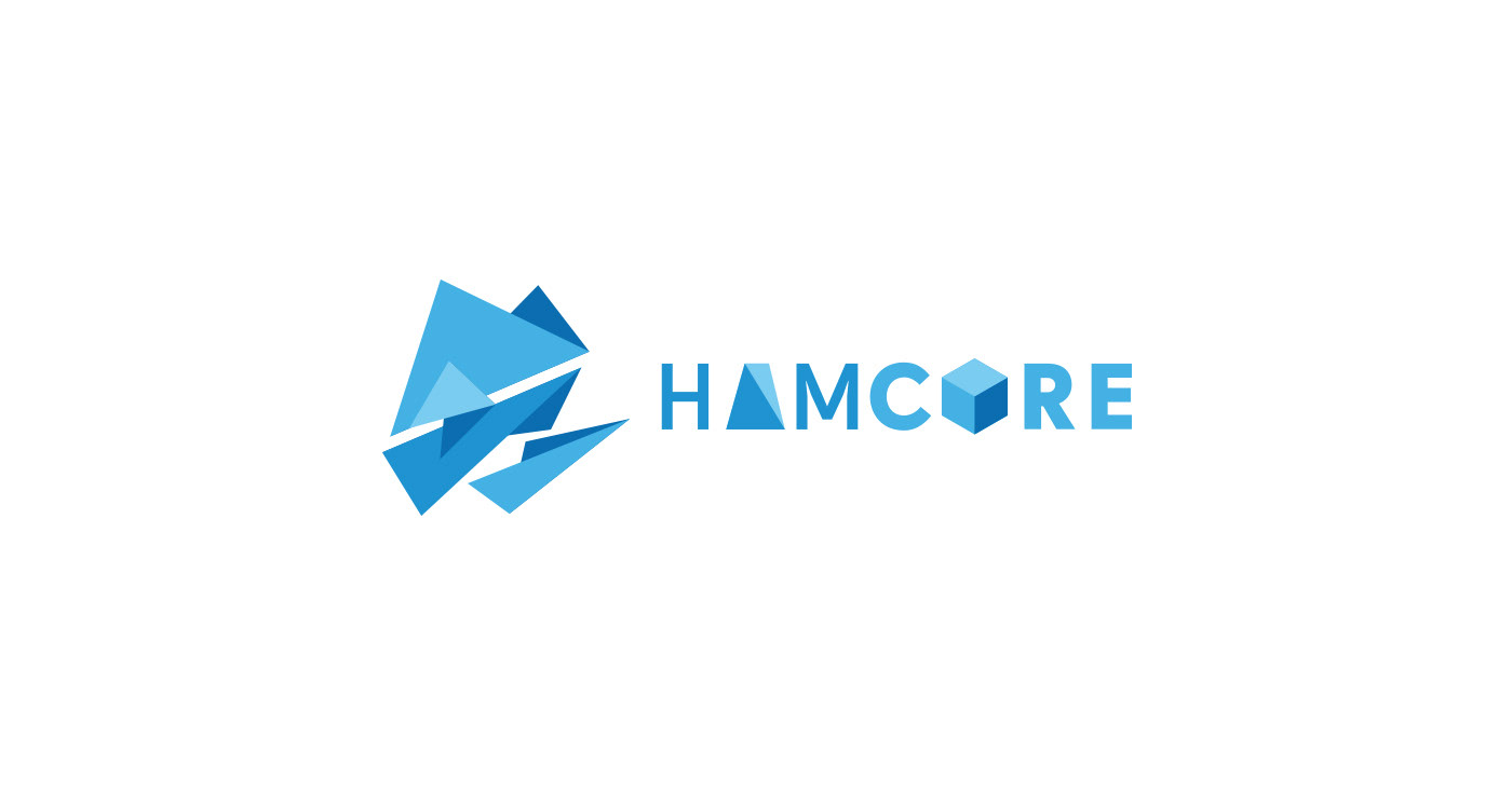
При разработке фирменного стиля бренда я использовал простые геометрические фигуры что бы подчеркнуть технологические формы. Добавил пространство искажением и перспективой, без света и тени, а использовал веер синих оттенков для более сильного ощущения глубины перспективы.
Что бы уйти от преобладания небесных оттенков и вдохнуть сильный, грубый, несгибаемый характер металла в фирменный стиль я добавил акцентный цвет.
Черный цвет выделяет самые важные элементы бренда, символику и заголовки. Черные плашки на вылет легко внедрились в пространство острых геометрических фигур, и снова не требуют света и теней – сознание зрителя добавляет их автоматически. Это было в основе разработки для легкого воспроизведения в большей части промышленными методами - убраны тени и растровые эффекты.
Для того что бы продукт стал ближе к пользователю, стал добрее, стал другом в работе и получил «имя» – было решено построить суперсимвол на органических формах головы хамелеона – что очень хорошо сплетается с продуктом – это обьединение 3 дорогих продуктов в 1 доступный любому дизайнеру или предпринимателю малого бизнеса.
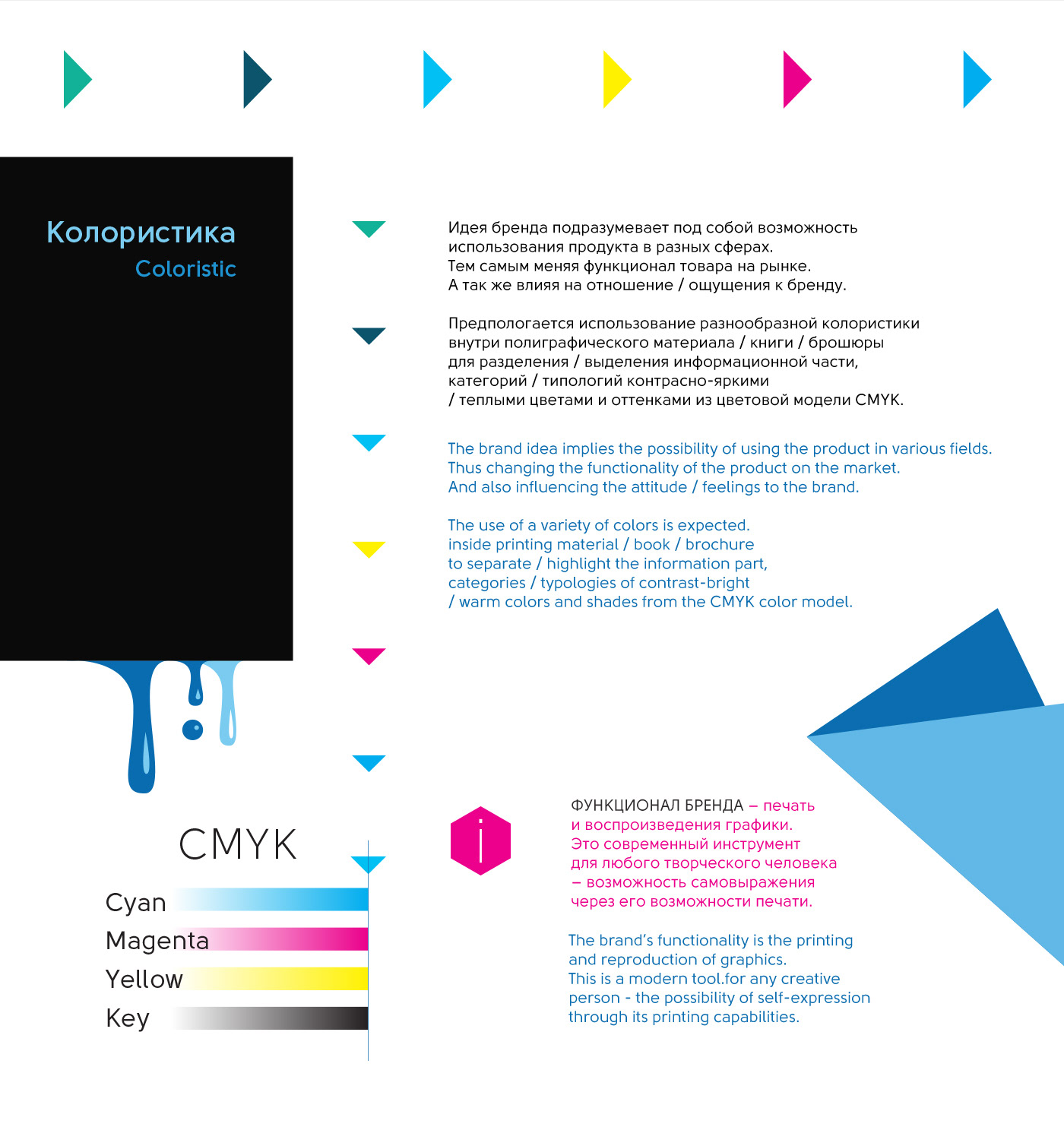
Полиграфия — основная коммуникация бренда на этапе знакомства с пользователем это инструкция. В нее кто-то налил все краски, которыми печатает принтер: во время печати — принтер окрашивается в стиле Поп-арт, брызгами и маленькими каплями, приобретая свою эксклюзивность. Я сохранил это в инструкции используя окрашивание элементов фирменного стиля для выделения разных разделов, что бы пользователь использовал это как визуально-ассоциативные закладки, и легко мог найти нужное описание или функцию.
Мерч — была разработана коллекция принтов на футболки, как «витрина» на выставках, презентаций и тестирования возможностей печати.
––––––––
HAMCORE is not just a brand, but a strong team of engineers, programmers and creators! A modern approach to automation and self-realization opportunities has created a stunning, affordable and competitive product.
When developing the corporate identity of the brand, I used simple geometric shapes to emphasize technological forms. He added space with distortion and perspective, without light and shadow, and used a fan of blue shades for a stronger sense of depth of perspective.
In order to get away from the predominance of celestial shades and breathe in the strong, rough, unbending nature of the metal, I added an accent color to the corporate identity.
Black color highlights the most important brand elements, symbols and headlines. Black dies for departure easily penetrated into the space of sharp geometric shapes, and again do not require light and shadows - the viewer's consciousness automatically adds them. This was the basis of the development for easy reproduction for the most part by industrial methods - shadows and raster effects were removed.
In order to make the product closer to the user, become kinder, become a friend at work and get a "name" - it was decided to build a supersymbol on the organic forms of the chameleon's head - which interweaves very well with the product - this is a combination of 3 expensive products into 1 accessible to any designer or a small business entrepreneur.
Printing - the main communication of the brand at the stage of acquaintance with the user is an instruction. Someone poured into it all the colors that the printer prints: during printing - the printer is painted in the style of Pop art, splashes and small drops, acquiring its exclusivity. I saved this in the instructions using the coloring of corporate identity elements to highlight different sections, so that the user would use this as a visually-associative bookmark, and could easily find the desired description or function.
Merch - a collection of t-shirt prints was developed as a “showcase” at exhibitions, presentations, and testing print opportunities.
Спасибо за внимание и оценку!
Всем добра!
Всем добра!
Thank you for your attention and appreciation!
Good to all!
Good to all!
;D