
Client: «Skarabævs» is a pr agency, focused on b2b. Specialized in editorials and the development of complete marketing concepts for industry customers.
Job: identity and corporate website

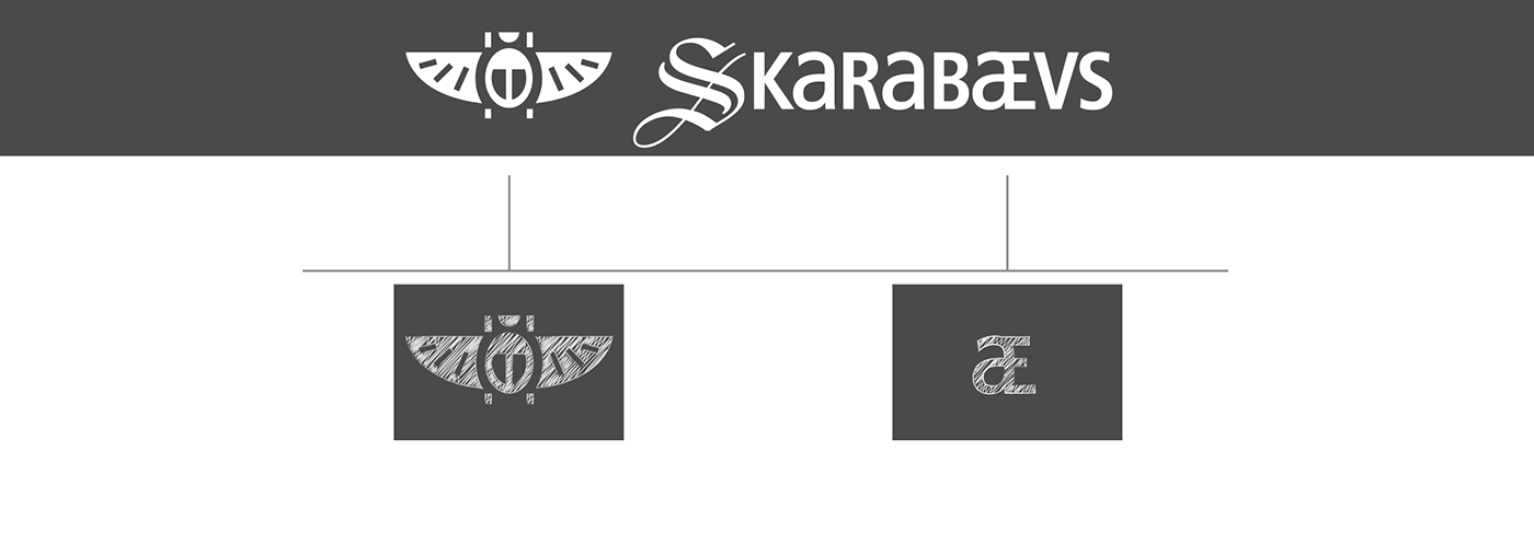
Logo
We wanted to create a logo that shows both, a clear and neutral look and visual barbed hooks. This was achieved by making the brand name a bit harder to read – first of all by mixing upper and lower case letters and especially by connecting the lower case a with the upper case E to a ligature. Additionally we used a V instead of a U, like it's typically be seen on latin scription tablets. The adjustment of the lower case letters' thickness was a quite important task.
The Skarabaevs bug itself was created just as minimalistic as possible, whilst keeping the characteristic shape of the animal at the same time.
▼
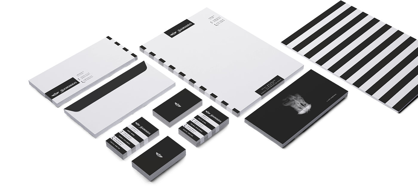
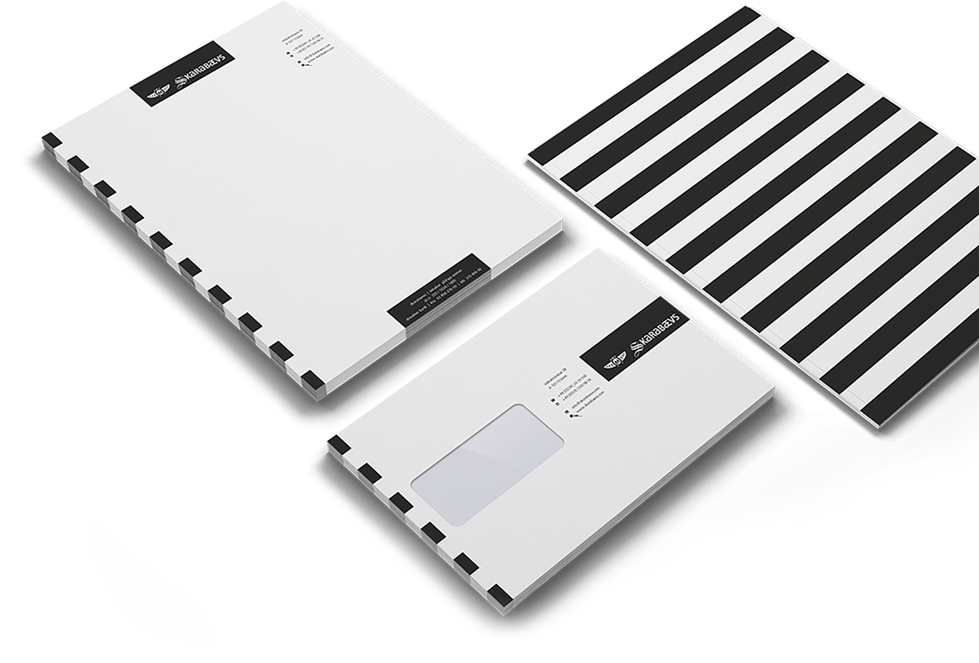
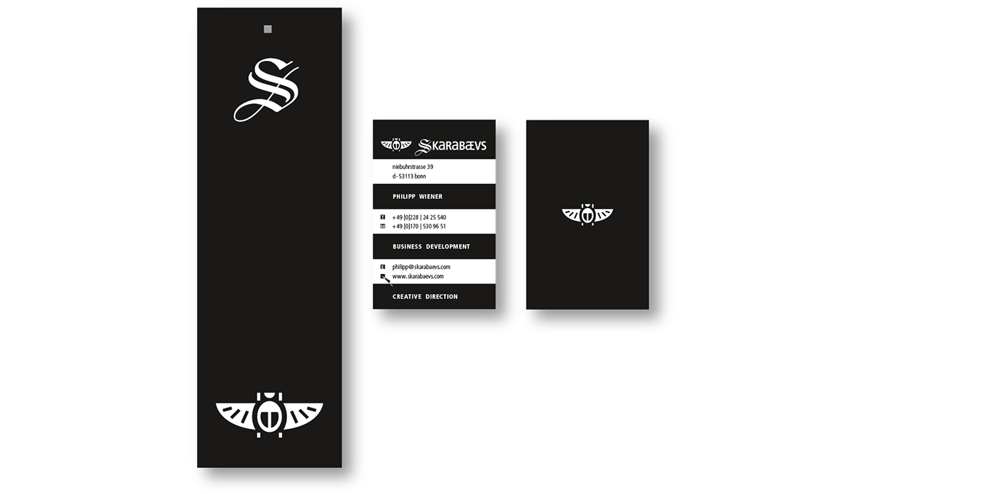
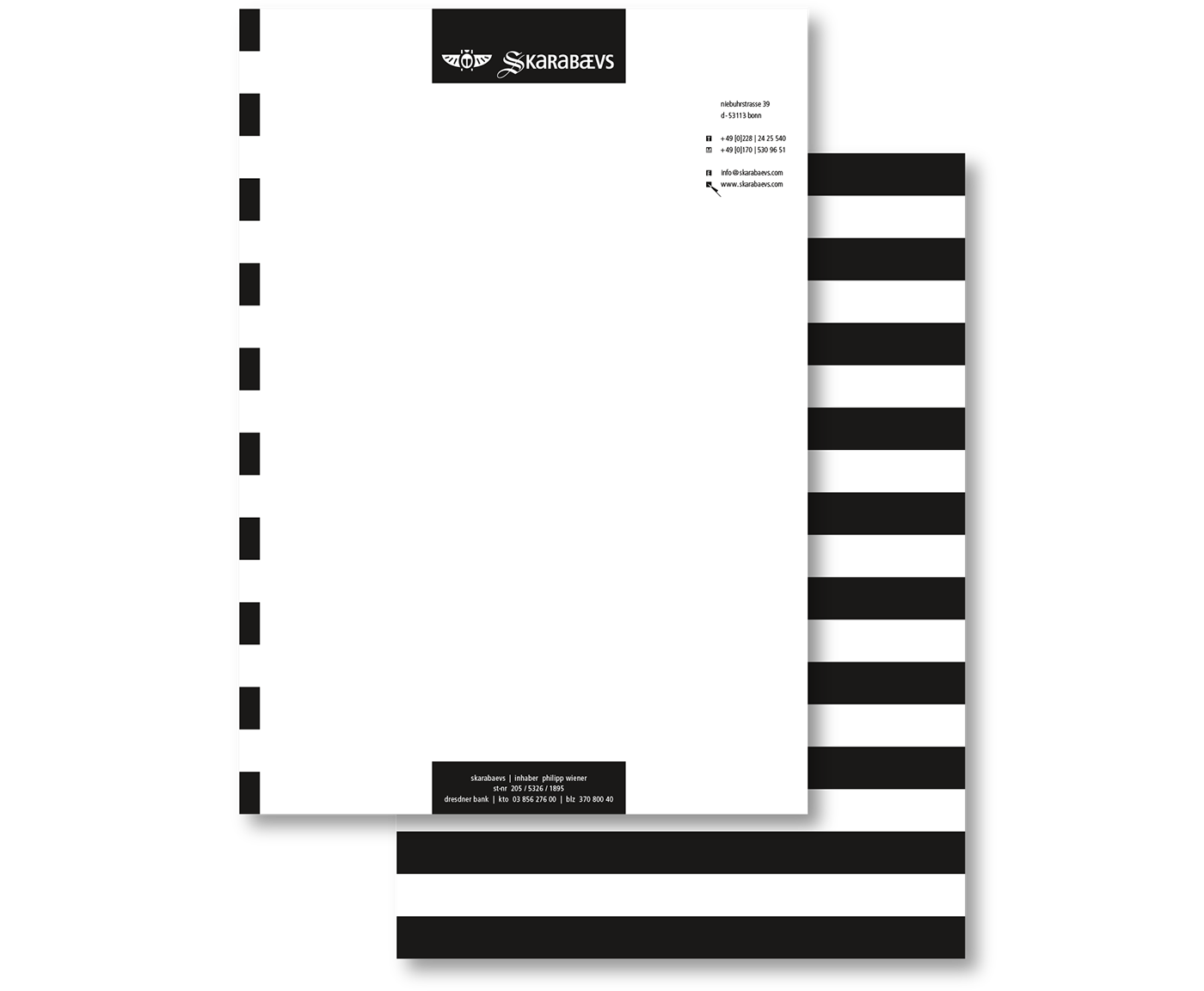
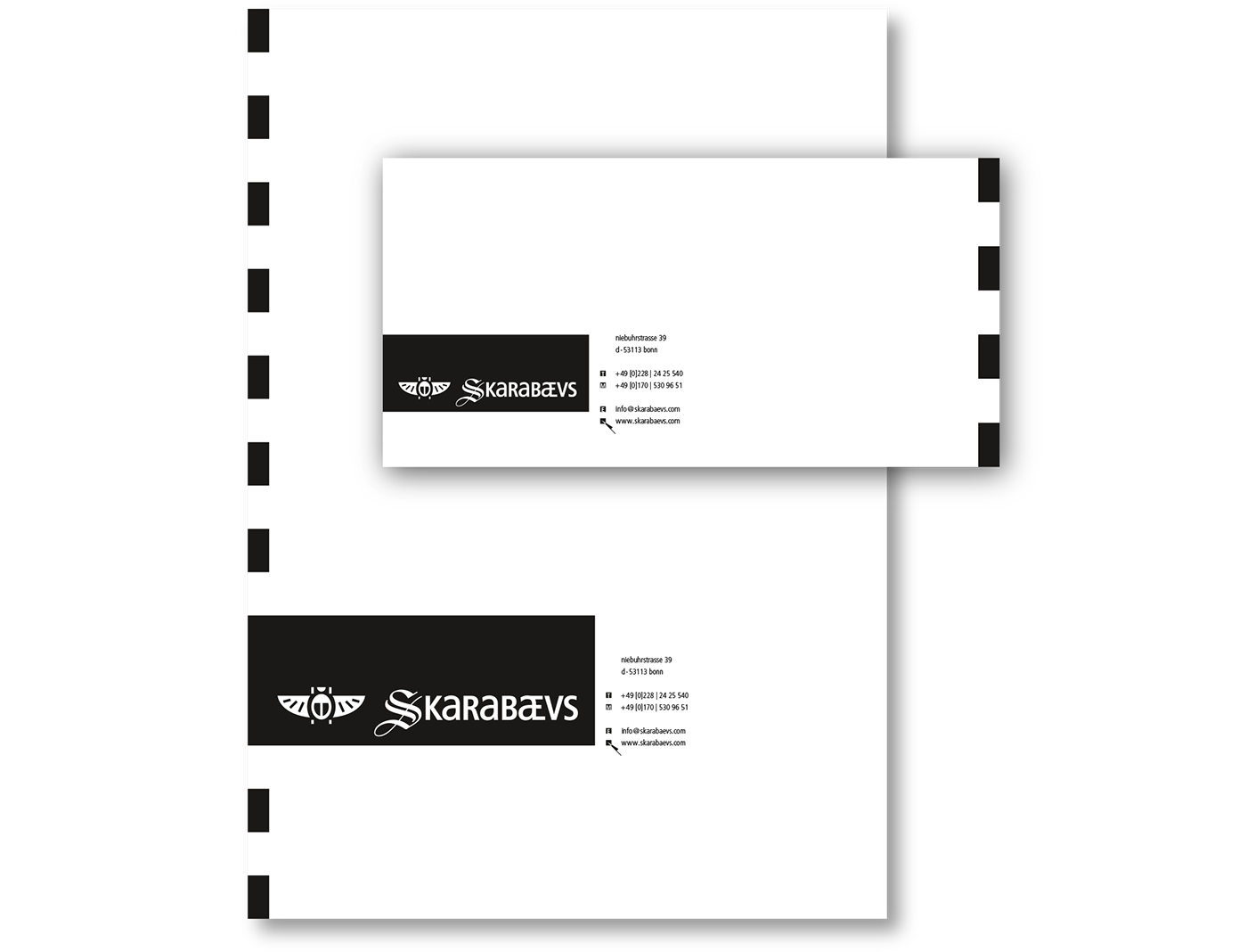
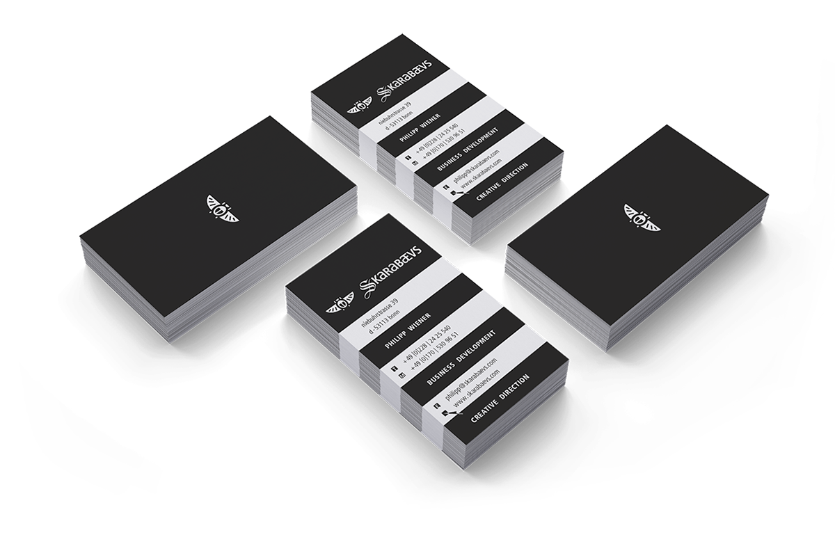
Stationery
We chose jet black as the only corporate color for the whole identity and combined it with a cosistent blockstripe-design. Honestly, we wanted to show a certain kind of self assurance by designing the identity seemingly as reduced as possible. That’s restrained, but it’s loud anyway.
▼
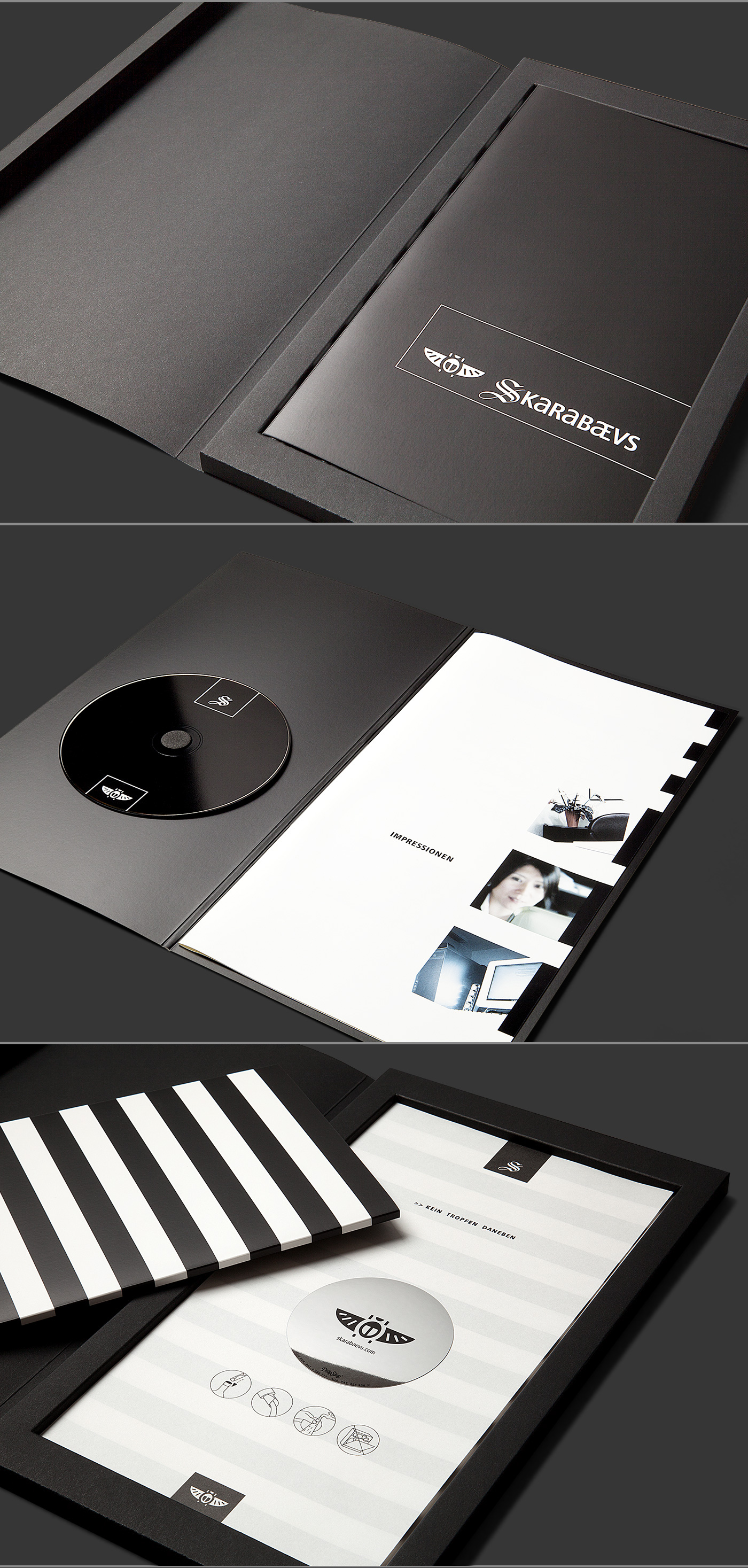
Company Profile Brochure & Multimedia Presentation
The print brochure presents a services overview – the included cd contains an interactive movie, delivering deeper visual insight into the company's portfolio.
▼
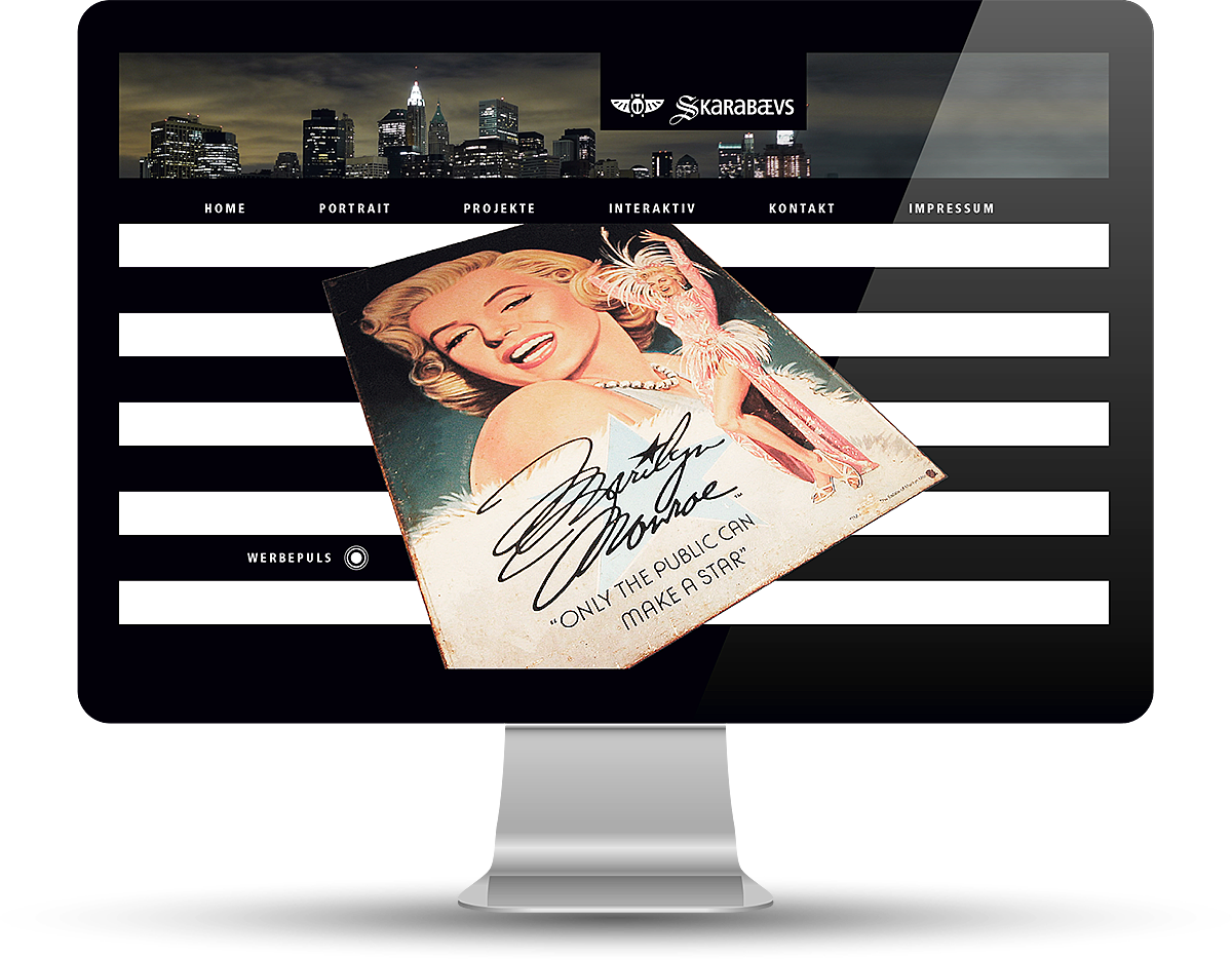
Website
The blockstripes play an important role in the website's animation. The user experience is a bit like watching an animated interactive movie.
▼
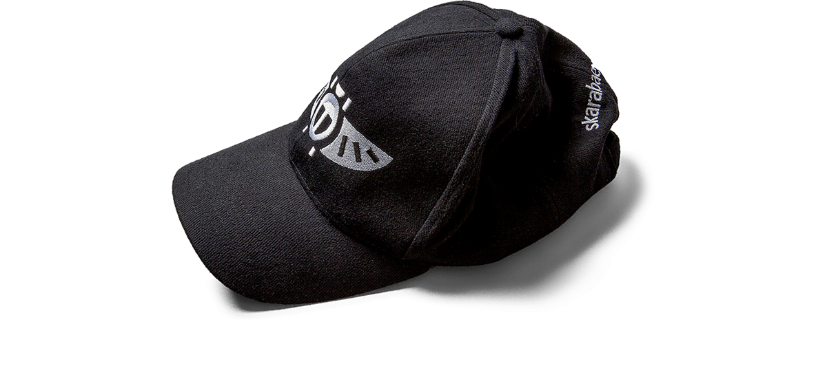
Team Gear
The team wears poloshirts and caps on events.
▼
Hey, thanks for watching.
I'd also like to explore your work – so please drop me a comment.
I'd also like to explore your work – so please drop me a comment.