


Oleagreca | Olive oil
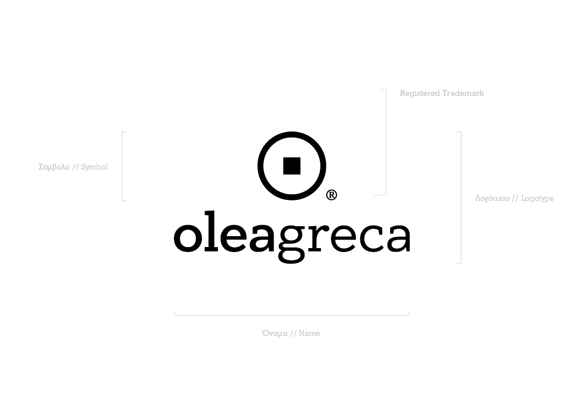
The client here is an olive oil trading company. The name is based on the product and the country of its origin, in Latin. In the logo, the name is read as one word, but visually the two words are separated by the different weight of their fonts, in order for the two words to be clearly comprehended.
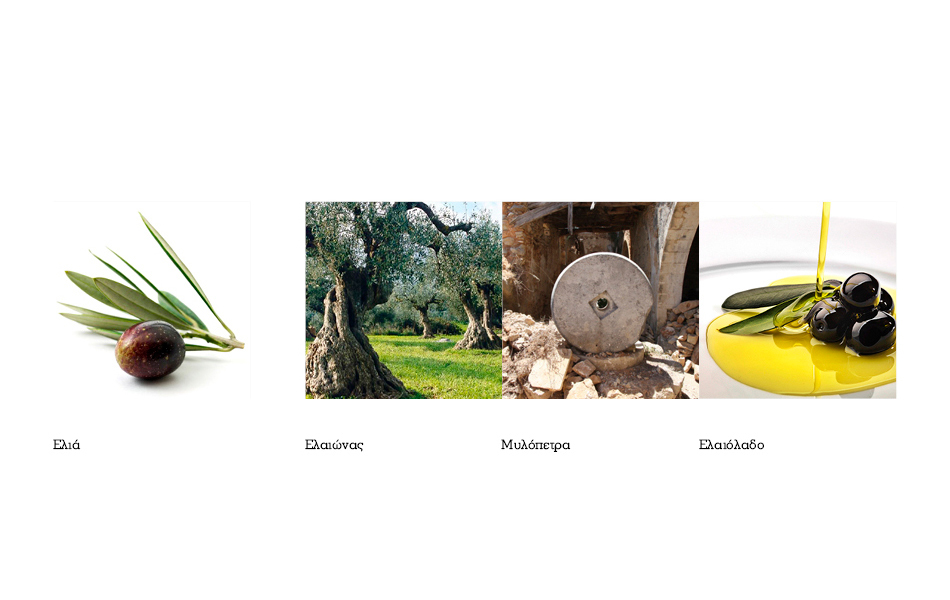
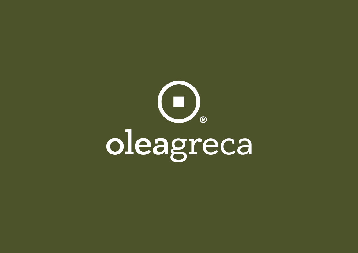
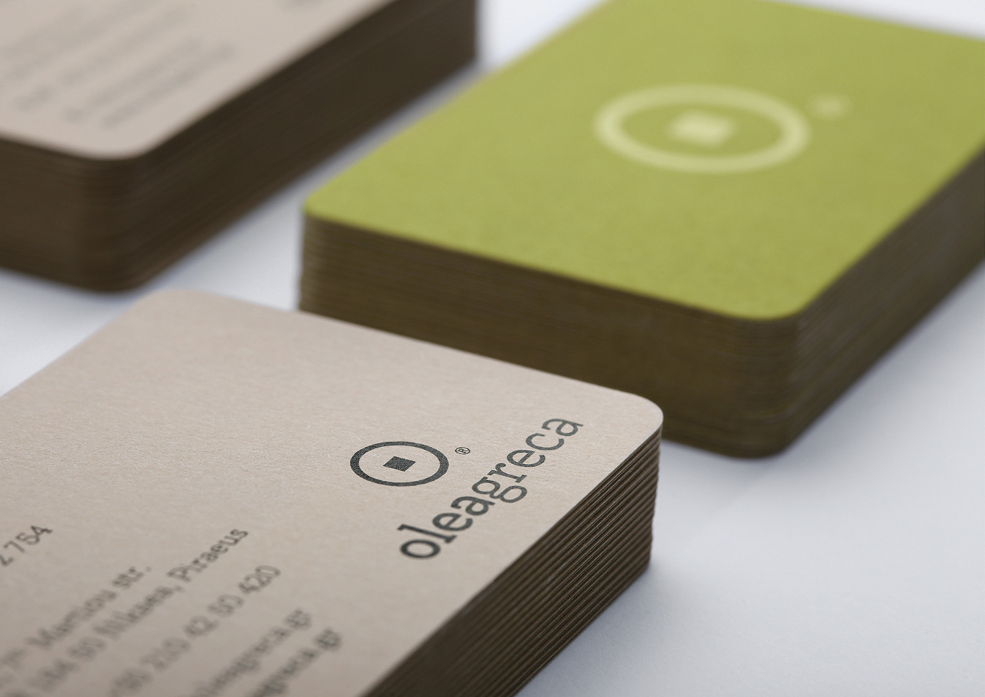
The color refers directly to the olive tree, while the symbol is inspired by the classic millstone. Although, with the development of technology, the harvest of the fruit and the production process of olive oil have become easier, the production method remains the same over the centuries.
Thus, the use of this symbol in the logo adds authenticity and lasting value to the logo. For this logo, a serif typeface that conveys classic values was chosen. The modern design of the lowercase enhances the friendly nature of the logo and refers to the accessible profile of a natural product.
_
Εταιρία η οποία δραστηριοποιείται στην εμπορία ελαιόλαδου. Η ονοματοθεσία βασίστηκε στο προϊόν και τον προσδιορισμό της χώρας προέλευσής του, στην λατινική γλώσσα. Στο λογότυπο, το όνομα διαβάζεται ως μια λέξη, οπτικά όμως οι δύο λέξεις διαχωρίζονται μέσω του διαφορετικού τυπογραφικού τους βάρους, έτσι ώστε οι έννοιες να είναι απολύτως κατανοητές.
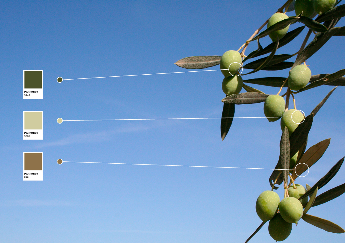
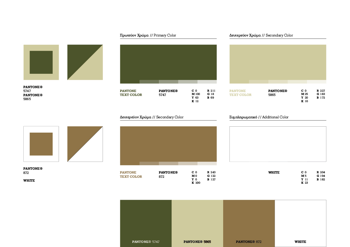
Το χρώμα παραπέμπει άμεσα στην ελιά, ενώ το σύμβολό του είναι εμπνευσμένο από την κλασική μυλόπετρα του ελαιοτριβείουΚαθώς, η συγκομιδή του καρπού και η διαδικασία παραγωγής του ελαιόλαδου έχει γίνει ευκολότερη µε την εξέλιξη της τεχνολογίας,στην ουσία όμως ο τρόπος παραγωγής παραμένει ο ίδιος ανά τους αιώνες, η χρήση αυτού του συμβόλου προσδίδει στο λογότυπο αυθεντικότητα και διαχρονική αξία.
Επιλέχθηκε τυπογραφία με πατούρες, ώστε να απορρέει κλασικές αξίες, ενώ η σύγχρονη σχεδίαση των πεζών γραμμάτων ενισχύει τον φιλικό χαρακτήρα του λογοτύπου και παραπέμπει στο προσιτό προφίλ ενός φυσικού προϊόντος.
Concept
Classic millstone
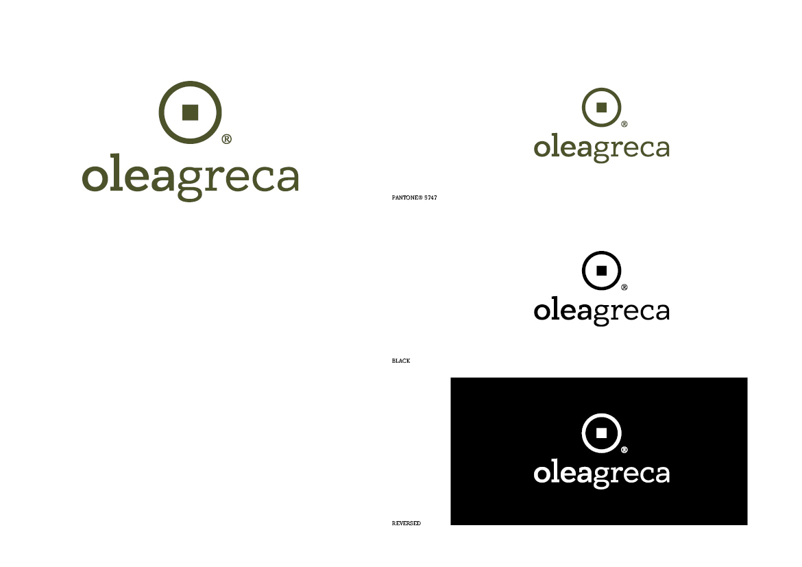
Color Palette

Typography

Logotype
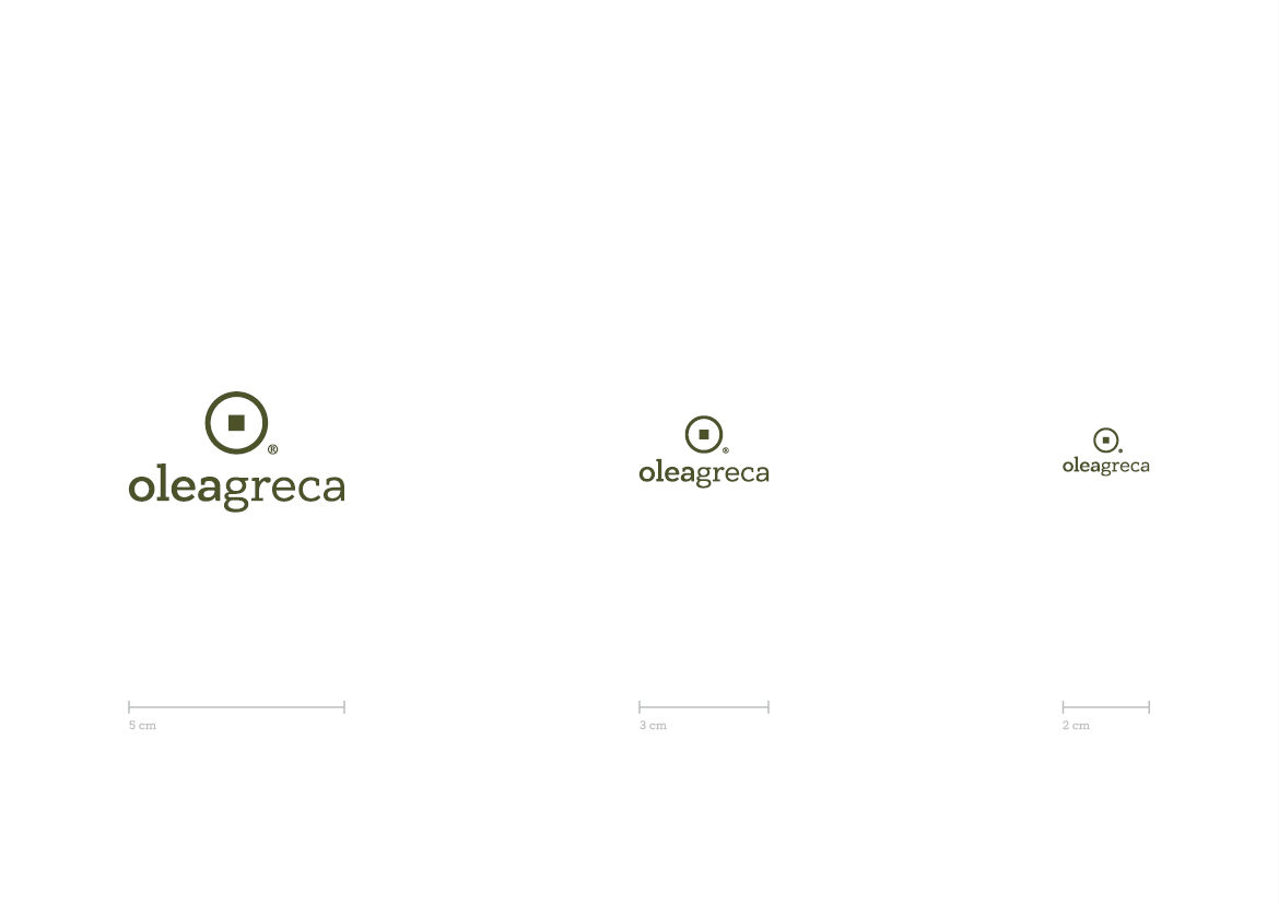
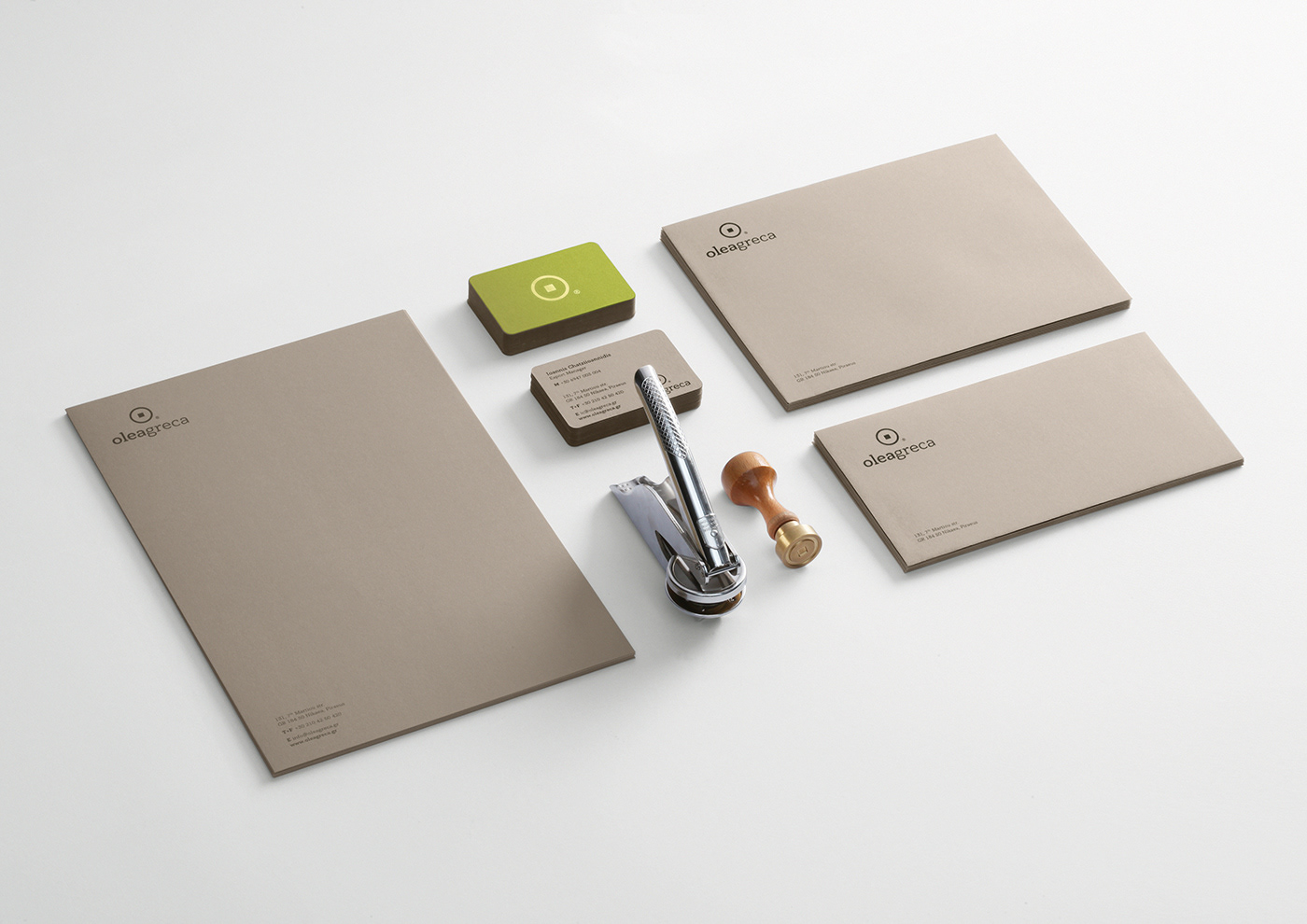
Scale

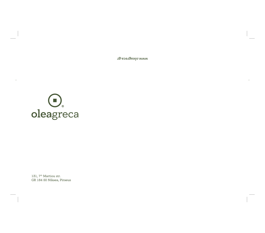
Envelope 11x22cm

Envelope 16x22,9cm

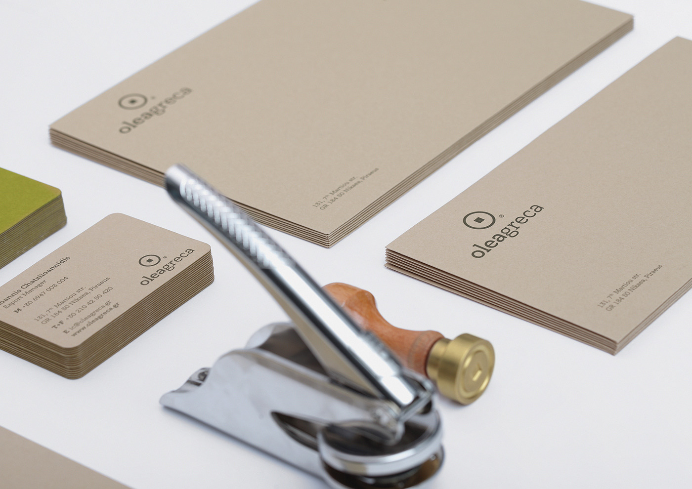
Letterhead A4


Business Cards 8,5x5,5cm


CLIENT Oleagreca S.A.
CONCEPT & DESIGN Chris Trivizas
EDITOR Sissy Caravia
NAMING Harry Tzannis
TYPEFACE Parachute® Typefoundry
PAPER Perrakis Papers
PRINT Miltos Alexandropoulos
PHOTOGRAPHY Math Studio
© 2013


