Monograma / Símbolo (JQ)
Trabaje en un monograma a partir de las iniciales de mi nombre y apellido (JQ). Definitivamente este debía expresar unión, conexión, un mensaje unificado el cual relaciono con el lazo de confianza que hay entre mis clientes y el servicio que ofrezco. Aún sigo trabajando en el sistema gráfico el cual se debe mover entorno a este valor, además he creado algunos recursos que están relacionados a mi forma de ver las cosas y lo que siento la mayor parte del tiempo. Entiendo que el éxito de cualquier proyecto es la transparencia y la honestidad de las personas.
Monogram / Symbol (JQ)
Work on a monogram from the initials of my first and last name (JQ). This should definitely express union, connection, a unified message which I relate to the bond of trust that is between my clients and the service I offer. Unn still working on the graphical system which should move around to this value, I have also created some resources that are related to the way I see things and how I feel most of the time. I understand that the success of any project is the transparency and honesty of the people.


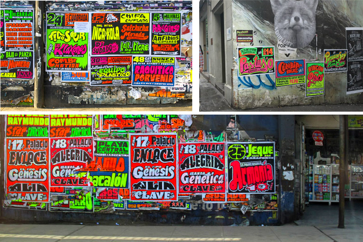
Propuesta de Colores Serigráficos
Si tienes la oportunidad de caminar por la Av. Aviación en el distrito de la Victoria o la parada en Lima - Perú y te gusta la tipografía, estoy seguro que te llamara la atención estos afiches chichas, lleno de colores fluorescentes y con tipografías de diferentes tamaños. En la época escolar trabajé por esta parte de la ciudad y definitivamente me enamore de estos colores tan vibrantes, me preguntaba que criterios se debería usar para realizar este tipo de trabajo.
Mi apellido (Quispe) es una palabra de origen quechua que significa "El que brilla" y siento que esta relacionado con estos colores que están presentes en diferentes culturas del Perú. Estoy seguro que esa fue la época en la que decidí estudiar diseño.
Me animé a participar en un pequeño taller de serigrafía para imprimir algunas ilustraciones y hay dos colores que siempre estuvieron en mi cabeza y además hacen buen contraste.
Color History (Serigraphy inks)
If you have the opportunity to walk along Av. Aviación in the district of Victory or stop in Lima - Peru and you like typography, I am sure you will be struck by these chichas, full of fluorescent colors and with typography of different sizes. In the school season I worked for this part of the cityand I definitely fell in love with these vibrant colors, I wondered what criteria should be used to do this kind of work. I'm sure that was the time I decided to study design.
I encouraged myself to participate in a small serigraphy workshop to print some illustrations and there are two colors that were always in my head and also make good contrast.