OFFLEY AGED TAWNIES
Another shade of Porto
-
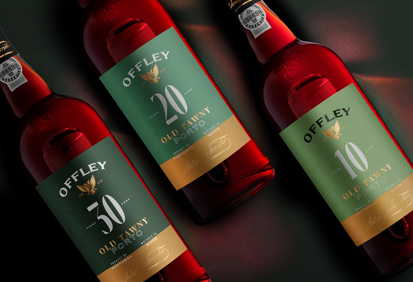
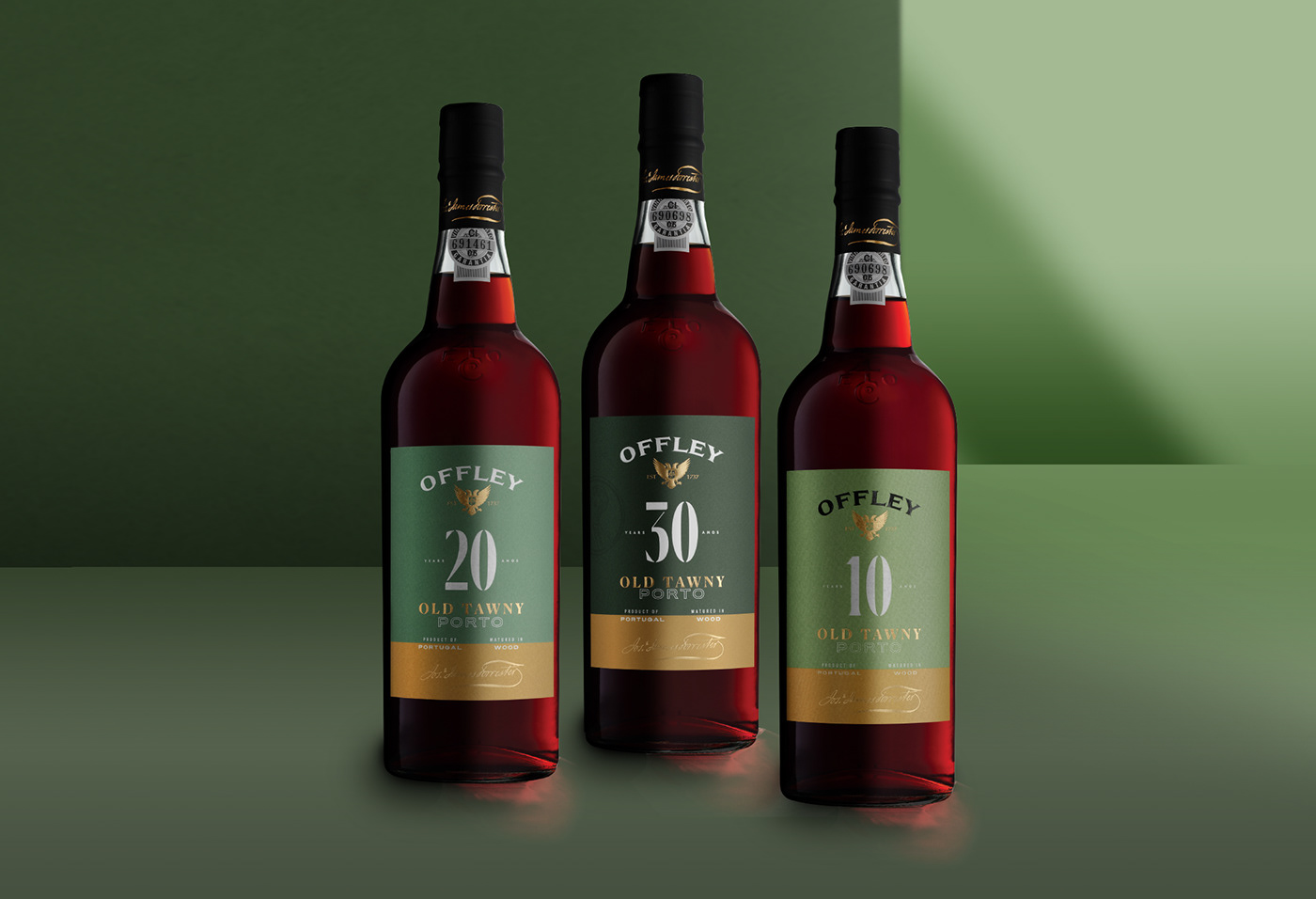
Following the recent redesign of its classics range, OFFLEY approached VOLTA Studio to redesign its remaining ranges, including the Aged Tawnies. With a dated and conservative image, OFFLEY wanted the easy-to-read codes and shelf visual impact of the classics range to be present again in the Aged Tawnies, but with a substantial evolution in terms of “premium perception”. The young and irreverent DNA of the brand should be respected but it mantain a visual language of quality aged wines for a more “wine-educated” target.
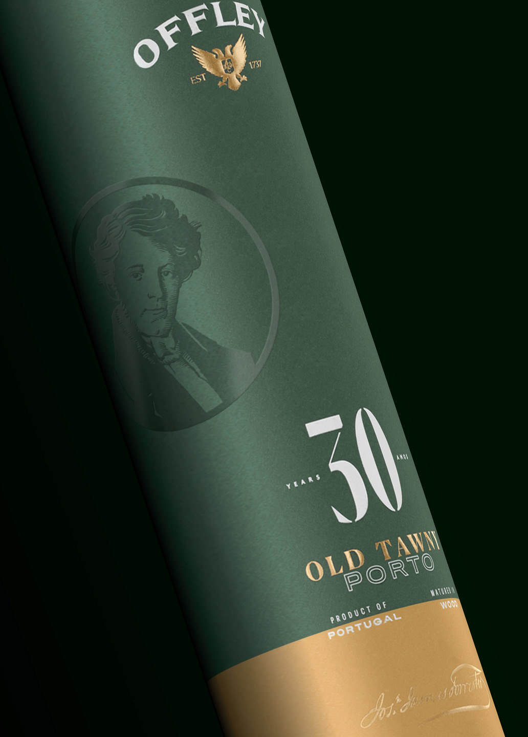
VOLTA Studio’s focus was on the color scheme: after an analysis of the competition and the most used color palettes, we focused on green tones, which represent both freshness and youth as well as the natural side of the product, its purity and quality. An evolutionary set of greens (from a striking light green to a more premium dark one) was used in the 3 references, metaphorizing the ageing of wines. In the bottle packs, this evolution was accentuated with finishings and shapes (10/20 years in boxes, 30 years in tubes). Careful typography choices, with clear contemporary elegance and condensed style, accentuates the verticality and grandeur of the bottles and its labels.
The result is an Aged Tawnies range of great impact and spirit of renewal, elevating the product on the “premiumness” scale, maintaining visible traces of the brand’s versatility and irreverence.