

Ravvivare Branding
Brand design for Ravvivare.
Brand design for Ravvivare.
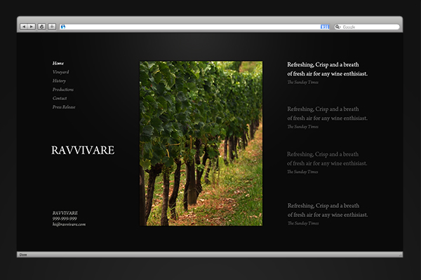
We were asked to work on developing the brand identity for new British based vine yard (orientated) business (with yards in Southern Sicily). With their business expanding over multiple areas from the production of their fine, high quality wine to high class event hosting/catering, the brand was to focus on the high stature of the business and not tie it down to a specific field.
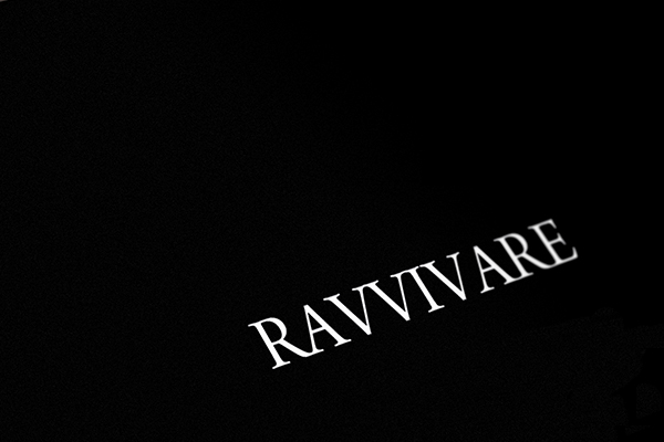

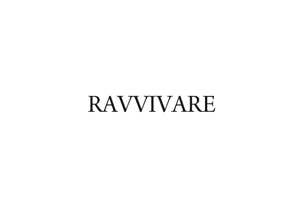

With the needed representative of power, strength, stature and class - we decided on a type based logo featuring a sans serif font with unique serifs which only increase the classic and strong feel of the logo. From the original sketch it was decided the character spacing would be decreased to make the majority of letters united in a free flowing modern way. Then capitalized to again, project the image of superiority and stature.

With the above mentioned needs, the color scheme which would best present the needed ethos was a given - Black (and shades of). Keeping bright colors non-existent - we were able to hold the classic feel throughout the brand colors.
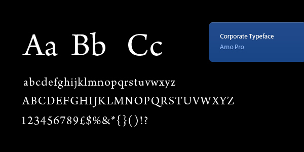
The typeface decided on was Arno Pro, the Sans Serif type held it's class sans serif feel while offering something different with its unique shaping of specific letters and serifs. The type was also found to be effective in both print and screen media resulting in exact consistency throughout.


We hope you liked our work on the Ravvivare project. You can also view the work at our avato.co - here. We appreciate all feedback and encourage you to follow our work if you enjoy. Happy Behnacing!
The Avato Team.
The Avato Team.


