

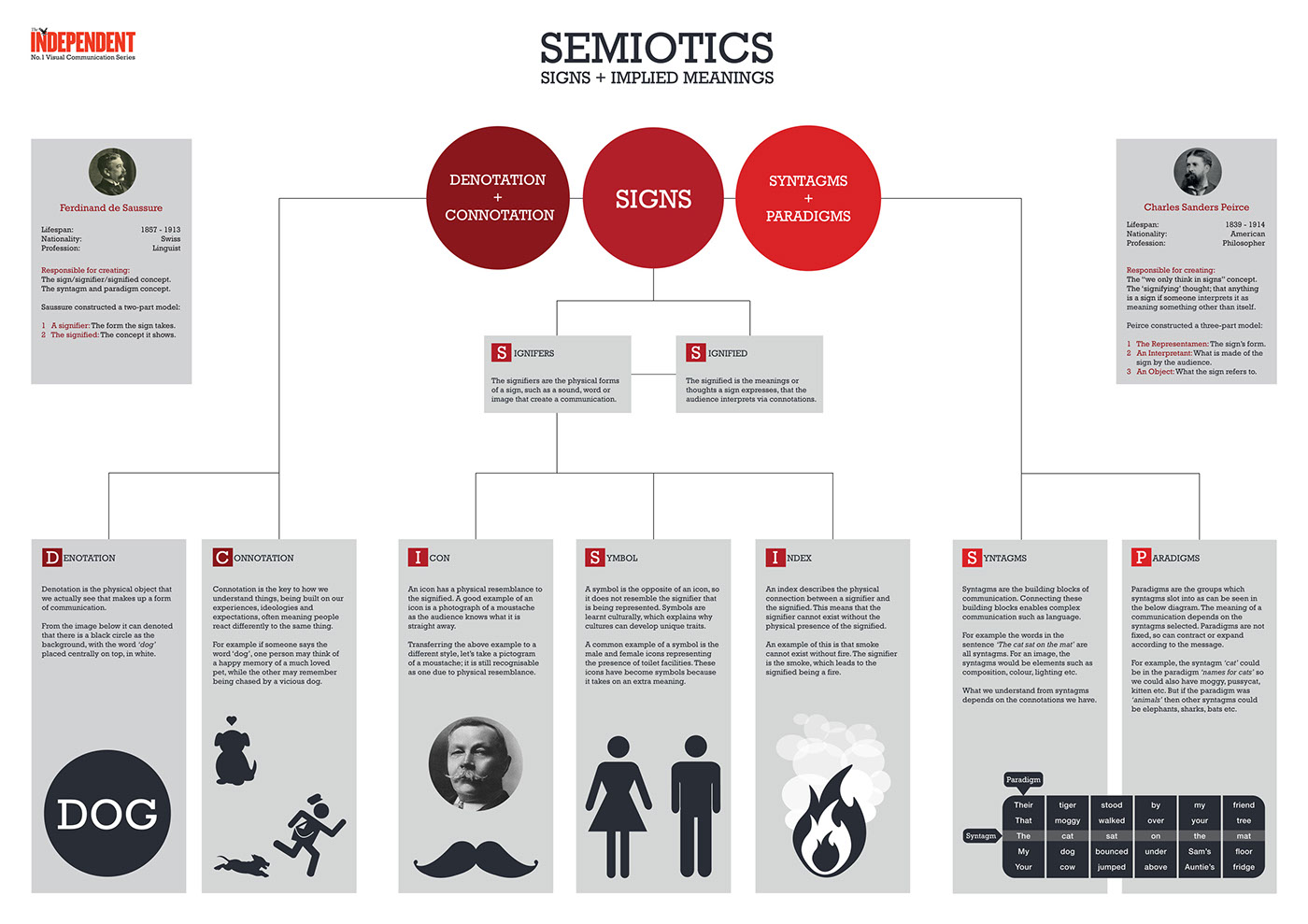
We discussed various concepts as to how we could make semiotics easier to understand, and concluded the best way would be to introduce it one step at a time, which lent itself well to a family tree style design.


As this was a conceptual design for The Independent, we felt it should take on specific design characteristics such as the red, and be one of a series of visual communincation theory posters.
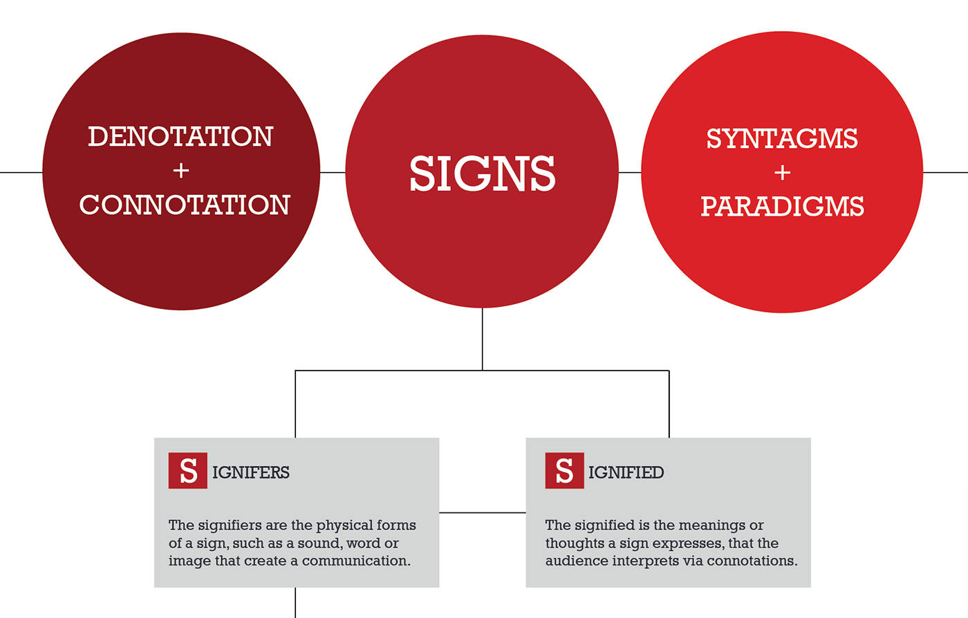
We chose a flat design style which has maximum visual integrity to it. The Rockwell typeface is well suited to posters because of its excellent legibility and strong character forms.
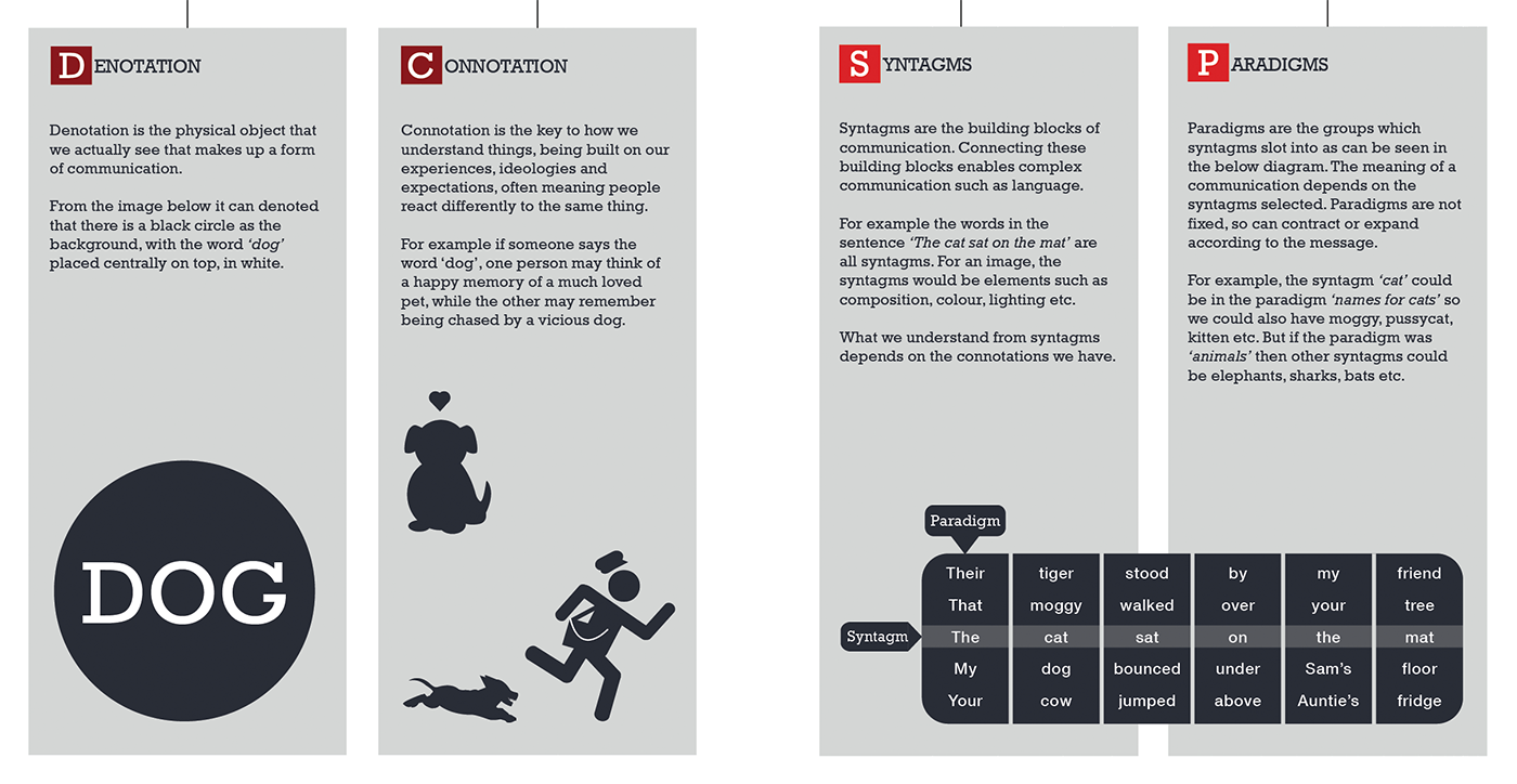

For the seven main sections at the base of the infographic, we chose to marry informative text as to the meaning and purpose of each section of semiotics to a set of striking vector illustrations that explains the text perfectly.
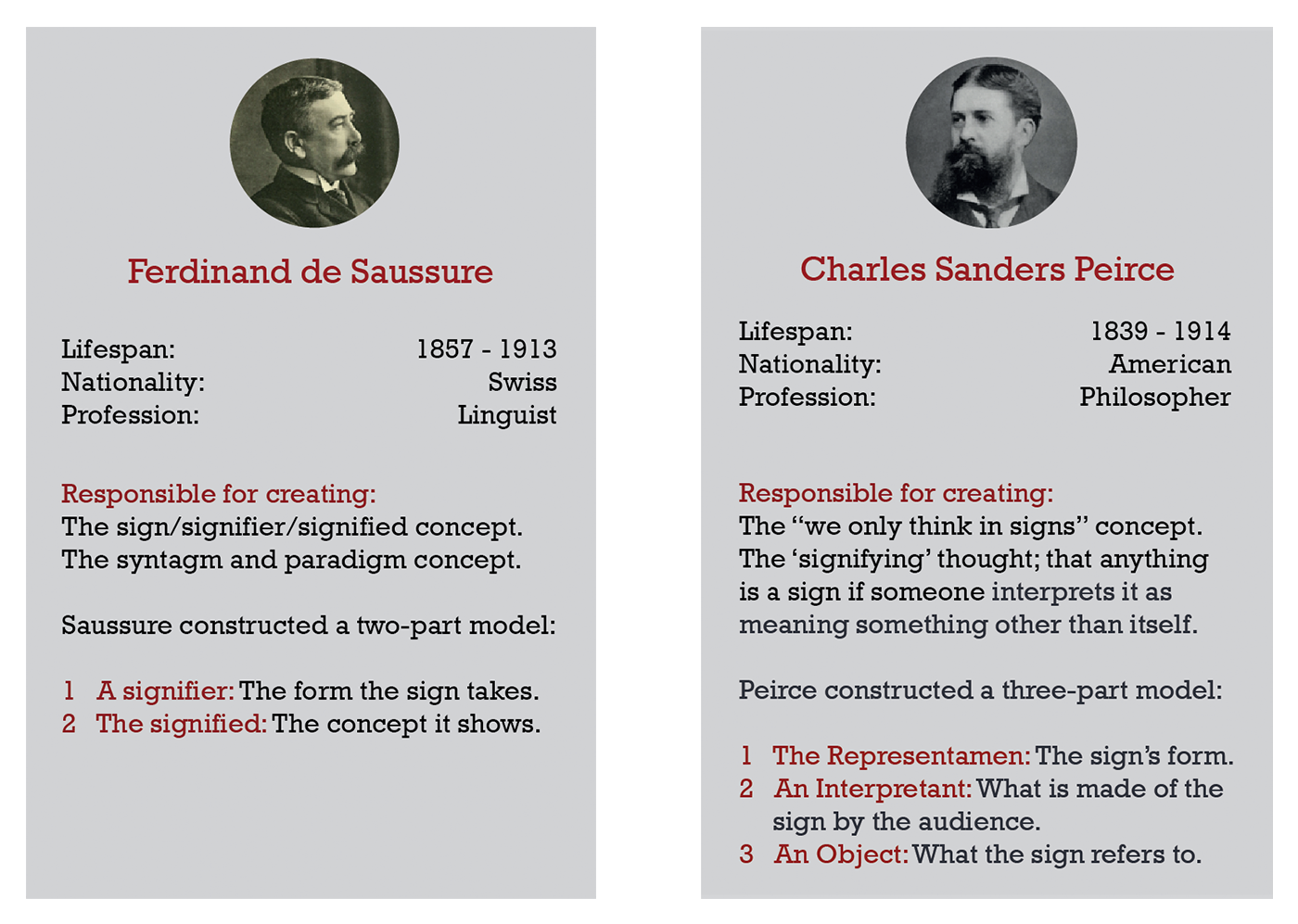
We also felt it was necessary to include some information about the two main people that created and refined the semiotics theory to give some background information to the reader about this subject.


