

Selima
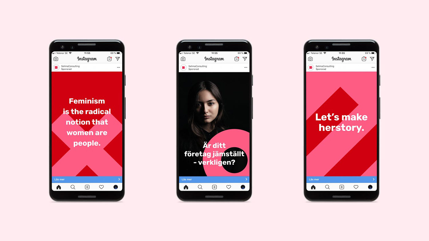
Selima is a Swedish company working for women's rights, by doing investigations and reports by order of authorities and other actors. They're holding a really substantial experience and knowledge in the subject.
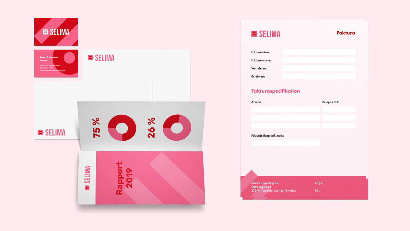
We created their visual identity – communicating power, activism and commitment – but also seriousity.
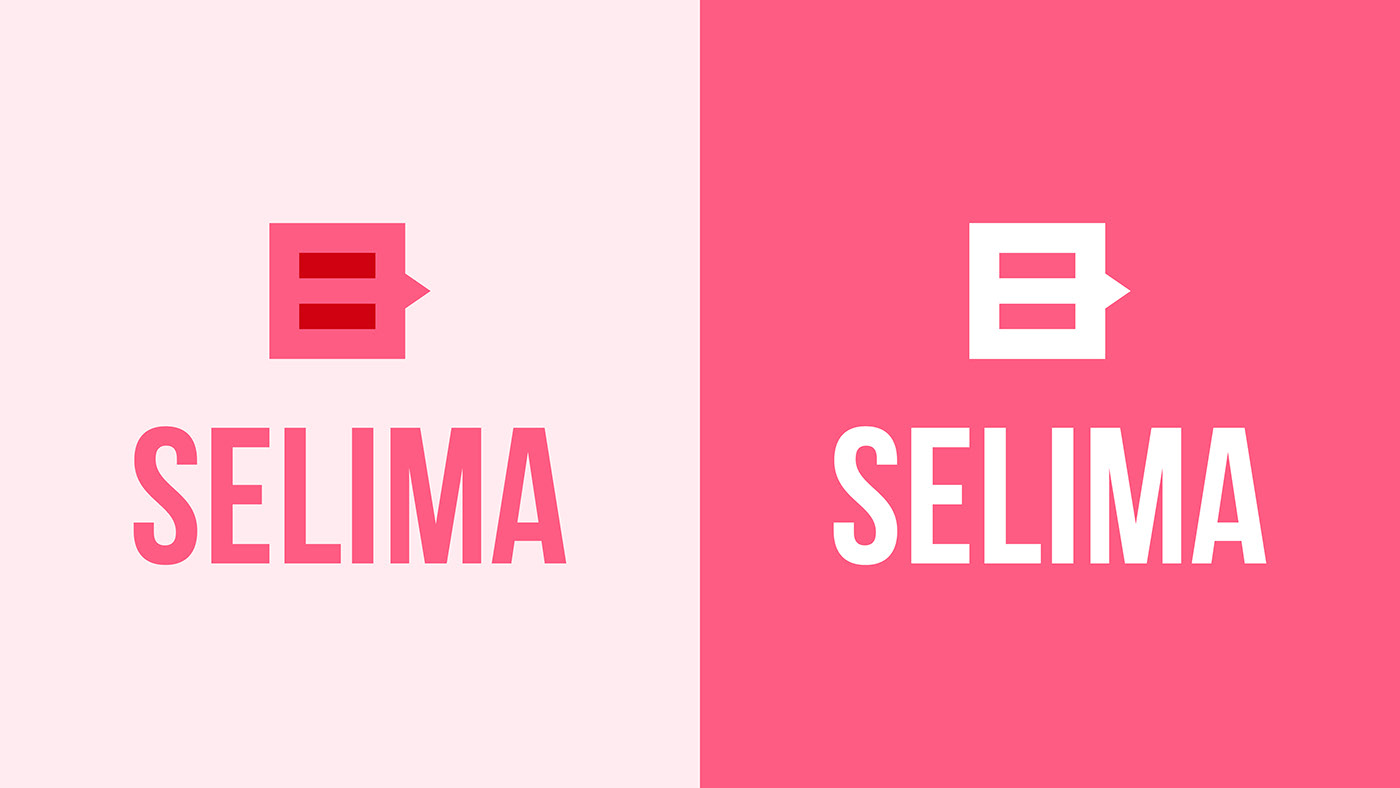
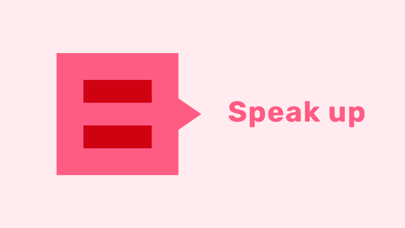
The symbol in the logotype is based upon Selimas most important values: equality, a voice for womens rights and hope for a better future. The wordmark is built of bold letters to create a confident look.
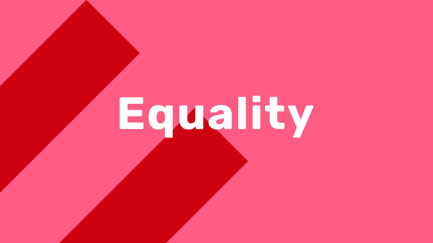
To make it clear that Selima is all about women and women's rights, we picked a shade of the typical feminine color pink. We have combined it with a strong tone of red, to give the color scheme a more powerful expression. Thus they together create a unity that communicates femininity, energy and change at the same time.


The graphic elements are inspired by the simple and clear words equality, unity and attention. These are used in large scale to create the impression that Selima has a positive impact on society and doesn't hesitate to take up space.


Thanks for watching! Get to know us at compani56.se


