Taniguchi Shichiten Rebranding (symbol mark, web, stationary, advertisement)
K-DESIGN AWARD 2020 Finalist
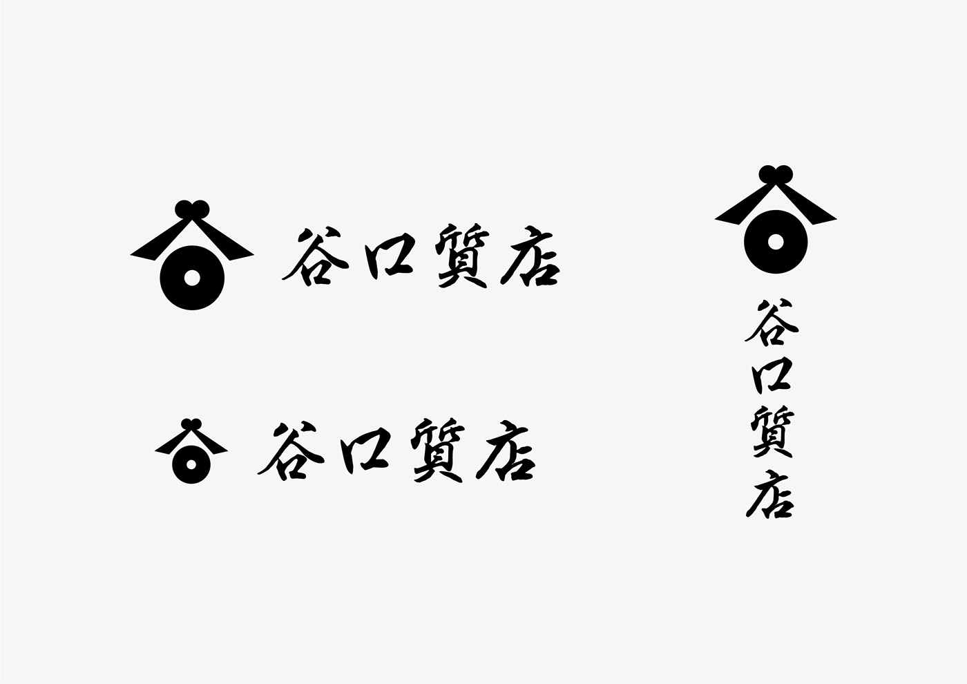
The Eye That Assesses the Authenticity
Located in Itabashi Ward, Tokyo, Taniguchi Shichiten is a well-established pawnshop founded over seventy years ago.
The concept of the new logo of Taniguchi Shichiten is “Pawnshop is the modern-day expert appraiser.”
The heavy circle in the lower part expresses an eye that accurately assesses the authenticity.
It is the eye of the appraiser capable of observing 360 degrees from a wide and deep perspective.
The logo was designed by combining two identities, the character “tani” (valley) from “Taniguchi” and the “eye” of the pawnshop.”
Taniguchi Shichiten was fully rebranded with renewal of the logo, the website direction, advertisement, and various tools for the new era.
「質屋とは現代の目利である」をコンセプトに、シンボルマークをデザインしました。下部の二重丸は、「物事の真贋を見極める目」を表します。360度見渡せ、深く・広く物事を見る目利の目として機能します。谷口質店の「谷」をモチーフに、一見作り込みすぎていない、いい塩梅の力加減を持つシンボルマークを目指しました。
-
-
クライアント:株式会社谷口質店
アートディレクター・デザイナー:栗崎洋
ウェブサイト制作:株式会社カドベヤ
フォトグラファー:伊場剛太郎
アートディレクター・デザイナー:栗崎洋
ウェブサイト制作:株式会社カドベヤ
フォトグラファー:伊場剛太郎