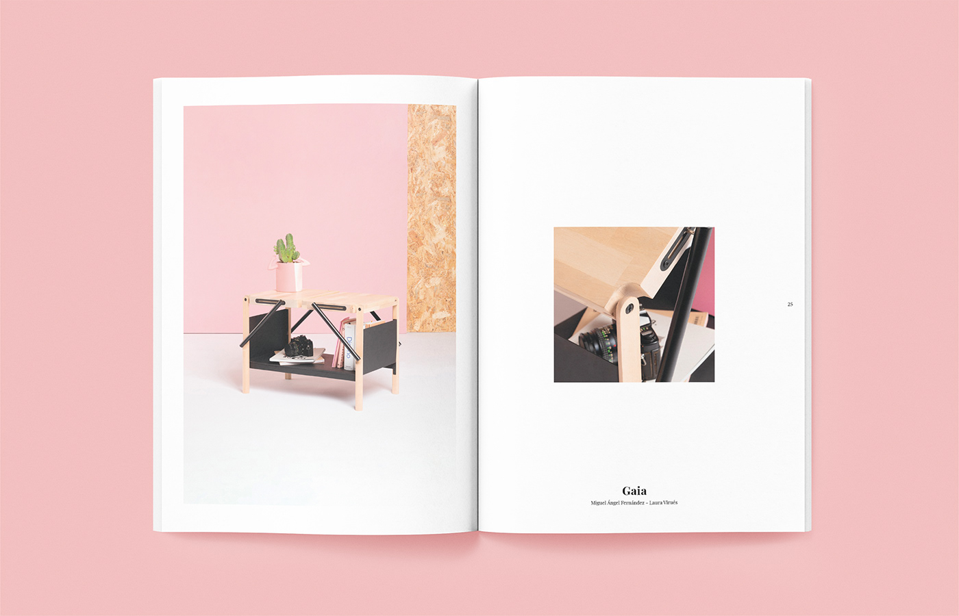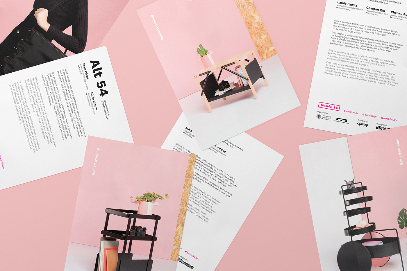
Paral-lel 5 #smartworking
-
New work meanings, how people understand the space and what product design can do for them are the inspiration sources for the graphic communication of the Paral-lel project. The graphic development maintains the pale pink used in product photography, as well as adding magenta in some details to give them a bigger protagonism. The texts and images composition inside the catalogue varies from the traditional editorial design, summed up as a close and entertaining publication for the reader.