


SENTIDO
The client
Sentido is a quality brand offering an effect-oriented line of natural face care products with an elegant, modern, and vibrant design for Polish confident woman who searches for a drop of luxury in their daily routine.
The brand provides a very good quality line with innovative products designed to achieve the desired effects. There are four lines with different effects on the skin: moisturizing, lightening, anti-aging, and cleansing. Each line has the main ingredient responsible for the effectiveness of the usage. Products have a delicate flower sense and are pleasuring during the purchase and application moment.
Within communication, Sentido offers simply vibrant, modern, and intuitive coverage to ease the choice making.
The problem
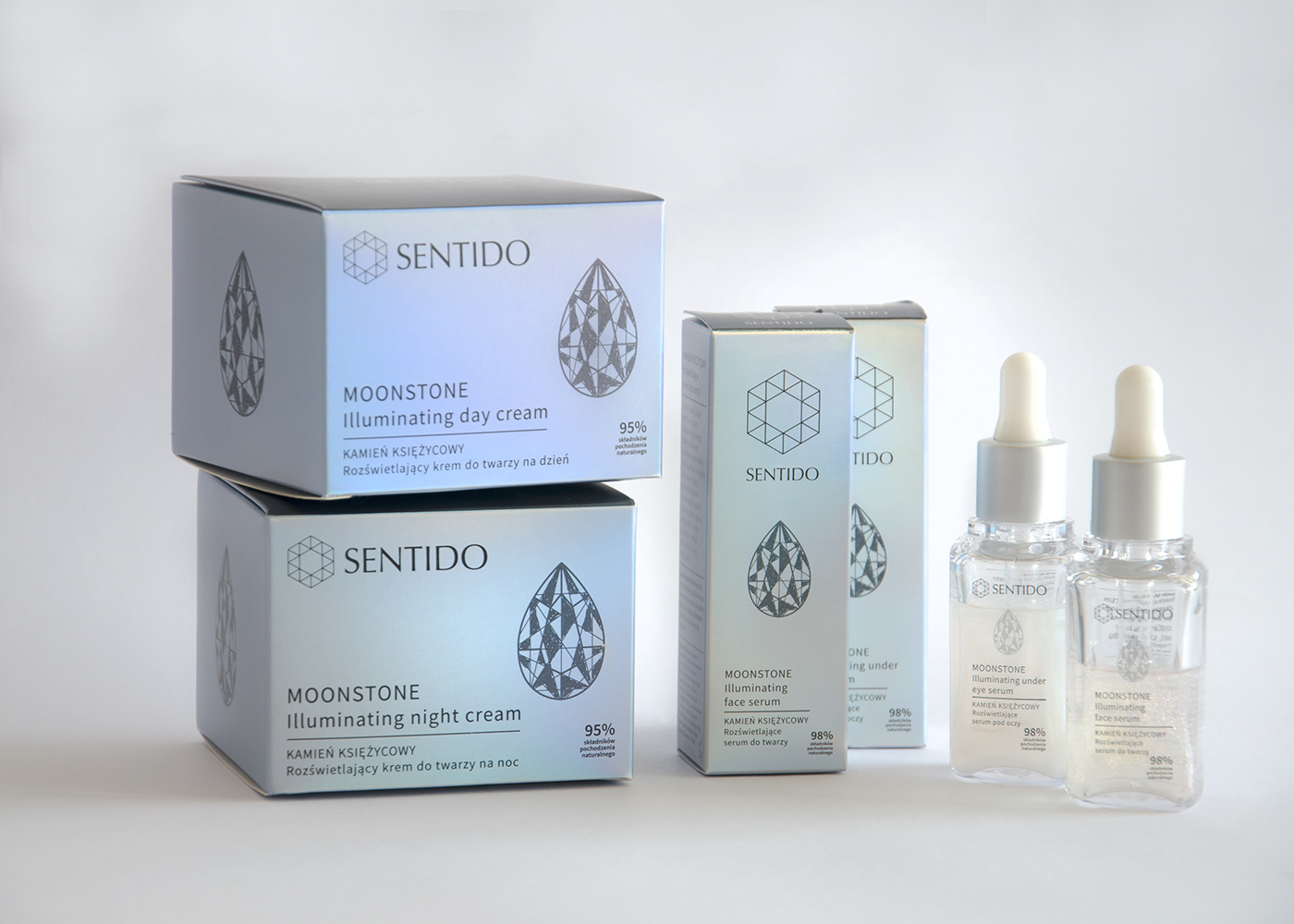
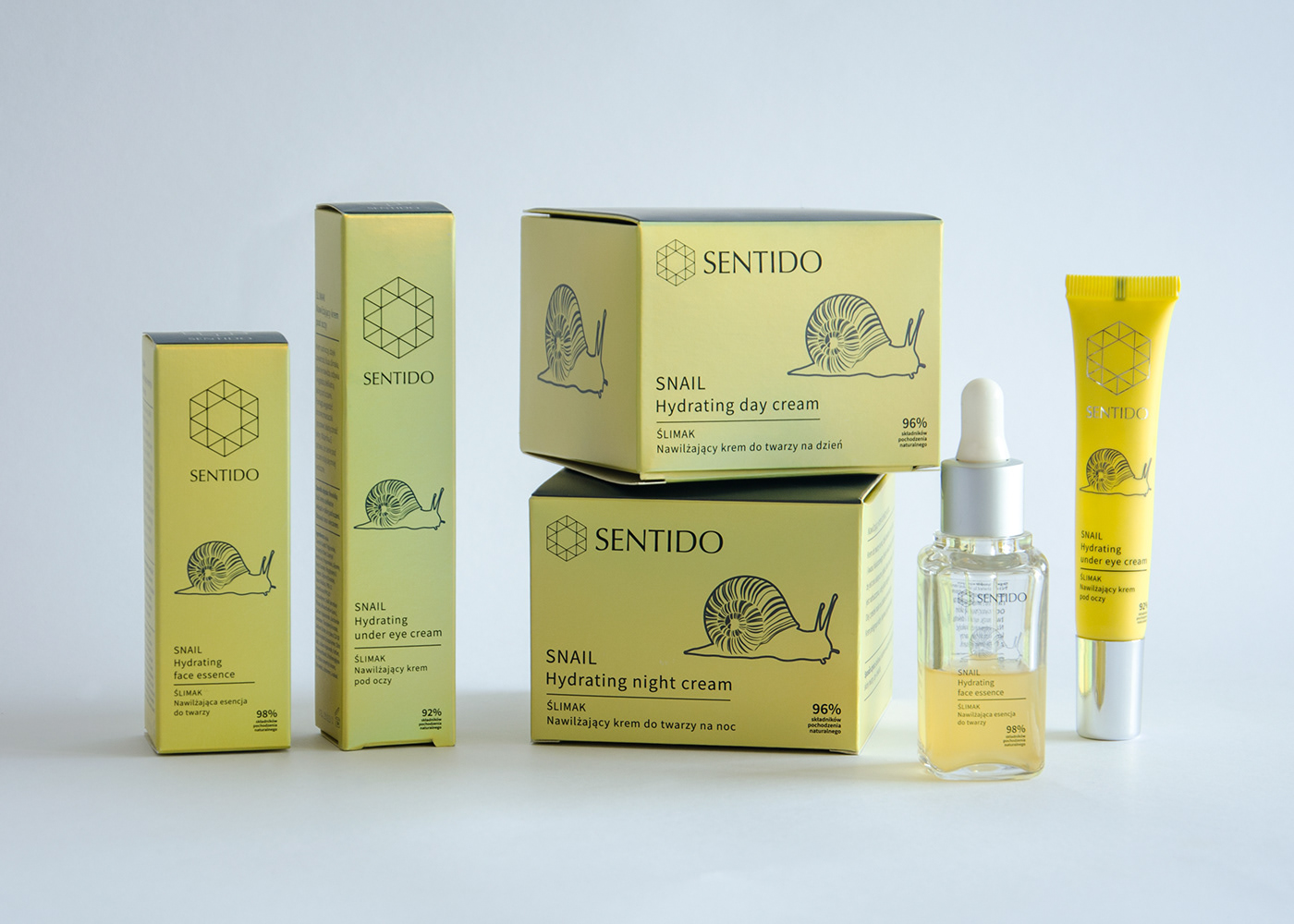
The brand required a name and a logo that was enhancing the professional character of the product and build trust. The packaging was supposed to be minimalistic, modern, distinctive elegant, luxurious, and feminine at the same time. The main emphasis was on the active ingredient and clear communication in which ritual is it. The brand has four main lines with the possibility to grow.
The solution
The name was invented by Aleksandra Szmak and came from the play of words between “senses”, “doing” and “I” as the main focus.
In a premium brand, it matters how it sounds, how you feel when you touch it, and how you feel when you look at it just to be able to fully experience all benefits of well- the designed product. It’s a harmony between many elements. However, as Ludwig Mies van der Rohe said “The less is more” so the solution was to limit artistic ways of expression and focus on the data. Thus I’ve chosen clean typography, sophisticated color, minimalistic illustrations easy to apply to every kind of material, and an interesting logo.
The logo is built on two main elements: sign and name described by font Optima. This font was a cherry on the cake while creating the logo. It adds an elegant and sophisticated look and has a large history as created by Hermann Zapf. To say more this is a very precise font thus adding extra value and building trust. This font was inspired by classical Roman inscriptions.
The sign remains connected to triangles as the elements in the universe that are transcendental over the centuries. They add the possibility to create other forms in the future as the brand will grow and they all together create a symbol of the hexagon. The hexagon symbolizes a new era and protects from the thunders in Slavic mythology (it is worth mentioning that the hexagon was an attribute of the most important God – Perun). The sign creates an element that is a kind of symbol of strength, health, and well-being.
As the main font for packaging Sentido uses Source San Pro modern font, designed by Paul D.Hunt.
Colors were kept as feminine pastels when they marge with modern holographic effects in printing.
As a result, Sentido has two versions of the logo depending if the area is horizontal or vertical. The typography highlights the professional character of the product. The packaging is clean and simple. The selection of printing materials with more pastel colors and holographic effects enhances the modern and feminine luxurious character of the brand.
#branding
#packaging
#advertisement
#naming
#brandbook
#brand architecture
DESIGNED BY ALEKSANDRA SZMAK STUDIO FOR KONTIGO 2020


