


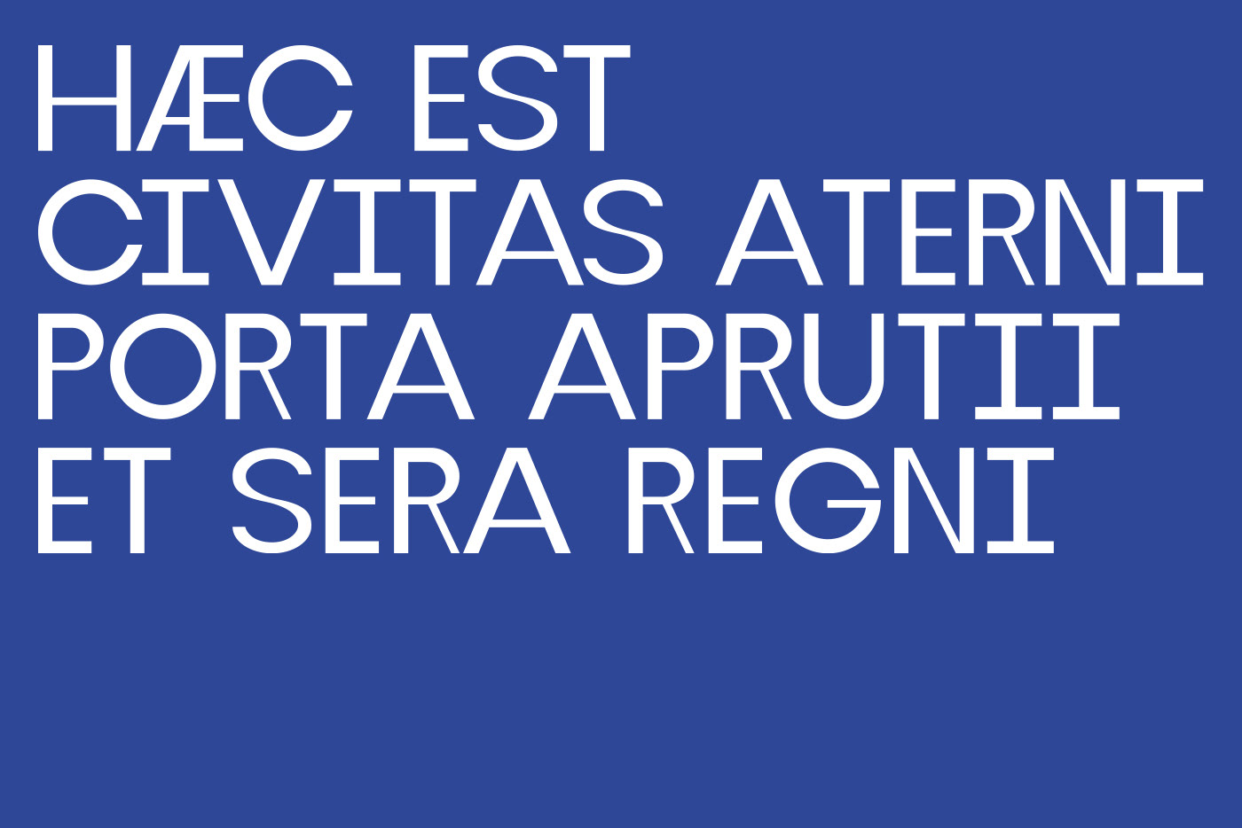
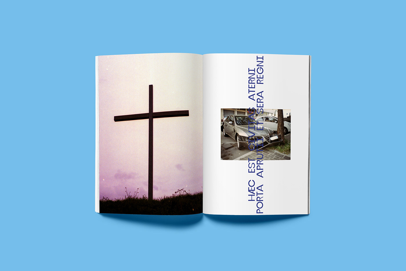
«This is the city of Aterno, entrance of Abruzzi and edge of the Reign.»

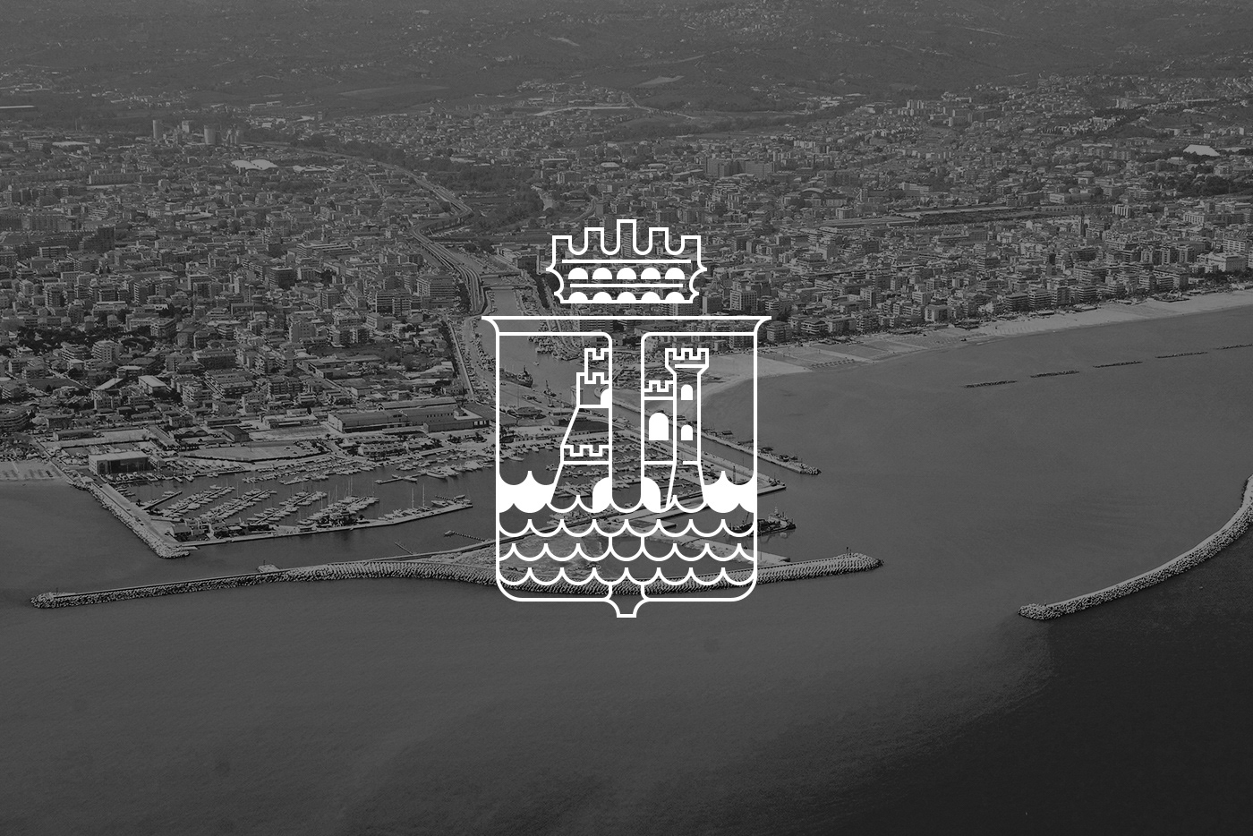
Pescara is the capital city of the Province of Pescara in the Abruzzo Region of Italy. It is the most populated city in Abruzzo, with around 120k residents, and approximately 350k including the surrounding metropolitan area.
Located on the Adriatic coast at the mouth of the Aterno-Pescara River, the present-day municipality was formed in 1927 joining the municipalities of the old Pescara fortress, the part of the city to the south of the river, and Castellamare Adriatico, the part of the city to the north of the river. The surrounding area was formed into the province of Pescara.
I decided to give a new look to my hometown, as it's usually represented in an old and traditional way. Therefore, my design tries to look ahead without forgetting how much history is behind the city and its symbols.

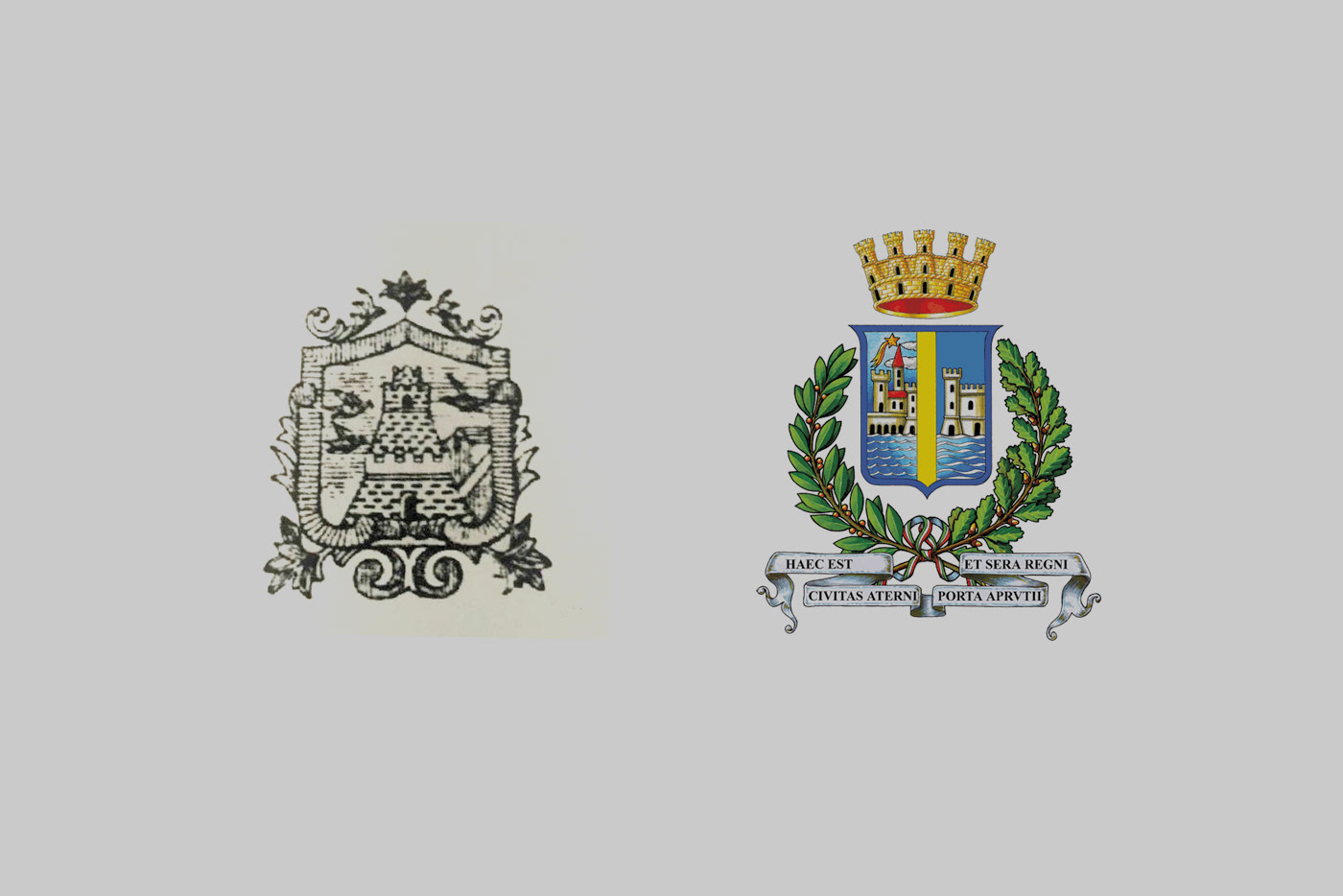
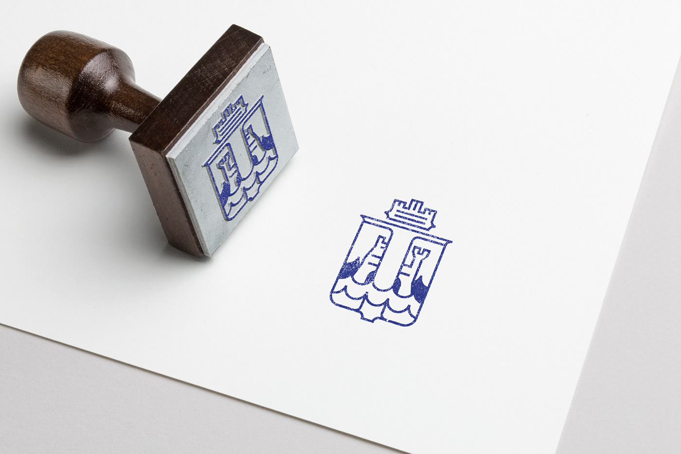
Pescara, as the majority of cities in Italy, is represented by its Coat of Arms, above on the right. The design on the left was the previous Coat of the northern part of the city.

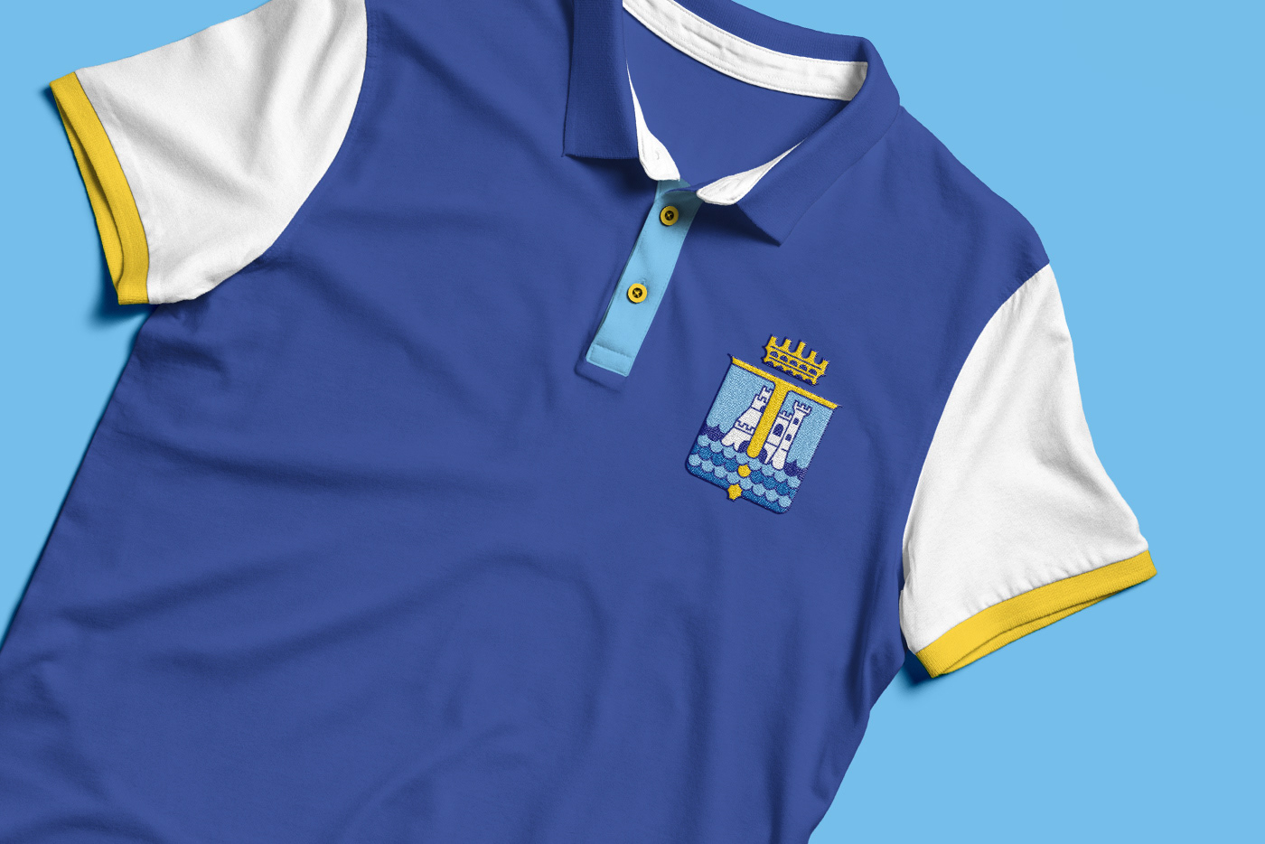
The rebranding of Pescara is modern, clean, and it does not forget about its history, respecting the past and what the symbols were.

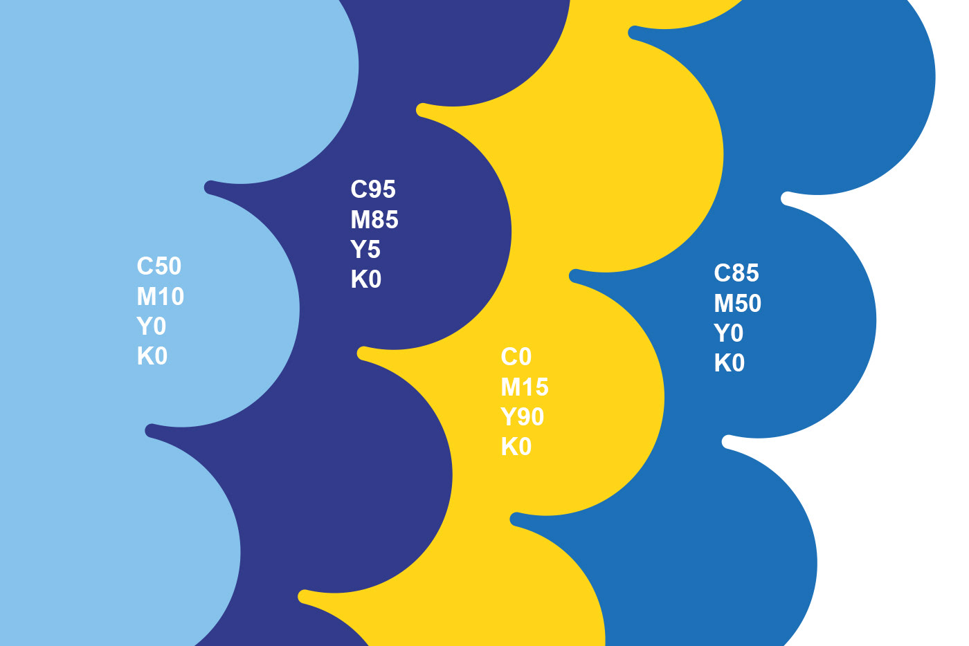
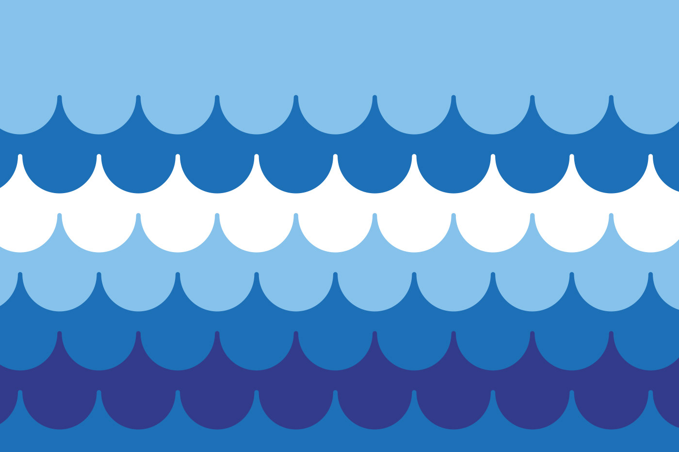
The graphic elements, such as lines and waves, can be used as a motif for every communication the city has to make. By doing so, there will be a uniformity of identity,
and the city will be always recognizable.
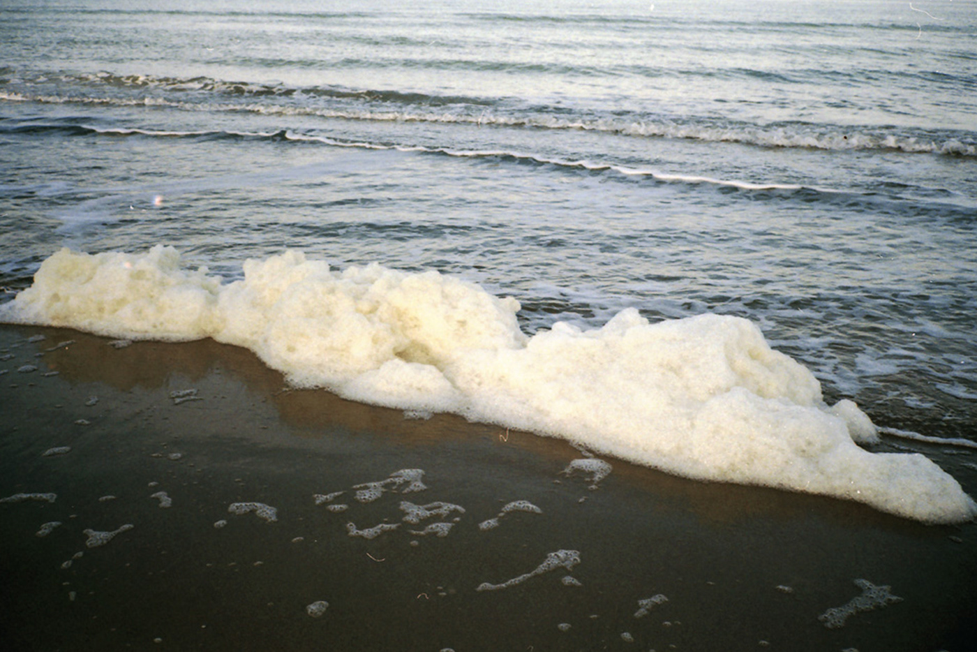
The branding colours are nothing new for Pescara citizens, as they come from the Coat of Arms. The unity, the sea, the sky, the sand, the peace.

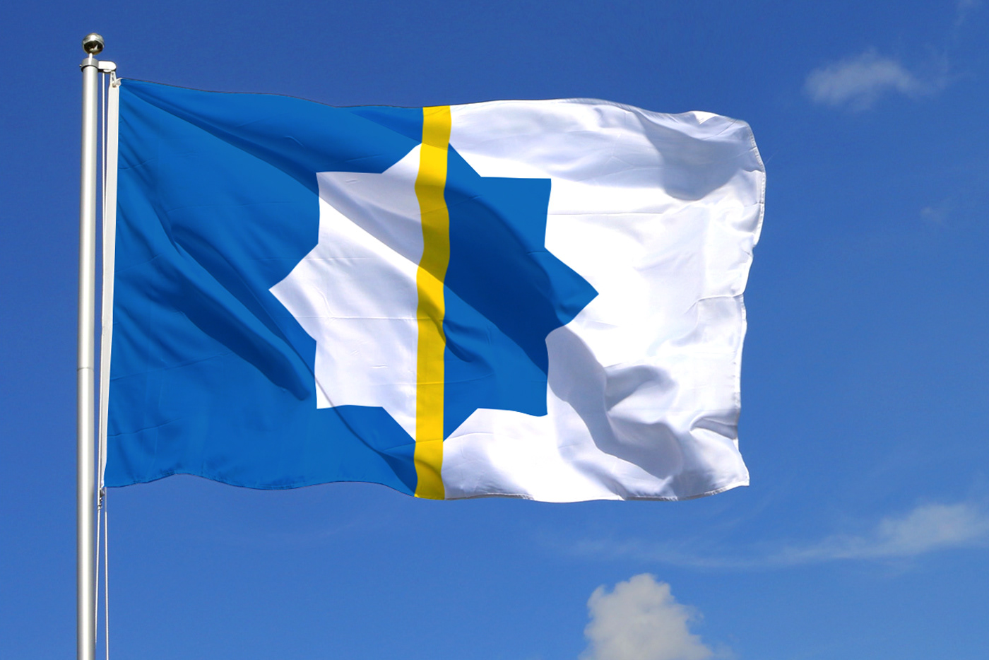
The city of Pescara lacks a flag to represent it. Using the same colours and a different approach, based on vexillology, I designed a flag as well.
The line is the river, which splits and, at the same time, unites the city. The shape is a geometrical simplification of the fortress' layout built by the Romans on the river, where the city is today.

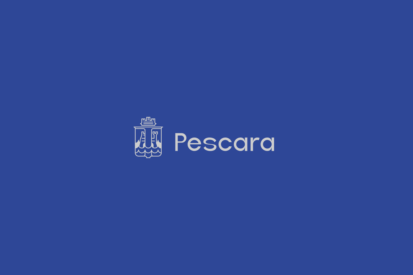
The new brand preserves lots of elements from the previous one, even being more modern and clean. Therefore I designed also a smaller version of the brand, to be used when needed. The elements are the same, but the design keeps in mind the small size.

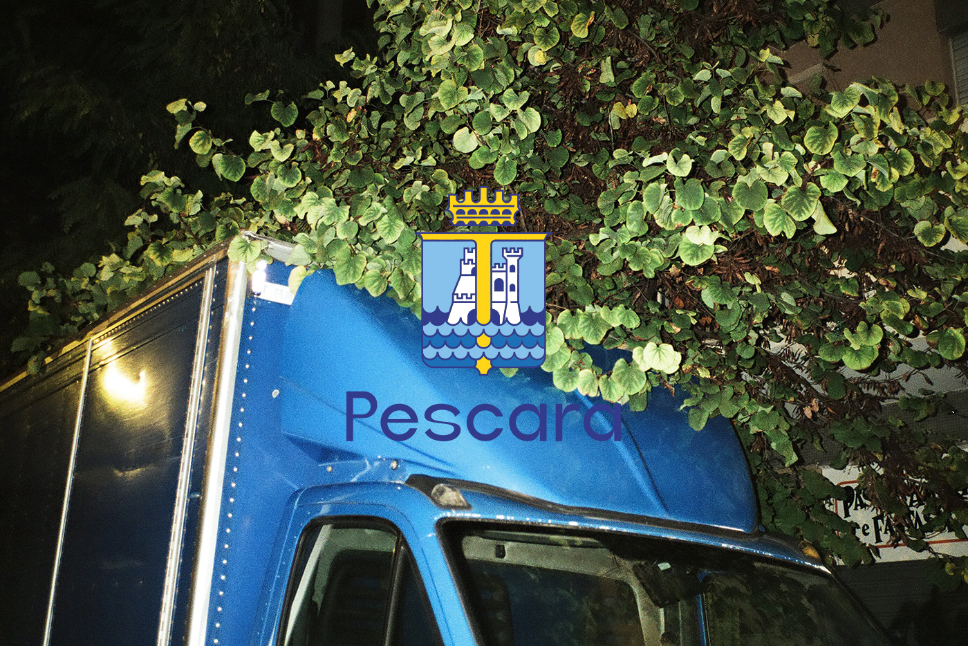
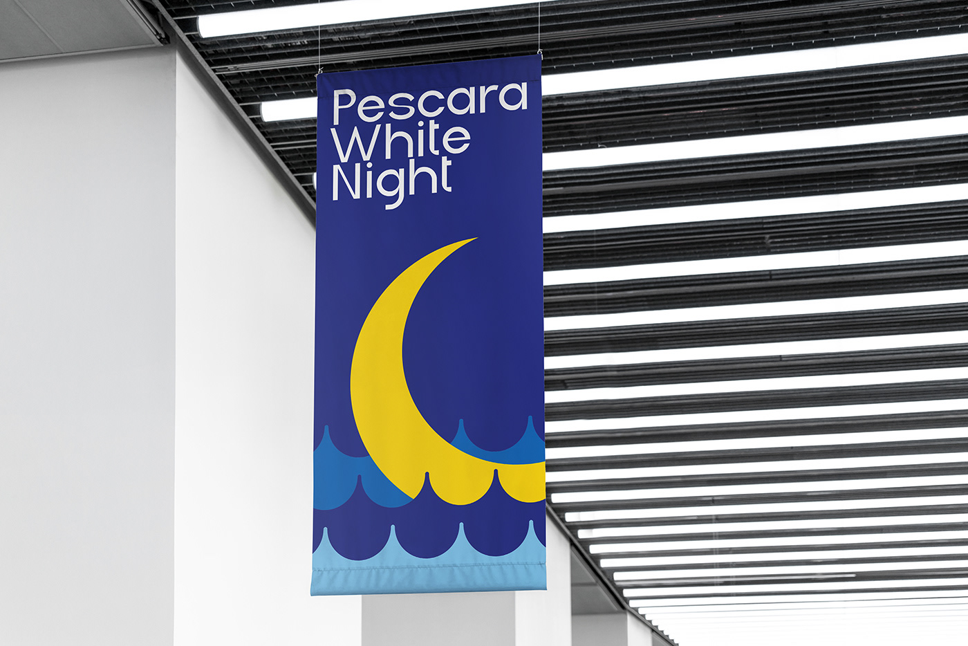
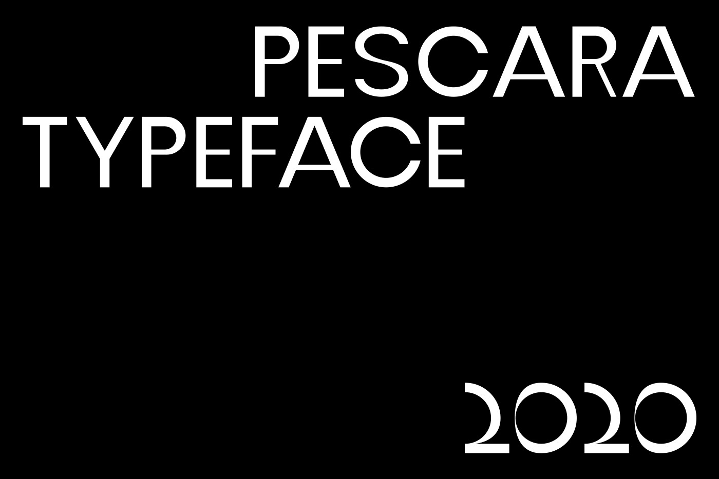
To make the brand unique, I designed an entire font family, called Pescara, to be used in the logo as well as in every city communication. It's a sans-serif, reflecting the willing of the city to look ahead with unusual, contemporary and experimental shapes, without following all the rules in a font design process.


A place-branding like this can make people feel the city in a better way. The uniformity of the brand, the colours, the typeface, will make citizens and tourists perceive the city as a modern place, up with its times, appealing and clear, recognizable and unique.
As well as it could make the city save some money.

Thank you for your time.
Branding, Graphic Design, Type Design: Matteo Masette
Photography: Marco Antonecchia
Support & Inspiration: Brando Corradini


