
Problem statement
The user needs a way to communicate with the community through Wikipedia because they need to feel like the website is social and interactive so that they will want to come back and keep using wiki.
Target Market
The target market would be people from their early 20’s to early 30’s, they want information but, they also want some color and images to draw their attention in.
They are young but they have some life experience and thus they will like a site that explains the information easily.

Problem Areas
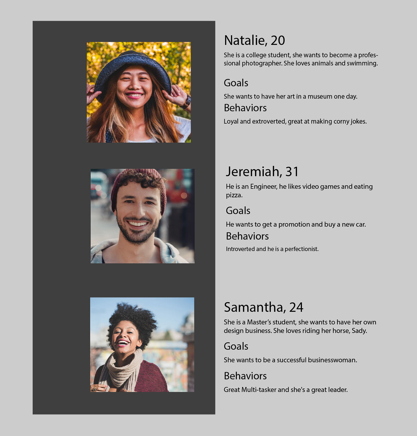
User Personas
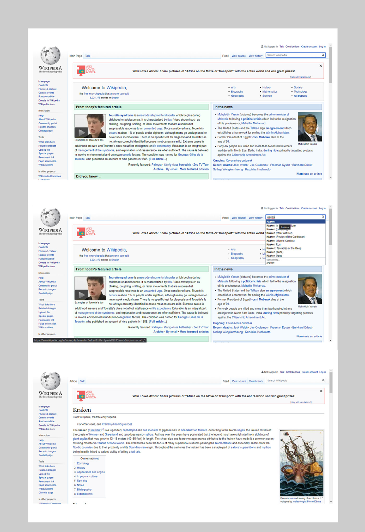
The problem was that Wikipedia is full of information that is not placed correctly, the information is cluttered together. There is not enough white space to make the site look balanced and the navigation tab is hard to understand. The site is also not interactive enough and it could be more user friendly. There is not enough color to draw and keep the user’s attention.
This project was about redesigning Wikipedia, we had to make a design that would showcase the information better. My goal was to create a design that would be more interactive and user friendly, by using big images and shortened sentences.
Wire-framing

Process and Experience
This was some of the process work that was done , it started with wire-framing then content planning and then the design stage. The design process was mostly figuring out what worked best with the information and what would look the most appealing. These are designs that was worked with and they are in the first stages of finalization.
My process was to look through Wikipedia and to find problem areas, then I made
wire-frames and sketches to plan a layout that would solve those problems.
I did research and found precedent and I came up with the final design.
The experience was good, I enjoyed making the layout and finding solutions to the problems, the problems being that it was too cluttered and not interactive enough.


The student research was done by Elandre, Caitlin, Houston, Casey, and Alba.
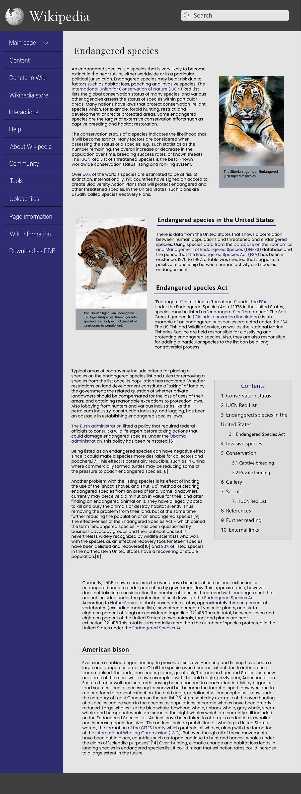
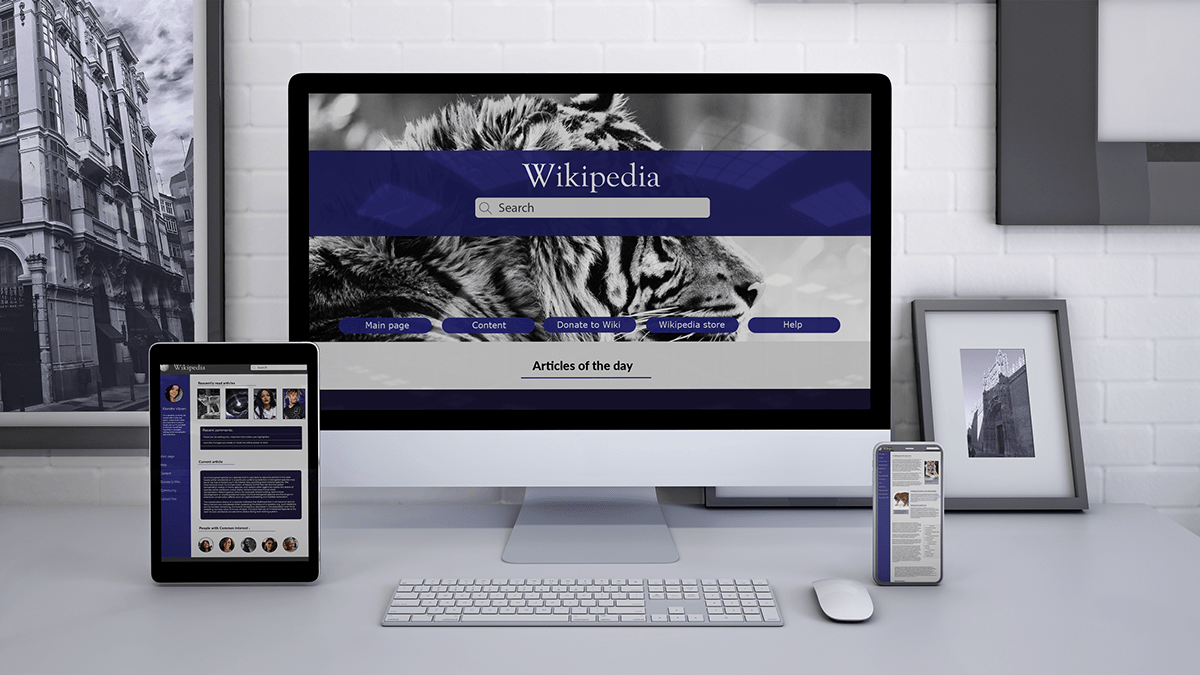
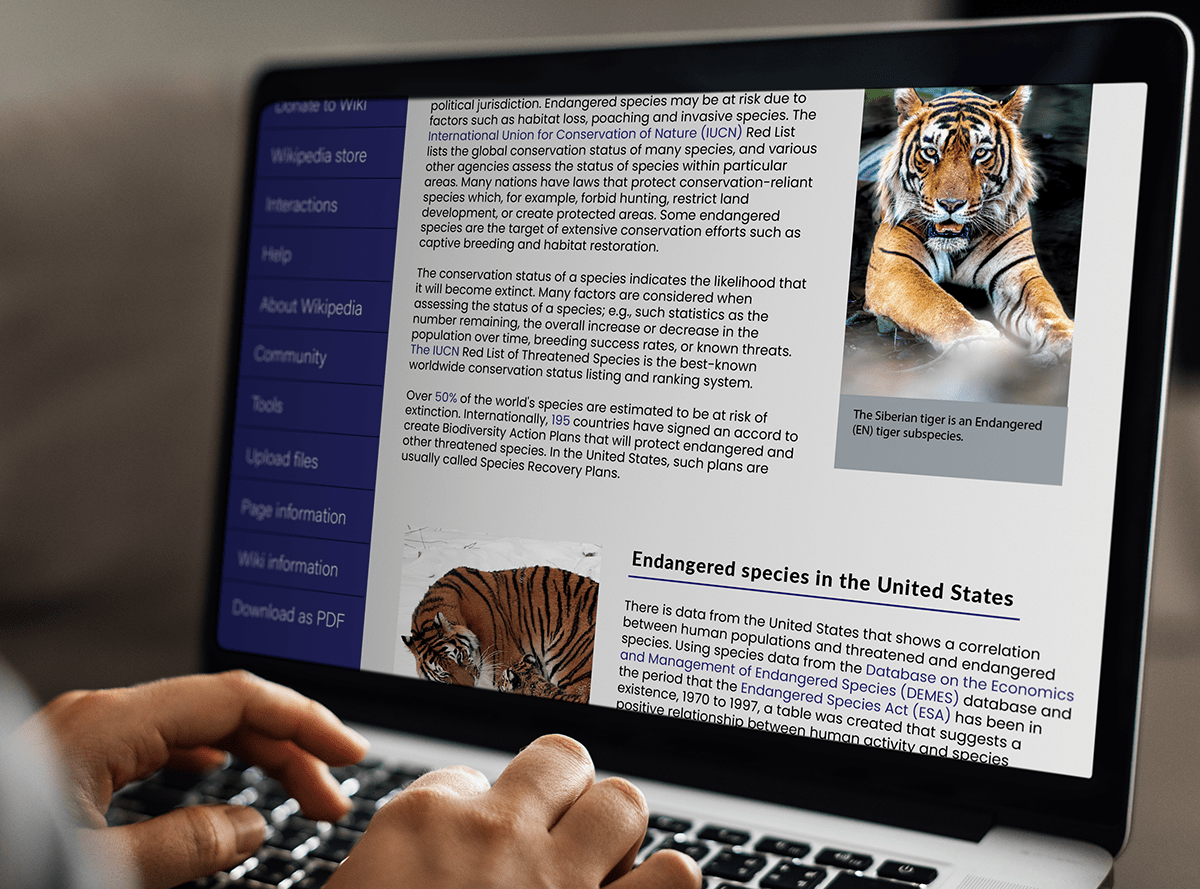
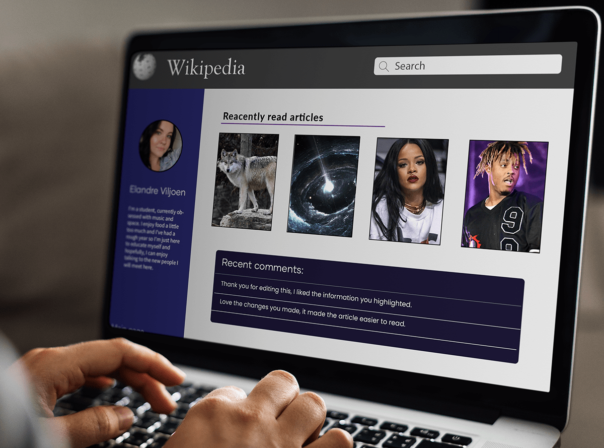
The solution for the previously mentioned problem of wiki being to cluttered and not interactive enough was that the new design should look and feel calm , it should not be cluttered and the solution should have some way to connect people into a community. The target audience would be people from 20 up to their early 30’s , they need relevant information and high quality images, the nav-bar should be easily understandable and the entire website should be more user friendly.
The design solution was to take away the busy nav bar , it was reorganized and set out in a easily understandable way. The information was highlighted to be the main focus and therefore the readers will find what they are looking for quicker, the images used is of high quality and they are being used to highlight the information.
Mock-ups

Thank you for viewing


