FunkedUp Quick Redesign
I was recently in the market to buy a fixie for basically arsing about around home. I'm currently a roadie, so I've got a few bikes lying around but no fixies and I was something that wasn't a piece of shit of the shelf so to speak. Anyway, a mate recommended a site called FunkedUp, so I went to their site to take a look. 🤨
I decided to redesign the homepage quickly (less than 1 hour) to improve the experience so that the independent guys can stick it to the bigger online retailers.
The Current Homepage
The homepage has a few issues; accessibility is terrible, SEO is impacted by text in imagery (not placed over images), site performance and load times are pretty shocking.
But more worryingly to me the look, feel and value comes across as "cheap tatty bikes". It comes nowhere near to standard they've set aside for their bikes so why don't they provide that experience with the whole way through. In no way does it show off their bikes in all of its glory as it should.
And for a company called Funked Up, I'd imagine it would show a little more character and break from the norm.
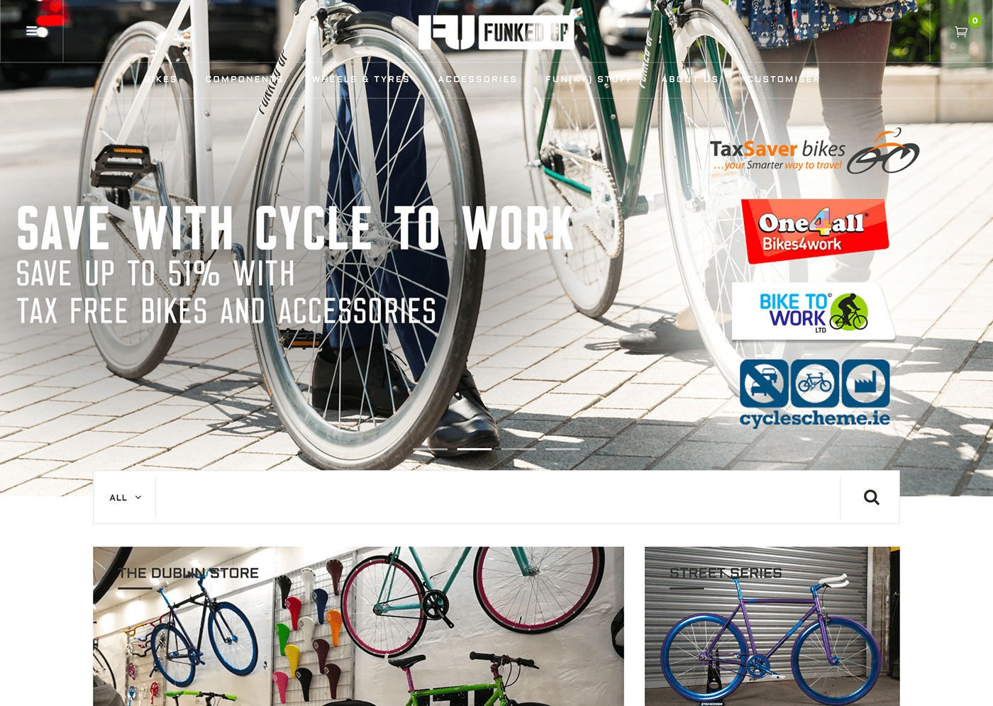
The homepage of the current FunkedUp website.
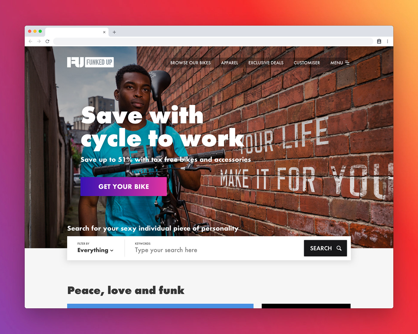
Redesigned Homepage
For the redesign, I wanted to focus on above the fold and some small changes that would make a huge impact. Good contrast has been added so that we can make the site accessible for all. A clear call to action is on the site, and I've added more spacing so the design can breathe. I'm confident this would perform much better on user testing when compared to the original, and because I'm a sound skin, I've shared this feedback and design with the FunkedUp team.


