

Payroll Service Brand Illustration System
Client - Wagepoint Payroll
Illustration, Photography, Iconography, Voice & Tone, Typography/Colors

Wagepoint wanted to bring their visuals up to speed with their growth over the years.
It was time for them to rethink most touch-points with all of their newfound experience and insight on their customers and strengths.
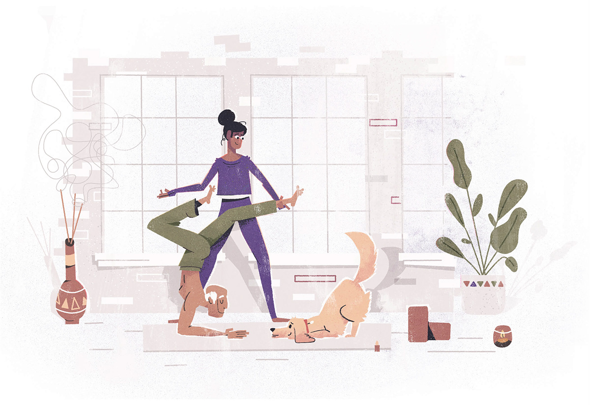
Each Illustration is inspired by a client of Wagepoint’s, to highlight the diversity of people that need to run payroll, from the craziest niche, to the most typical. Focusing on the emotional benefit of the products rather than the transaction or literal visualization of a feature.

Customer Support

Relax and enjoy business knowing employees are paid

Benefits

Stay ahead on taxes
Stress free taxes


Get paid anywhere

Integrations

Using the product's help

Downsides of running payroll on your own

Benefits of running payroll through product

Creating the Style
After a full brand audit which includes a ton of conversation, questions, and high level views of the current state of the brand, we defined three core pillars for the visuals to stand on. Each of these pillars have a visual cue. Think of them as guiding bumpers to keep us on track.
Wagepoint’s core pillars are Friendly, Competent, and Educational. These pillars are intended to not step on one another’s toes, but to span the full reach of the brand. Each of them have a list of synonyms and related words that help us define what our visuals may look like.
For instance, competent is derived from the technical qualifications both the product and team possess. A full trust from the customer is required and therefore it’s our job to earn that trust. How this may look visually could be through a simplified color palette, balance use of whitespace, thoughtful compositions, and a tight integration with the typography and UI. We had mood boards and write ups for each of our pillars.


Iconography
The icons are meant to be simplified, distilled versions of the illustration. We used an alternative color palette that is based off of the illustrations, but brighter, bolder colors that better match with the UI style.


Abstractions
We also needed a way to show the product without using screenshots as the large amount of data displayed would overwhelm and clutter the image. So using all of our elements and style defined from the illustration we were able to create a very scalable and simple style to show the product's features.

Photography
While our first choice is custom photography (which we’re working on) we decided an easily treatable style would benefit scalability and speed of implementation. Sourcing photos that display working people in their element, feeling proud and happy felt like the perfect compliment to the illustration approach.


Thank you!
Hopefully this helps as a resource of how we can make intentional illustration systems that are built around strong stories and fit the uniqueness of a company.
Please feel free to follow me on IG as I'll try to continue to share my insights


